Affiliate Disclosure: We earn a commission if you purchase through one of our links at no additional cost to you.
Why Photographing for Color Should be Part of Your Creative Playbook
Photographing in color isn’t about deciding if your photo should be in color or converted to black & white. Instead, think of photographing for color as a method to influence the viewer’s mood when looking at your photo.
Color can be the subject of your photograph, or it can influence how someone perceives your subject. We can use color psychology to invoke feelings and emotions. People associate certain colors with a sense of time of place.
Imagine the warm colors of autumn, or the pastels of spring. Those colors may provide a sense of time. Color combinations may remind of of a place, like the urban colors of asphalt, skyscrapers and yellow cabs.
How to use Color in Your Photography
Color is all around us, but it’s often a mess. Distracting colors do more harm than good. Concert photographers occasionally get bitten by unflattering stage lighting on their subject. When the photo is otherwise a good shot, they’ll convert it to black and white to eliminate the distraction.
The problem is that a black & white conversion won’t save every photo, and most of us don’t want to look at black and white photos all of the time. It’s up to us as photographers to manage our colors and use them for a purpose.
There are three elements of color that you can use to influence the emotional impact it presents to your viewer.
- Hue – The hue is what most of us think about when we hear the word “color.” Is it a Red or Green hue?
- Saturation – Hues have different levels of tone. We can change them with by adding white (tint) or black tones (shade).
- Brightness (or Luminance) – Changing the brightness of a color is like adjusting its exposure value. That may also impact its hue and saturation.
So how to you use color in a photograph?
Dominant Color
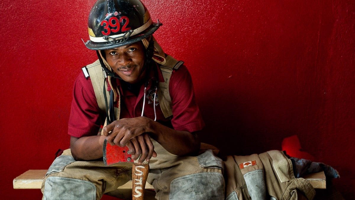
In some scenes, one color just stands out and demands attention. In the example above, the fireman is awash with red. The wall, his shirt, the axe, numbers on his helmet and even a patch of the Canadian flag on his jacket all work together.
It makes sense, given his profession. We’re used to Firetruck Red, and the color dominates several aspects of his career. A dominant color can communicate many things, and it’s the context used with the color that truly determines its meaning.
Red can convey excitement, power, romance or love. In this case, his profession has moments of excitement and power. Red suits him.
What color describes your next subject?
Color Contrast
Color contrast is the difference between two colors. Those colors at opposite ends of the color wheel are complementary colors, which indicates a high color contrast.
In this image, the red coat offers a contrast against the green trees in the background, and also the head of her umbrella. Red and Green are complementary colors. They help your subject stand apart, separating foreground from background.
High tonal contrast separate dark from light
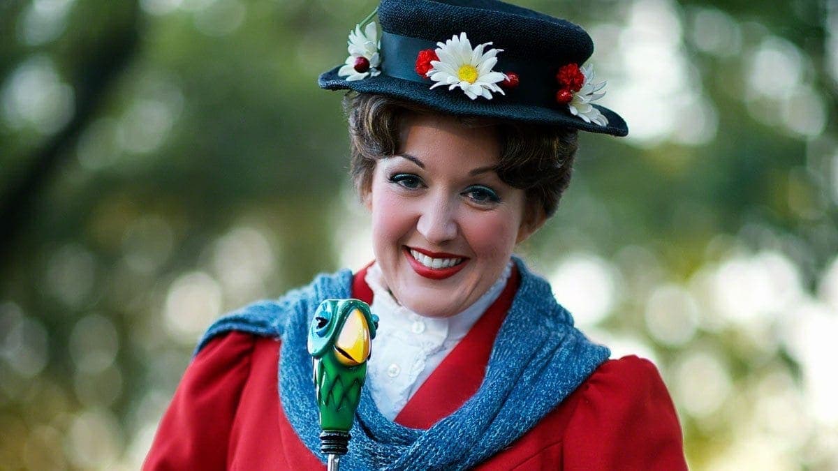
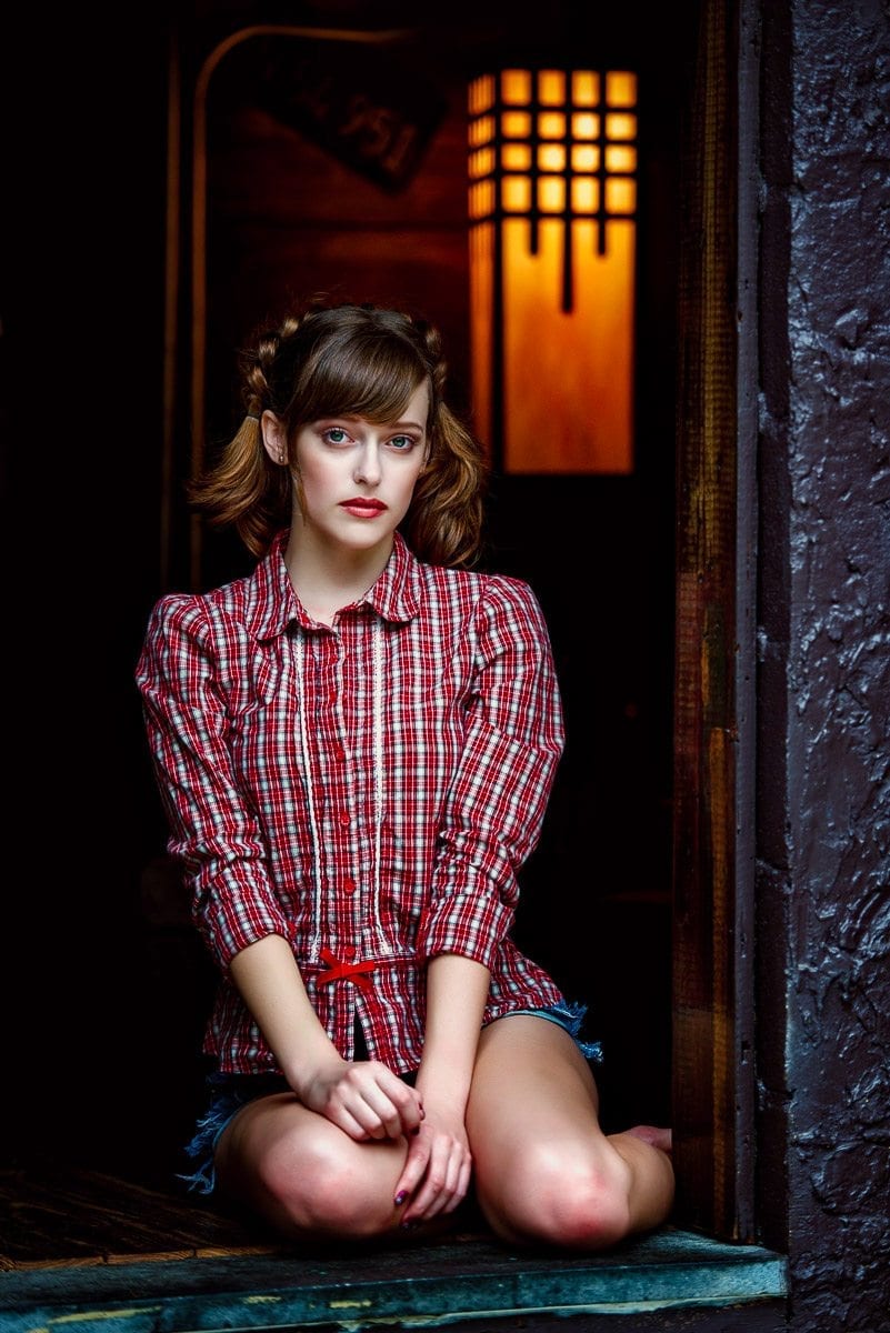
Splash of Color
It’s hard to mis the man in red. He stands out of the neutral background of this photo. It doesn’t matter much what color he wears. Choose any fully saturated color on the wheel and he’d still be the center of attention.
Sometimes a finding a neutral background gives you an opportunity to wait for the right actor with high contrast, colorful clothing.
Using a splash of color works in any genre of photography.
Emotions of Color
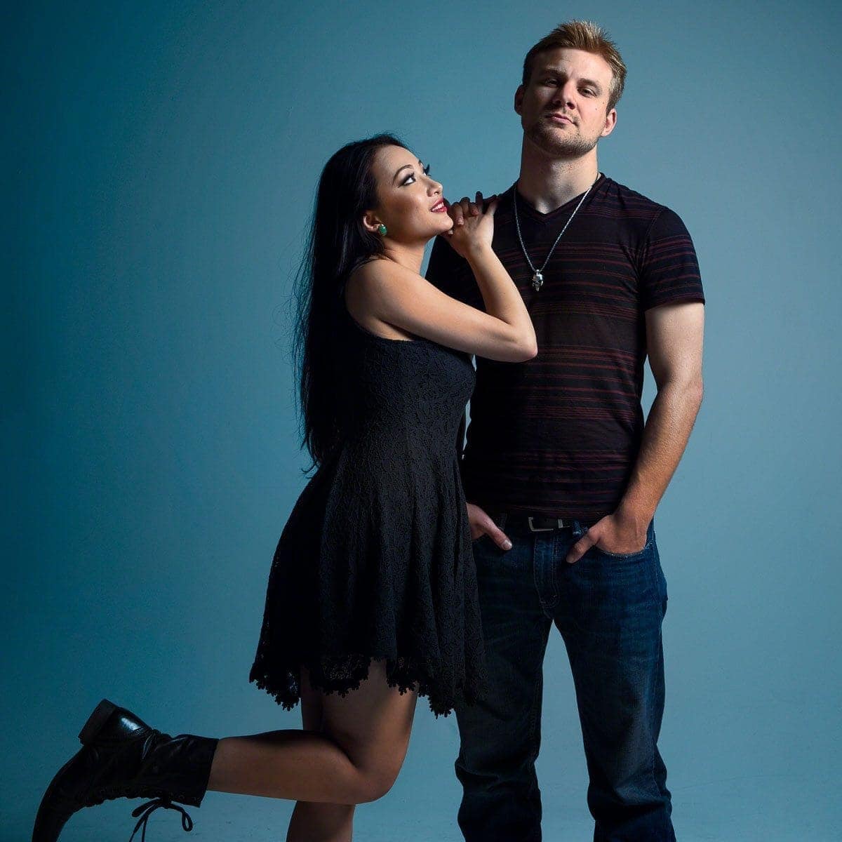
I like to get as much of the photo done while in camera as possible, but don’t ignore your creative choices just because you don’t see them. Sometimes a gel on your flash, or a choice in post processing, allows you to apply color that didn’t exist.
My original photo of the couple above happened on a white alcove, so that gave me the opportunity to add my own sense of color. In this case, I went with a pale blue to create a sense of contentment. Maybe the obvious choice would be to go with red as a symbol of love, but there are a couple of problems with that choice.
First, a red background wouldn’t offer much color contrast against their skin. It would work great against their clothing, but my photo here i about the couple, not their fashion.
Second, there’s more to love than burning, red-hot passion and romance. These two were very comfortable together. They related well and I wanted a color that showed how content they were with each other.
Third, you could still interpret this in another way. The man’s expression could be content, or it could be aloof. It’s also fair to interpret this photo as a bit of a cold reaction to her affection.
You can use color to beat your message over the viewer’s head, or sometimes you can put something out there and let the viewer make a personal decision. That’s the joy of artistic expression. It doesn’t need to have the same meaning for everyone.
Sense or Time or Place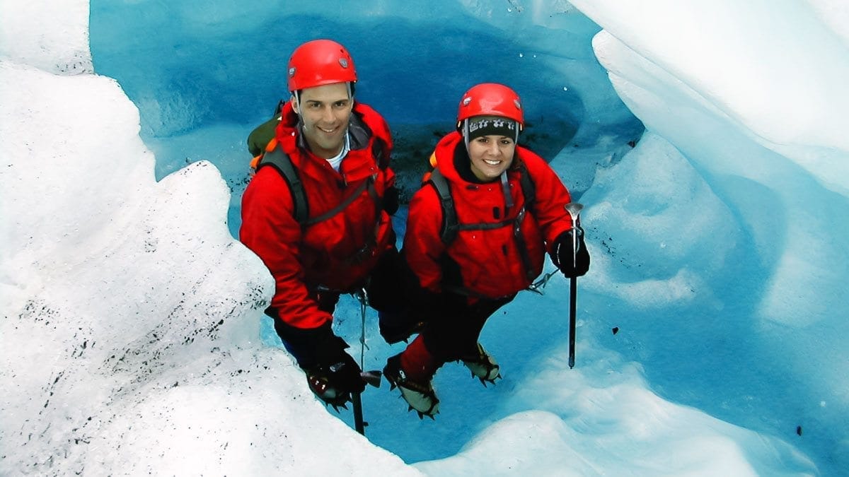
This is probably the lowest quality image I’ve ever uploaded here, but it’s to make a point.
There aren’t many colors going on here, and the prominent colors really provide contrast. They also help you accept, even embrace, a sense of location. Yes, that’s me. I’m on a glacier. More specifically, I’m in a glacier. The environment is full of cool colors and you can imagine the chill we felt standing encased by walls of ice.
If were standing in these outfits in a place with warm colors, you’d just think we were idiots on a beach in winter clothing. With the right colors, we get a sense that the people in the photo are where they belong – seeking adventure in the frigid North.
It works with warm colors, too.
Just Plain Pretty
Maybe one of the best times to photograph something for color is when you think it’s just plain pretty.
It’s OK to trust your instinct for color and attraction. If you like the way something looks, it may be due to one of the reasons mentioned above, or it may be to some primal instinct of attraction. The good thing is that something you think looks good will probably look good to other people.
You don’t always have to articulate why something works for you. If you think the colors are an attractive part of the subject, take a photo. Trust your gut. Chances are that you’re right.
Subscribe to The Photo Flunky Show
Thank you for listening to The Photo Flunky Show. Make sure you get every episode by subscribing.
iTunes – https://williambeem.com/itunes
Stitcher – https://williambeem.com/stitcher
Google Play – https://williambeem.com/googleplay
Blubrry – https://williambeem.com/blubrry
Social Media Links
We love seeing your photos and keeping in touch with you on social media. Here’s where you can find us.
Transcript
THE PHOTO FLUNKY SHOW: Episode 92
Links to subscribe to the show:
You can find links to this episode and all of the other ones at photoflunky.com
iTunes: williambeem.com/itunes
Google Play Music: williambeem.com/googleplay
Stitcher Radio: williambeem.com/stitcher
Blubrry: williambeem.com/blubrry
Keep up with us on social media:
Twitter: @photoflunky
Facebook: William Beem Photography
YouTube: William Beem Photography
You can find links to this episode and all of the other ones at photoflunky.com and of course if you’d like to subscribe, we would love that. Go to at williambeem.com/itunes or williambeem.com/googleplay or williambeem.com/stitcher or even williambeem.com/blubrry
William: Welcome to the Photo Flunky Show, Episode 92.
Today we are going to be talking about photographing for color and what that means, why you want to do it and how you are going to use it.
Hi, my name is William Beem.
Lee: Hi, my name is Lee Beem.
William: Surprisingly enough, we are the hosts you’ve had all the time.
Lee: Nothing’s changed.
William: No, nothing new.
Lee: I’m still full of it.
William: It’s a little sad.
Lee: No it’s not. I’m still full of it.
William: Before we get started with our topic I want to let you know that show notes are going to be available at williambeem.com/episode92 And you can get a transcript of the show there for free.
Links to subscribe are there as well as at photoflunky.com, which has a player for this episode and all of our other shows and also, I’ve got a free ebook for you. If you’d like to get this go to williambeem.com/freebook It’s called Creative Portraits and it’s about the emotional and creative side of portrait photography, rather than the technical side. So I’m not going to be talking about flashes and lighting and how you do all this stuff. I’m going to be talking about things that you’re looking for that help make your portraits look like the mean something to somebody. Does that make any sense at all?
Lee: Absolutely. I get that.
William: You like that book don’t you?
Lee: Yes I do.
William: There are plenty of photos, plenty of examples in there and of course it’s free so you can share it with a friend if you want to.
Alright, let’s start off with the basic questions. Why shoot for color? What does that even mean? Actually we’ll talk about what it means in a moment, but as far as why shoot for color and to me color is really what brings in your emotion.
Lee: Color to me is expression. Expression, if you want the viewer to pay attention, expression can either make a statement, draw an emotion, create a mood or kind of convey a mood or any of the aforementioned so color is your way of communicating with a photograph.
William: And just to be clear, we are not talking about shooting in color versus black and white. When we say shoot for color, we are talking about color is your subject or a major part of what makes up our photographic composition. And you’re choosing your color deliberately for what you shoot rather than just black and white or color. So it’s not a matter of saying we want you to shoot in color rather than convert to black and white. We are saying look for color. Use that color to make a statement or an expression, as you said, in your photography.
Lee: How often or the extent to which you apply this may depend on the genre of photography that you are into. I mean for me, with what I am doing now, I would say that I almost always shoot for color.
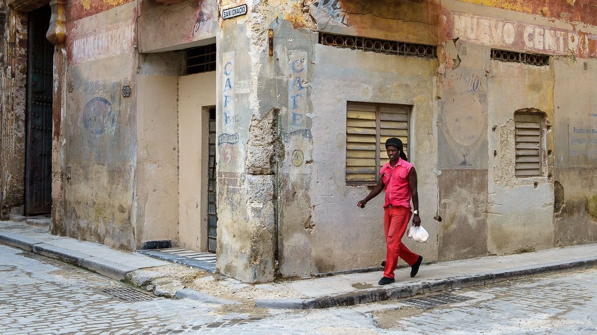
William; One of the times that I really like to apply this, I think, is with travel photography. I remember – I brought this up before on a couple of episodes and I hate to keep bringing this up that I’m going back to Cuba in January. But when I was in Cuba before there are so many colors there and the buildings are kind of well weathered. But they are also very colorful. And as I was looking around I thought the colors really make an impression upon me while I am here. I need my photographs to tell the story through that color. And some of the shots really were walls and maybe a street sign that said Cuba or whatever the street was. But the color became part of how I told the story of where I was because it was part of where I was.
In other cases I was just out Friday and looking for backgrounds and textures to use in other photographs and one of the most important things I could find was not only just what texture of the material was I was shooting, but what the color was and how I can apply that with another photograph. The question really kind of comes up: How do you use color in you photography. You said, Lee, this is something that you are looking for all the time. So what does it mean when you are shooting for color?
Lee: I have a subject in mind or in view when I’m about to take a photo. I don’t think I want to take a photo and what should I use. There is something very specific. So whether it’s a pair of shoes, a drink or a still life that I’m going to set up, there is something there
The first thing I do is look at the prominent colors in there or the prominent neutrals in there and then my next step is to find the color that goes with it. I either want it to blend nicely or to contrast or to complement. So my starting point, before I even look at my composition, is finding the colors. I’ve got a number of fabrics and things and little props that I use as backgrounds and my main thing is to determine: am I going to use a neutral or am I going to use a color for the background? And that depends on the subject.
William: One of the things I’m looking for is a dominant color. Something that is bold that stands out. It doesn’t have to be red. I have got a photograph of just some red rose petals. I really love that. It’s a very bold statement but it’s too powerful for use everywhere. Sometimes the colors you want may be dominant but they also may be neutral or a bit more subtle or faded. And that kind of comes back to tying the emotion you want to present or the subject you want to use with that color.
Lee: Bold colors are loud. It’s like typing in all caps and there is a time – well there is never a time to type in all caps – but there is a time to be loud with your message and there is also a time to be subtle or quiet. Or just to kind of let the person see it.
William: You mentioned color contrast. When you say that I’m thinking complementary colors that are opposite sides of the color wheel. Is that the way you are looking at it or …?
Lee: Yes, but not necessarily opposite ends of the color wheel. There are colors that work together that are not opposite ends of the color wheel.
William: Could be triads or some other relationship.
Lee: It could be anything else and sometimes even it’s not really a contrast but it’s kind of working with different shades of a similar color. I had a recent photo where my subject was black with stainless steel on it and then some black text and I chose blue as the background. I could have chosen any color as a background except black or white because the stuff would have got lost in there. But that might have worked for example if I wanted something very plain and simple where I wasn’t trying to create a mood.
I wanted the cool in there. That was just what looked good to me the day I was in the mood for blue. But what happens for me is I look very carefully at my subject, which was a rubber wrist band and it had stainless steel attachments on there – little messages – and I wanted these things to stand out so it was a real zoomed in (I wouldn’t say macro shot) but we were kind of getting to that level. But what happened was depending how I angled it, I took a few photos and got one where the light was shining onto the metal and catching it which kind of brings out the brightness of the metal and then I did some where I tilted it slightly and it was picking up the tones from the blue.
That also worked. I have the same photo taken two different ways that is going to work for different purposes that I have in mind. I’ve used one very specifically and there is another one that is going to work for something else. It’s saved for a later date.
William: And that’s something in this case you were specifically setting something up, but it’s also something you can find in nature. So if you’ve gone to a beach scene, you’ve got a blue sky in a shade of blue, you’ve got an ocean that is another and it could be a deep blue, it could be an aqua marine kind of blue depending upon what location you’re at where you are. And then maybe you’ve got part of the environment around. If you can find some color on a building or maybe a beach cabana or something like that you can work in those different shades of blue. And construct your scene that way. I am sure there are probably other examples like that. I know people who go off to the desert and they are looking at red rocks and looking at the color of the sand. There are ways that you can look at gradations of the same kind of color or color family and work those into your composition.
Lee: Yeah. It’s almost like monochrome sometimes with some different gradients in the shades. I really like that. I also like to work where you’ve got maybe a color temperature that becomes your theme. For example, the blue was one case, but desert scenes would be one of the same and you might have it like that.
William: Well that’s something where your creativity can come in. I know a lot of us are shooting in RAW so we can change our color or white balance later on, but you can do some very interesting things, even as a portrait photographer. I’ve seen people who will go ahead and change their settings so they are looking at almost a blue color cast on a model and you would think that wouldn’t work out but sometimes it works out really very nicely depending on what the model’s features are and what he or she is wearing.
I have seen some great examples of that, just being creative with your white balance.
One thing I also like thought is an occasional splash of color because a little small bit of color can really stand out over an otherwise repetitive or dreary scene.
I’m thinking of examples like imagine if you see a row of chairs and then one of them is red. That doesn’t come up every day but it’s really something that’s eye catching.
Lee: It’s just the color that contrasts what else is there and it might not be the classic warm/cool color, but you might have subdued colors and then something bold that stands out.
William: Color also gives you a sense of place or a sense of time. We mentioned the blues at the beach or the warmer colors you are going to have at the desert, but also seasons tend to have their own colors. I’ve done some shots in spring time and I kind of want to give them a pastel color cast.
Spring time you are thinking of pastel colors. Christmas you’ve got your greens and reds that are kind of showing up at a lot of places. Every season has its colors. We are in autumn right now as we are recording this.
Lee: Not for us in Florida, but for the rest of you.
William: OK, it’s still summer here in Florida, but the rest of the northern hemisphere is autumn. So you’re thinking of Halloween colors, you’re thinking of the orange and brown and that kind of color. And that conveys a feeling or emotion or sense of when you are taking these shots. Except for in Florida. Florida is just still hot!
Lee: Through October at least.
William: That’s different. So here we can still be taking beach colors.
There’s another time when you want to shoot for color and that’s when it’s just plain pretty. You like the colors.
Lee: That’s me. I don’t think a much. I’ve often said that I kind of feel my way through my photos, but I like pretty. I take photos of things because they are pretty and I want to share them. Sometimes I don’t know how and where yet. If I take something that’s pretty, I always find a way to put it into context and share it.
William: Are there some colors that you think are pretty and some that you think not so much, or is it just pretty as a mood that whenever you see it you know it?
Lee: It kind of is like that where it’s a mood as I see it and I know it. I am naturally drawn more to cooler colors.
William: Are you thinking like winter tones or are you thinking bright summer tones like bright blue and red and beaches or whatever?
Lee: Winter tones, like your blues and deep bluish purples. Generally cool colors are my personal taste. That’s where I’m naturally drawn. However that it not exclusive because I want something fun and upbeat. You have lime greens and yellows and maybe summer colors – teals and things like that – I enjoy them. But sometimes I either see colors that work together or I see something that works really well against a color and to me just plain pretty works.
William: And I know you’re being honest because the T shirt you are wearing is in the blue cooler colors.
Lee: Almost all my clothes. I don’t actually have warm color clothing except for red. I do love a bright bold red. That is my statement color and I a lot of stuff in red. But it’s my exception.
William: So when winter comes around you are going to have cool colors except for that bright red wool coat.
Lee: I’ve got a bright red personality, but my tastes for other stuff when I’m laid back and relaxing and just enjoying stuff, I enjoy the cool colors.
William: OK so you actually mentioned something there that I want to go back to. The emotions of color. The cooler colors make you feel one thing but you’ve got your bright red for another.
Lee: I know a lot of people use cool colors for a mood and they think happy and sad. For me, cool colors are contentment, peaceful and relaxed.
William: I can see that.
Lee: I like that and I think the reason I need that is because my personality is maybe not really chilled out and relaxed. I have got quite a loud, vibrant personality. Red is my personality color. My recharging colors are the cool ones and I think that kind of balances me out. That’s a personal thing and sometimes that is interesting to look at if you have a real passion for color. Not everybody does to an extreme extent but I live my life in color and for me I’ve definitely got a personality color that contrasts everything else that I enjoy.
William: I think that’s what I think of when I’m shooting for color. What is the emotion that I want to bring out of this? If I see something that has a lot of shades of blue, I like that and like you said, that’s kind of peaceful and contentment and I’m thinking the ocean and blue sky – relaxing in summer time – yet you throw a splash of red in there. Someone is having a good time!
Lee: That would be me.
William: That’s all we’ve got today on photographing for color. We hope this gives you some ideas.
Lee: If we skipped something and you’ve got an idea to add, just leave us a comment. That would be great. We never get to think of everything so we need input as well.
William: Absolutely. Comments are always welcome. In this case comments are welcome at williambeem.com/episode92
Thank you for joining us on the Photo Flunky Show. We have already told you where the show notes are going to be available and the transcript is going to be there. But also you will find links to subscribe iTunes, Google Play Music and Blubrry and others.
And please, leave us a comment and let us know. Do you have a favorite color? Is there something that you see in your photographs over and over? Or do you want to take a challenge and go off and shoot for color that’s something that’s really not what you typically do?
We’ll see you again next week. Thank you so much for joining us. We appreciate you. Take care.