Affiliate Disclosure: We earn a commission if you purchase through one of our links at no additional cost to you.
Backgrounds are one of the three pillars of your photos, along with subject and light. In fact, I think that finding the perfect background is often more important than your subject.
Some of the things we want you to understand about backgrounds are pretty straightforward.
As a bonus, we’ll also discuss how you can find some great backgrounds.
Please know that some of the links below are affiliate links. These are items that I use and recommend. There’s no extra cost to you, but I may receive a small commission if you buy something based upon my recommendation. Those commissions help us keep the blog running so we can keep sharing more info.
What is the Purpose of a Background
The purpose of your background is to provide context for your subject.
There are a number of ways to do that, even if it seems conflicting at first glance. In fact, I often think some contrast and conflict make a photo much more interesting. However, there ought to be some logic as to why your subject is in front of a background.
How Does Your Background Speak to Your Audience?
If the job of a background is to support your subject, how can you best make it work for you? The good news is there’s no perfect or straight answer. We have to do a bit of comparison to help illustrate how a background speaks to your audience.
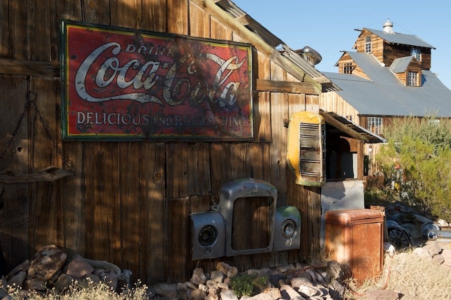
Let’s take a look at a horrible example of a potential background, and then we’ll go through the issues with it.
1: Light or Dark
One of the biggest problems with the photo above is the lighting. It’s a rough mess of shadows and hard lighting. When you consider that the human eye gets drawn to the brightest thing first, this photo will take you off to the right and out of the photo.
Would it be a better background if everything were in shade, or if it were evenly lit?
The decision to light your background, and how you do it, is every bit as important as how you light your subject. If it’s a rough, uneven mess of light & shadow, then your background will compete with your subject instead of support it.
Your background and it’s lighting helps establish context and mood for your subject. Hard lighting may be brutal, but that could be part of your story. Soft lighting may be romantic or calming.
Think about the attributes of light to see how they can flatter your background:
Some photographers love to start in complete darkness. The mantra is “My canvas is shadow. Light is my brush.” So they only add light where it has an need, allowing their subjects to emerge from darkness.
That makes for some dramatic and moody photographs. The light becomes much more effective when there is less of it.
Yet we also love bright, bouncy images with flat light everywhere.
So there’s no perfect answer for all photos. Choose the right answer for your story and your background to support it.
2: Should a Background Have Texture or Be Flat?
My ugly example above is full of texture. Some may think too much texture.
I tend to like to use contrast between my subject and background. So if one has a lot of texture, then I want the other to be rather flat. If I were photographing a walnut or an avocado, then I’d choose a flat background to help accentuate the texture of my subject.
Yet putting something flat on a flat background could also be boring, at least to me.
If I photograph a plate, I’d rather place it on a textured placemat. That provides some dimension and contrast from the rather dull surface of most plates.
Keep in mind that texture doesn’t have to be deep in order to be effective.
Use texture to create shadows, even if they’re small shadows. A canvas or burlap placement doesn’t have much depth, but a bit of sidelight helps bring out the texture in the material.
Portraits often work well on a flat background since we want a bit of detail in our subject. We want to see the texture in the hair, somewhat in the skin, and other features of a person.
While the ugly photo above could provide context for some portrait subjects, it’s rough to use. If nothing else, having an angled background adds more texture and distracts from your subject.
3: When is a Background Too Busy or To Clean?
In my opinion, a background should have as little information as necessary to support your subject. You want to remove everything from the photo that isn’t absolutely necessary.
Our example has many things going on, making it very distracting.
However, that doesn’t mean you can’t use the site. One of the things I mentioned about this example photo is that it’s a problem because it’s at an angle to the camera.
Move your camera to provide a right angle with the barn wall and eliminate many distractions. The lines in the wood start working in your favor. You get rid of the building on the right, the shrubs, and other elements here.
After checking your composition to eliminate the unnecessary elements, this ugly background starts to work well for a cowboy, a country musician, or someone knocking back a bottle of Coca-Cola.
Get in tight on the tractor nose and you have a good background or prop for a farmer. The background provides context for a rural subject.
On the other hand, it also provides a lot of contrast for an urban subject. You could use this same location for a “fish out of water” story in your photography.
All of that texture can work for you.
In most cases, it’s just too busy, though. There are so many elements that the background competes with your subject. So you have a couple of choices.
Either find another background or try to tame the existing background.
4: Should Your Background Be In Focus?
One of the ways we could try to clean up this background is to use a shallow depth of field. Keep your subject in focus and let the background fade into a blur.
That works in a lot of situations, but not every single one.
Some backgrounds are still too busy, even out of focus. While you may not make out the details, your viewer could still get distracted by changes in color, line and shape.
Two factors determine if you can use shallow depth of field to tame your background.
The first is your camera and lens. Shorter focal lengths just don’t have the same lovely bokeh as longer lenses. Likewise, cameras with smaller sensors don’t help create bokeh or larger sensors.
Another factor is the number of changes in detail and color in the background.
If everything is in a uniform color behind your subject, like a pool or some greenery, you have good odds of success. In this case, the different colors of the scene make it an unlikely candidate for blurring out the background.
If you’re on location, chances are that you want some of the background to be recognizable. That’s the purpose of going on location. So a subtle blur that prevents the details from stealing attention from your subject, while still allowing your audience to recognize the location, is a good tactic.
In some cases, you want your background to be in focus.
A good example is a portrait on a solid background or a lay-flat photo. If you’re photographing a subject in front of a concrete wall, you may want to let some of the grit and texture of the background show up in the final result.
Likewise, it would really be awkward to have a lay-flat scene where the depth of field was so shallow that you couldn’t see the floor, table or setting behind your subject.
5: Should You Use Color Contrast or Not?
I admit that I’m a big fan of contrast. For portraits, using a Cyan background is just very flattering for skin tones – all skin tones. I don’t want every portrait to use that same background, but it works well when you have the chance.
The other side of the coin is to use a monochromatic theme with your subject and background. Just vary tints and shades of the same color to create your contrast. You’ve probably seen something similar with fashion or product ads.
In most cases, I opt for a neutral background color. It’s something that isn’t polarizing to the audience, and does a good job of providing contrast for my subject.
If you want to get some more information, check out our episode on How to Use Color in Your Photography.
How to Assess a Potential Background
It doesn’t matter if you’re in a studio or on location. You need to consider some basic elements to find the perfect background for your photos.
1: Does the Background Compete with Your Subject?
Remember, the job of your background is to provide context and support your subject. Your photo fails if the background is more interesting than your subject.
That’s why I generally recommend plain backgrounds. However, plain doesn’t always set context. If you need to show a person playing at a pool table in a bar, then plain goes out the window.
However, that doesn’t mean you give up control of the background. Go through and remove anything you don’t need. Look for hot lighting spots that steal your viewer’s attention. Get rid of people in the way (or wait for them to leave). Distill your photograph to only the elements that support your story.
That includes controlling the light. Let parts of your background be dark so they don’t compete with your subject.
2: Does it Create a Mood?
A photograph should evoke an emotion from your audience. So when you evaluate your background, ask yourself what someone will feel or know when they see it behind your subject.
Is it a honky-tonk bar that generates a bit of excitement, or something dark & moody? Find the emotion you want and a background that supports it.
If you find a background that makes you feel something, then it will make your audience feel something, too.
3: Is the Background Relevant?
Remember that your background doesn’t have to be cliché to be relevant. You can put an Olympic downhill skier on top of a skyscraper and still have relevance.
She represents all of America, not just those on snowcapped mountains.
Don’t be afraid to play with perspective to make your subject seem much larger or smaller than the background. You can be very creative when coming up with relevance.
There’s nothing wrong with a farmer in front of a tractor. People get it, and that may tell the story you need to share. However, there’s more than one way to tell a story.
You may be able to use a background you otherwise wouldn’t consider if you can find a relationship between the subject and the background.
4: Evaluate the Light and Shadows
Sometimes you can control the light and shadows. Other times you just have to show up at the right place at the right time. In my example photo above, the shot was definitely at the wrong time of day for that scene.
Some locations look better at different times of the year, also. The Earth’s rotation around the sub may cause shadows when you don’t want them.
There are time when the sunset hits a waterfall at a perfect angle to create light and color in the stream. It only happens during specific times of the year if you want to get that “Firefall” effect.
So plan ahead if you have to depend upon available light to get the background lighting that you need.
Where to Find the Perfect Background for Your Photos
For most photographers, the perfect background is on location. You have to go and scout places that work for your subjects. The good news is that the world is your oyster. It’s full of miraculous and interesting places to be your background.
The bad news is that it may take a long time to get there because the world is a big place.
1: Work With Your Environment
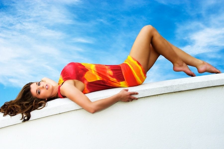
I live in Central Florida. This is not a place where people come to photograph landscapes. Yet your background doesn’t have to be grand or expansive.
This photo was taken on top of a hotel building. There are air conditioners, pebble and cigarette butts on the ground. If I hadn’t shot upward, there was an ugly parking garage in the frame behind the model.
The good news (for her) is that she wasn’t on a ledge with a big drop on the other side.
Yet this background worked to add some color contrast against her skin tone and her dress. She’s on top of a neutral color that doesn’t complete.
You can find a background anywhere, no matter your location.
2: Visit Craft and Hobby Stores
Lee works at home with most of her photography these days. So when she needs a new background, she visits places like Michael’s or Joanne’s to get things to use in her background.
That could be some cloth remnants, wood or marble backgrounds for lay-flat photography or even just some textured paper glued to a poster board.
These stores are full of ideas for creative people.
I found that these aren’t good places to go if you know exactly what you need. That’s because their stock changes and you never find exactly what you need.
Instead, you have to go wander around and let the different pieces speak to you. See what’s there. Listen to how it makes you feel. Then think about a subject that can go with your background.
More often than not, that works out well.
3: Photography Stores for Purpose-Made Backgrounds
Your local photography store may not have these items, but you can order them online. If you ever go to photography conferences, you can find them at a discount or show special.
My favorite backgrounds are either Savage Seamless Paper or Manfrotto Collapsible Backgrounds.
Savage has a plethora of colors and widths. I prefer using #56 Fashion Gray (107 in x 36 ft). To me, this is the most versatile paper background to buy.
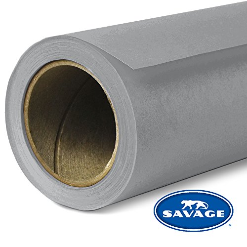
Savage Seamless Background Paper in Fashion Gray is a top-quality background paper that features a non-reflecting surface with an exquisite, fine-tooth feel that’s ideal for creating smooth and even backgrounds. It’s perfect for fashion photography, portrait photography, YouTube videos, interviews, and so much more.
It’s easy to use – just unroll what you need. If the end of the paper gets torn or dirty after a photo shoot, the used portion can be cut off and recycled. The 107” wide x 36ft roll gives you plenty of paper to work with, so you can create stunning backgrounds for all your projects.
If I want to photograph someone I’m going to cut out and use in a composite photo in Photoshop, then a light grey background is the easiest to use for selection.
If I need a white seamless background, I just add light from a flash. If I need a black background, I don’t light the background and stop down my aperture so there’s no ambient light on it.
The range of colors is pretty wonderful, too.
As for the Manfrotto Collapsible backgrounds, I have a few of them. Here’s what I like and why I recommend these pop-ups more than any other brand.
They don’t get wrinkles.
Seriously, these things look perfect every time I open one up and use it. I bought less expensive collapsible backgrounds from other vendors and I can’t use them because of the hundreds of wrinkles in them. It was a complete waste of money.
That doesn’t happen with the Manfrotto Collapsible Backgrounds.
My current favorite is Olive on one side and Tobacco on the other. They look like painted canvas backgrounds. Whether you use them for portraits or food photography backgrounds, they just have an excellent, old-world feel to them.
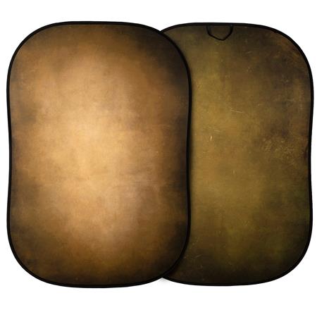
The double-sided Manfrotto 5x7' Vintage Collapsible Reversible Background in Tobacco/Olive is a great way to add a touch of class and sophistication to your portraits, fashion, and product photography. The Tobacco surface offers a range of brown/ochre tones with a slight hint of green, while the Olive surface features a range of deep greens with a touch of ochre. Both sides also feature a dark vignette to the edges. The durable and practical no-wrinkle material ensures that your background will always look its best.
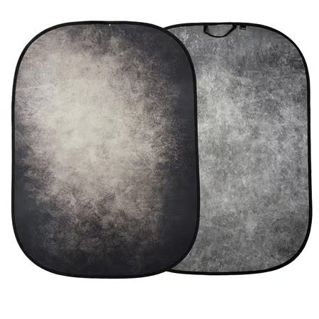
The Manfrotto 5x7' Vintage Collapsible Background in Smoke & Concrete offers a timeless look perfect for portraits, fashion, and product photography. This versatile, reversible background features a dark "Smoke" side with grey tones, a hint of green, and a vignette effect. The other side is "Concrete," which offers an evenly distributed grey tonal texture. When you're finished shooting, the background collapses for easy storage.
The collapsible backgrounds aren’t useful for full-length portraits, but they work pretty well for many subjects and moods.
If you like table-top photography, definitely look at the Vflat-World Duo Boards. Lee and I both love these well-made, realistic-looking backgrounds for food photography.
Each board is double-sided and they come with legs to attach to another board to create a complete table-top background for your still-life photos. Highly recommended!

I freakin' love our V-FLAT WORLD - Duo Boards!
With its hyper-realistic textures and double-sided design, this versatile board offers four different designs in one compact package. The durable and lightweight construction makes it easy to take with you on your travels, while the included Duo Legs provide a sturdy backdrop for your photos and videos.
I bought three sets of the Duo Boards for Lee one Christmas, and then we immediately bought a few more. They come in two sizes and we found the larger size works best. The surfaces look real in our photos. They're much better than any other table-top background we purchased in the past.
You may also want to look at Denny Manufacturing for some products that look like painted backgrounds or different types of floors. The mats roll up for storage and then roll out like a rubber mat with a print of an attractive floor or ground texture. They call them photo floors. I don’t have any yet, but they looked interesting at WPPI.
Finding the Perfect Background for Your Photos
While it isn’t always easy to find the perfect background, we hope these concepts will help you understand how to know what you need before raising the camera. No background is perfect for every photo, but you can find your perfect background by understanding its role in supporting your subject.
Subscribe to The Photo Flunky Show
Thank you for listening to The Photo Flunky Show. Make sure you get every episode by subscribing.
iTunes – https://williambeem.com/itunes