Affiliate Disclosure: We earn a commission if you purchase through one of our links at no additional cost to you.
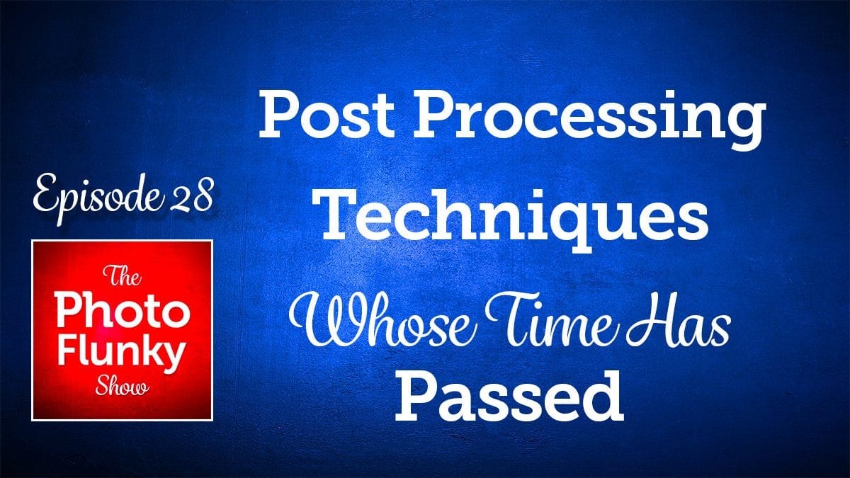
Are Your Post Processing Techniques Out of Fashion?
Thank you for listening to episode 28 of The Photo Flunky Show.
Post processing techniques are as much a part of your art as your photography.
We’ve heard that good artists copy and great artists steal. That may be true, but I think there’s something else to consider.
Like all art, there are trends and styles. They come and they go.
If you’re on the tail end of copying or stealing, your art just doesn’t have the same impact as something original or new. Post processing techniques are like fashion. Some are timeless and others are past their prime.
In this episode, Lee and I discuss some of the post processing techniques we think it’s time to stop using. Are we wrong, or are there some post processing techniques you’d like to add to the list. Please let us know in the comments.
Subscribe to The Photo Flunky Show
Thank you for listening to The Photo Flunky Show. Make sure you get every episode by subscribing.
iTunes – https://williambeem.com/itunes
Stitcher – https://williambeem.com/stitcher
Google Play – https://williambeem.com/googleplay
Blubrry – https://williambeem.com/blubrry
Social Media Links
We love seeing your photos and keeping in touch with you on social media. Here’s where you can find us.
Transcript
THE PHOTO FLUNKY SHOW: Episode 28
Welcome to the Photo Flunky Show, Episode number twenty-eight.
Our topic for today: Post Processing Techniques Whose Time Has Passed.
William: Hi! Thanks for joining us on the Photo Flunky Show. My name is William Beem.
Lee: Hi, I’m Lee.
William: Today we’re going to be talking about post processing techniques whose time has passed; things that were once interesting and unique and now have perhaps been a little overdone.
OK, but before we get into that, let me tell you. I’ve got a coupon code for you. If you are interested in some post processing software from Topaz Labs, they’ve got some great software out there and I can give you a fifteen per cent discount. It’s an affiliate link so I get a little kickback and love from them and you save fifteen per cent.
Just go to williambeem.com/topazlabs and when you check out use the code WBEEMPHOTO, and that will save you fifteen per cent.
Let’s get into it. Post processing techniques whose time has passed.
There are post processing techniques – things that people have been doing for a while because they have seen someone else has done it and it really looked great. It was very creative the first time you saw some of these things and now we’ve seen enough of them and it’s kind of time to move on and do something different. And we’ll start off with a perennial favorite for things that people love to hate and that is selective color.
Lee: Oooh, yeah!
Do you know, the first time I saw it, it really caught my attention. Somebody had shot a street scene in London and if you’ve ever been to London or you’re familiar with the area, they’ve got these big, red city buses and it’s like you see on the picture postcards. They really do still use them there!
Everything had been converted to black and white, but the bus was in red and it stood out and it caught my attention. I really thought it was interesting.
William: And that’s the kind of thing: red is a strong color and it’s really going to contrast off of a black and white photo.
Lee: Yeah.
William: The first time you see it you think, “Wow! I’ve never seen that before. It’s great.”
Lee: Yeah, I couldn’t stop looking at it. I had never seen something where nothing was in color except the subject. I thought this was …. I just couldn’t tear my eyes off of it.
William: And then you saw it somewhere else!
Lee: Yes, actually I think the next things that I saw was a series of portraits that were being posted and they were also converted to black and white, but the eyes were in color. And it just sent chills right through my core. I don’t know what it was. And they were children’s photos as well. They were portraits of little kids, so you’ve got these beautiful faces. You know kids just radiate this innocence and this perfect skin and yet there was something …. it just felt like something out of a horror movie. It really creeped me out!
William: It had those creepy eyes burning a hole through the photo.
Lee: Yes and they were beautiful eyes, but the whole thing should have been in color or not.
William: Well a couple of episodes ago we were talking about black and white and I like a few black and white photos, but for the most part I think color really is best and it’s what works for your subject.
I see small children with beautiful faces and the color and good light is what really makes that photo.
Lee: Their hair is perfect and their eyes are perfect and the skin is flawless. Go on, get a nice photo. Show the color.
William: Exactly. But you take all that color away, but then just the eyes come at you.
Lee: Or the lips. That was another thing sometimes.
William: The lips?
Lee: Yes! Have you ever seen where they take a photo of a woman with bright colored lipstick on and everything would be black and white except for the lips? And maybe the eyes.
William: It sounds like a Dracula thing!
Lee: It was because sometimes there would be someone with blue eyes and they had blue lipstick. I don’t know if you ever saw those? And they tried to match it up and then you’d have your selective color. It was kind of …. oooh!
William: And I’ve got to say I’m guilty of some of these things. Selective color is one of them. I did this one time and it was actually at House of Blues out at what used to be Downtown Disney and now is Disney Springs, and that’s the time I got hassled by Disney Security down there.
I was just taking photos. I was practising. I was just getting into HDR, I was practising taking my brackets and stuff. It seemed like an interesting place. There was a lot of stuff going on and I did one of the things just at the side of House of Blues I left in selective color and it was blue.
And I told my story about being hassled by the security folks down there and one of the guys who left a comment said, “His crime was selective color.”
And he was right. It was a horrible thing to do to the photo. I was practising and experimenting and I’ve never done selective color before that and I’ve never done it after that.
Lee: Selective color is just one of those things that was attention grabbing, but it doesn’t work with every subject. It’s like any form of photography. It’s going to work with some things and not with others, but I think it was just killed when it first came out. Everybody wanted to do it. And that’s fine. That’s what happens with a trend.
William: Exactly and that’s what it is. These are things that were photography trends and sometimes trends get overdone and their time has passed. It’s time to let go of these things.
Which kind of brings me to the next one: Preset Mania.
Well you brought up this topic. Why don’t you go and explain?
Lee: I did because I was kind of interested when I started using Lightroom when I saw these things where you could buy sets of presets or I think there are some free ones as well and you can download them and try them out. So I did and then I went in to see. I think one of them had a video tutorial or marketing video for it and they were claiming they had one of the presets was a “one fix for everything”; it was kind of like a one size fits all. I thought, well that’s weird! How do they know what’s wrong with my photo?
William: Exactly.
Lee: The problem is that some of these ….. I’ve got a few favorite presets that I use and I use them as a starting base when I know what needs to be done with the photo. They are not a fix-all. You can use it as a platform from which to work, if you know what you’re wanting to do.
Nobody can create a preset – I mean some of these things have got filters that are on there and if you click into your little filters (your gradients and, what else? The brush tools and things), you can see where they’ve put that in when they put the preset together. And your subject is going to be possibly in a completely different place. Or maybe your light and dark spots. The whole thing is just out.
William: And that’s really the problem. We are not against presets. Presets are a wonderful place to start. It’s kind of like some of these apps that you get on your phone like Instagram. They have got all these little presets over there and all you do is just pick and choose one and your photo is now purple or sickly green. And if you’re using presets that way – you just pick it and never adjust anything – it doesn’t really work. I think every photo needs its own side of post processing. There is no one size fits all. You need to tweak things.
Lee: It’s not straight out of the box. And I’m also not against them because I use them. But you don’t get to just slap it on and walk away.
William: Well think about all the plugins that you can buy to go with Lightroom or Photoshop. Each one of them will have different filters and each of those filters is going to have a few presets that come with them. It’s a good place to start and it kind of gives you an idea what this tool can do for you.
And if you’re smart, not only will you click the preset, but then you’ll click over to the sliders or whatever controls they have and say, how did they get there? What did they do for that? And you adjust them to your style and what works for your photo.
I’ve never applied a preset and just said that works and I’m not going to touch anything.
Lee: It’s a starting block and there are some really good presets out there. But one of the other secrets is picking the correct preset for the photo that you have. It’s not just the type of photo, but you have to analyze and see what needs to be done to it.
William: Well the presets that I think are the most vile, in my mind, are the ones that are cross processing presets.
Lee: See I don’t care for that and I don’t use them.
William: Well it’s like you’re taking colors and shadows and darks and highlights and putting them in different yellows and greens or whatever colors you want to do and it just makes the photo look icky. You put that on someone’s face and you think, why does she look like she’s got jaundice?
Lee: We spend so much time trying to figure out how to remove a color cast, I don’t know why you want to go and buy a preset that’s going to apply it!
William: Presets have a wonderful way of showing you a starting place and if you like that kind of jaundiced look on your models, there are presets that will do that for you and you can just go with it. I still think that even something as simple as a vignette. You’re not going to have a preset for a vignette because you may want the center of the vignette to be somewhere else. You may want to control how much or how little of the vignette is going to be different for your photo.
Lee: Actually I like them. Lightroom has got a couple of light vignette presets and I quite like those. I do go down into the panels and I tweak them a little bit, but those do sometimes work if your subject is dead center.
William: Alright, this is really off the topic here a bit, but as far as vignettes are concerned, have you ever found one where you needed to have the white vignette instead of the dark?
Lee: No! What’s the point of that?
William: I don’t know. It’s like those 1980’s glamor shots.
Lee: Because your eyes are usually drawn towards the light.
William: Yes.
Lee: Right, so if you put the light around the frame, then it means ignore the subject and look at the frame?
William: Maybe that’s it. Maybe you’re taking a photo of someone or something and you say, you know this is just awful. I’m doing it because I have to, but I really don’t want you to look at the subject, so look at the white on the edges.
Lee: Yeah, you can create it yourself in the custom panels in Lightroom. I know that if you go and drag your little sliders along you can do it. But no, don’t do it.
William: Just a little tangent off of presets, but we are not against presets. Presets are a wonderful thing to start.
Lee: I love them. I have bought some and I use them.
William: But if you’re just slapping them on and not putting any thought into what you’re doing with your photography, then you may as well be using Instagram filters.
Lee: Yeah, the presets are great. But they need your help.
William: Yes, they need your help.
Alright, the next thing whose time has passed: Grungy HDR photos. And God knows I’m guilty of this. I look back at some of my old HDR photos and I think, oh! I don’t want to see these anymore.
But a part of that was because of the tools of the day that were really not up to the task.
Lee: Yes, possibly. I liked the grungy HDR photos. I really did.
William: You liked them?
Lee: I liked them!
William: Is that what drew you to my photography? Because they were grungy?
Lee: No, when I started following your photos you had kind of – a lot of your stuff had moved on – you had a different processing technique for them. But the funny thing is that I never cared for it for my own photos, but I do think some things just work with the grungy look. So I understand why. I think people used it to death and just assumed if it was HDR that everything went grungy. I’ve seen them use it on people. I mean, what in the world were you thinking?
But there are certain subjects. I’m a bit of train fanatic. I love my trains and old steam trains and things and sometimes these old locomotives, where the paint has got distressed and they are a bit rusty, those kinds of subjects worked well with the grungy look.
William: Well, I think there’s a difference between enhancing the texture and HDR grunge. Because I’ve even seen people refer to that. You do something to enhance the texture and they say, “Oh you made it look like HDR.” And I thought, oh this is really not what HDR was supposed to be about.
I mean HDR – high dynamic range – was supposed to be able to allow you to capture more of the range between highlights, midtones and shadows. And the grunge was just kind of an unpleasant side effect because of the software we were using.
Then, in order to get past that, you had to start masking in different exposures from a bracket that we had shot. I used to spend a lot of time trying to get the grunge out of my HDR photos and at the end of it I started wondering, why am I using Photomatix when all I really need to do is blend these original exposures?
And for a while I was doing that. I was just blending exposures, rather than using HDR software. I am really happy with Aurora HDR from MacPhun. That one does a nice job and the photos look realistic. They don’t have that grunge to go with it.
Lee: And it’s so super quick as well!
William: Oh, things that I used to spend hours working on! You’ve seen. I’m done in ten, fifteen minutes.
Lee: I know. It’s incredible. It’s worth a look.
William: As far as the HDR grunge, if you’re still using the old Photomatix and you’re still enhancing that with too much clarity in Lightroom or other plugin tools, it’s over! It’s done. You should not have any halos on your photos anymore.
Lee: No. That clarity slider is also another thing. Beware! Less is more, if you need to touch it.
William: I am really a fan of having photographs look like what you experienced. Maybe enhanced a little bit. I don’t have a problem with enhancing it somewhat from what you saw to make it stand out and pop. Grunging it up is just last decade. It’s time to move on.
Lee: It is. At the time though, I am just confessing, I did like it.
William: I did it. I’ve got too many photos. As a matter of fact I’m going to be deleting a lot of them from my website and probably re-processing them to use them for something else, but I’ve got too many photos that have that HDR grunge. I don’t want that to be part of my repertoire now.
Lee: I never did it because my subjects aren’t suited to that kind of processing. Or even then, at the time, they weren’t, but I didn’t hate it then. I hear you. The time has passed. We have moved on.
William: And kind of related to that is the next one, and I am guilty of this as well. It’s something I call overglow and that is adding too much glow to your photos. If you were a fan of Nik Software’s tools, it was called Glamor Glow and there are similar glow tools in other plugins and you can do the same thing in Photoshop with a bit of softening and kind of making a layer over everything and then sharpening after the fact. This soft kind of glowing look and making the lights just really spread out is gone. It’s been overdone, too.
Lee: I’ve got no experience with it. I’ve never done it.
William: Sadly, I have!
It’s time to let go of glamor glow and tools that are like that. A little subtle bit of it I think is still nice. You want a little softness in places, but people were cranking this stuff way up and it was really very noticeable and it is one of those things much like HDR. And often, basically in partnership with HDR, there was too much glow.
You do your HDR and you get a lot of grunge, then you soften it up with some glamor glow and then you go sharpen the snot out of it again so the texture comes back through the glow. You don’t know if you’re looking at something soft or textured or hard or grungy. It was very confusing.
Lee: Well, stuff was hard work then.
William: It was! And it shouldn’t have been.
Another item on our list, and this is not necessarily just a post processing technique, but it’s something that you do in conjunction with your photography and in post processing and that is levitation. And if you don’t know what I’m talking about, have you ever seen one of those photos where someone seems to be floating in the air, or maybe there are books or lights or something else like that that’s just kind of floating in the air? And you think, ooh, how did they do that? Well now we kind of all know how they did that. They were on a block and then they erased it in Photoshop on top of another photo that they took without anything in the background.
Lee: It’s magic.
William: It’s freakin’ magic! Well, it’s not magical anymore. Much like everything else that we’ve talked about on this list, it’s been done.
It was kind of like selective color in a way. The very first time you saw it, there was this sense of wonder. Oh that’s different. How did you do that? It’s striking.
Lee: Yes, but when you keep repeating “different” it becomes the norm.
William: Again, it was a trend and that’s why it’s something whose time has passed. We need to get creative and come up with some new techniques of things that haven’t been done before. Or maybe just as an idea, concentrate on the beauty of what we are shooting now and maybe make that, rather than trickery, what’s really the subject.
Lee: Yes, just enjoy what you’re doing.
William: That’s our list for post processing techniques whose time has passed. If you’ve got some ideas of your own, we would really appreciate it if you would let us know in the comments. You can find the show notes available at williambeem.com/episode28.
Thank you for joining us again on the Photo Flunky Show. Show notes are available and you can get a free a transcript at williambeem.com/episode28.
And you can find links to subscribe to the show on iTunes, Google Play Music and Stitcher Radio.
Thank you very much. We really appreciate you listening to us and we’ll see you again next week.