Affiliate Disclosure: We earn a commission if you purchase through one of our links at no additional cost to you.
5 Easy Tips to Improve Photographic Composition
Two of the most common tips new photographers get to improve photographic composition are the Rule of Thirds and Leading Lines. While not bad suggestions, have you ever noticed that they contradict each other?
The rule of thirds teaches us to avoid placing our subject in the center of the photo, yet leading lines generally direct your eye to the center of the photo. It’s like some kind of banal plot.
The biggest problem with these rules is that people treat them as laws. Commandments. They’re more like guidelines. Feel free to break them.
Here are my recommendations, in no particular order.
1: Who Says You Can’t Center Your Subject?
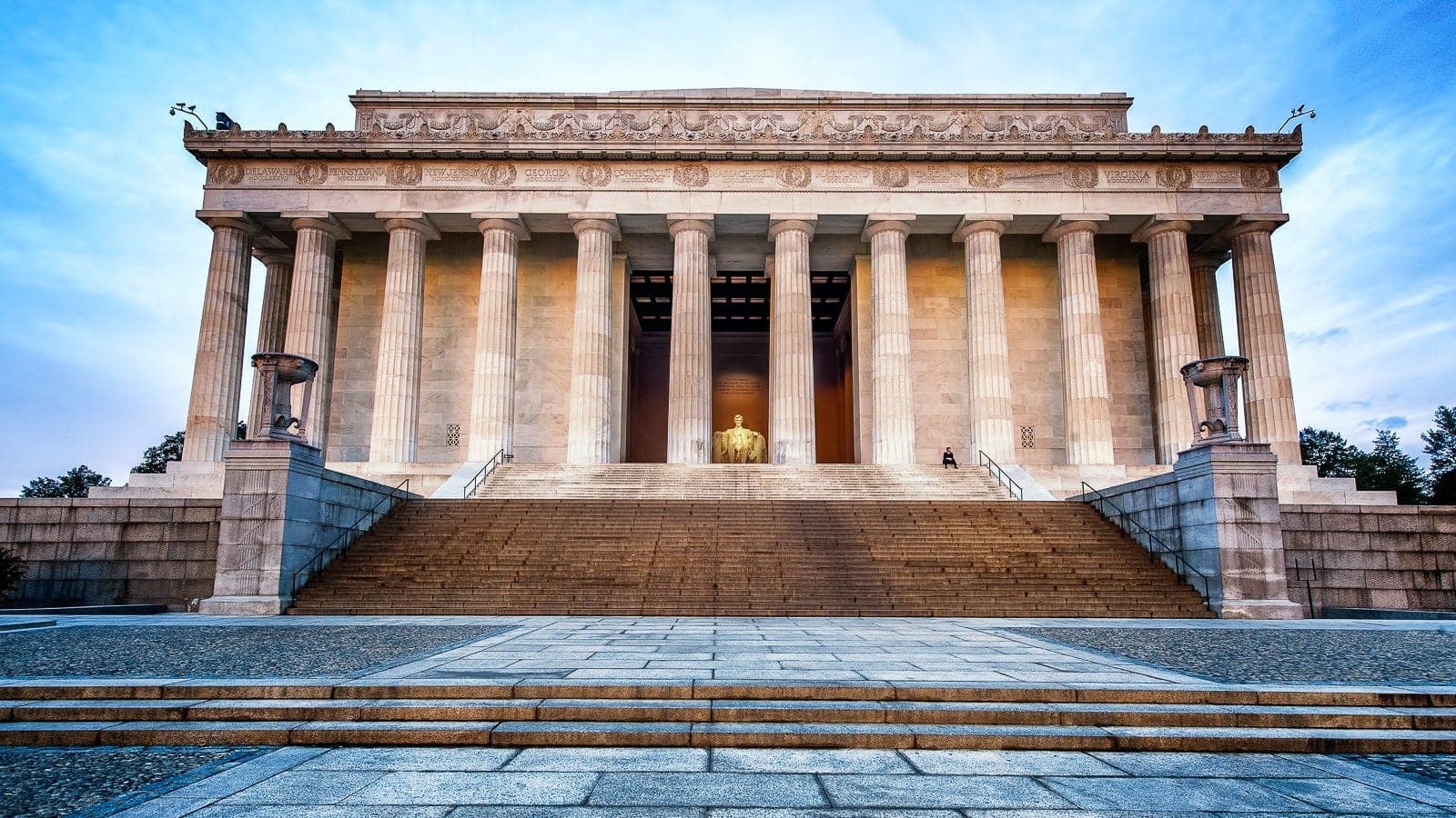
Yes, I placed the Lincoln Memorial right in the center of the frame. Sue me.
There’s a reason I went with this composition. Placing your subject in the center of the frame indicates power and dominance. The Lincoln Memorial is a massive tribute to Abraham Lincoln, who also sits dead center in my frame.
While I was at the site, I walked around and searched other compositions that worked within the rule of thirds. The problem is that those compositions didn’t suit the Lincoln Memorial or tell the story I wanted to share.
The reason you treat the rule of thirds like guidelines is because it’s more important to serve your subject and your story than to obey some rule.
2: Balance and Symmetry are Your Friends

Balance is easy to understand. When both sides have equal visual weight, you’re in balance. Symmetry is related, but with a bit more detail. You have symmetry when equal parts are facing each other or are surrounding an axis.
The photo above is a great example of columns facing each other. Oddly enough, the photo also uses leading lines directing your eye to the center of the frame.
It’s that banal plot again!
I’m not worried about adhering to the rule of thirds here, yet the composition works.
3: A Pattern Interrupted Catches the Eye
The human eye loves patterns. They make us feel comfortable. The columns above easily form a pattern to direct your eye to the center, and we don’t mind. Even if there were a gaping maw of the Kraken waiting to devour us, we’d blissfully follow the pattern.
If you want to catch someone’s attention, interrupt that pattern.
We see that happening in the photo of the Lincoln Memorial, in more ways than one:
- The two center columns have a different color background than the other columns
- The statue of Lincoln sits between the very center columns
- A lone man sits at the top of the stairs, between a pair of columns
My subject has balance and symmetry, but small changes interrupt the pattern and add a bit of tension and interest to the photo.
4: Give Your Subjects Breathing Room

There are some parts of your subject that you can push to the edge. Then there are parts that just need some empty space. This boxer is a good example.
The important thing here is direction. His eyes and fists are facing the left of the frame. You need to give the viewer some room on the edge where we anticipate forward motion, even in a still frame.
I can crop the top of his head or his left shoulder without any worry. We don’t expect him to move in those directions. We expect him to move forward. Your composition needs to allow the viewer to imagine that motion taking place.
5: Too Much Negative Space Diminishes Your Subject

Here’s a prime example of how I screwed up a shot by using too much breathing room. That’s because I wasn’t clear on my subject at the time of composition. It’s an error I’ve seen others make countless times.
The musician should’ve been my subject, but I was fascinated by the grandeur of the lobby inside The Venetian in Las Vegas. It’s a beautiful lobby, but my story here should stay with the musician. Adding that ceiling doesn’t make for a better photo.
Worse, trying to include it diminishes the key subject in my photo – the musician. He’s entirely too small in the frame.
It’s tempting to take portraits in front of some massive object, but it doesn’t work when the subject is too close to the object. Instead, get the subject away from the big object and use it as a background element, an anchor point to describe the location. Then fill most of the frame with your portrait subject.
To learn more, read my article to Improve Your Photos with 10 Elements of Composition.
Transcript
THE PHOTO FLUNKY SHOW: Episode 89
William: Thank you for joining us on the Photo Flunky Show. Today is Episode 89.
I know, we’re getting up there, aren’t we!
Lee: Yes, we are!
William: On today’s show we’ve got five tips for a better photographic composition.
Hi, my name is William Beem.
Lee: Hi, my name is Lee Beem.
William: Lee Beem, do you know what photographic composition means?
Lee: It’s the way that you have your subjects arranged within the frame.
William: OK. You can stay on the show.
Lee: Oh, yay!
William: Alright, before we start talking about photographic composition, I want to let you know that show notes are going to be available at williambeem.com/episode89 And you can find a transcript of the show there for free. Links to subscribe are there and you can find all of our shows at n photoflunky.com
Also, if you are a Mac user, I’ve got a discount coupon code for you from Macphun. It’s ten percent on most products. For Luminar and Aurora HDR it is a $10 discount.
The code is my last name BEEM. Just go to williambeem.com/macphun If you are not a Mac user; if you are a Windows user, I’ve got another link. I’ll put it on the show notes so you can get a beta version of Luminar for Windows. It is absolutely free and then it will come out later on this year and if it comes out and you like it and you’re happy with it, then of course that coupon code will work for you too if you decide to buy it then. For right now Luminar for Windows is a beta version. It’s free. I’ll have a link for you on the show notes.
Photographic composition, as you just side, it’s about how you are arranging your subject and what your photograph is going to be. And there are a lot of rules that people have put out over there and probably the most basic one that comes out is the rule of thirds. In other words you are supposed to put your subject somewhere along the line in the rule of thirds or maybe at the intersection or one of those.
Who says you can’t center your subject?
Lee: Well when you say rule of something and I hear the word rule, it means a suggestion or a recommendation. There are no rules in my life.
William: I agree with you there.
Lee: There are laws.
William: The rule of thirds, to me, those are guidelines. But what you are really serving is what makes your subject the most interesting in your composition?
Lee: It is and I think it’s a great place to start for somebody who is trying to figure out how to do this. I think breaking things down so that they can learn how to see it. It’s not natural for everybody. I don’t think it’s a bad thing, but when these rules of thirds and centering things and all these other complicated things come out… I’ve got a bit more of a creative background and I look at it and think, well I know if stuff is balanced or not. I can look at it and feel it. Not everybody can. So I think you just need to find your place within there.
You might start out using the rules as basic guidelines and please, they are guidelines, and then move on from there as you find yourself within your photography.
William: I kind of agree with that because a lot of people start off with the rule of thirds and it’s a good guideline to start off with because you don’t necessarily understand why something works within the rule of thirds, but it kind of gets you there and the idea is you are supposed to look at it and evaluate your photographs and grow. And then there are people that take these rules almost as if they are laws. You can’t center your subject! Your photo looks bad if your subject is centered.
Well that’s really not true. It depends upon your subject.
Lee: My favorite is when you have a photo posted somewhere and somebody shows up and tells you “According to the rule of … or the law off … whatever” and they start citing it. I think to myself, well I’ve got a not so polite gesture for that law. This is about a photo. You are welcome to use it, but I am not applying it to mine.
William: You know, I like some of these things as guidelines. And it’s a good place too start. Some people hold onto them and they never grow beyond that. Then they will criticize other photographs.
I’ve got a shot of the exterior of the Lincoln Memorial. It is centered in the frame. It works that way. If I try to put it anywhere else, at least for the composition that I’ve got, it wouldn’t work. It’s too close to one edge and not enough to the other.
Maybe if you backed off several hundred yards, then you might want to put the whole building onto one side or another or higher or lower. But for where you are standing dead center, it gives you a real sense of power to have something centered and looming large in the photo.
Lee: It really does. That is a good example because with symmetry that is found within your subject, some things lend themselves very well to fit within this guideline.
William: That goes to our next tip. Balance and symmetry are your friends.
Lee: Yes, they are. And with architecture you do usually – not always but usually – want some balance and symmetry. But balance and symmetry… people look at these as lines. I often look at them as colors and where the light is in the photo because to me that is a much more powerful way. I don’t want somebody to technically move through my photo. I would rather have fewer people appreciate it and have the people who get what I’m seeing, love it. I can take the haters and kind of shrug them off if I’m in a good mood; if I feel like having some fun I might mess with them a little bit.
It really depends what you see within that frame.
William: You actually brought up a really nice concept that I think a lot of photographers miss. They are thinking of balance and symmetry, working within lines; within the edges of their subject. But you are talking about it within color.
Lee: And that is the way that I interpret things. That is how I see things and we all see things differently. So it’s not really a right or wrong; it’s not to say that color is more important than the lines and balance in symmetry. But you find your own way that you interpret things and the way that you balance things out and I think people are pretty good now. We’ve been almost trained through photography forums and hearing advice and reading books and going through courses that everything is about drawing lines. And that’s great for somebody starting out, who is trying to grasp the concept. It goes well beyond that and I think if you’re going to stop with the lines, you are short changing yourself.
William: This is one of the things I find funny, that kind of contradicts the rule of thirds. People will talk about leading lines. And what do they do with their leading lines? They always put it dead center. I thought, well that’s not on the rule of thirds.
Lee: It’s not!
William: I tell you, rule of thirds and leading lines – those kind of conflict with each other. The way it’s generally taught.
Lee: I have a history with rules. I don’t actually break them as much as I reinterpret them. I don’t go by what is stated that you must do. I look and see: does it specifically say I shouldn’t …. And then I work within that.
William: Well, I think what people misunderstand. I’ve said this earlier but I’ll go ahead and say it again. They misinterpret the rules as the most important thing, whereas I think the visual interest of what you’re shooting is the most important thing. The rules are there to help guide you, but if they guide you to a place where it’s really not an interesting photo then how have they served you?
Lee: Well, if you want to impress technical photographers – and I think there are certain genres where it has its place – then that is great. But if you have viewers who are not necessarily photographers and you want to put your picture up somewhere as art or as a story or a message, you’ve got to break beyond that.
William: A lot of photographers are technical photographers and here is another thing I’ve said before. Creativity is the intersection of technical skill and imagination.
Lee: Yes.
William: You have got to have the skills in order to make the capture.
Lee: Yes you do.
William: You have got to have the imagination to come up with something interesting and when you put those two together, that’s your creativity. That’s really what it means. How can I take this technical skill that I have? We can go out and take technically perfect photos all day long but that doesn’t make them interesting. It’s the imagination combining with it to make something creative that’s really fun.
Lee: That’s what brings out your unique interpretation. It kind of puts your own mark on what you do.
William: When you are looking at balance in the frame, what are you looking for?
Lee: Again, the balance could be related to light. It really is all about the way that the eye moves across the photo. We spoke last week about where the eye is drawn. All these, if you want to go back it will be the previous podcast, which is episode 88, right? So you can go and hear that. I think that is the easier way to sum that up. We discuss that in a bit more detail.
But when you are looking at a picture for me it’s feel. I do understand that not everybody feels their picture. That is just the way I’m wired, but your balance might be about lines, it might be about a sense of weight. It might be light. And sometimes you very specifically disturb the balance, where you want somebody hanging into a corner because that creates a different mood. You might want them pulling into the center. So you can use this to your advantage, depending on the message you are trying to portray.
William: And that’s one of the reasons I say balance and symmetry are your friends. I’m not saying that every photo has to be balanced and every photo must have symmetry. Sometimes you can break those elements to create tension in your photo and that’s a different kind of interest and a different kind of mood. And that is your imagination with the technical skills again. That’s your creativity.
Another item to come up with is a saying I heard called: a pattern interrupted catches the eye.
You can see a row of a number of things. Let’s say one of them is just maybe out of order; maybe it’s a different color, but something like that, for some reason, people say “Oh I like that!”
We are going to go back to the photograph I took of the Lincoln Memorial. If you go out and look at the exterior from the front, you’ve got all the columns there and then you’ve got this grand staircase leading up to it. In my photo there is one man sitting on one of the steps up there just taking a break and that kind of interrupts the pattern of the stairs. I think it’s perfect that he was there. Usually I’m the kind of person that wants to take a photo and if there is somebody in the way I’m thinking, damn tourist, get out of my way!
He actually made the photo for me. He was a solitary person there on those steps and that was the perfect place for him to be.
Lee: That’s kind of your message in that photo. When I look at something like that, it’s like I have a very good grasp of the technicalities of making this perfect and I did … but here is my cheeky side that kind of abandons the rule.
William: What I liked about it was these memorials and monuments in Washington DC are there for the people.
Taking a photo of it without a person in it … if you’ve got too many people in it it’s just a clutter. But one person right there in that spot just sitting down. He was probably smoking a cigarette, I don’t know. He made it perfect because it was for the people and he represented that. He was representation and he also interrupted that staircase.
It would have been a nice photo without him, but I think it was more poignant with him.
Lee: Here’s the thing about a photo like that. When you have a subtle message, it immediately catches attention, but people don’t consciously think about it. I love photos like that because you don’t have to explain yourself. It’s there and they are aware of it, but it doesn’t make them have to think. And the viewer shouldn’t have to think. They should feel something.
William: No, you don’t need to beat them over the head with something. And there are probably people who have looked at that photo and never thought of it the same way I described it. That’s the way I look at it.
Lee: We perceive things differently and I think that’s something that we accept.
William: Here is number four. Give your subjects some breathing room. Here is what I’m talking about and this almost goes back to the rule of thirds in a way. If you have a photo of let’s say a person, and they are looking in one direction or another. Maybe you’ve got a photograph of a car that’s driving down the road, a horse that’s running or something like that, you don’t want to put the nose of that object right up against the edge of your photo where it looks like they are just about out of your photo. You kind of want to give them room to run. But it doesn’t even have to be that. I’ve seen photographs of just a wall with a solitary window in it and you don’t want to put that window too close to the edge. You want to give it a little bit of negative space.
Lee: especially if there is light rays coming through it. You want the light rays flowing into the negative space.
William: So when you’re thinking of breathing room are you thinking negative space? What does that mean to you?
Lee: I understand the concept of negative space. I don’t really think of it like that. To me it is the space for the viewer to continue the story.
William: I look at it as it’s kind of what you said – to continue the story. Because even if I’m just taking a portrait of a model and he or she is looking off slightly in one direction, you kind of want to follow their gaze a little bit. And if they are in the wrong spot, they don’t have room for you to interpret that inside of your own mind. And it’s not that you are consciously thinking about it. You just know that something is wrong. Maybe it’s out of balance, but you need to have them slightly off so that they can have room. I call it room to breathe, but it goes back to your balance and symmetry I think.
Now number five is the opposite of that. Too much negative space diminishes your subject.
Lee: Yes, we see that a lot!
William: Particularly on travel photos where they’ve got this grand thing and you want to have somebody in it and they are this tiny little speck of a person in front of a big mountain or yacht. A yacht is a good example. I have a friend and I won’t call him out, but he took some photos of a model on a yacht and she is up on the yacht in a red dress and you can’t even make out her face because she is so far away. I get the idea. You want to show someone young and beautiful enjoying the luxury of the yacht. All you really see is the yacht. That’s the subject. She is just kind of there.
Lee: I think what happens is the yacht becomes the subject and in there it’s kind of apparent that the girl was supposed to be the subject and something just doesn’t feel right. If the yacht is supposed to be the subject that’s fine. If you had a number of people on there, maybe it wouldn’t have been as big a deal. But I think if the person is your subject, bring them forward.
William: We see this with travel photos all the time. Living in Orlando we see people, they want to stand in front of Cinderella’s castle and take their picture and they are more worried about getting the castle in than actually people recognizing that they were there in front of the castle
Lee: Yes, they want to run back. If you’ve traveled you have probably had somebody hand you a phone or a camera and say, would you mind taking a photo of us? Sure. Then they go and pose themselves and they start walking back. They are always surprised when you call them forward and when you take the photo and you show them: now we can see your faces and whatever the landmark is behind them, you get this, “Oh thank you!”
William: That happens to us all the time when we go out to Disney. People see us with our cameras and they say, would you mind taking a photo for me? Alright, I’ll do it, but I’m going to do it my way. And I don’t say that obviously, but we’ll call them closer and the castle is an anchor point to say: I was here. But the photo is really about the people.
Lee It is. When somebody says, will you take a photo of ME in front of whatever it is, that is my cue. If they say they’d like a photo of that and they’re just going to be somewhere in the background …. nobody ever asks for that. So I kind of know what they want. Just maybe they don’t know how to get the result that they want. If I’m going to take a photo for somebody, I’m going to use whatever tool they give me, whether it’s a phone or a camera.
William: The same thing just happened to me a few nights ago. I was at a place in Orlando called Lake Nona and there is a structure out there called The Beacon and the Code Wall. Really it’s just a parking garage, but the code wall they’ve got binary code, ones and zeros all up and down that’s got a message in it, and The Beacon is this large projection thing so it will show different images.
Lee: It’s like an hourglass tower.
William: Yes, it’s really visually interesting. Anyways I was out there taking photos. A couple came up and said, would you take our photo?
Sure, I did it. I did the same thing. The Beacon is illuminated from behind. I had them come up a little closer to me and it was dusk so I put the flash on their iPhone. It worked out really very well. The only time it didn’t work was when she wanted to walk. She wanted a full length photo and you don’t really see them very much against the Beacon.
Lee: And the little flash doesn’t really help.
William: I told her. This flash is not going to travel that far and without it you are just going to be a silhouette. But she wanted it and I took it for her. She took her boyfriend or husband with and when they got that far back they were just part of the overall scene. They weren’t necessarily up front and present like the first photo I took for them.
Lee: They weren’t identifiable.
William: That’s what the problem was. There was just too much negative space and they seemed dwarfed inside of that photograph.
Lee: I don’t want the space to become the subject. I think that’s really how I would sum up too much negative space.
William: And those are our five composition tips and of course these are tips, not rules. They are really good tips!
Lee: There are no rules with art at all.
William: Thank you very much for joining us on the Photo Flunky Show. We really appreciate you.
Show notes are going to be available at williambeem.com/episode89 and you’ll get a transcript of the show for free. There will be links to subscribe to us on iTunes, Google Play Music and Blubrry and others.
I just cannot get the notes out today! I’m going to leave now because I don’t want to screw anything else up. We really appreciate you and we’ll see you again next week.