Affiliate Disclosure: We earn a commission if you purchase through one of our links at no additional cost to you.
Have you ever seen photos with practically flawless composition and wondered why your photos aren’t quite at the same level. You can get there, but you just need to learn how to structure your composition. That’s why we’re sharing 10 elements of composition to help you improve your photos.
The Main Thing to Know About the 10 Elements of Compositions
Before we get into our list of 10 elements of composition, I just want to give you some principles to keep in mind on your next photography session.
Many people come across some beautiful scene, interesting object or fascinating person and they just want to start snapping away. That’s good if you need to catch something before it disappears. Sort of like documenting the existence of Big Foot.
In most other cases, you want to evaluate your scene for a great composition. Think before you snap away on your shutter button. I always do better if I take the time to think, though that’s also why I don’t have a photo of Big Foot.
What do you think about?
Think about what creates visual impact for your viewer. Are the colors powerful? Are there interesting lines or shadows? Take some time to consider what will make your viewers want to stop and look at your photo. That’s a tough thing to do in the modern age. People flick through Instagram photos with hardly a second per photo. If you want to stop someone from doing that, you need to capture something with impact.
You found a great subject. Wonderful. Now what?
Look for elements that build upon your subject. Add what you need, subtract anything that takes attention away from your subject. For some photos, I understand that’s easier said than done. It’s hard to move a mountain or a tree a little to the left. In those cases, you need to move yourself and change the way you approach your composition to eliminate distractions.
For a good example of adding things that build upon your subject and removing things that take away from it, just look at advertising photos. A good photo for a product or service carefully creates just the things the vendor wants you to see, and includes nothing else.
That’s because the photo has a message, and so should you. What’s the story of your photograph?
1: Unity
We start our elements of composition with Unity.
How many elements should you have in your photograph? Should it be busy or minimalist? Although I tend to prefer minimalist photos these days, that isn’t necessarily an indication of a good photo. You want to ensure that the different items or elements in your photograph work together to tell your story. That doesn’t mean that you can’t have contrasting themes, but there needs to be a unifying theme running through the photograph.
Have you ever seen one of those photos of Santorini at sunset? All of the white buildings with blue tops nestled together by the sea. Those elements work together and give you a sense of place. It’s a very serene location to view. You can compare that to something like Portofino in Italy, another seaside town. Instead of one set of colors for each building, they have a multitude of colors with those buildings crowded upon each other. Yet, it works together in one color palette. Both of these locations have elements that belong together and provide a sense of unity in the photos.
London’s skyline is a bit more disturbed. You have a plethora of old buildings occasionally punctuated by something modern – The Shard, the London Eye or the Gherkin. They stand out amongst the masses of other rather boring old buildings. The cityscape lacks a sense of unity.
In some cases, you can introduce contrast by adding an element that just doesn’t belong in the photo, but yet has a reason for being there. Life magazine did this very well with Olympic athletes. A gymnast on a pommel horse in a wheat field. A downhill skier perched on the ledge of a skyscraper. The theme of Olympic athletes representing all of America came across with a unifying message and story.
Sometimes I visit a location and start thinking about a photo, and then put the camera down without taking a shot. That’s because the scene is a disunited hot mess that won’t interest anyone. When that happens, I have a few choices. Sometimes I narrow my field of view to find something with a bit of harmony and unity. Either that, or I pull out a subject that belongs in this ugly environment and see it works.
The important thing is to test. You can take any photo you want, but think hard about the ones you show if the photo lacks unity throughout.
2: Balance
Photographs have something we call visual weight. You can achieve visual weight, or balance, with a number of methods.
A simple way to think of Symmetry in balance is to have your photo dead center – even on all sides. I know, you’re told to follow the Rule of Thirds, but that’s a rule to break occasionally. Symmetrical subjects often carry a sense of power along with their innate sense of balance.
Asymmetry allow you to start placing elements on different parts of the photo. However, you need to maintain your sense of balance. So if something is in the lower left corner, perhaps you need another element in the upper right. Think of it as adding a counter-weight to your photo, as in this example below:
My subject is the building on the left, but the trees on the right provide my counterbalance for asymmetrical balance.
Symmetry and Asymmetry provide visual balance with objects, but you can do the same with your color palette or tonal range. A monochrome photo with ranges between highlights and shadows can provide your tonal balance just as well as symmetry or asymmetry. There’s nothing that says you can’t combine these different types of balance in one photo.
Balance is a wonderful way to get creative in your photography.
3: Movement
We think of still photos as being still. To some, that seems elegant. To others, it could be incredibly boring. Movement is one of my favorite elements of composition.
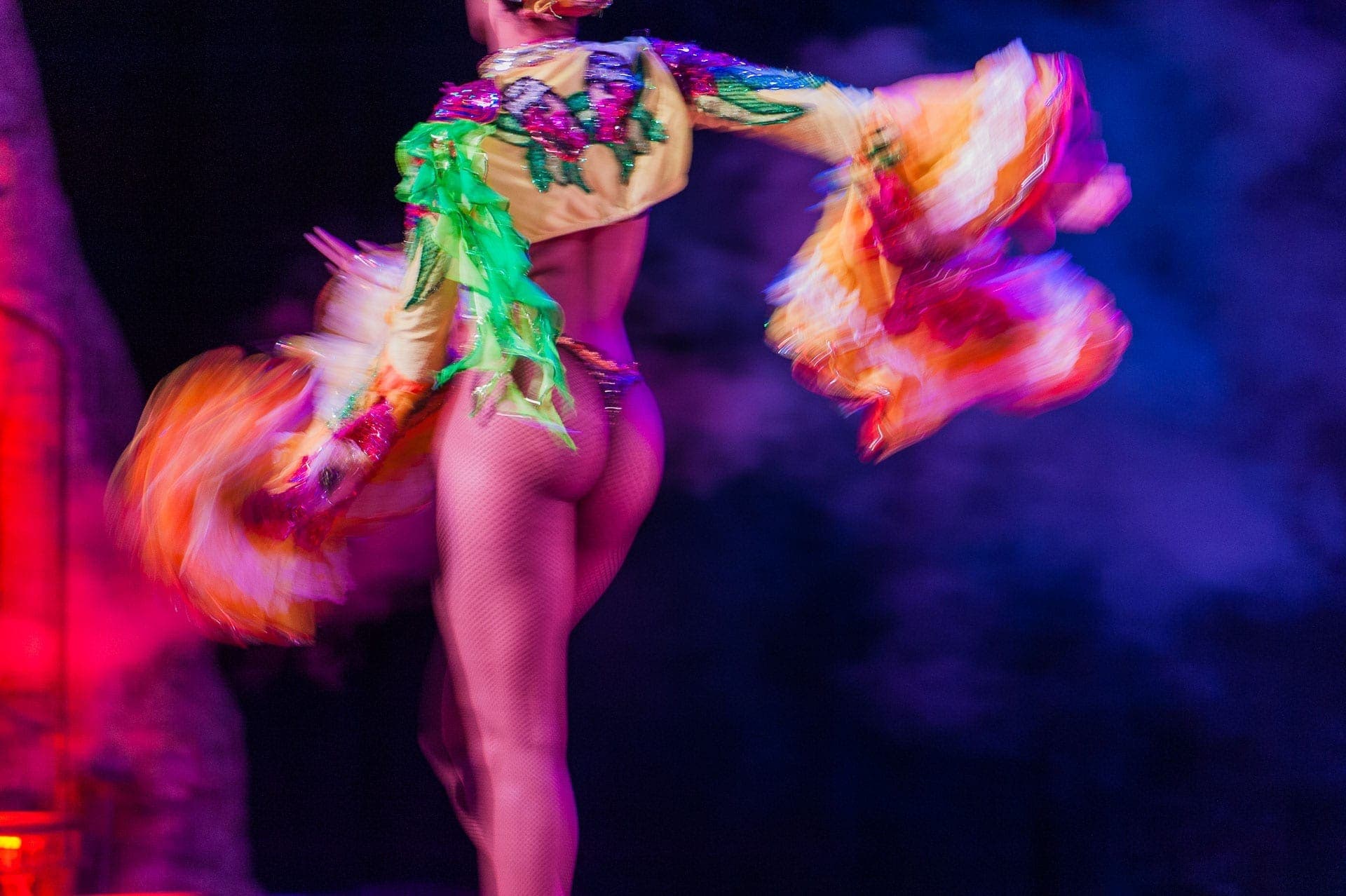
Just because you’re taking a still photo doesn’t mean that you can’t provide a sense of movement. Movement often means using a little (or a lot) bit of blur. Our eyes know that blur comes from motion, so don’t be afraid to use a slow shutter speed now and then.
If I write an article on how to get tack sharp photos, I know that it’s very likely to get a lot of traffic. Photographers are enamored with tack sharp photos, no matter if they’re boring or not. It has less to do with telling a story and more about mastering a technical skill. There are times when you want a tack sharp photo. However, some stories require a bit of blur.
Panning a photo with a moving subject is a great way to show motion. Using a long exposure on headlights and tail=lights show motion on a street. You can drag your shutter on a performer or athlete to show their motion. If you want, combine that slow shutter with a rear-sync flash to get the best of both worlds – a sharp subject followed by a ghostly blur.
4: Rhythm
Perhaps rhythm is one of the easiest elements of composition to use, yet also one of the most misunderstood.
Photographers can use rhythm in their photos to show progression or direction. A flight of stairs is one example. It’s essentially a series of the same object progressing in one direction or another. Repeated patterns of any items provide your photos with a sense of rhythm, and they lead the viewer’s eye. Sometimes you can interrupt that pattern to create visual interest within the pattern instead of leading to your subject.
Rhythm can appear with shapes, colors, repetition or progression. Our minds love rhythm, which is why it’s an essential part of photography, music and other arts. We’re drawn into patterns, but we also like an occasional disruption to the rhythm or pattern. That’s why songs have a verse and a chorus a few times, then a bridge, and back to a verse and a chorus.
The audience loves a chorus so we can join into parts of the performance and sing “I Love Rock n’ Roll”, but that gets boring if we just do the same thing over and over again. That’s why songs include a bridge. It’s a relief from becoming bored with repetition and rhythm. Yet than it’s followed the familiar rhythm to close out the song.
Think about what this means for your photography. Rhythm is familiar and comfortable. We enjoy it for a while, but then we need a break or a disruption. Use rhythm from time to time, particularly to lead the eye or to progress from one place to another. Use disputed rhythm as a form of interest itself. However, I wouldn’t create an entire gallery of work based upon rhythm, unless you can find a way to do it in a unique way with each photo in the group.
To me, rhythm is like a seasoning used to taste. It’s just not meant to be the meal.
5: Subject
What does every photo need?
Every photo needs a subject. If your photo doesn’t have a subject, then there is no hero in your story. I look back on some of my old photos and wonder what I was thinking. The sad part is that I know what I was thinking.
Oh, this looks nice. Snap.
There is a difference between being someplace that you like, or being with someone you like, and presenting it for others to like. That’s the difference between a snapshot and a piece of art.
I’ve taken a lot of vacations on Sanibel Island in southwest Florida. It’s a peaceful little place. I enjoy it there, particularly because of a lot of memories from previous trips. However, I have to be honest and say that it’s not really a beautiful place. I like it for the ocean, the laid back pace on the island, and because I know how to unwind there.
When I tried to take some photos to show what I liked, I realized that the results didn’t capture anything interesting to show anyone else. The Gulf of Mexico is there, and so are a lot of canals. There are plenty of scrub brushes and other vegetation. The problem is that it doesn’t make for a lovely landscape or seascape location.
People do not like a photo just because you have an emotional attachment to the subject.
I’ve seen many boring portraits of people who are likely wonderful to be around. What do portraits have to do with my favorite vacation island?
You can’t just plop any old thing down and make someone else care about it in your photos. Maybe you can use some interesting lighting, but then your story becomes about the light and contrast – not your subject. You may as well shoot an abstract photo and be done with the notion of a subject rather than have an uninteresting subject.
People want subjects that tell a story, spark some curiosity, or make them feel something. You have to find the emotional impact within your subject that you can convey to others in order to bring your photo to life.
6: Contrast
Contrast is a great way to grab visual interest. Tonal contrast, color contrast, or as we discussed earlier contrasting subjects. Sort of like placing a bullfighter surrounded by ballerinas. Be careful with contrasting subjects, though. The viewer needs to be able to make sense to unify the different subjects, or they’ll get confused.
Why is there a bullfighter among the ballerinas?
You lose your audience if your photo doesn’t indicate any answer. Sometimes that context comes from a supporting article or story. It may come in the context of a gallery of photos. No matter how you do it, ensure that your viewer understands the context of your subject contrast.
In most cases, using tonal contrast can really make your photos pop. Bear in mind that tonal contrast also affects your colors. You want to ensure you don’t add so much contrast that human skin turns orange or some other unsightly color. The idea is to enhance the photo, but there is a tipping point where you can add so much tonal contrast that it beats your subject with the ugly stick.
Color contrast is exceptionally popular for color grading. Almost every movie poster uses some form of Teal/Orange color grading. You aren’t stuck with just those colors, though. Break out your Color Wheel and find some complementary colors to use in your own photos.
7: Proportion
You can have some great fun using proportion as one of your elements of composition.
Think of proportion as the relationship of size between elements in your photo. Maybe you’ve seen photos where someone cups their hands and pretends to hold up the moon. or squeezes a tall building between two fingers.
There are times when you can use proportion with intent, and other times where it screws up your photos by accident. That’s most likely to happen with a wide angle lens. Here’s one I did intentionally.
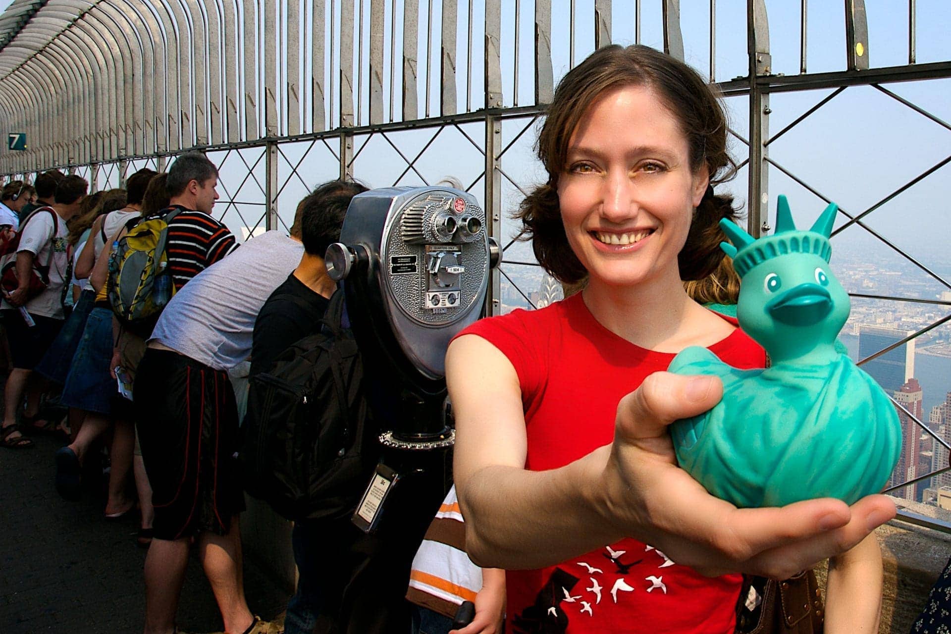
This is my friend Colleen. She lives in New York and she has a blog about rubber ducks. I used a wide angle lens for this portrait knowing it would distort her hand and the size of the duck. The background of the New York City view from the top of the Empire State building added to her story. It’s her place and the ducks are her thing.
Why does the duck look so large?
Because it’s closer to the lens than she is, and that proximity exaggerates its proportion compared to her and everything else. You can use this technique as a storytelling device or get burned by it when you last expect it.
I generally try to be very aware of the plane that my subject occupies with its relationship to the lens. When something reaches toward the lens, I know it’s going to seem rather large in proportion to the rest of the subject. That’s why you see photos of a lounging model with enormous feet close to you and a very tiny head far away.
Keep this in mind for smartphone photos. Many photographers like to get a somewhat lower angle when taking portraits. Yet doing that with a smartphone, which uses a wide-angle lens, can emphasize the wrong part of your subject. Instead of flattering them, you make them look short and fat.
8: Space
Nobody likes a crowded photo. Your subjects need breathing room. Not only does that help isolate them to draw attention, but eliminating distractions creates a more pleasing photograph for your viewer. As I said earlier in the article, there’s a reason why so many advertising photos include a product shot without any distractions.
You can use Space in your photography to communicate different things.
My favorite photos of New York City aren’t the ones with row after row of skyscrapers. Instead, I love the photos that show the space in Central Park, surrounded by buildings.
In most cases, you want to think of your photo in terms of Active Space and Dead Space. If you have a living subject in your photo, the Active Space is the area ahead of the subject. The dead space is the area behind it. You probably want to have the larger area as Active Space. It gives the viewer the notion that your subject has room to move.
Doesn’t matter if your subject is a race car or a bear in the woods. It’s going somewhere. Do you want it to drive off the edge of the photo? How rude.
Your subject doesn’t have to move in order to use another type of space.
Earlier we talked about Balance. Not all balance has to come in your photo. That’s because there is a world of opportunity to sell photos tagged with the phrase “copy space.” Advertisers need images with room to insert their add copy. The combination of your photo and their copy provides the balance.
If you want to get into stock photography and find a market that many other photographers are ignoring, start taking photos with room for copy, and be sure to tag them with the phrase “copy space”. Buyers are searching for those photos and they could find yours.
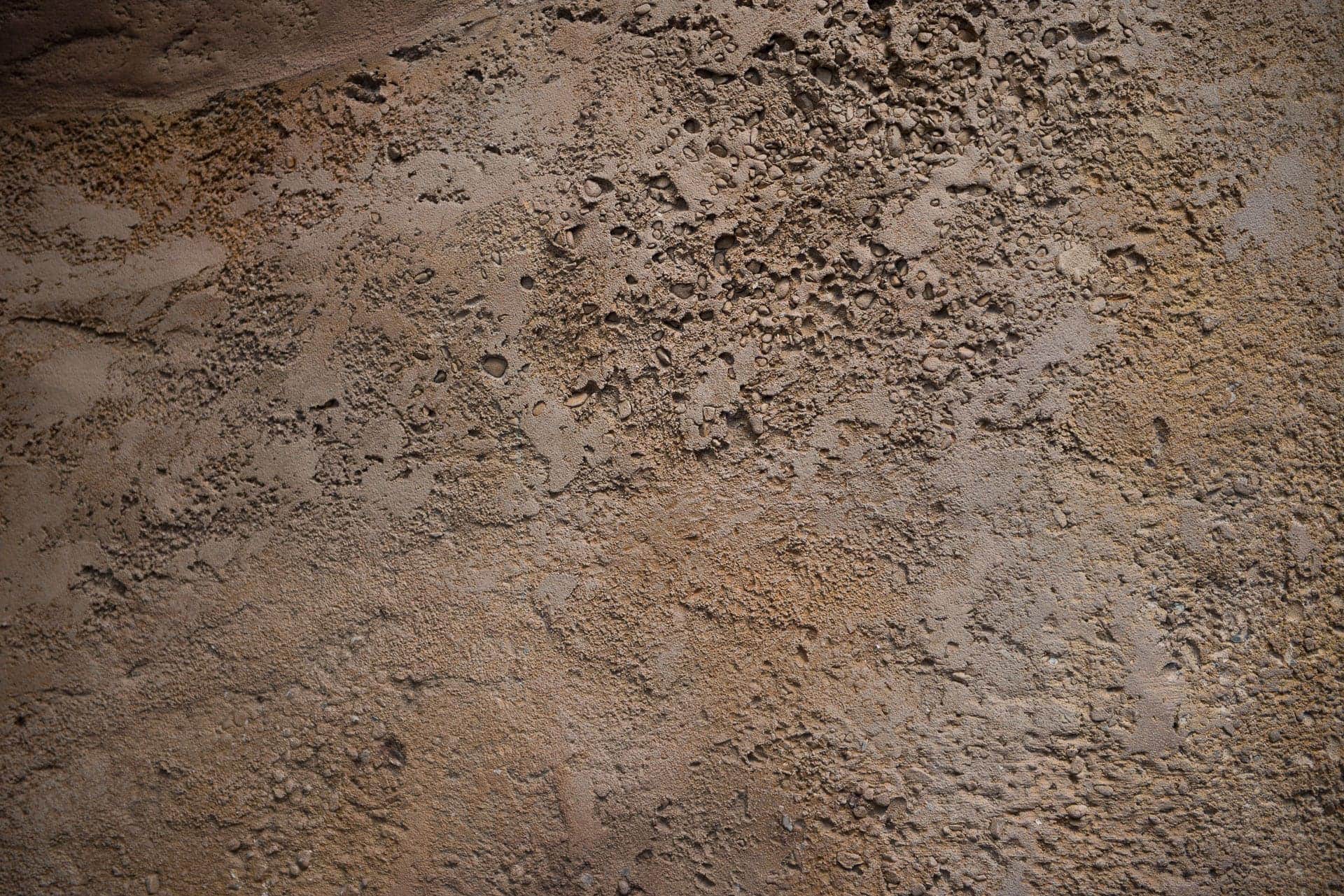
9: Texture
This isn’t something I often say in public, but I love the texture. Rock, stone, trees, fabric…whatever. I love me some texture in photos. Nothing makes a photo seem quite so tangible as a bit of texture.
Like most elements of composition, there are different ways to use texture in your composition.
A big part of my travel photography is picking up photos of textures. I use them for backgrounds, or to blend into my photos. Living in Central Florida, Walt Disney World offers a treasure of textures for any photographer. You don’t even have to spend the money to go into the parks (though that is where many great textures reside). There are textures in a lot of the areas that are free to visit. House of Blues, Disney Springs, the various resorts. Each place has a theme and they’re decorated with a variety of textures in different grains, shapes and colors.
Don’t live in Orlando and don’t plan to come here?
That’s good, we have enough tourists. You can find textures where you live, city or country. I have bird’s eye views of grass, pavement, sidewalks and anything under foot. You can take texture photos of buildings, barns, walls, etc. Get some canvas or burlap cloth for great textures. Go find some interesting wood or shoot the bark on a tree.
Textures are familiar to people because we understand them by our sense of touch. You’re playing on memories of another sense when you include texture in your photos. It’s great to support your story by adding the right textures.
10: Dimension
How many times have you heard it said? Foreground, middle and background. That’s how you add depth and dimension to your photos.

If you want to give your photos a three dimensional feel, then remember to have layers in your composition to include elements in the foreground, the middle, and the background. The row of trees in this photo provides my foreground. The piton mountains are in the middle, and the low hanging clouds provide my background.
It’s a simple formula, though I sometimes find it abused. I can’t count how many times I come across a portrait with some leaves, branches or other natural element appearing blurry in front of a model. To be honest, I don’t think your foreground should obscure your middle, particularly if that’s your main subject.
Why We Use These 10 Elements of Composition
You don’t need to cram all 10 elements of composition into one photo, but it doesn’t hurt to combine them when the situation calls for it. The purpose is to use the right element of composition to provoke an emotional response from your viewer. They help you tell a story. Maybe they make someone wish they were with you when you took the photo.
What do you have to lose by trying?
Do you have other elements of composition that you use? Please share them in the comments below to help other readers.
Welcome to the Photo Flunky Show. Episode 153. Our topic for today, we want to help you improve your photos with 10 elements of composition. Hi, my name is William Beem and we are here to help you improve your photography with visual storytelling and today that storytelling's going to take on elements of composition. We think that this is something that's creative,
that you're really going to like because it just helps you think a little bit more, not necessarily about the gear and the topics, but really how to look at your photography as an art, a piece of art. But before we talk about any art, we want to let you know that show notes are going to be available williambeem.com/episode153 and we would love it if you would subscribe to us.
They're going to be links to subscribe on the show notes, but you can just go to Williambeem.com/itunes and subscribe there and you'll get the podcast sent to you every Wednesday. Why don't we get into this and really the three takeaways that we're hoping that we're going to get from this is we want you to learn how to evaluate a scene for a great composition.
In other words, you can walk up to any set in any genre of photography or landscape or cityscape travel, whatever it is. How do you look it over and say, is this really going to be a good or bad composition and what can I do or what can I think about to make it better? We want you to think about how it creates a visual impact upon your viewer.
In other words, is it telling a story? Does it have any emotion to it? And of course we want you to understand how to include elements that build upon each other to make that composition great. It's all right. The first thing that we're going to be looking for is unity. And that means basically, if you look at the elements that are in your composition,
do the parts belong together? Do they support each other? Do they relate to each other or are they just sort of random mix of things that have nothing to do with each other? Yeah, you don't want to shambles because it doesn't make sense unless it's very deliberate, which is a rare thing shot for that purpose. Um, if you're into weird stuff,
it's just your, your photo has to come together just like a story has to come together. Well, and this is one of the reasons that a lot of photographers, even a lot of artists also prefer kind of a minimalist approach. You want to distill everything down to just the elements that belong there. And that's what helps you build that unity is it's easier to control two or three items than it is 500 items at a junkyard.
Yeah. It's also easier to position them. Yeah. So you're looking for unity, do the elements and pieces support each other? And that's not to say that there can't be contrast in the elements in your photograph. So if you want to go to the beach and then put someone in a wedding dress there, you can still have unity with your subjects.
But if you start putting in a steam shovel of the beach and the wedding dress, then you kind of are losing that unity. Exactly. The other concept that we want to look at second on our list is balance. Is, is your composition balanced? Yeah. This is really important. Um, there is something that naturally irritates the subconscious mind. Even if you don't,
if you're unable to identify it when a picture, a photograph is unbalanced. If you've got too much business or too much visual weight in one place, it could be color. It could be light, but if it's all kind of top heavy corner, heavy or bottom heavy, and the center isn't necessarily the best place for it to be either. But if it is,
it's gotta be kind of equally weighted. So the photo can hypothetically stand on its own. And that's not to say that you can't be out of balance with your photograph if there is an intent behind it. Yes. But the balance is something that people are going to be looking at and like Lee said, this does kind of get in your subconscious. You know,
something just isn't right. And you're kind of, maybe you don't. If it's not there, you don't see it or you don't put your finger on it. This comes up for me a lot when I'm creating just our post headers. Because I need to have a photograph there and I also usually need to put some text on there and if I put the text in the wrong place in relationship to the subject on the photo,
it doesn't feel balanced and it doesn't flow well for the eye to go across, read what I want to read or see what I want to see. Yeah. Like I said, this is a concept really that comes from art overall, not just photography and if you're creating something new, some new drawings, some new painting, you're looking for a balance in the overall composition as well.
Yep. It's visual communication and you don't just like, you don't want to listen to an unbalanced story. You don't want to look at when either. Yeah. Number three is movement and you're used to hearing about this as leading lines or curves or light. You want something that kind of moves your eye along and draws the eye. Yeah. You don't want to just stick the subject in somebody's face.
You actually want them to gravitate towards it across the frame. Like you said, if you were talking about putting something dead center, there are times when you can put something dead center, but there needs to be something that draws your eye to that particular subject. Or maybe what your subject is is on the edge or the side. You know, one side or the other, and the opposite side is drawing you in that way or maybe they're looking in towards the center.
Whatever it is. What I'm talking about. Movement is something that will draw the eye and that is one of the key elements of visual storytelling. Another one, number four we have on here is rhythm. And that would be if you have repeated shapes, repeated colors or elements. I kind of think of like a cityscape. You know, one of the,
there's this little Plaza out there and you have a whole bunch of chairs, repeated lines over and over again. And you can disrupt that. If you can interrupt that pattern maybe with all the chairs are white and then one of them suddenly red. That's kind of interesting, but you want to have some kind of rhythm inside of your photograph. Another thing might think of, and this kind of,
I guess does lead onto are there balance or movement, is think about a path with just some stepping stones going from one to the next. And that gives you a sense of movement. It gives you a sense of balance but also gives you those repeated shapes. And like I said, it doesn't have to be shapes. It doesn't have to be objects. It can be something that you can do with color.
It can be something you can do with light. Maybe you do a um, colors as far as, analogous colors, you know, the like you've got different shades and tints of the same color that just kind of go from dark to light. That gives you a little bit of rhythm and it kind of just, it tells a bit of a story.
It sets a mood within itself. Yeah. And number five, it should be obvious to most people, but you want to have your focus in on the most important thing. When I say focus, I'm not necessarily talking about the camera focus, but basically you want the most important thing to be the centerpiece of your, your composition. But yeah, of course you do.
And it's, it seems almost obvious to say that, but we were talking on a previous podcast where, you know, there were portraits and people will put their subjects in a diminutive position compared to some other objects. Cause it's almost like they want to take a picture of the boat or the wall or a sign and then, but it's supposed to be a portrait.
Yep. And to somebody who isn't looking at that photo under the category of portraits would be forgiven for thinking that, um, the subject was whatever else is there, not the person. So yeah, if you look at something and say, wow, that's a really nice boat. And then the photographer says, but it's a portrait of the lady on the top.
I didn't even notice her. Alright, number six, contrast. And this is, you know, there's a trend in far for the past few years and it's one that quite honestly it annoys me. And that is to kind of flatten out images and eliminate contrast. I love contrast in a photo. I want to have defined shapes, colors, edges. I want to see the difference between light and dark.
I want to see the difference between color contrast. If you got a flat image that just looks kind of hazy, I find it incredibly boring. I agree. I mean look at the other day when we were setting up my light for my food photos and he said, Oh, the only thing that might bother you is that shadow over there. I have to have the shadows because it puts everything into 3D perspective.
Without that, I mean you could see it was, you know, it wasn't a two dimensional photo, but I just think it gives that extra depth that makes you feel like you can grab something. You know, if you taking a picture you have to have lights. And if you have lights there should be a shadow somewhere even if it's very soft. But with that contrast,
the number one thing that I really want to do in most of my photos to kind of give them that little extra pop is to add some contrast and usually it doesn't take much and it could be if you're in Lightroom, it could be with clarity, it could also be with the contrast slider. But you want to see some demarcation between darks, the midtones and the highlights.
I want each one of them to stand out and to me that's what makes a photo pop. When you do something that just kind of flattens out the entire image. I'm, I think it's just a background for putting text on it then. Yeah, I agree. In contrast could be with color. It could be with light. It, it could be with texture.
There's, there's a list of all the things. It doesn't just have to be moving a contrast slider. So think about when you're setting up, cause you can actually put contrast into your photo from, from the outset just by the colors that you use or the way you arrange things or color. Contrast is, is very popular, particularly in movie posters.
You see this all the time with a teal and orange. And almost every movie poster you look at seems to have some version of teal and orange color grading in it. And you see it in the movies themselves. It's just something that orange works with most skin tones. Teal kind of cools down the shadows and it just makes the person pop and it really works. That's why it's probably overused,
but it's a good example of color contrast. Number seven on our list is proportion, and this is something that I think that will really throw you off is, if the elements in your composition are out of proportion with each other in an uncomfortable way, Oh yeah, I know what you're talking about. So what should be a certain size appears not to be that size relative to whatever else is in there. That comes through arrangement.
It comes to placement of your subject. You know what, this can also happen with composite photos. So you take a picture of somebody or something over here and then you want to put it on another background. But when someone's looking at us, it's just not right. And what's happening is you haven't put your subject photo in proportion to the environment. Yeah.
You've got the light coming from the wrong from different directions for the subject in the background. Well that's one element, but the other element is like if you know something's too big or too small here, it just doesn't fit. You know, maybe it's the example that we gave earlier. We'll put the model on the boat, you know, she's out of proportion because yeah,
she fits on the boat. But when you look at the photograph, she's, she just doesn't, she's so small. And I think what proportion you want to say, let's say if I've got a basket of apples, and it's on a tabletop. The basket of apples should not be 12 times larger than the tabletop. Yeah. Do you want to see things as,
as they make sense, unless you're specifically trying to do something out of proportion, you know, like an Alice in Wonderland kind of thing. And that's different. That's kind of cartoonish. It is. And I'm not saying that there isn't a place for that, but generally speaking you want things to be in proportion within your compositions. Um, number eight, we're talking about space.
In other words, don't crowd everything together. Yeah, this has become my friend. And putting text and graphics into my photos has been one way to really hammer the lesson home for me. I've made some mistakes and then I'm learning. Um, I decide what I want to write, how much space I need and then where to leave that empty space.
So leaving space is good if you're going to do graphics on it, but space kind of helps you emphasize your subject. So if that's closer to your lens or if there's more space between your subject and the background, that is a good element. But also it's not just that kind of depth and background. The relationship of space between subjects on the same plane or a side by side,
if that makes any sense to you. Number nine this is one of my favorites is texture. There are times, you know when you can shoot on a flat subject or background and it makes perfect sense, but if I see texture in a photograph, it kind of gives me that "you are there" feeling it could be, you know woodgrain. It could be,
you know, the bark on a tree. It could be grass or something that has an edge and in the kind of on our next one talks about depth and dimension, but I want to see texture where you would expect it. If I look at some clothing, I want to see texture from the cloth or the leather or whatever it is. If I'm looking at a portrait,
I want to see pores on the person's face. I don't want them to be devoid of texture. Plastic skin. Yeah. The nice part about texture is it reacts to light. So in other words, there should be little shadows here and there and depending on the quality of light, how hard or how soft it is, that texture will change as to how much you emphasize it.
But I definitely want to see some texture and I think that really helps to emphasize the composition. And finally, our last one, number 10 is depth and dimension. And that's kind of what I'm thinking of as a foreground, middle and a background. Your basics, it really is, but you want to, I'm trying to avoid flat photography. And this kind of is,
was a trend with the past few years. If you looked on computer graphics and those of you who are into the Apple thing, you remember the icons used to be what they called a skeuomorphic. In other words, they had, they looked like the real object. And then there was this big flat design that kind of came over and everything. It's like they had no edges that had no height,
no shadows, no depth. It was everything was just perfectly flat and it was so incredibly boring. Of course, it's boring, there's nothing to it. And I guess that might work for an icon because you just want a quick visual reference, but for a photograph, I want to see some depth. I want to see some dimension. I want to know that if I'm looking at a person,
that there is a front and back to them. If I'm looking at a shampoo bottle, I want to see the gradation you know of the light, you know from front to back. It doesn't matter what your subject is. You want to know that it almost feel like you could reach out and touch it and hold it. Thank you so much for listening to us and if you've got something you want to add to this,
please let us know in the comments at williambeem.com/episode153. I think that if you give some consideration to these 10 elements of composition, It's something that when you're taking your next photograph it was really going to help enhance, but if you've got something else in mind as far as a compositional element, please let us know in the comments, share and help everybody else.
Thank you so much. Hey, thank you so much for listening to us on the Photo Flunky show. This was episode 153 so show notes are available at williambeem.com/153. We would love it if you would subscribe to the show. You can find links on the show notes page. You can go to Williambeem.com/itunes or if you're listening on your mobile device,
go ahead and subscribe right there. As always, we really appreciate you. Thank you so much. We'll see you again next week.