Affiliate Disclosure: We earn a commission if you purchase through one of our links at no additional cost to you.
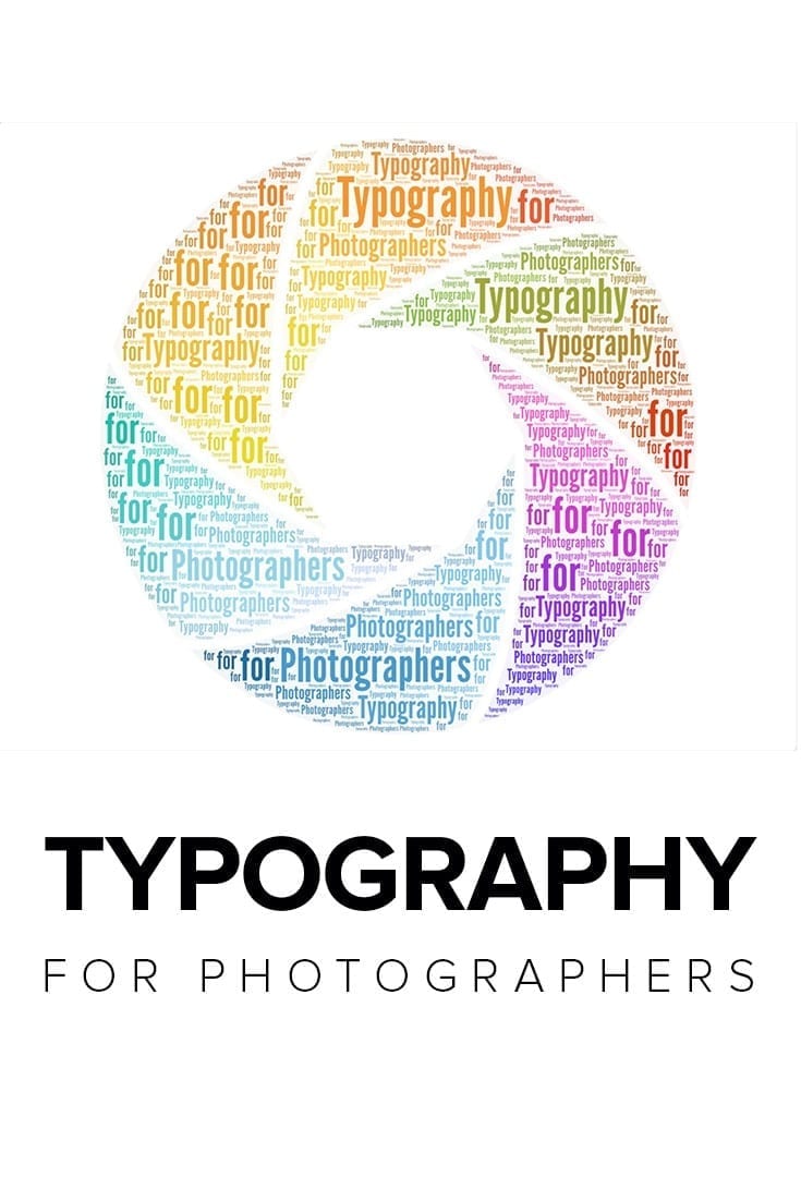
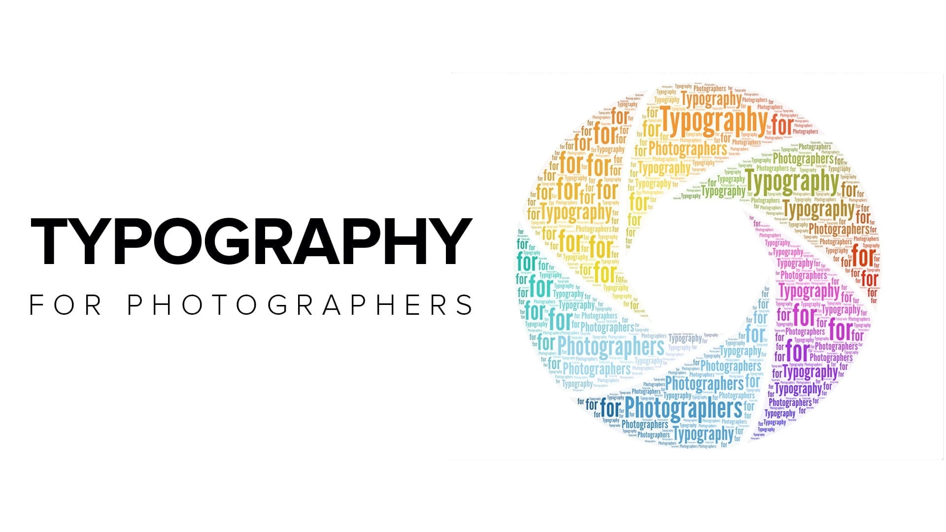
We need to understand typography for photographers, at least at a fundamental level. That’s because our photos often work well with type in different circumstances.
I won’t pretend to be a trained graphic designer. I’m not. However, I struggled for a long time and wondered why my efforts looked so…pathetic.
Fortunately, I learned from Scott Kelby that some simple rules of typography can help you create professional-looking results without much effort. You don’t even need Photoshop (though that’s what I prefer).
You can create a wonderful blog, but great typography enhances the user experience.
Why You May Want to Use Typography with Your Photos
I like to say that every photo should tell a story, and that’s true. So why do we need typography to go with our photos? Shouldn’t they stand on their own merit?
They often do, and I am not trying to tell you to put messages on every photo. There are some circumstances where your photos and some typography go together like peanut butter and chocolate, though (or jelly, if that’s your thing).
Let’s take something like an engagement or wedding photo. We can see the story of two people in love, and that’s a great photo.
What are their names?
Most often, we don’t get that in our photos. That’s an example of when you can fill in some missing pieces with typography.
Let’s say that you’re having a party. A beautiful photo of the location looks very inviting, doesn’t it?
Where is it? What date and time does the event start?
Typography to the rescue!
My Favorite Typography for Photographers
Many different fonts and typefaces are available for you to use. Too many, in my opinion. I’d love to narrow the list to five or six, but it’s not up to me.
On this blog, I use two fonts.
These are available from Google Fonts
Before switching to Google Fonts, I used Adobe Fonts as part of my Creative Cloud account. My favorites were Museo Slab for headlines and Proxima Nova for body text.
If you're a creative professional, then you need the Adobe Creative Cloud. It's a suite of applications with everything you need to express your creativity. With powerful photography, video editing, audio processing, and more tools, the Creative Cloud has everything you need to turn your ideas into reality.
I tend to use three basic types of fonts.
1: Serif Fonts
These letters have a small stroke at the end of vertical or horizontal lines, like my headline font. Some examples include:
2: Sans-Serif Fonts
These have letters, like my body text font, without the small stroke at the end. Some examples are:
3: Script Fonts
You know, the fancy stuff that’s hard to read.
You may have noticed a version of Museo in both serif and sans serif fonts. Sometimes the font foundry will create different styles designed to work well together.
Of course, many other font combinations can work. If you’re not sure what to use, search for “font pairings” to see some recommended combinations. If in doubt, just use one font for both headers and body text. You know that’s going to match.
Script fonts vary widely. I like Graffilito Script for my blog post graphics when I need an accent.
The Rules of Typography
There are a few simple typography rules to follow. I’m not saying that these are all the existing rules, but they’re enough to guide you into really nice results that won’t offend your graphic designer.
Remember, these are basics…fundamentals. You can do a lot of strong work by sticking with the fundamentals in any field.
1: Everything Must Align with Something
This is more than your typical Left, Center, or Right flush text, although that’s a part of it. You may need more than one line of typography. How do you align them?
The good news is that you get to be creative here. However, you can’t just stick something on one line and not think about where the next line goes.
There needs to be a point of alignment.
I just returned from a conference where the main logo lacked any alignment. It bothered me for all three days to look at that logo, each line somewhat a-jar from the others. If you know that typography ought to be aligned, you know what bothers you when it isn’t.
If you don’t know that rule, you know something isn’t right. That’s the last thing you want going through your audience’s mind while looking at your typography.
The point of alignment could be the left or right. It could be the center. Maybe you align specific letters on different lines. Whatever it is, find your point of alignment.
2: Use No More than Two Fonts
Plenty of graphic designs go straight to ruin if using more than two fonts. Too many fonts confuse the viewer and clutter your message. Simplify as much as you can.
Start with one font. Like you use a key light in photography, decide your key font for your graphic design. If it does all the necessary work, don’t add another font.
If there is a purpose to using a second font, choose a font that serves that purpose.
For example, I use a different font for my headlines. You know something is a headline because of the font change. Also, you can achieve the same result using a different weight (bold, light, etc) to the same font so it serves the same purpose.
You would typically use a serif font with a sans serif font for a pairing. I’ve seen people use two different sans-serif fonts, and I’m not a fan of that style. I’d rather pick the best sans-serif font and use it for both.
In other cases, you may want to use a script font as an accent. Be careful with script fonts. I never use them for my keywords in the graphic. That’s because they’re harder to read than a serif of sans serif font.
Oh, and never use all caps with a script font. It doesn’t look very good.
How to Enhance Your Typography
You’ll be pleasantly surprised to find out that many of the concepts we use in photography also apply to typography. You’re still looking at contrast, balance, composition and space.
Here are a few tips to enhance your typographical compositions.
1: Use Visual Hierarchy
Some words in your design are more important than others. Your font choices should emphasize the important things. It’s OK if your keyword stands out.
That’s why I said I never use script for my main keyword. Sure, it stands out visually, but it’s not very legible. Instead, use things like size and weight to emphasize your important message.
For graphic design, you typically aren’t trying to use a normal weight. Go Bold or Light. The idea is to contrast different parts of your design to help the viewer see things at a glance.
You can also use all upper or lower case to help create visual contrast in your typography.
2: Use Kerning, Tracking and Leading to Control Space
You may have heard these terms before, but you may not remember exactly what they are or how to use each technique. Essentially, they help you control the spacing of your typography.
Kerning
Kerning controls the space between each letter. You can individually control the spaces between letters to provide a better overall appearance of a word.
Most type designs work at 10-12 points. When you start making them larger, the spacing between letters may seem a bit awkward. Perhaps you need to reduce some space or increase the space between two letters. Kerning allows you to make those adjustments.
In Photoshop, place the cursor between two letters. Hold the Option Key on Mac or Alt Key on Windows and then press the left or right arrow keys to decrease or increase the spacing between those two letters.
Tracking
Tracking does the same thing as kerning, but for all the letters of the text that you highlight. Have you ever looked at a sign or graphic where the letters are unusually spaced far apart – but it somehow works?
In Photoshop, highlight your selection of text. Hold the Option or Alt key and press the left or right arrows. You’ll see all of the selected letters change spacing evenly.
Leading
Leading isn’t like directing someone by pulling their nose. It’s pronounced more like the first part of Led Zeppelin. In this case, leading changes the space between two or more rows of letters. It’s about line height.
Once again, select your text on multiple lines in Photoshop. Hold the Option or Alt key and press the Up or Down arrow to adjust the line height of your text.
3: Select Colors from Your Image to Use in Your Typography
The world isn’t just black and white. If you want your text to blend with your image, get out the eye dropper and choose a color from your photo to use as a palette for your text.
Head over to https://color.adobe.com and upload your photo. On the upper-left corner, select the option to Extract from an image.
Select your image and upload it.
Your result will look something like this.
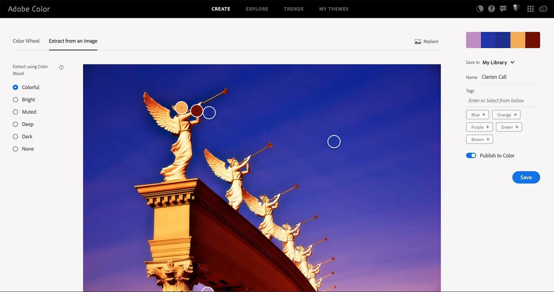
Those circles on the image were automatically selected to create the color palette in the upper-right corner. You can move them around to select colors from the image if you like.
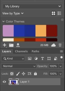
Now that you have that palette, you can save it with a name, and it will appear in your Adobe Creative Cloud apps, like Photoshop.
You can easily select a color from this palette and use it for your typography (or anything else) within Photoshop, InDesign, or other Creative Cloud applications.
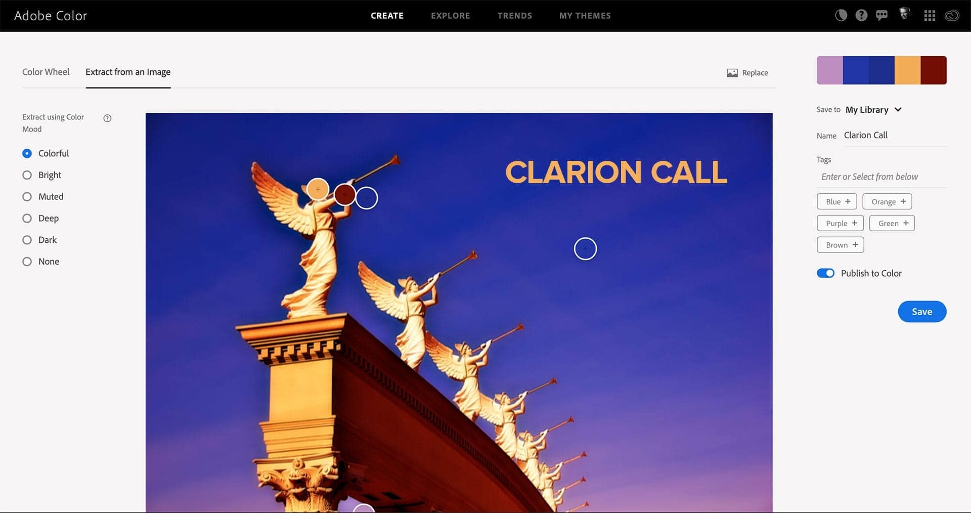
The idea is to blend your typography with your image so they look like they belong together, creating a cohesive design. Color is one of the best ways to blend text with photographs.
Here’s an example of this image using one of the colors saved in the palette.
4: Use Transparency with Typography
While I like the Adobe Color site to get a color palette, there’s another way to blend your typography with your image.
Just lower the opacity a bit. Allow the colors of your image to pass through your font, and you can achieve an interesting result. Sometimes it’s a better option than creating a color palette.
It’s also available in other tools. If you’re using Canva or PicMonkey, it’s pretty easy to change the opacity of your text. Give it a shot.
5: Know When To Use Bold, Italic or Script
There are several ways to emphasize your text in typography.
Bold is a common method. Essentially, you’re changing the weight of your font. You may have options like Extra Bold or Heavy, depending on your chosen font. You can also reduce the weight of nearby or supporting text with Lightweight options. This contrast in weight helps you place the emphasis where it belongs.
Italics are somewhat slightly stylized versions of your text. My thought is to use italics very sparingly. It’s hard to read, which is what causes the emphasis. People have to pay closer attention to italicized words.
One of my old employers had a standard template for slides, and they used italics for each slide headline. It was horrible. You could barely read any headlines.
What’s the point of a slide? It’s to communicate. So I’d love to meet the idiot who designed this template and kick him or her in the shins. Italics are my least favorite way of emphasizing text.
Script fonts can emphasize text, but you should never use them for your main message. If I create a graphic with a line like “How to Emphasize Your Message”, I’d only use a script font for the “How to” part of it. It catches the eye, but it doesn’t obscure the main message.
Scripts may also work well for names, sort of like a signature under the main text.
Start Here and Grow Your Typography Designs As You Gain Experience
I wish someone sat me down and taught me the basic rules of typography for photographers when I started blogging and using my photos in various publications and social media outlets. It would’ve saved me a lot of embarrassment when I reflect on a few things I created.
This is not an exhaustive or complete list of how you can use typography. It’s just a list of things to get you started. Experiment. Try the ideas to see what works. Break some rules to see how it looks and perhaps see why something doesn’t work.
Choosing the right font is an entirely different conversation. I suggest sticking with the classic fonts until you get a better feel for why you may want to choose something else.
More often than not, some of the classic font styles will work best. There’s a reason you see them in so many place. The idea behind typography for photographers isn’t to turn you into a graphic designer. You can create professional and elegant graphics using fundamental ideas that appeal to your audience.