Affiliate Disclosure: We earn a commission if you purchase through one of our links at no additional cost to you.
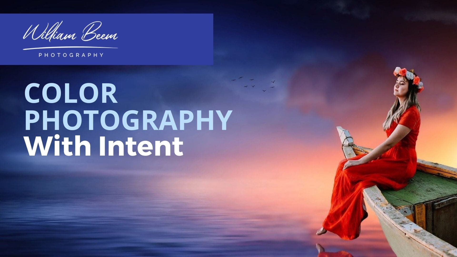
Color photography is one of the best ways to evoke an emotion from your audience. The question is which colors do you choose and how do you know if they work together?
We have a few answers to help you understand how colors work together and impact the human mind. So check out the podcast to get started learning.
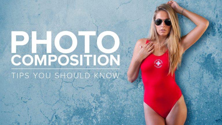
Three Techniques for Color Photography
We share three techniques in this episode to help you get a grasp on how to use color in your photography.
Color Harmonies
The first is Color Harmonies. If you aren’t familiar with color harmonies, there are several ways to understand how to use them on sites like Adobe Color and Paletton.
You can use Complementary colors, which are opposites on the color wheel. That’s a good way to make sure that your subject pops by using its opposite in the background.
Analogous colors are another option. Those are colors next to each other on the color wheel, and they work together well.
One of my favorite techniques is to use a range of analogous colors, and then choose one complementary color for an accent.
Themes
Themes are a bit easier for most people to understand. We’re used to colors that go with a theme. For example, we understand warm colors for Autumn and Thanksgiving. Different seasons evoke ideas of different colors that go with the season.
Themes aren’t limited to the time of year, though. You can select different topics to have a theme, like your favorite sports theme, a location or even a fast food restaurant. Tell me you don’t know the colors that go with McDonald’s?
Moods
You can find colors that go with your mood. Movies often use color to set the mood for a scene. Cool colors are creepy while warm colors are energetic.
However, keep in mind that the same color may have more than one mood associated with it. Red, for example, can mean love or anger. So it’s not just the hue that matters, but how you use it in context with the mood you want to set.
Timestamps
One of the things that can make a tremendous difference in how people perceive your photography and your photos is your use of color. And that's what we're going to talk about today is color photography with intent. I'm William Beem. Welcome to I Like Your Picture. The show that helps you improve your photography with visual storytelling. What is visual storytelling? It's a method of approaching your photography with a knowledge of who you're trying to serve with your photos and what emotion you want to make them feel.
We encourage you to concentrate on your subject, light and background to create a photo. Your audience loves. I'm glad you found us. Hi, my name is William Beem. My name is Lee Beem. He's looking at me. Lee is going to be having some fun with me today. Once again, there's no alcohol here. This is just natural
Lee. That's the whole point of having a husband have fun. Hey, today, we're going to be talking about color photography with intent and to describe what I mean by that is the idea that you're planning your photographs and enhancing your photographs, even after the fact, with color that matters. In other words, you're not just going out and taking some pictures and say,
Oh, these are bright colors. These are pretty colors. You want to understand how colors work together. You want to understand color harmonies, which is a phrase that Lee does not use. And you want to understand a number of things about this, but what we want to get you to take away from this is why color is important to your viewers.
We're going to give you three ways to use color in your photography, and Lee has the quick tip to enhance color and post-processing, so let's start off with why color is important to your audience. I always go back to visual storytelling and I go back to the emotion and color is a scientifically proven way to tweak someone's emotions. Well, I can totally see that.
I mean, you look at colors, you look at something bright and bright colors make you feel happy, or it feels like there's excitement. It can actually even feel like there's chaos. You look at something kind of more subdued. It leans more towards formal or kind of less loud. It's quiet. Yeah. Well, you see this in both commercial photography and movies or cinema that they will use colors in their different scenes or in different photographs to set a mood.
Like if it's something supposed to be a little creepy, it's going to be a cooler color. Yeah. If it's something supposed to be happy and warm, there's a nice sunshine day. It's a warmer color. If you want people to think of spring and fresh stuff, maybe some greens are going to be there. And their autumn has its own little season.
These colors strike memories within us. And we feel something based on colors, based upon our previous interactions with memories and events and experience with those colors. What do you feel if I tell you about the color of mud? Oh, that's kind of earthy and dirty and Brown. I don't care for Brown. However, I do actually like rustic themes of things.
If I'm doing arts, I like doing arts and crafts and things. And I really do like the handmade kind of rough rustic theme and various shades of Brown are often my neutrals. Brown's not my color. But when you say the color of mud, I'm thinking it's kinda dirt is Earthy. Yeah. I think of mud for some reason, I think of horses. Because I'm thinking of horse races in the mud and I've just and horses are Brown.
The idea that color means something to your audience is a good way for you to convey an emotion, which is part of your storytelling. And that's what we always say is that you want to use light, subject and background to take a portrait or a photograph that your audience is going to love and makes them feel something. Color is one of the key tools that you can use to make somebody feel something. It's also a key way to stand out.
If you look at places that are very colorful all the time, sometimes that color is just cluttered together with things that those colors do not go together, which we're going to talk about some ways that you can identify colors and use them appropriately. The first one we're going to talk about are analogous colors on the color wheel versus complimentary. And there's more options than that.
These are actually called color harmonies. Again, as I said, that's a phrase that Lee doesn't use, but she understands analogous and complimentary colors very well. Lee when you're looking at a color wheel, which is, again, is something that you typically don't do because you feel your way through these things. But if you're looking at a color wheel, do you think about using analogous colors or do you just look at,
I need to take a photo of something and I see colors, how am I going to use them? Is it going to be complimentary? Is there going to be analogous? Is it going to be monochromatic? What's your, what's your mental process of going through and choosing colors that you want to use. First of all that depends on my subject. It also depends on whether I chose the color in the subject or whether I have a color theme or a color mood in mind.
So I will take the dominant color that I want to use. Doesn't matter what the motivation is to choose that color and then decide on the mood. So if I wanted, let's say it chose bright teal color, and that is going to be the color that I went to stand out. For it to stand out. If it's going to be a bold statement,
if it's going to be something exciting or lively or anything that kind of evokes some kind of energy, and that doesn't mean negative or positive, it's just, it kind of gets a more of a punch in the reaction or response visually. Then I'm going to go with something complimentary because that's really going to make a jump out. If it's something a little more calm or maybe a little more natural,
or I don't want quite such a bold statement, but I still want it to stand out. I'm going to go with analogous colors because they're separate the main color, you know, or the color of the subject. I want that color to be separate from the other colors, but I don't really want it to come up, knock somebody over the head.
It's more a case of, I just need to separate it from the other colors in there. One of the ways that I like to do that is thinking about luminous values. And I know that you with this that way too. Let's say that you have complimentary colors. You know, one is on one side, let's say, it's the teal color that you mentioned in the opposite side of that is going to be in the orange range.
You can have those two go together and they work together very well, but if they are equiluminant, in other words, they both have the same luminance value, it's very difficult for the eye to kind of pick out which is which or which one, you know, to really focus on. What I will usually want to do is I'll pick out which one is my dominant color,
and I will give that more saturation or more luminance and I will kind of fade back the opposite one. And that way it still works together very well. But your eye isn't competing with which one should I be paying attention to? Here's something else that I do quite a lot is where I will take my dominant color. So let's stay with the TEALS so that we consistent in the example,
let's say that I'm going to choose my complimentary color as something in the orange range. That's going to stand out against it. What I may do is actually take a gray or like an off white or an ivory, or maybe even like a pale color of teal as my background. I'm not necessarily using the other color as the background. I may actually use my complimentary color as accents to enhance the complimentary color.
So let's say now I've got a teal vase and I want it to stand out. And I've got a very kind of pale washed out, almost grayish blue as the background that kind of ties in with the tones of the teal. And then I'm going to take some dried flowers and those are going to be in the bright orange or in the, you know,
And that's actually another method you can use. You don't have to do just analogous colors or just complimentary colors. You can actually do analogous colors with a single complimentary color on the opposite side of your dominant one. So as you were talking about, you've got teal and you've got a different shade or tint for your background, probably a tint, because it's going to be lighter than what your base is,
but then you can also have that neutral coming from the orange side and it will work well because it's close enough and family to all the analogous colors. Well, it's true. Or you can't even go the other way. You may, because you've got a really bright color in the teal, like would work really well if you had an almost black background. So now instead of just taking almost black,
you look for something, that's almost like, let's say that you're going to go with the different shade of blue, but it's so dark that it looks black, but they're still like that little bit of tonal. And there's some detail. And so you don't visually, you just assume it's black and that's good because you don't want people to dwell on the background And those are going to be your shadow value.
So it's good to actually put some color into those shadows. Yeah. At first glance that may look black. If you start investigating it, which most people aren't going to do, but a photographers, we kind of like to play around. We want to put an eyedropper and see what something is. You might find that there are some blues in those shadows or some other color,
depending upon what your color harmony is going to be. And that subtle little difference makes your photo stand out much more than just getting it straight out of camera. Yeah, I do this a lot. And I say that I am sitting here struggling to think of an example where I've chosen two colors, like two complimentary colors. I tend to use three colors and two of them are analogous and one is complementary.
And that works extremely well. You can have a lot of analogous colors and then that accent piece could be complimentary to one of those analogous colors. And it's still close enough that it fits with all of the analogous colors you have, but it's on the opposite side and it just pops. It stands out. All right, here's another flip I'm throwing in.
I hope I'm not complicating things, but something else you could do is for your accent colors, you could simply have something that's neutral that echoes tiny little pieces of your main color, your theme color. So that would be more like a monochrome. In other words, it's within the same direction, but you've changed the luminance values. Not even necessarily, but you want to use it sparingly always.
Remember you never want to distract from your subject. I think this also depends very much on what your subjects and what your accents are. You know, if you're in an area outside nature, you can reframe things and you've got a lot less control over what you can do with those colors, but you can get yourself in front of things. If you setting up in a home studio,
I think it's a lot easier. You have a lot more control and the smaller your sets possibly the easier it is to, to bring different colors in, in different ways. So I think this is something where it's good to be aware of. I wouldn't obsess over it, but just kind of be aware of your colors. That's the whole idea. You want to be conscious of the colors that you're including and excluding before you take the photograph.
In other words, get to know your color wheel, get to know your color harmonies. You'll start recognizing them if you're out and about someplace. So if you see someone that's in a light blue dress and that's going to be your subject, well, what's going to be on the other side of light blue. Is it going to be yellow or orange kind of color that might work very well?
Or is it going to be purple and green that are complimentary colors? Or are you going to look for shades that are very similar or analogous to your subjects? And they just have different luminance value. Some are lighter, some are darker. Those also work extremely well. So the idea is that you look for that because the idea of picking up any subject and just say,
Oh, that looks pretty. And I'll take a picture without giving any thought to the color is not really doing your viewer as much of a service as you can. So if you start thinking about those colors and looking for them, it gives you different ideas for composition. If you're capturing what's out there. And then of course, if you're just doing your own studio photography,
you can decide on those colors before you even begin. And whether it's anything from portraits where you're choosing wardrobe and backgrounds or Lee's work that she does with her flatlay photography, she's choosing her colors of what's going to be the background. What's going to be my subject. I mean, let's face it. She takes pictures of coffee and it's the most boring,
dull color that I can imagine. The coffee is the hero and it's dull, but everything. It is beautiful. Yeah. Which draws but because the dull coffee in the middle, the plain dark color contrast from everything else that draws your eye in to the simplicity. So things can work both ways. You can actually use something. That's very simple, a plain and clean to draw the eye in the middle of chaos.
And I think that's also something good to keep in mind when you're setting things up because we learn as we go through photography and you hear it a lot. Like don't have an overcomplicated background, you hear it over and over. Some people don't get it. Some people ignore it on purpose because they know how to work with it rather than out of ignorance.
And I think that is something that is harder to explain to somebody, but it really is a very simple concept. Standing up means it's different to everything around you. And that's the first of our three tips to use color in your photography. I'm going to add a little bonus on top of that. Think about visual weight. In other words, you don't want equal amounts of each color.
I mentioned before. Maybe your subject is going to be a little more saturated or a little more Luminant than the background. That's one part of it. But the other part is the size. Your background should probably be larger in size than your key subject. When I sit, talk about visual weight, how much weight are you, if you're really going to pump that color up,
you don't want to make it too large because then it just overtakes everything and you kind of lose your message. So I hope that makes sense. And if not, leave us a note in the comments and I'll try to explain better. This is one of Lee's favorites. I hope because she told me it was her favorite. Themes. Since this is yours.
Lee go ahead. Explain how to use themes for color. I love themes for me, themes this either about a mood. It might be about a season. Usually it starts with the subject and sometimes they start the other way around. So here's an example. I've just done some fall decorations kind of leading into Thanksgiving. Cause we're trying to pretend summer's over in Florida,
even though it's not. I've kinda done some handcrafts and actually created some decorations for the home. Now, when you think of fall, you start thinking about warm colors. Some of them are soft. Some of them are bold, but my theme is, is going to be fall. If I want to take a picture of one of these. So you're going to be talking about orange Brown,
maybe some light yellow. Some kind of yellowy greens as well. That works very well. I wanted to take some pictures of some of my decorations, which in this case were a decorated bottles. I know it sounds weird, but they actually look kind of nice. I want to take pictures of the bottles, the bottles is the subject. By default. I knew that my theme is going to be something in the warm or the fall or earthy or mom's warm farmhouse kitchen kind of thing,
because it works with them. So wasn't looking for something complimentary. I wasn't going to stand it out against the cool colored Aqua beach scene. And I think that kind of set my theme already. And then I had something to work with. I think if you find a baseline, you know what direction you're going in a lot easier to build it. So that it was just the case of finding out.
Do I want something as a bold contrast for the backgrounds to solidify? You know, my subject kind of pulls itself out to the front or do I want something that's kind of soft and muted in the background? That's kind of fades away, maybe with some natural bokeh blur or, you know, letting the light fall off of it. It could have been anything.
And I did a little bit of both, but having that theme really helped me. And in this case, the theme came from the subject that I chose. Other times they'll have stuff, and think go with those colors are lovely. In my mind, I'll build the background theme. And then I think, okay, now what color is going to pop off of this?
So there are two directions you can go, there's not a right or wrong, But when he's talking about themes, I mean, you mentioned fall Thanksgiving, even Halloween, they'll all have the same kind of colors within the theme you go into winter. Winter is different than fall, but also within winter you have Christmas, which has very different colors than what I think of when I think of winter.
So it's like, I'm thinking very cool colors, very blues, dark blues, and plus snow or something like that. I'm thinking of monochromatic almost on the opposite end of what the autumn colors are. But then if I go into Christmas, it's red and green and those kinds of things pop out. We go into spring. I'm thinking something completely different again and summer as well.
So each of those seasons can be a theme, but themes aren't limited to seasons. They can also be emotion. So if I tell you, you know, be happy, what colors come to your mind? And sometimes there's the pastels. Are they bright colors or muted, colors, those different things where they're brighter, muted, really having a difference on your emotion.
But if you can think of something, that's a theme, you'll think of colors that come with it. I believe He did. And you know, there's, there's different. If you think about moods here, let's take the example of happy and stick with it. There are different ways to be happy. You could be happy because you feel peaceful, calm,
and content, and you might choose some more serene colors for that. You may go more along the pastel lines with something like that. And they could be like bright colors or clear colors, but they're not necessarily bold colors, but you could think happy, energetic. And now you're kind of going into different, you know, you, you branching off into a different set of colors that are a lot more intense.
Another way to come up with themes are, look at things that are kind of opposites of each other. If I say urban, the opposite of that is going to be country. If you can come up with something and look at opposites, then you get the idea, what colors go with that idea for a theme. Now Lee mentioned moods as part of her themes,
but I think mood is a little bit different. So Lee when you're talking about moods with your colors, how is that coming about? Well, moods is really about how you feel. Themes is about what you see. That's how I look. So when you look at your coffee photos, those are the experience of coffee, but you've got a lot of different experiences that come to mind.
I do. So with a theme, you're actually trying to draw somebody to feel the mood based on the theme. I think with the mood, you building your theme around how you feel. So there's a difference in the dominance with a mood there's a dominant mood that kind of pulls somebody into the theme, as opposed to the other way around. I know this sounds very,
very complicated and I do. I have, I have to say, I do tend to feel my way through things. And I'm a bit of an artsy weirdo. If this does sound a bit off base. Alright. So when you're thinking of moods, do you think in ranges of color? Like from, are they more saturated or less saturated? Are they brighter or more pastel or darker?
Does your mood affect what kind of colors that you pull in? It does to an extent, but I'd say it's more to do with the intensity of the colors and the brightest and boldness of the colors than the colors themselves, because I can be very angry and have red. I can be in a very romantic mood and have red. I could be very excited and have red.
Well, let's think about that for a moment. So red is the hue. Yeah. The next thing we're going to play with would be the luminance and the saturation. So if you're a romantic, which way are you going to take those sliders? I, I would probably go a little more bold with the colors. I want the colors to be brighter.
I don't necessarily want them to be muddied down, toned down or deeper than a brick. Yeah, pretty much. And that's kind of what I think happens with mood is we know the hue that we want and some colors, some moods are going to go with some colors. Like she's angry, it's still red. She's in love. It's still red,
but it's how you tweak that red. Is it going to be brighter and bolder? Is it going to be more subdued? Let's say, if I pick blue, we go to the beach with blue all over the beach, which kind of blue is that going to be? This is where it becomes very personal and personality comes into it. When I think we use the example of romantic and I'm trying not to throw in a hundred different examples,
I'm going to stick with that one. I'm going to think of red. I may actually think of red, black, and white. I'm going to go with the race, dark, bold colors that fits into my personality. Then I look at our daughter who is, she's much softer as a person like in her personality and her delivery. She's a lot more of a,
she's a romantic, she's more of the fairy tale style. So she's probably not going to choose red for love or romantic. No, she's more into the pastels. So she will have, there are a couple of things where maybe she's got something red, but mostly she's going to be more on the pastel. So it's the same colors. But with her mood is a softer mood.
So she would kind of probably pull those down. She would, I'm going to say, I'm going to be bold and make a statement. Say, I think that moods are often less about the colors and more about how you tie them together. I can take red and put it with black and make it very formal. It could be very angular. I could have very definitive lines.
It could be very bold, but kind of very clean that might look very professional. It could look businesslike, but something bold and making a statement. Now I could take the red and have a romantic and not have softer lines. I might blend things in, have some softer details and accents in there. Some of my props, maybe like less formal,
a little more flowing, and I could work that in and have that same color red look a little more romantic, Right? So there's three ways to use color in your photography. We talked about the color harmony. It's like analogous and complimentary, and there are others in there. As far as split complimentary is triads. You can use a lot of,
uh, analogous colors with one complimentary color and kind of build a scene that way so that you've got an accent color. There's a lot of stuff you can do with color harmonies. Themes. Again, we talked about, think of something that's a theme, whether it's a season or an event or a holiday, those work very well. Moods are a little bit more individual I would say.
And depends on what your mood is and what kind of colors come to your mind with those moods. Alright now. So Lee has a post-processing tip to enhance color. So let me go ahead and see what that is. Okay. So this is using Lightroom, there's probably other post-processing tools that have similar options. I never ever increase saturation, ever. Almost all of the time with,
because I do mostly still life. I will decrease saturation and it may just be by a couple of points that maybe up to 10 points and I'm talking in the Lightroom now, which is what I use, but I do always enhance my luminance almost always. I mean, I typically don't go for a desaturated or more subdued look, I went my color,
the dominant color I went to stand out. So if that's what I do, and you can do this, if you go in Lightroom and you kind of click on your color range, you can actually do this selectively with specific colors as well. So if you drop down the menu and you go into your hue saturation, what hue, saturation luminance law, I know where it is.
I get to the part with all the dots, with the colors, I'm really interested in the colors and that's where I pick the color. And he can do this on the mobile app as well, which is, that is my GoTo. That is actually what if my, I don't do very much with post-processing, but I'll always go and hit that up.
And it also helps if you want to reduce saturation on something where you've got a little bit too much color cast, just go in there and remove like maybe the light is blue. Just go and pull the saturation down a little bit on the, on the blues. And that's not your main color. And you're trying to get rid of some of the casts instead of doing a global thing where it affects all the colors.
Yeah. Global things usually screw up all the colors. But this, I think is a really wonderful idea because you want your subject to stand out. Your subject is usually has a dominant color. That's the one where you're going to boost your luminance, but everything else is desaturated a little bit. And it gives that the eye, that opportunity to say,
Oh, this is where I'm supposed to be paying attention. Let's say that you've naturally got some warm light on the colors. It looks great because you've chosen to work with me. Here's my example. With fall colors, five got a lot of warmth in the lights that's already there when I'm taking the picture, it looks great. But when it comes to post-processing,
it, it can actually make the stuff look a little like, ew! Instead of messing around with the temperature of the entire photo, I'll probably go and just nudge some of those yellows and oranges it's may just be one of them down a little bit on the saturation, but that lets me increase the luminance. Cause I find that saturation always hits you over the head.
Um, it's very loud. It's very in your face. Whereas luminance kind of pulls something out. It's just got a more natural way of, of bringing the color to the surface. Hey, thank you so much for joining us on this week's episode of, I Like Your Picture. This is episode 234. So go to Williambeem.com/episode234 for the show notes.
And also we want to let you know that we've got a new Facebook group for the podcast. We would love it. If you'd join us, go to facebook.com/groups/ilikeyourpicture. There's three questions there to answer. As soon as you've got that, I will go ahead and admit you to the group. And I look forward to seeing you there. Thanks so much.
We'll see you again next week.
Related Links