Affiliate Disclosure: We earn a commission if you purchase through one of our links at no additional cost to you.
Adobe provides us with a plethora of Lightroom controls, but some of them just don’t go far enough. Here are three suggestions I have to improve some Lightroom controls that would have a major benefit.
Sometimes Lightroom Controls Just Need a Tweak
After using Lightroom for many years, I’m finding that I enjoy most of it. I used Apple Aperture before switching to Lightroom and honestly, I liked it much better. However, Lightroom is growing on me.
Check out my Lightroom Classic Workflow.
Adobe added Lightroom controls that never existed in Aperture. There was nothing equivalent to the Transform module and Upright. Aperture’s noise reduction showed its age, never really doing much to reduce noise. Even the post-processing tools, where Aperture used to be superior, fell behind after Lightroom 4 and they never improved.
So when I complain about Lightroom controls, it’s with the knowledge that I’m getting some massive improvements over the old tools we had just a few short years ago.
Still, I think Adobe could make some simple changes (at least, I presume they are simple) to a few Lightroom controls to make our lives easier.
After all, isn’t that why we bought Lightroom in the first place? To give us features that ultimately yield the benefit of making our lives easier?
I think so.
With that in mind, here are my suggestions to tweak three Lightroom controls for ease in my life and yours.
1: Improve Keywording Hierarchies
I’ve said it many times before. Keywords (or tags) are far superior to Collections for describing, organizing and finding your photos. You can add plenty of descriptive keywords to every photo or group of photos. You can use them to create Smart Collections in case you need a set to use while working on a project.
Most important, you can use multiple keywords and other metadata to really target your searches or Smart Collections.
Or you can look through buckets of Collections and hope you find the photo you want. Sort of the same way a toddler searches for a favorite Lego piece. Just dump it all on the floor.
In Lightroom 5, Adobe finally added hierarchies to Keywording, and it was a welcome addition. I’m amazed it took them five versions to get this feature (Apple’s Aperture had it right off the bat).
The idea of a keyword hierarchy is to provide a sense of organization to your keywords that provide a sense of organization to your photos. Adobe uses “greater than” or “less than” symbols to identify a Parent/Child relationship.
For example, these two entries show the same relationship:
Model > Rachel
Rachel < Model
Here’s the benefit of using a keyword hierarchy. You don’t have to look in your list of keywords as a drawer full of loose socks. Instead, you create a handful of top-level parent categories. Maybe six or so.
Under those parents, you start to branch out. That gives you a nice visual representation that makes it easy to find the keyword you want and help you avoid creating duplicate keywords that are similar, but unnecessary.
Here’s another example. How would you tag a State? Is it New York or NY? Is New York a city or a state? Hierarchies can help you make sure that you’re applying the right keywords to a photo.
Mind you, the existing Synonym feature tries to address part of this issue. You may want New York, but you type NY. You should be safe if it’s identified as a synonym. However, do you want to dredge through a pile of your keywords to find those existing synonyms and fix them?
I thought not. Especially when you have several hundred (or more) keywords in your bucket.
The problem with keywords in Adobe Lightroom is that we have no way to identify a keyword as a Parent. That makes it very difficult to organize your existing keywords into a hierarchy. The keyword you want gets lost in the list.
My suggestion is to add a checkbox to the existing keyword panel, which looks like this:
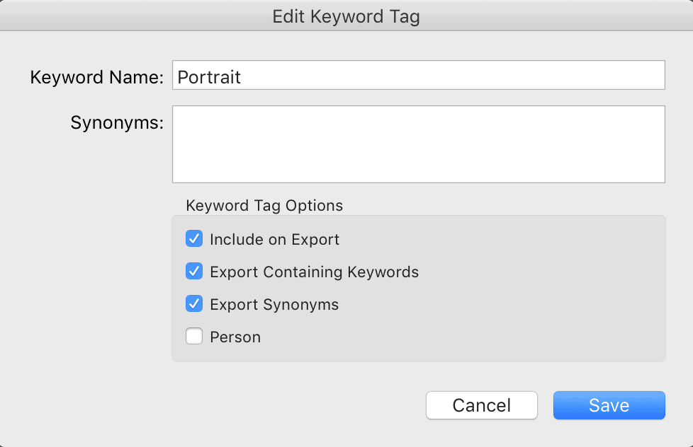
Let’s call it Parent, or Keywording Set (to coincide with the Collection Sets that serve a similar purpose). Any keyword with this field checked gets sorted to the top of its current location, regardless of its place in the Alphabet.
That simple little feature would give you the ability to start organizing your keyword hierarchies without requiring the equivalent of assembling a jigsaw puzzle.
You don’t have to find the corners and edges first. The parents are always at the top, so you can start dragging other keywords into the parent list where they belong.
The same feature works for sub-parents. Just mark them as a Parent and they will rise to the top under their parent category. Now you can start sorting through that stack of keywords.
Before you know it, you have a rational, usable keyword hierarchy. If only Adobe Lightroom had a simple checkbox that sorted Parent keywords.
2: Cycle Through Upright Modes
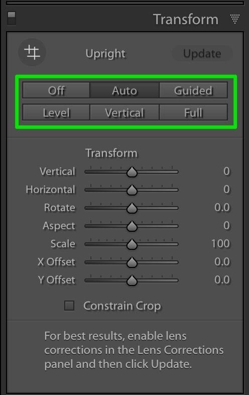
This is a quick tip to help you quickly shift through the different views you can get using the Upright feature in the Transform module of Lightroom CC.
Use Control-Tab to cycle through the various modes.
It’s simple, but I like keyboard shortcuts that allow me to cycle through my options. Sometimes I’ll go through a few cycles before an idea hits me. I’m a slow learner.
Upright is a great tool and I just hit Auto most of the time because I honestly didn’t take the time to learn more about this feature.
I’ll give you one word of warning, though. Any changes you make on the sliders will be lost once you move to a new mode. If I had my preference, those sliders would stay put.
Imagine that you made some changes in the different modes and you wanted to cycle through the results to see which one you prefer.
Imagine all you can do, because you lose your settings after changing modes. Perhaps a setting in the Preferences to make this a persistent panel would work. It could keep this behavior for those who like it, yet give others a chance to evaluate different changes.
3: Place Center for Post-Crop Vignette
This one wins my prize for the biggest “duh” in Lightroom. Why can’t we have a small feature in the Post-Crop Vignette to move the center of the vignette? My wife has a free iPhone app that supports this feature, yet the industry standard application from Adobe to managing and post-processing photos can’t handle it?
Give me a break.
With the introduction of the Radial filter, there is a work-around. You can draw a Radial filter to the size that you want, move it to the location you want, change the exposure, invert it, and even change the feathering.
That’s nice.
Wouldn’t it be much nice to click a spot and drag a slider to add the amount of vignette you want? That’s what I can do in some of my 3rd party plugins. I’m talking about OLD plugins, too. Things like the Nik Collection, with Darken/Lighten Center. That’s essentially a vignette tool that does what I want, and it’s FREE.
However, I wouldn’t have to jump through a few extra steps to use a Radial filter or launch a 3rd party plugin if Adobe would just at one stinking little tool that allows me to place the center of my vignette.
Maybe we’re talking about First World problems here, but I want my post processing to be quick, easy and effective. Adobe Lightroom does that very well in many cases. Now its time for this to be on the JDI list (Just Do It) to pick up something that’s obviously useful and, I hope, easy to implement.
What Are Your Suggestions?
Now that you’ve seen my list of suggestions for 3 Lightroom controls, what change would you make? Leave a note in the comments if you have a recommendation to tweak Adobe Lightroom just a bit to make life a bit easier.
After all, we’re photographers. We bring delight and joy to the world. We deserve a few tweaks.
Want to learn more about Photography software? Click below to check out articles about Adobe, ON1, Skylum, and more.
Photography Software Articles


Hi
First one that comes to mind, different optiona for the graduated tool, to mirror Photoshop’s shape of gradient tool. Sometimes, say, I want dehaze just in the middle of a photo but not in the top (sky) or the foreground then a position modified central black mask would be extremely useful. This a better option than adjustment brushing since the feathering is more desirable and easier (quicker).
Richard,
I like that idea. Now that you bring it up, there are a lot of adjustments that would benefit from using a graduated tool instead of a brush. Good suggestion.