Affiliate Disclosure: We earn a commission if you purchase through one of our links at no additional cost to you.
Using the right Luminar workflow can save you time and yield better results. In this video, I’ll demonstrate how I follow the TEXTURE – TONE – COLOR workflow while processing a portrait.
Why spend time working on something that you’ll end up cutting out of your photo later. Even worse, why do re-work on something that changed because you applied your processing in the wrong order. Sometimes changes in Tone affect Colors.
Understanding the Luminar Workflow
This video is part of a series of Luminar tutorials I’m creating to explore Luminar, its features and benefits. You may want to click here to check out the Luminar Getting Started video.
I’m a believer in following the TEXTURE – TONE – COLOR workflow when processing photos. By separating your workflow in this order, you get a lot of benefits.
- Save time by avoiding unnecessary work
- Avoiding mistakes that cause rework also saves time
- You build your processing in a logical order that yields the best results
- It’s easy to change your mind and your result if you decide to go for another result
Here’s something with your Luminar workflow that you may not have considered. You have to bounce around to use the tools in the right order. If you just go to the Essentials tab and do everything there, and then go to the Canvas to do everything there, and so on… You’re not building your photo in the best order.
That’s because each of these tabs has related tools, but they may be a mixture of TEXTURE – TONE – COLOR that could cause you to do some rework.
If you follow this workflow, you’ll save time and avoid processing mistakes.
Have you ever had this problem when you're processing your photos? You make a change, it looks good. And then you go ahead and make another change. And it seems like it's undone what you did before, or worse made it look completely terrible? Well, that's probably because you're doing things in the wrong order with your processing software. So that's what we're going to talk about today.
Hi, my name is William Beem. I am a portrait photographer in central Florida. I'm also the cohost of a podcast called I Like Your Picture. Today. We're gonna be looking at some software from Skylum called Luminar and looking into, "what's the right way and right order to use the wonderful tools that are in the software?" So let's go ahead and get started.
All right. So I have a portrait up here and the first thing you'd think of when you get here, it's like, where do I begin? I think almost everybody likes to go ahead and start working on their exposure and the lighting and all these wonderful controls. Those are important things, but they're not necessarily the first thing that you want to look at.
I like to work in an order of texture, tone, and color. If I go ahead and do something to fix the color or work on something specifically for color, and then I changed the tone, there's a good chance that that tonal change may impact the color changes. Likewise, if I work on fixing something with texture, or if I want to crop things or do something like that,
and I don't do that first, I may end up going back and undoing or covering up some of the work I've done. In other words, you waste time if you don't do things in the right order. So what I'm going to start with is what I refer to as texture. And I'm not the person who invented this order of things, but it does seem to work out nicely.
Let me give you an idea of what we're talking about. I'm going to start off with a canvas tool. And one of the first things I want to look at is my lens geometry, because there's always just a little bit of distortion with any lens. Doesn't matter if it's short focal length or long, and I'm just going to click this little box.
And for me, you can see how that just popped, right a little bit? That does a couple things for me, one, it fixes the lens geometry, which means I've got to have a better looking portrait to begin with, but also you notice how it kind of brought the subject in and just on the edges, it cut some things out.
I don't want to go in there cloning or fixing things that I'm going to cut out and throw out of the photo later on. So that's why I work on these things first. Working with a canvas, I'm going to look at this and say, what do I want the lens geometry to be? And I think, honestly, I don't think I need to go ahead and work on any of these sliders here.
I don't have a big issue or problem. The next thing I'm going to work on is crop. And for some people that might seem like it's pretty early to work on a crop, but it goes back to my idea, why would I want to fix things that are maybe over here on the edges or some other place, if I end up propping them out of the photo?
it's just a waste of time. So the idea of cropping is get the composition that I want and then clean up the details inside. So I tend to like a 16 by nine crops when we go over here and we'll select 16 by nine and a few things are happening. I see, like, I've got this little bit of, um, the edge of the pool of structure that was there and you see more of it over here and I've got her elbows in between.
So I'm probably to want to bring this in to my taste maybe around there. And I may change this a little bit. We'll see how this looks and you know what, I'm probably going to bring this back up. I just want a little bit of that hairline. And I'm also looking at this center line here is like where I have her on kind of the rule of thirds.
So I've got her eyes pretty close to that line and let's just go ahead and crop her. The reason I'm choosing this spot is I don't necessarily want to cut her arms and fingers off. So let's take a look and see how that is. If I don't like it, I can go back and crop it again. And honestly, I'm not afraid to crop somebody off kind of like at the top of their forehead.
I don't think that's an unusual thing. And right now I'm kind of happy with us. I've got a little bit of balance for this thing over here and this thing over there, and I haven't cut her elbows off. So I'm happy with that. I'm going to stick with this. The next thing I'm going to look at is the clone stamp tool.
You can see that it says select the source here. This has kind of a decision point if you're working in Luminar because in most tools you'd normally go ahead and a clone and stamps, some of these little small imperfections and blemishes that she has. You may not need to do that within Luminar because of the AI skin retouching tool. It can clean up a lot of this stuff.
So this is one of those cases where I'm going to say, you know what, let's see how that does before I go ahead and go into the clone and stamp tool. So we're gonna come over here to the portrait tab and go to the AI skin enhancer. And I'm gonna check this box, AI Skin Defects Removal. And I'm just gonna move this up.
I'm going to start about 20 or so. And I'm looking in her forehead, cause we knew that we had some little insignificant, but yet still present, um, basically blemishes over here. Everybody has them. It doesn't matter. What if you hire a model or a regular person that shows up. I think even babies have some little blemishes and defects.
It's just part of life, but we'd like to clean those up for portraits. So I think let's go ahead and I'm going to move this all the way up to 50 to see what happens here. And let's take a look at before and after you can see there's, it's done some, a good job of cleaning things up, but it hasn't done everything.
And I don't want to go too far with a skin enhancer if I start to lose structural detail in her pores. So we're going to leave that where it is, and we're going to go back to the canvas tool and we're getting clone and stamp, and I'm going to select a clean spot of skin over here and I'll change my brush size. I'm using the bracket keys to kind of decide what the size is going to be.
Now, notice how these are linked together. And I kind of to make the spot that I'm using just a little bit smaller than the area that I'm fixing. And I'm looking at small little blemishes, just kind of just jiggling just a little bit on each one of them, try and fix things up and you can see how quickly and easily it is to go through and fix those blemishes.
So they're not a problem at all. And we may go back to the skin enhancer and run that again afterwards. Now, if you want to change the spot where you're sampling from... I'm on a Mac, I'll hold down the option key. If you're on Windows, I'm thinking, hold down the alt key and then pick a new spot. So I'm going to pick right here and then I can go ahead and start.
And I just kind of changed the perspective or relationship I have between my source and where I'm cloning things out here or in healing them. So there's a few spots here and there. Now, if you see things like this, like this is really white or much lighter, I should say than the area around it. It's probably because my source was in the wrong place.
So I can go back over here and choose something where the skin is a bit darker and go back and brush that. And you see how it fixes that up? Same thing up here. I probably need to go back and make an adjustment there. So it helps to look every once in a while just to make sure that you're seeing the same shade and color in the skin.
If you're working on texture. And pull the space bar down so I get the hand icon and take a look. There's a little bit here that I may want to fix, but mostly this is a model who has just really wonderful skin and I don't want to overprocess it. And I also don't want to take away things that should be there. So for example,
this tiny, tiny little speck right there. That's part of who she is. I'm not going to take that away from her. All right. So let's back off and I'm looking around saying, is there anything else that I need to work on for the texture that I want to work with? And I'm not seeing anything I'm not seeing. This could be a lens spot.
It's not really distracting me, but let's just give it a quick little stroke. And I think that's it. So we're gonna go ahead and hit, done and finish up our clone and stamp. All right, now that we're done with that, I'm going to look at tone. And tone really is looking at contrast and perhaps sharpening. So you might be thinking about,
is this a good time to do any exposure adjustments? I think it is because exposure is also going to affect your tone. Right now, I'm satisfied with the exposure that I have. So I'm not really going to mess with, um, changing the exposure. I am going to bump up the smart contrast just to see what kind of look I get. And this would also be a good time to work with your highlights and shadows.
I tend to just kind of do them at opposite ends like this when I have a nice exposure, just to see if I like the look of it or not. And so let's take a look at it before and after. So it's very subtle, but there are some nice improvements going on already. Okay. At this stage, I'm going to be looking for,
what else can I do that might have a change on the tone rather than the color. Uh, one of the first things that comes to mind is going to the portrait. And I think the AI Portrait Enhancer, and I want to add a little bit of face light. So I'm brightening up her face area. So if I click this kind of right around 38 or 40,
you get just a nice little brightening inside of her face. So let's take a look at that. So you can see when I turn that off, her face goes back to where it was and turned it on. And it's just a little bit brighter. The idea is your eye goes to the thing that's brightest. We add just a little bit of brightness.
In fact, I probably got a little bit more than I want on here. I like to start with a little bit too much and dial back. I think I'm going to go probably about 30 for her. Close enough, 30, 32 then. So it's a very subtle effect, but it's one that draws the eye. The eyes that is more of a contrast issue.
So we're going to go ahead and try and whiten the eyes a little bit. And again, I'm going to kind of here around 30 everything with the eye enhancer and just see what results that gives. Eye whites should be a little bit brighter, but they shouldn't be electric. So I'm probably going to bring the eye whites down. I think let's say maybe to 25 and we'll go there.
She doesn't really need dark circles removed. I'm not going to work on her eyebrows. One of the things I've noticed about the, uh, improve eyebrows is it, it does fill them out, but it also darkens them. She's blonde. If I go ahead and darken things too much, let's just go ahead and try that. I'm going to bring it all the way up and you'll see that it's gonna just really dark them.
And I don't think her eyebrows match her hair. If I'm using that, I can bring this down a little bit, but then again, I don't see the point of it on a blonde subject. So you might give a little bit of fill, but we might darken it too much. I kind of only use that for brunettes with this tool. There are other tools we can use to,
uh, enhance eyebrows on blondes and redheads. And we'll go in that on another video. All right, so the other thing I'm looking at is perhaps if we're going to do any more darkening, so if I want to darken her lips, I can do that here. Um, I'm not entirely certain that's right for this photo. It's something you do to judgment.
It's something that you do to taste. So I'm going to leave it right there and I'm going to also whiten her teeth just a bit. She's already had a brilliant teeth. I don't think that she really needs too much. Matter of fact, if I did it that much, I think it kind of distracts your attention away from her eyes. I really kind of want you to be pulled into her eyes just a little bit.
So with that, I'm going to bring up the eye enhancer a little bit more and we'll see how that looks. Okay. So I'm at this point, I think I'm happy with the contrast overall, we can go back also over to the AI structure and give that just a little bit, maybe 15 or 16 and maybe a little bit of a boost.
I don't want to give too much structure to the background since it's already de-focused in bokeh. I was thinking a little bit more of her hair. We could get the brush and mask that in, but for now I'd say that we're good. Let's go ahead and move on to see what else we want to do. The next thing I'm going to look at are any local adjustments.
So let's go back to the portrait area. I don't have any red eye removal to do here. We've done her whites. We don't have any dark circles. Slimming the face is an interesting one. It's not necessarily a color one. So I would say that probably is going to fall somewhere between texture and tone, but it's really, it's a manipulation.
And so are enlarging the eyes, I kind of like these. I think I would probably do these before I would go into the color, if I'm going to do them all. So let's take a quick, look it maybe a quarter of the way through, on slimming the face. And then we'll do the same rough area with enlarging the eye.
Let's take a quick look at before and after. Honestly, there are times when I think slimming the face really works. This is not one of them. So I'm going to take that off. That's just a little bit creepy for me and we'll do some before and after with the eyes. I think the eyes still work. The idea of enlarging,
the eyes really is kind of to draw you into the portrait. It's something that really relates back to again, we're talking about babies. You know, their heads are a little bit large. Their eyes are a little oversized for their whole proportion. And it's something that's actually a little bit endearing. Magazines have been doing this for years. So enlarging the eyes a little bit.
I wouldn't go too far. If we come all the way over here to a hundred, I think it's really going to look weird. You're going to end up with like a, uh, a crazy kind of look, but doing a round of 18-20 here for her, I think is a nice enhance. So now that we've done the portrait enhancer, we've done the skin enhancer.
The next thing I'm gonna think about is what is, what am I going to do with the overall color and tone that's going on here? I think the tones are fine. I may want to add of it yet. I may want to change the overall color of, so let's take a look at our essentials. We're going to take a look at the vignette.
Alright. So the first thing we're gonna do is we're going to choose our subject. I'm just going to put this like right between her eyes. And I'm going to pull this down a little bit to give us some darkening and then we'll see how that looks. And then I'll adjust the size a little bit and you can see, that's a subtle change.
If you want to go to the advanced settings of you can change the mode. Like I said before, they cropped it or after I recommended just living on post crop, cause I'm always doing my crop before I ever get to the vignette. You can change the roundness. You can change the feather, you can add some inner light, which in some cases you may need in this case,
I don't think that's really going to be appropriate. So pull that back down. Also on her arms. They're just a little brighter than I want to be compared to her face. So let's go ahead and put a gradient on there that down. We'll move the exposure down a little bit, just to kind of darken up the arms. So they're not competing with her face. And I think that's good.
I don't really need to change anything else for that. Alright. So if we want to look into some color or a color grading, there's a few options. We've got a color enhancement here. We've got photo filters, which I like very much and we've also got split toning. But I think what I want to do now is actually kind of work with one of the,
the color styles. LUTs or look up tables and we'll just go ahead and pull one out of here. And you can see as we kind of go over these, I'm just hovering each one. It gives you a little bit of a preview of what they look like. Keep in mind. You don't have to go full strength with what you see here.
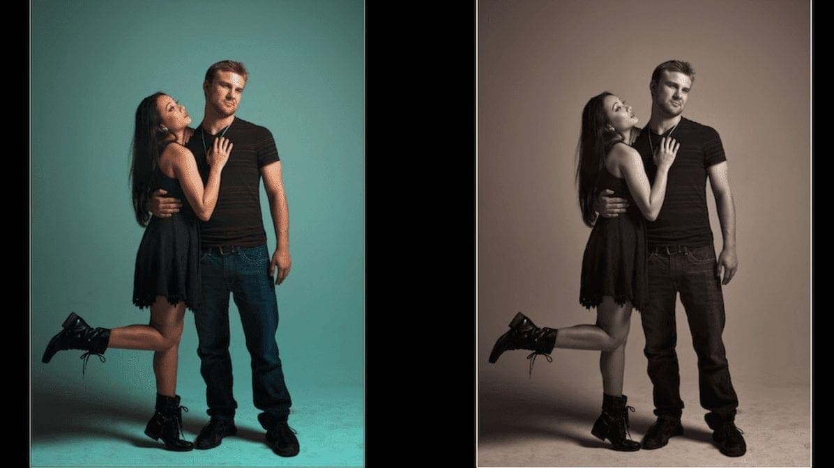
I'm probably going to go with this one, Sina. So this is where we were before. You can see that their skin tone and little blemishes are there. We've released that. And we've kind of brought up the color in the background. We've brought out some of the texture in our hair. We've smoothed things off on her skin. We've, uh,
brightened up her teeth. We've also kind of shaded this down, so it's not too dark on everything. So that's the order that I'd like to go through - texture, tone, and color. You can play with a lot of the tools and find out which ones work best for you and your own workflow. One of the things that I've would say though,
is you see a lot of people that will go and say, let's do everything on the essential tab, do everything on the creative. And then if they're doing a portrait, everything on the portrait. That's not necessarily the best way to go. Sometimes you want to jump around a little bit in the tool in order to save time for the whole thing.
Hope you enjoyed this tutorial. If you did, please, don't forget to like this video, subscribe to the channel and ring the bell notification because that'll let you know when I've got another tutorial coming in. When you look at the order that we worked in. So you see the process that I used with texture, tone and color, which of the tools do you think belong in each category?
Let me know in the comments. There are some that maybe should go in texture. Some that should go in tone. Some that should go in color. And others you look at them and you don't know where do they go. If you have any questions about that, leave a note in the comments and I'll get back.
Related Links
Please know that some of the links below are affiliate links. These are items that I use and recommend. There’s no extra cost to you, but I may receive a small commission if you buy something based upon my recommendation. Those commissions help us keep the blog running so we can keep sharing more info.
If you enjoy the free training, buy me a burger! : https://www.paypal.me/williambeem
#phototips #photography #photographypodcast #williambeemphotography
Here are some of the gear and resources I use for my photography and tutorial videos.
Skylum Software:
Skylum Luminar (Coupon Code BEEM to save $10) – https://williambeem.com/luminar
Skylum Aurora HDR (Coupon Code BEEM to save $10) – https://williambeem.com/aurorahdr
Topaz Software
Studio (Coupon Code WBEEMPHOTO to save 15%) – https://williambeem.com/TopazStudio
Mask AI (Coupon Code WBEEMPHOTO to save 15%) – https://williambeem.com/TopazMaskAI
Adust AI (Coupon Code WBEEMPHOTO to save 15%) – https://williambeem.com/TopazAdjustAI
Sharpen AI (Coupon Code WBEEMPHOTO to save 15%) – https://williambeem.com/TopazSharpenAI
DeNoise AI 2 (Coupon Code WBEEMPHOTO to save 15%) – https://williambeem.com/TopazNoizeAI2
Imagenomic Portraiture – https://williambeem.com/portraiture-ps
Adobe Create Cloud – https://williambeem.com/cc
The following links are Amazon affiliate links
Hardware:
Nikon Z50 DX-format Mirrorless Camera Body w/ NIKKOR Z DX 16-50mm f/3.5-6.3 VR (video tutorials) –
Shure SM58 Microphone –
Yamaha MG12XU Mixer –
dbx 286s Mic Preamp/Processor –
Zoom H4n Handy Recorder –
Neewer 2 Packs Professional Metal Bi-Color Dimmable 660 LED Video Light –
Neewer Collapsible Softbox Diffuser –
GVM RGB LED Video Light – I
Want to learn more about Photography software? Click below to check out articles about Adobe, ON1, Skylum, and more.
Photography Software Articles

