Affiliate Disclosure: We earn a commission if you purchase through one of our links at no additional cost to you.
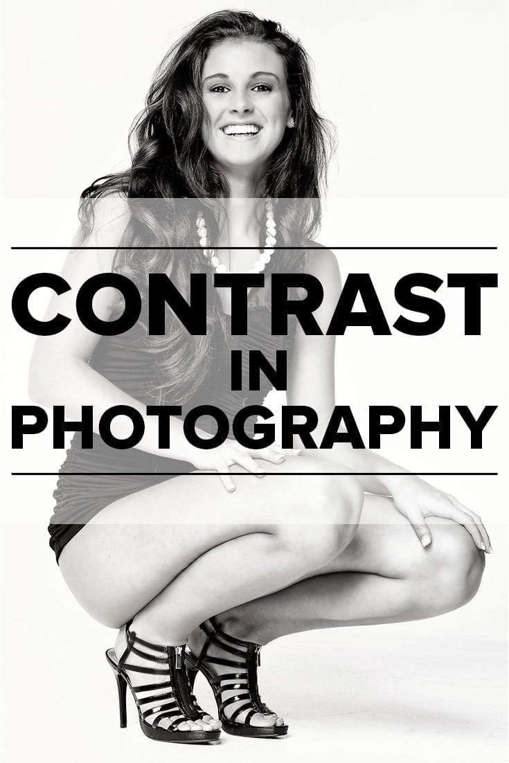
When you think of contrast in photography, you most likely think of tonal contrast – the difference between dark tones and light tones. Perhaps that’s because it’s one of the easiest types of contrast to conceive.
You can easily spot contrast, particularly in monochrome images. Software products celebrate contrast with it’s own slider or some form of control. That’s what the photographers want, so let’s give it to them.
I love contrast, too. It’s good to know there’s more than one way to achieve contrast in photography.
10 Elements of Composition in Photography

This episode and blog post are part of a series we’re creating to expand upon this blog post. As a list of 10 elements of composition, I thought the post touched on some useful ideas. However, I decide that it may help if we expanded a bit more on each of those elements. I hope this gives you some ideas to use in your compositions.
What is Contrast?
In order to have contrast, you need two of something. Those two things should have a striking difference. Opposite sides of a position.
The people who view your photos have an innate concept of contrast. It’s in everything we do and how we live. Day or night, we see contrast in our lives.
Anything that’s so much a part of a person’s life is a great tool to use for visual storytelling. That’s why stories don’t just have heroes. What would a hero do without some problem to solve, or a good villain to cause problems?
Batman would be bored to death.
Contrast causes interest. That’s why people love it, even if they never talk about it. Think about the interesting photos that you enjoy. How often are they flat with even lighting on every part of the image?
Photographers work with light and darkness. Contrast is inherent in our field. Too much of one thing or the other and our audience loses interest in what we’re doing.
1: High Contrast vs Low Contrast
Before we start discussing different methods of using contrast in photography, let’s discuss the difference between high and low contrast.
High contrast images have some pretty stark relationships between light and dark parts of the photo.
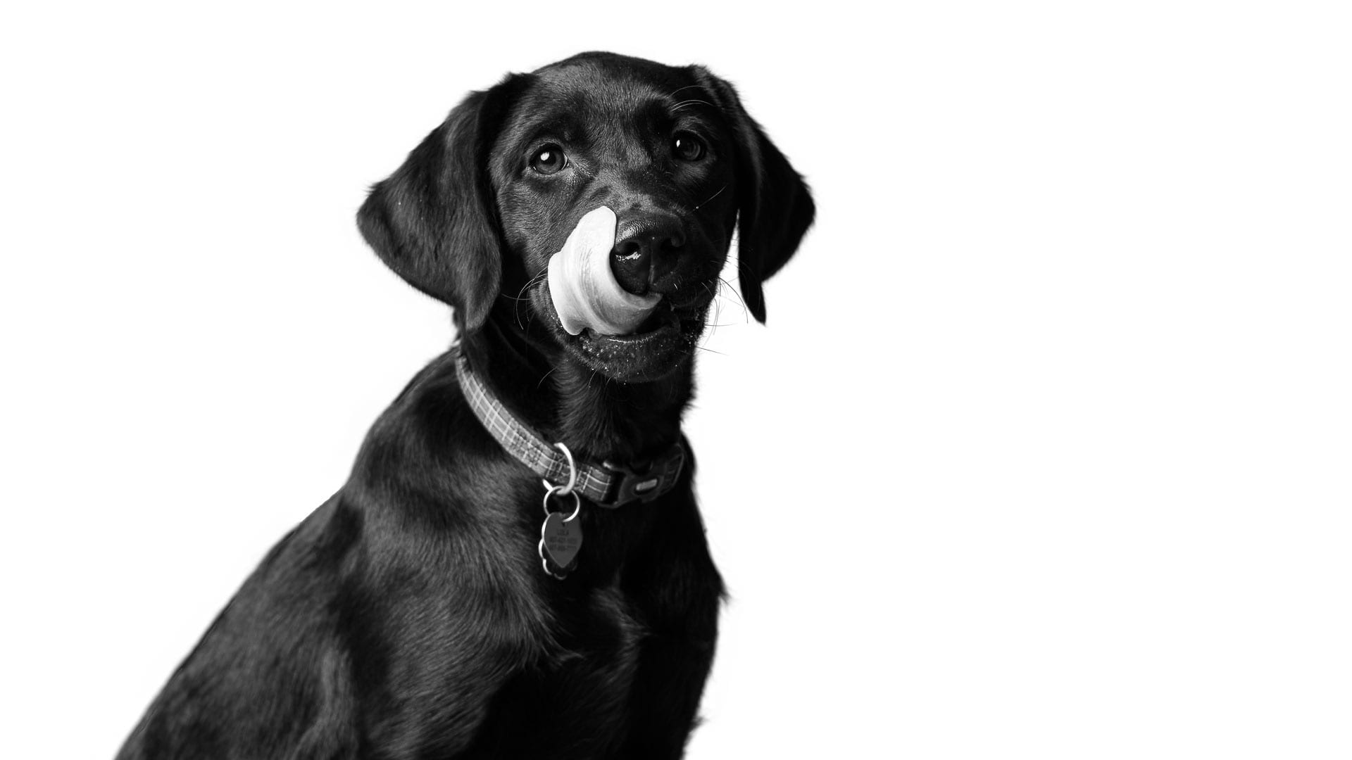
This is my dog Lola. You may remember her from the episode on Space and Balance.
Today, Lola is here to teach us about high contrast. Black dog, white background. You don’t have to hit someone too hard over the head with this photo to understand the stark difference in contrast.
Now here’s an example of low contrast.
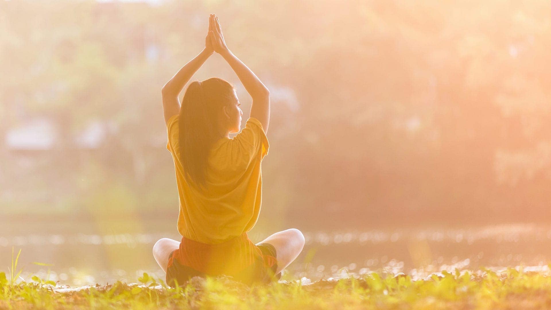
I had to use a stock photo for this example, because I just don’t like low contrast photos like this one. Some people refer to it as a “wash” effect. If you do a search for “lifestyle” photos, you’ll find something with this same kind of low contrast effect. Apparently, it’s good for advertisers so the photo doesn’t conflict with the text or message.
To me, it looks rather muddy. There’s no clarity or definition between the subject and other elements. Even the colors seem muted and muddled together.
It’s pretty easy to get this effect in Photoshop. Just bring up a Curves adjustment and click on the bottom-left spot on the line, then drag is straight up.
2: Color Contrast
Another way to use contrast in photography is to find contrasting colors. You want to see one color juxtaposed against another.
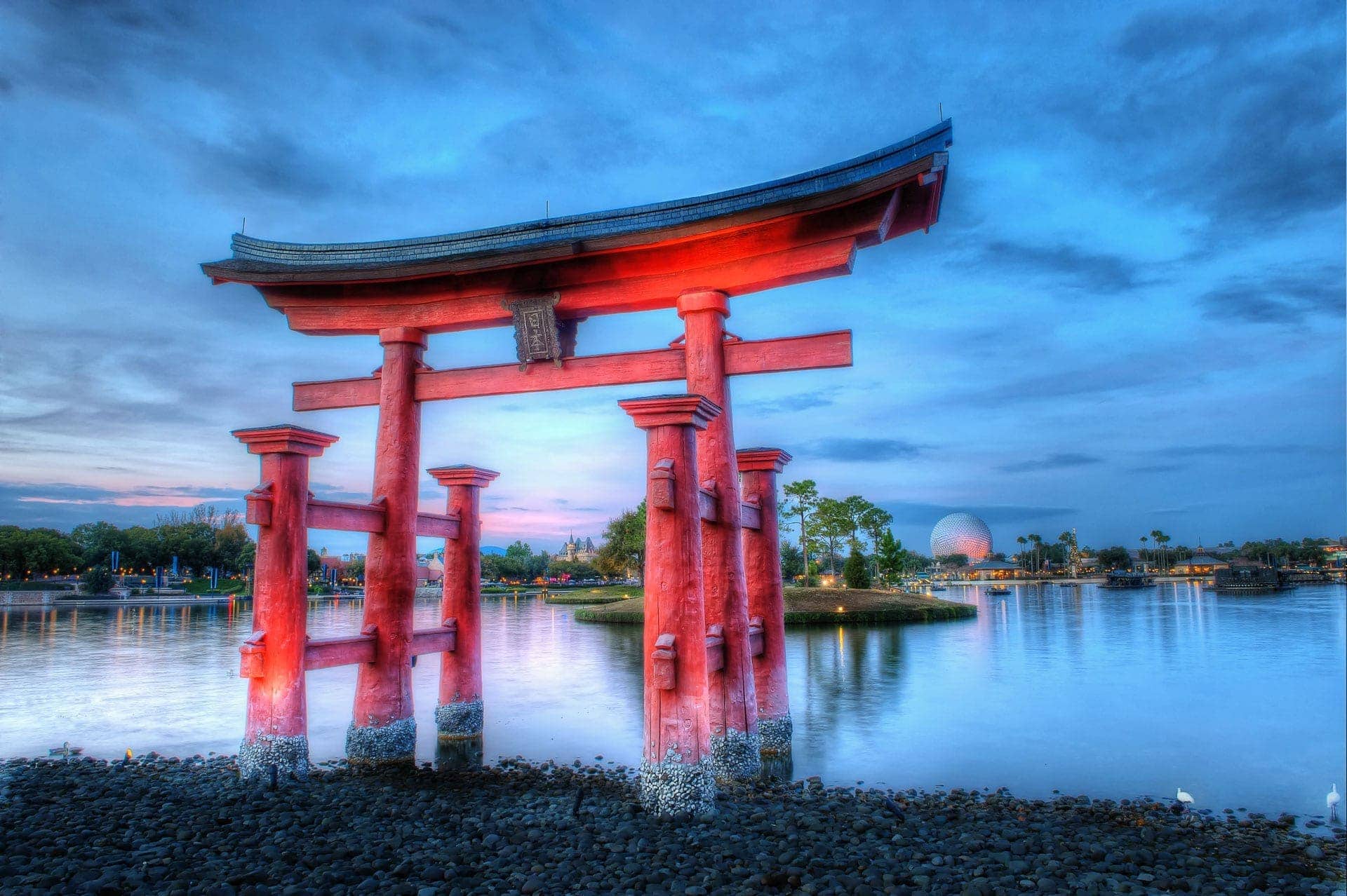
The red of the Torii gate stands out well against the blue sky. These colors aren’t total opposites, as complementary colors would be. Instead, these two colors relate as part of the same triad.
You can visit color.adobe.com to check out the color wheel and look at different combinations.
Ask yourself, do you think the color differences are striking? If so, then you have color contrast that you can use in your composition.
Color contrast helps your subject stand out from the background, and makes it pop. You can go with absolute complementary colors like Red and Green for contrast, but don’t ignore color triads for combinations that help differentiate elements in your photo.
3: Tonal Contrast
We spoke briefly about tonal contrast in photography.
Generally speaking, people love tonal contrast. That’s when you define shapes and edges. Tonal contrast differentiates between dark and light, shadow and highlight. Things are clear and comprehendible when tonal contrast gets amped up.
So far, I’ve shown tonal contrast using monochromatic images. However, don’t think for a moment that tonal contrast doesn’t apply to color images.
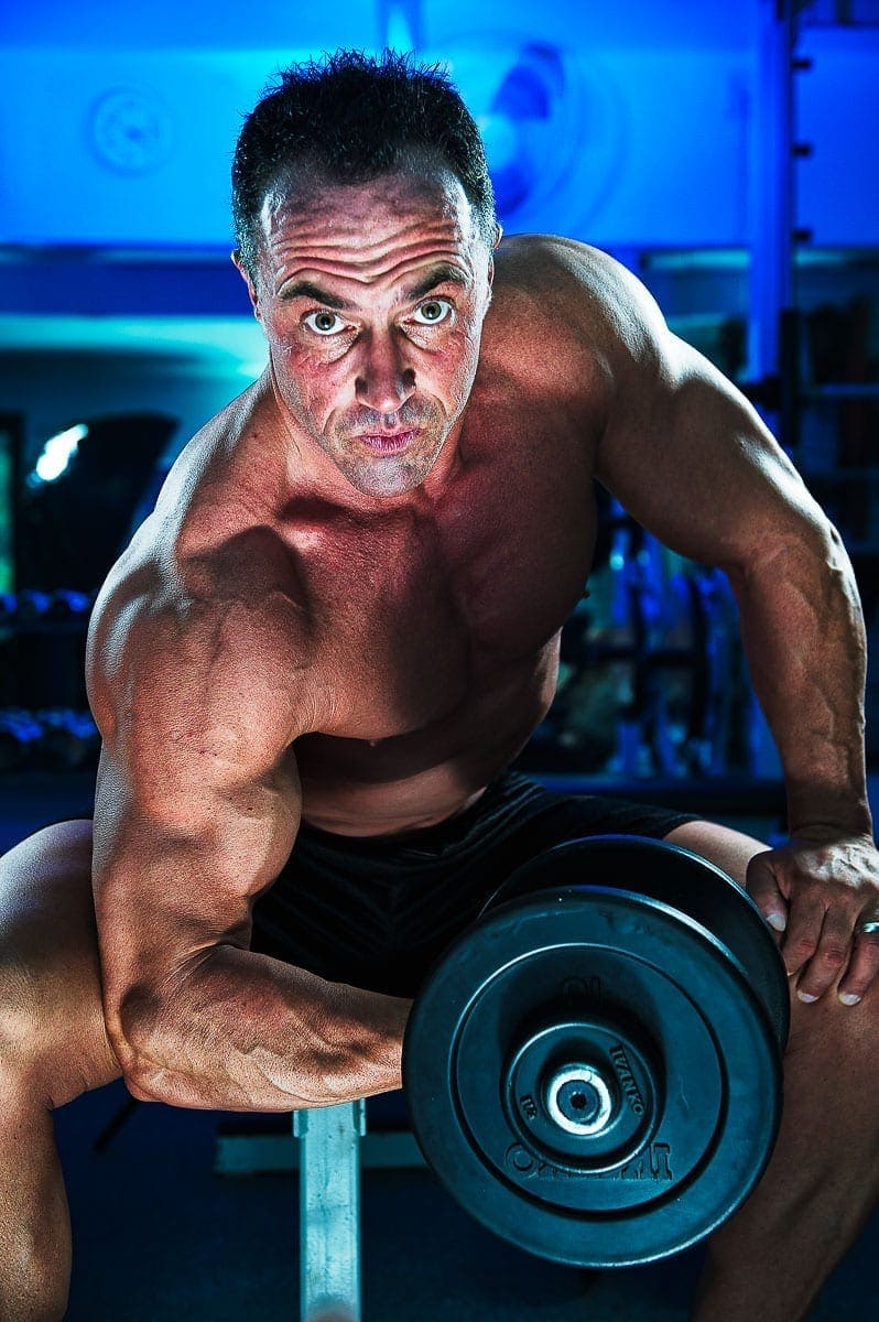
You can see both color contrast and tonal contrast in this photo. The color contrast between the blue background and his skin tone provide separation. However, so do the darker background compared to the light on our subject.
There’s a play of edge lighting and shadows that help define the subject and create some interest. If we photographed the man with just a blast of light, we’d lose our contrast and interest in the photo.
4: Texture Contrast
I think one of the best ways to emphasize your subject is to use texture contrast.
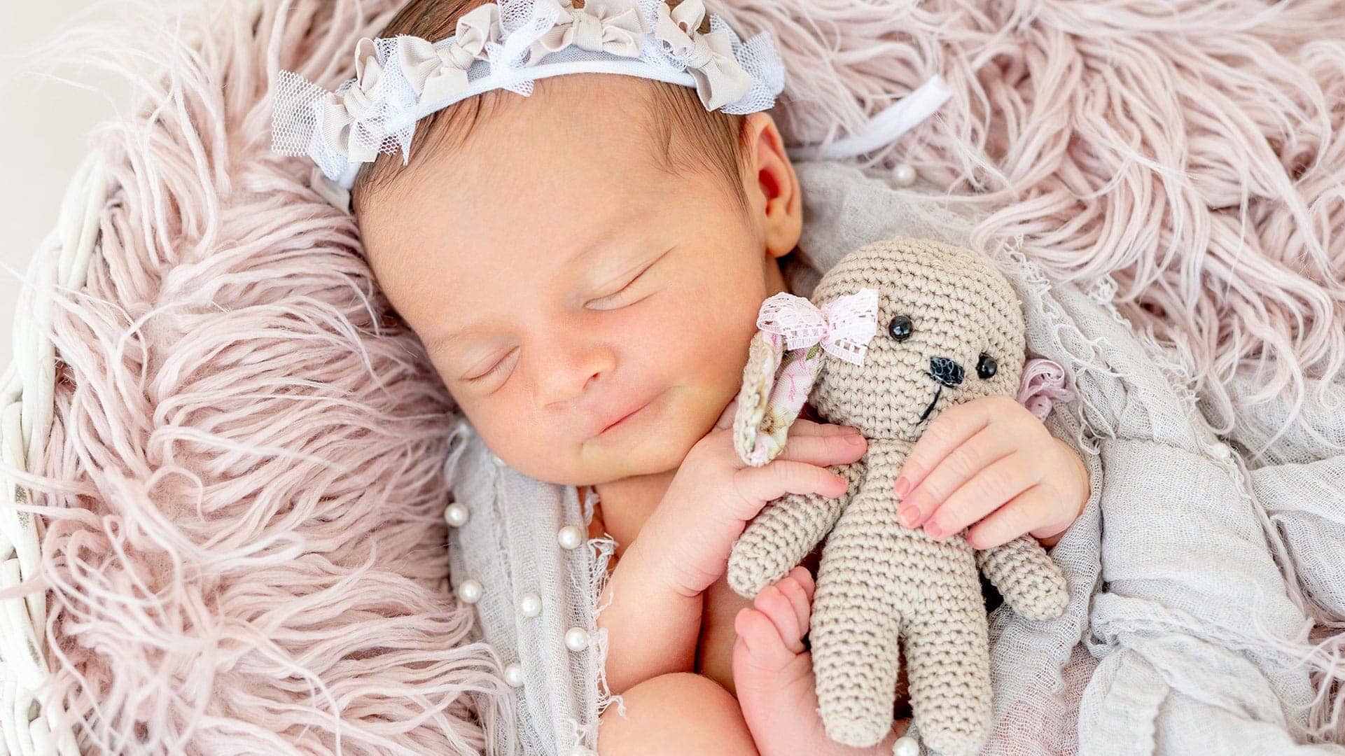
If you have a smooth subject, like the baby above, find some texture to surround her. If you have a textured subject, like Lola above or an older person with wrinkles, find a smooth background.
People love the idea of contrast in all of their senses. We like to see contrast, feel it and even taste it. How else would you explain salty and sweet going together?
A photo with texture contrast allows the viewer to imagine what it’s like to touch the different surfaces. It’s a great way to get someone to engage with your photo.
5: Conceptual Contrast
One last way to use contrast in photography is to combine subjects and backgrounds that just don’t logically go together. It’s like a fish out of water.
You wouldn’t expect to see someone dressed as a mechanic sitting in a corporate boardroom. Neither would you expect to see a downhill skier on top of a skyscraper. Yet these conceptual images imply a relationship despite their contrast.
The mechanic could represent the purpose of a business, while the boardroom represents the power, support and stability behind the mechanic.
On top of the skyscraper, the downhill skier was one of several photos of Olympic athletes representing the USA in the upcoming games. Another conceptually contrasting photo showed a gymnast on a balance beam in the middle of a wheat field. The message showed that all of the athletes represented the USA.
How to Use Contrast in Photography
Ultimately, using contrast is a method to tell a story. You can help your subject stand out with color, tone, texture or concept.
Using contrast allows your viewer to engage with their imagination. Differences naturally engage us, so including contrast in your photos gives you a leg up in the fight for attention. Give your subjects some contrast in the background.
However, don’t confuse clutter with contrast. A busy background may confuse or annoy your audience. Make sure the elements you use for contrast are simple and easy to understand. When there are too many elements in a photograph, it’s easy to lose your audience because they don’t know what message you’re sharing with them.
Simplify your photos as much as you can.