Affiliate Disclosure: We earn a commission if you purchase through one of our links at no additional cost to you.
Using proportion in photography is an important concept to grasp. Sometimes people use distorted proportions for humorous or comic effects. However, you don’t want to accidentally use it to show a person or thing as it should be.
Proportion is about the relationship between size and space between different objects. If you’re taking a portrait, you probably don’t want to cause unwanted distortion on your subject, making them look too tall, too short, too wide or just plain weird.
People will accept a bit less than perfect proportion, but there gets to be a point where something looks unnatural. You need to know if you intend to cross that line or not.
Two Types of Proportion in Photography
How do you tell what’s important in a photo? There are several ways to draw the eye. One of the methods is proportion or comparing the size of one object to another in a photo.
If two or more subjects are pretty much the same size, you can infer they’re equally important. If one is a bit larger, you tend to think one subject is more important than the other.
Let’s look at an example of a proportion picture.
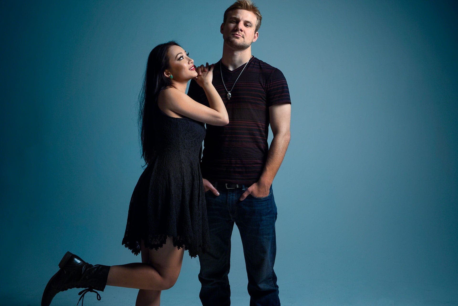
In the photo above, we see a couple. The man is taller but not bigger in proportion. We see their relationship in size as roughly equal, meaning they’re both important to the photo.
On closer examination, we see their bodies are also proportional to what we expect. We’re not making their heads look large while the rest of their bodies look cartoonishly small. Most of what we think about as “proportional” means that the pieces fit as we’d expect them to fit, or compare to each other.
1: Perfect Proportion
Any time we call something perfect, it brings a lot of judgment. Fortunately, talking about perfect proportion in photography means showing something as you would perceive it if you were right there looking at the subject.
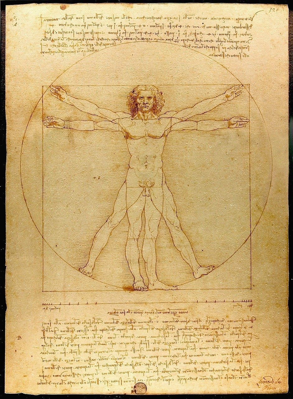
Leonardo’s Vitruvian Man is an example of perfect proportion. In other words, we see the man as we would see an average person if we stood next to them (albeit I’d expect some pants on him if he were next to me).
The expected norm for perfect proportion is about seven and a half heads tall. People have different size heads, but then we expect the rest to be “in proportion” to their body parts.
That’s not to say this always aligns with everyone. Gymnasts tend to do better if they have short-lever arms and legs. No matter what your proportions, there are advantages and disadvantages to all of us. Perfect proportion aside, nobody’s truly perfect.
As portrait photographers, we generally try to ensure that we capture someone in their correct proportion. Using a wide-angle lens tends to distort their proportions. Sometimes you may do that for effect, but you don’t want to do it out of ignorance.
That’s why some focal lengths – generally over 70mm to 200mm – are considered portrait lenses.
2: Distorted Proportion
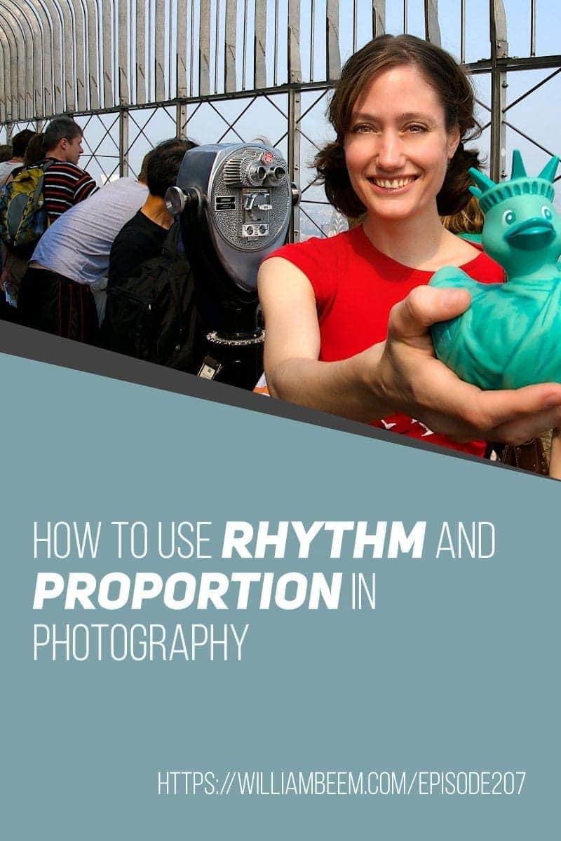
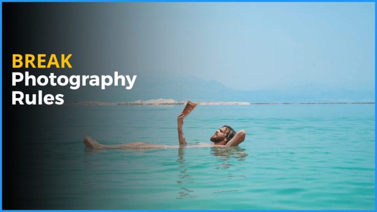
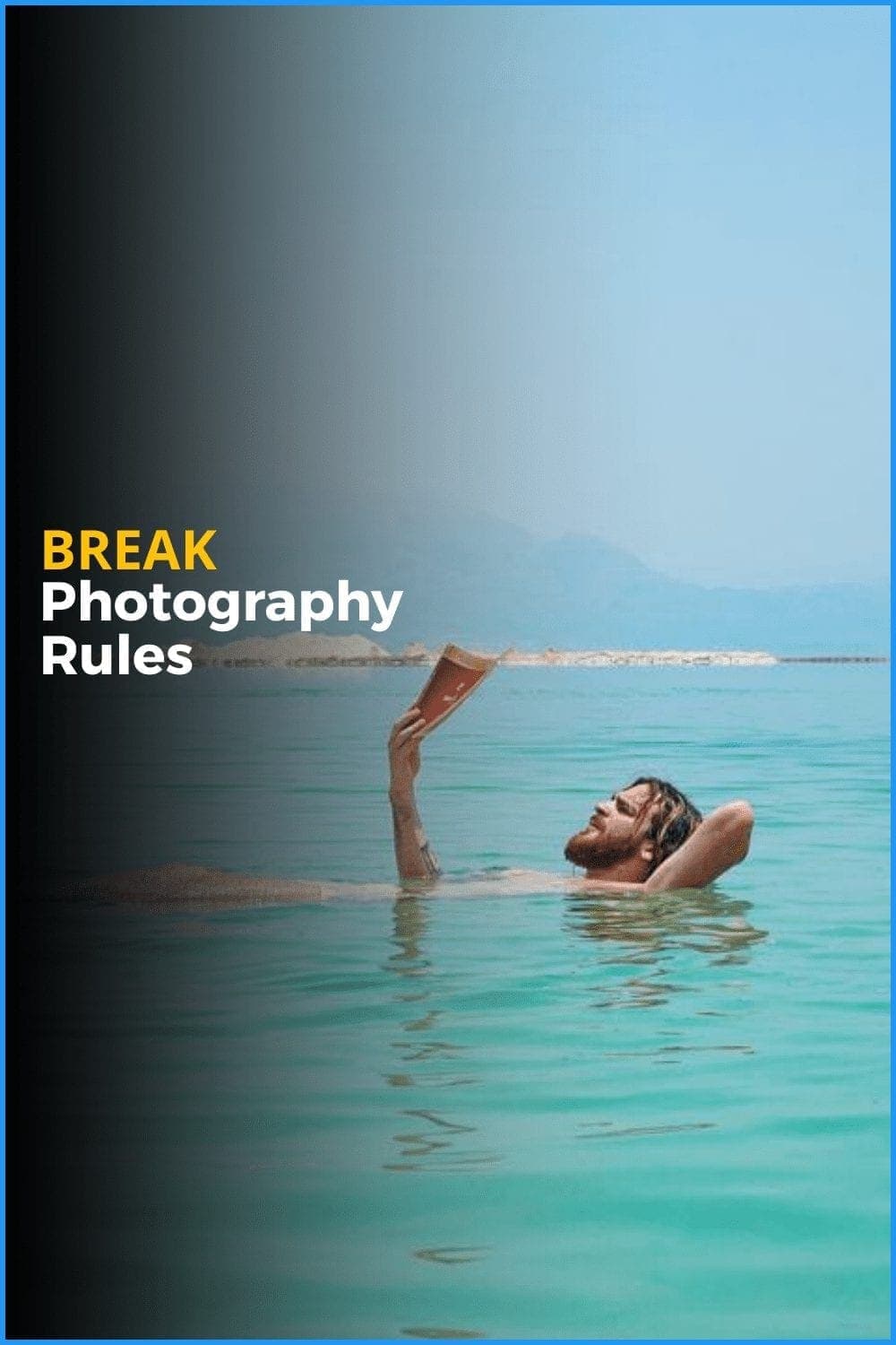
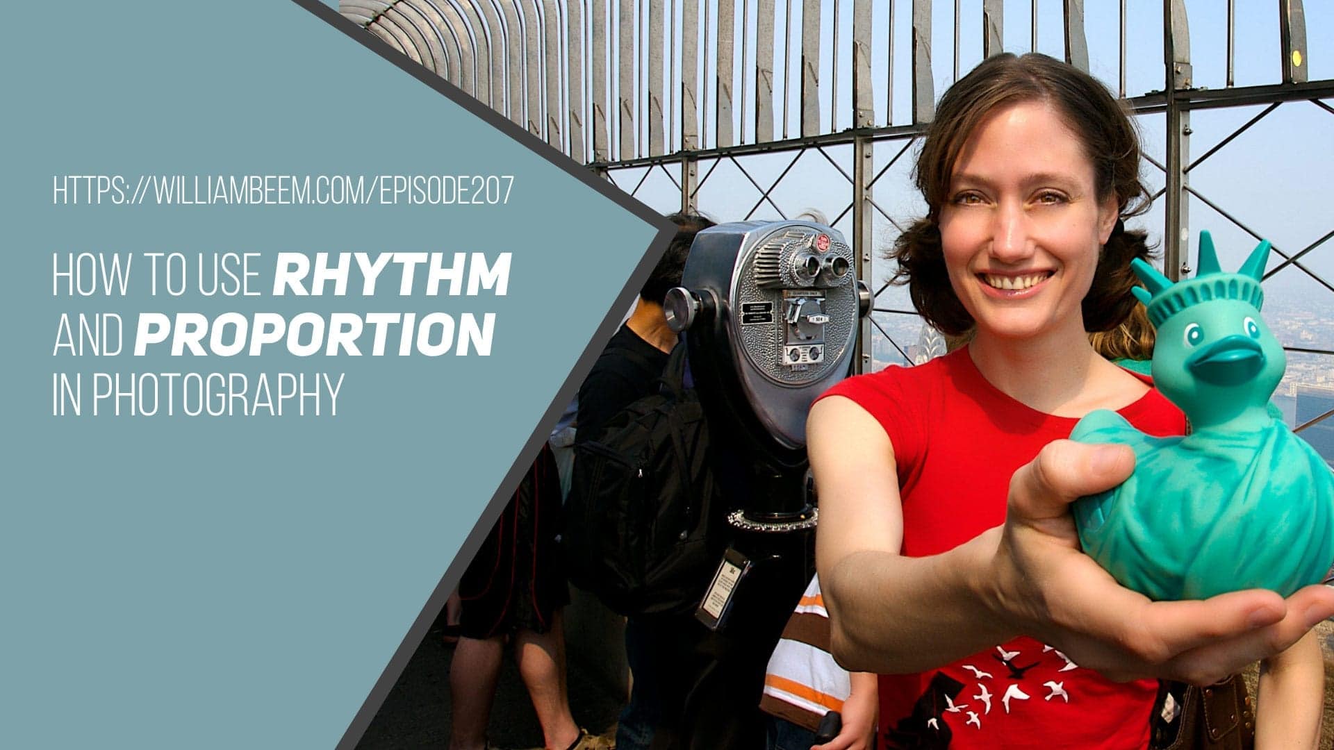
Sometimes we want to distort proportion in photography for a specific effect. The photo below is one of our proportion photography examples.
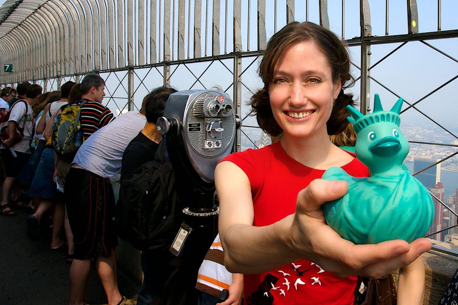
Colleen is a friend of mine in New York City. She’s a fellow photographer and has an enormous collection of rubber ducks that often feature in her photos.
I used a wide-angle lens to take this portrait of her on top of the Empire State Building. The idea was not just to show her, but to put her in context with her home (New York City) and her favorite photo subject – rubber ducks.
Yes, her hand looks freakishly large in proportion to the rest of her. It’s a risk I didn’t mind taking to emphasize the rubber duck and capture her surroundings.
Notice that the rest of her body doesn’t really look out of proportion at all. That means you can use a wide-angle lens for an environmental portrait like this one, but you have to keep a few things in mind.
You probably aren’t thinking about it, but look at the lines in the background on the metalwork that protects people from falling to a horrible demise. It isn’t warped or curved because of the wide-angle lens. That’s not because I did any perspective control on this photo in post-processing. It’s because I combined a diagonal perspective of the background so it naturally diminishes without looking warped.
Take a photo of the same thing from a straight-on point of view with a wide-angle lens and you’ll see converging lines.
3: Using Distorted Proportion in Photography
Another way people commonly use distorted proportion in photography is to trick the eye.
You’ve probably seen photos where someone appears to grasp an object that you know is much larger but appears small in the photo. Sometimes it shows a person pinching or holding the Sun. Another example I recall is someone who appears to be pushing the Leaning Tower of Pisa back up so it won’t fall over.
The idea is to use distance between a person and an object to distort the proportion. Sometimes it’s funny. Sometimes it fails. At the very least, it’s an idea to keep in your bag of tricks when the occasion arises.
Rhythm in Photography
Rhythm in photography is essentially using repeated patterns in the image.
People like repeating patterns. We love rhythm in music and visual arts. There’s something peaceful and comforting about it. Rhythm makes us happy.
However, too much rhythm gets boring. That’s why songs have a verse & a chorus, a verse and a chorus, then a bridge, before returning to the verse and chorus format. That bridge gives the song a bit of a jolt. We love the a good groove, but all good things must pass. That’s because we also love something new.
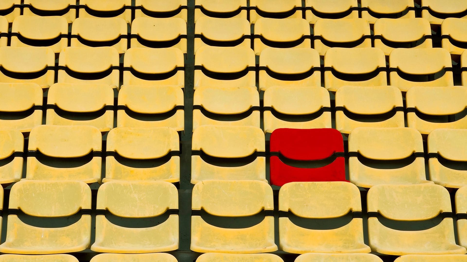
In the photo above, there’s a single red seat among all the repeating patterns of yellow seats. That break in the rhythm, the interruption in the pattern, is something interesting to people. It makes us stop and take notice.
Using rhythm in your photos is a good way to provide a sense of comfort, but you can combine that with an interruption to make something interesting.
Best of both worlds.
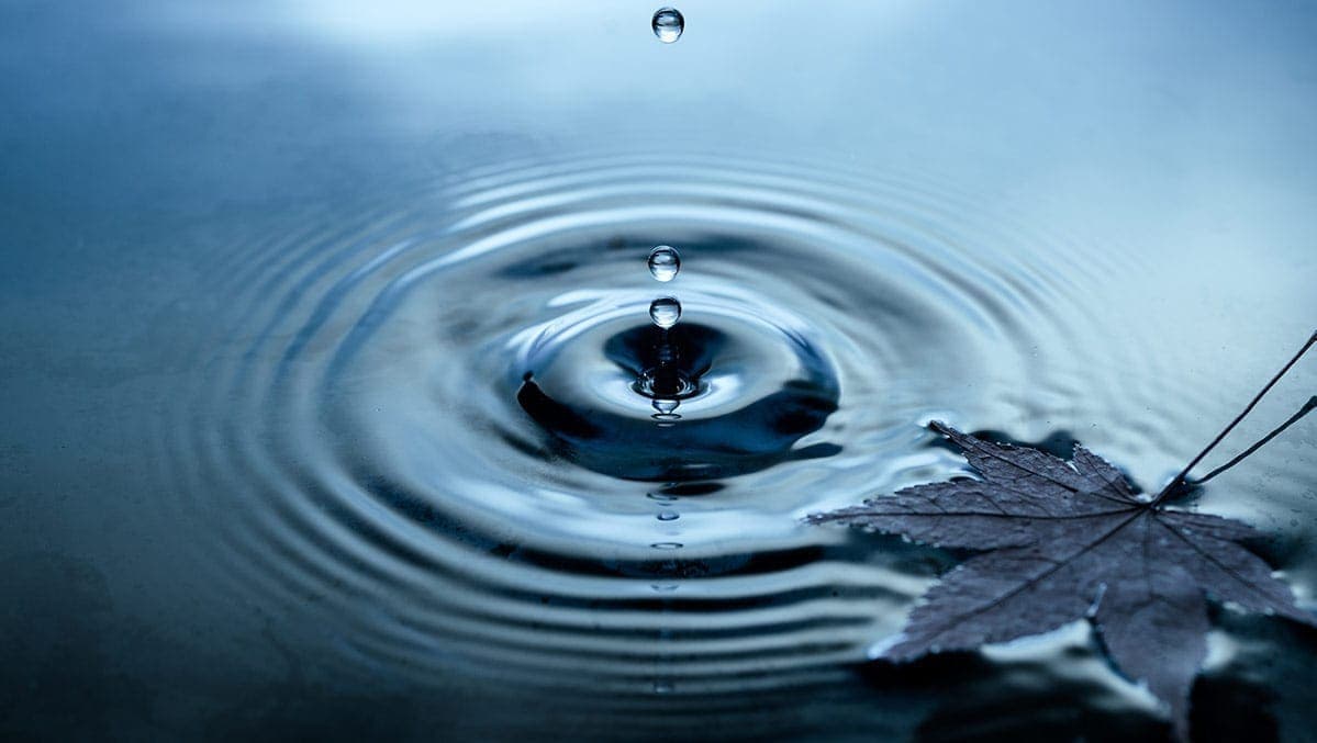
A pattern doesn’t have to be vertical or horizontal. You can find radial patterns in life. Everything from a ripple in a pond to a circular staircase. Toss in a leaf to disrupt the ripple, or add some people in the staircase, to create a break in the rhythm.
Use your imagination.
Composition is More Than the Rule of Thirds
The usual advice you hear about composition is to use the Rule of Thirds, look for Leading Lines, and that sort of thing.
It’s not wrong, but that advice is extremely limited. It doesn’t give you any indication of what elements or subjects in your scene will have an impact upon the psychology of your viewer. Let’s face it, some things trigger responses in the human mind. Proportion and rhythm are some of those triggers. We don’t consciously think about them when we see them, but their effect is still present.
If you’re familiar with the 10 Elements of Composition that I shared in this series, you’ll have plenty of options to consider when composing your next composition. Knowing how to create engagement or emotional response using these elements gives you an advantage over other photographers.
You may not remember all of the elements at first, but keep using them until they become second nature. You’ll spend a little time analyzing your scene before making your composition. Maybe you’ll try a few different compositions and choose the best result later when you review your photos.
Ultimately, you’ll be a more thoughtful photographer capable of creating photos that your audience will love.
10 Elements of Composition in Photography
This episode and blog post are part of a series we’re creating to expand upon this blog post.
As a list of 10 elements of composition, I thought the post touched on some useful ideas. However, I decided that it may help if we expand more on each of those elements. I hope this gives you some ideas to use in your compositions.