Affiliate Disclosure: We earn a commission if you purchase through one of our links at no additional cost to you.
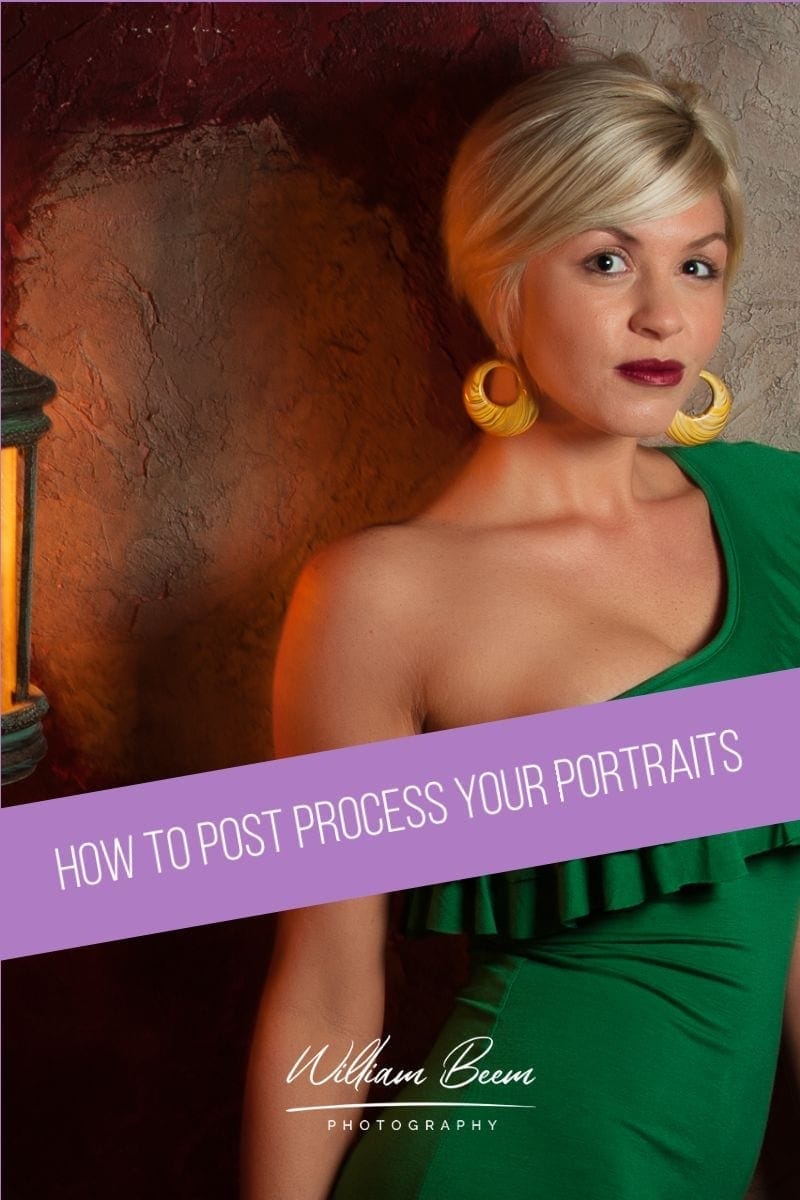
Once you complete your portrait session, schedule time to post process your portraits. Your subject is waiting on you, as well as anyone else who assisted on the portrait session. Also, don’t forget that your audience wants to see examples of your latest work.
The first step is to start editing your photos, which isn’t the same as post processing. Editing is the process of choosing the photos you want to post process and potentially share. My process is quite simple.
I assume every photo I took is crap, and then I look for some that prove me wrong.
In other words, don’t look for something to throw out. Look for photos that you think are great. The rest are crap.
Post Process Your Photos in the Right Order
If you want to post process your portraits in the right order, I have a checklist for Lightroom users that may help. Get a free copy of the Lightroom Portrait Workflow Checklist to save yourself time and get better results.
I discuss the order to use in Photoshop during the podcast, but here’s a brief recap.
Start with your cleanup workflow to correct Texture, Tone and Color – in that order. Then remove anything that shouldn’t be in your photo, and add anything you need if you’re going to do some composite work.
Next, move on to enhancing your portrait.
You can do skin smoothing, add makeup or any enhancements you need on a local adjustment level.
If you’re doing composites in your portrait, make sure the lighting sources are coming from the same direction. Next, add a color or texture across everything to unify the photo. If elements of your photos look like they have a different white balance or colors, the whole thing looks like a fake. Get some unity across the color spectrum.
Finally, work on drawing the eye where you want it to go with a vignette, radial filters, or just a pop of color.
Time Stamps
On today's episode of, I like your picture. We're going to talk about how to post-process your portrait and this is part of the series that we've been going through for the past few episodes. We're not going to talk about specific techniques today. This is going to give you an idea of what you're looking for, the things that you want to address, and maybe in a future session or another area. We can take a look at some specific details, but today we just kind of want to talk about the things that you need to be aware of when you're doing your portrait post-processing. I'm William Beem. Welcome to I Like Your Picture, the show that helps you improve your photography with visual storytelling. What is visual storytelling is a method of approaching your photography with a knowledge of who you're trying to serve with your photos and what emotion you want to make them feel. We encourage you to concentrate on your subject light and background to create a photo your audience loves. I'm glad you found us. Hi, I'm William Beem. Today, we want to talk about how to review your photos and choose your selections. We want to talk about what issues you want to consider for post-processing and also how you're going to enhance your story with post-processing. If you've been following along with our little mini series that were going on, how to come up with a concept for your portrait session and how to plan for it and deliver it today is the post-processing, so we're assuming that by the time you get to this section, you've already taken your portraits. Now everybody is waiting on you and that's, that's the fun part. You know, no pressure at all and I understand, you know, sometimes maybe this isn't your main thing and you've got a job and you've still got to edit at night or weekends. That's okay. You can tell somebody that it may take you two weeks to deliver as long as you set that expectation for your post-processing. I think communication is very important. The times that I get into trouble as well as always with family because I never set expectations with family, with anybody else. I said, yes, I will deliver this for you. It's very important to me. I will make sure that I get you your photos in a timely manner. Here's what you should expect with with my daughter. She says, I don't want to pose for you anymore. You never give me the photos. So no, she's not wrong. I, well, I have given her photos, just not all of them. Okay, so that's the first thing we want to talk about. How to edit your photos. When I say edit, that's the process of going through a selection. A lot of people use the word edit to mean post-processing. That's not quite what editing means. Editing is really picking your winners and discarding the losers. The first thing I want to tell you is never ever give all of your photos to anybody ever. And I mean unless you're all doing a work for hire and someone says, I'm going to take all the photos, I'm going to do the post processing, you just give them to me the card or the batch of photos and they're paying you for it. Fine. If you're working on your own or if you're doing it kind of as your own hobby. Never ever give anyone all your photos because you know good and well, there are photos in there that suck. Yeah. I've actually seen a lawsuit of wedding Photography. Yeah. And I'm sure there have been many. Um, basically the couple was unhappy with their photos and they wanted, I don't remember if they wanted some kind of rebate or what they wanted, but they were not happy. The sad thing is when they went through the photos in the courtroom, there were some great photos there. The problem is that he'd given them all the photos. Thank you. In his mind, he said he felt like it was a gesture that they could have the extras for themselves, not necessarily to share. They didn't understand this. And most estimates, remember the people who don't, who aren't into photography and don't really understand everything that goes into it are not aware that, you know, they look at a photographer and think that they assume that every single photo is great because that's what you show them. It never occurs to them that you might take a sucky photo and it happens to every photographer. I've been on workshops with professional photographers, very high end ones, and I've seen them looking at their own photos in the back of the camera saying, Oh no, I don't like that. I've got a reflection. Here are the, there was something that they were unhappy with. They never showed that photograph anybody. Because they want to maintain the reputation as a high end professional photographer and they only deliver the finished results that meet their standards. You're going to take a lot of photos that don't meet your own standards and that's okay. You know, I imagine the same thing is true with someone who's a sculptor. You know, you hit the hammer too hard, the chisel blocks off something. Okay, that's not a keeper. Yeah. And also I think, you know, you have to put yourself in the position of the person receiving or maybe their guests or their friends. As soon as you show somebody in a light that is not flattering. And I don't mean like literally, but you know you show them in a way that is maybe not flattering to them. They do take it very, very personally. I know there is a race director when we, when I do races, a lot of these um, race organizers have a photographer or if a crew of photographers to take photos of the rhinos during, you know, before, during and after the race. And there's one particular local group that does trail runs and something that I think is really a nice touch. There's cause these are not photographers. Once they've got the photos, you know, in from the photographers, they go through there and they check every single foot and what it was. There's a couple of thousand of them. It's not a big race but they make sure that anything, you know, maybe somebody's pulling a strange face or making a funny face or something. And I don't mean on purpose anything that might, that they think might be perceived as embarrassing. They don't show him. There was a concert photographer and I don't know who he was. This is something that happened a couple of years ago. I think he got a photograph of Beyonce that was unflattering and people went to town on the internet. You know, they changed her skin green like she was the she Hawk. And that that photograph should've never been released. Yeah. Terrible thing to be sending. Never ever want to release something that does not show your subjects in a good or flattering light. You can or really dislike somebody to release. Well, not only that, it's also your reputation. The photo you release that Is not up to your standard or the standard that you want to be considered is just a big mistake to release that photo. So my suggestion to you is when you're editing, don't look for photos that you're going to throw out. Assume that you're going to throw out all of them and then find the exceptional few that you're going to keep. Yes. And that makes it much easier for you because there's gonna be somewhere like, you know, maybe somebody's eyes are blinking or their expression just isn't right. The lighting isn't right. There's a shadow or something isn't quite right. You're looking for the ones that are almost stunning, and I say almost because you're going to need post-processing to fix some things, but if it looks great out of camera, then that's a potential keeper. Everything else, just figure that was like, you know, you're shooting throughout the day. You're not necessarily going to get everything. It's good to have a shot list when you've gone on your thing. So you know that say I have to get a good shot. If you're a wedding photographer, you know the standard shot list that you're going to be going at, but you're also going to know who the relatives are that are going to be important to the company. They're gonna want to see aunt Lisa, they're gonna want to see uncle Bob. They're going to see their parents on both sides of the family. Whoever is important to them at the wedding. You want to know that when you go into it and when you're doing your post-processing, you may be looking to see, okay, did I get a shot of the, obviously the couple did I get a shot of the relatives? They get a shot of a DJ if that's important to them as the wedding did I get a shot of the band? If they have that and all those little things, You want to make sure that you've got a decent photograph of those things, but now when you're in post-processing you can't do any more photography. You're looking to see did I get those shots, are they worthy of your reputation and those are the ones that you're going to mark as keepers in Lightroom. I just mark them as picks. Those are the ones that you're going to look for and everything else is just wasting space on your hard drive and Lee doesn't even put them on our hard drive, not tell him your process. I put the card in and I'll only import the ones that look like they've got potential. Now some of those are going to go as well, but to me there are, I make the thumbnails a little bigger so I can see what's going on more or less. But I do not import things where it is blatantly obvious that it's a fail or also sometimes you have like a series of, you know sometimes you take a photo and you think it's fine but you just take a few more anyways. One will do. Yeah, at one one will do it if the, maybe there's one that stands off. Honestly, as far as I'm concerned, the one that I didn't know was there because they didn't put it in. It's not going to bother me cause I don't know about it. So I didn't even go in and start picking it in Lightroom. I don't import things and then I narrow it down from in there. So yeah. From there I suppose I used a similar process. I didn't really use pics. I just kind of go through them and then once I'm looking at them kind of full screen sort of, I see something I go that's not fixable, I just deleted it without warning. You know what a pick is a quick and easy way to do it. You could use star ratings or you could use color labels, whatever you're comfortable with and that might Mark your workflow progress. So in other words, let's say let's to use stars, one star means, okay, this is my original, it looks like it may be good enough. And if you have four or five of the same subject of the same setting or scene, go into compare mode in Lightroom. And then you can start looking one by one. Say, okay, is this one on the left better than this one on the right? Pick a winner. And then keep comparing until you've gotten through all five of them. One of those is going to come out on top and then maybe you make that star rating too. Yeah, well let's use them differently. Well, everybody uses them differently. I mean if you look at him as like a form of quality, it's like is this a four star or a five star? It's kind of very, very subjective and you might change your mind when you look at him a year later, but if you used them as part of your workflow and you can do the same thing with color labels, he kind of says, okay, this one is better than that because I've already looked at all five of these photos that have the same kind of shot, but this one with two stars is the one I decided after going through compare mode is better than the other ones being a rating sites. Anything that gets five stars means a fabulous photographer. So I give all my things five stars because that's because we're fabulous. Look, a lot of people do use stars for ratings and I'm not saying that you shouldn't, I'm just saying this is an alternative way to use stars as part of your workflow. When I was working in amateur, I used color labels as part of my workflow. Anything that was red is obviously a reject. Yellow was the maybe in, you know, by the time I got to green, that's like, okay, I like that photo of us blue. Well that's, that's my blue ribbon award winning that goes to my portfolio. So you can use these, uh, either cuddled labels or star ratings for your workflow rather than as quality images. So that makes sense. It does. Let's say that you've chosen the ones that you're going to work on. Now it's time to go in and look at them for your post-processing. You've finished the editing, now it's time for post-processing. My thought is you work on correction first and then you enhance the mood or story afterward with ortho. You do. So I break down correction into texture, tone, and color. So the first thing I want to do is I want to look at texture. So for example, if I'm looking at a portrait of somebody, are there obvious blemishes or flaws on the texture that I need to take care of and I'll start doing that. You know, it's like if there are maybe some wrinkles that I want to soften, you don't want to. If you have, let's say an older subject, the older people have wrinkles. I mean I don't because I eat a lot of ice cream, but most older people have to have some wrinkles and if you go out and present a photo where you've eliminated every single wrinkle, they're going to look at it and say, that's not my grandmother. Or you know, that's, that's not this who this person is, but you can soften them. In other words, you could maybe take the healing brush, eliminate it, and then reduce your capacity of that layer down to 40 or 50% the wrinkle is still there, but it doesn't look quite so pronounced. Yeah. If you start sharpening and increasing contrast on lines on a woman's face, I can guarantee they're not going to be lining up as your friends and fans. I look at it this way with post-processing, particularly with portraits. I'm looking for texture and then I'm looking for tone and want to talk about tone. I'm thinking of contrast, highlights and shadows and that's a good way where you can kind of draw the eye. Where should something be brighter? Where should something be darker? What is the contrast? There are people who really like this washed out kind of look, I'm not one of them. No, but it has, I think there's a certain look that if that's your objective or your client's objective or you know, whoever you take the photos for, then it does work. I mean, there was a lot for a long time, people doing baby, toddler, maybe little children photos or it kind of, they wanted the light to everything and that washed out. Look, look, it has its place. I've seen it done very nicely. It's not my personal taste, but I don't dislike it. It's just the kind of doesn't fit with my kind of loud tastes. This, my issue as well is like I, I really like contrast both color contrast and tonal contrast. So I want things to be honestly kind of brash when someone's looking at my photograph. Yeah. There's nothing washed out and faded about my personalities. See, I start with, I don't start with those. Where do you start? I actually start with my, uh, with my white balance. Not because it's first on the Lightroom list because you know that I don't work in that order, but I actually start with the white balance because I didn't always do this, but I noticed at some stage when I was working on photos, but once I co correct any color cast, it's sometimes changes the appearance of the textures and I've found that by doing that first I felt like I could see what was going on. I'm not saying that it's a better way to do it, I'm just explaining why I still do that. Actually the reason I go with texture, tone and color is so that the changes don't affect each other because if I get a color the way I want to and then I changed the tonal contrast or even the color contrast is changing the color itself. Huh. That makes it look, that makes perfect sense. When we're talking about portraits here, I very rarely have people in my photos and if they are, they are definitely very rarely are the subject once it's a family snapshot or something. So I'm typically not dealing with skin and things. So there's, is there a different, would you do it differently if you were not doing portraits? So I'm not speaking about doing portraits here for myself. When I, when I made that mention, You know that's actually a good question because I do tend to look at texture and tone first because I'm so used to those changing color. If I do them after I've done my color, I don't have a single problem with doing the white balance, but I find myself having to go back and do that again if I've made some changes to the texture and tone. And also sometimes if my white balance is off, it just feels kind of creepy and weird processing the thing in with the color, just not quite right and I will go back and change a white balance, you know, as as properly initial workflow just because it, I want it to look normal before this distracts me and I want it to look in my mind what is normal before I go on and put on my own little artistic choices on it. But that's, that's the reason why I choose texture, tone and color in that order is because I found that has the least amount of rework for me to go back and do. Okay. Well don't take my advice. I mean it wasn't meant to be advice. I was just pointing out I do it differently, but it did occur to me, hang on a second. I'm not really dealing with skin and I think that skin is really the main thing and we're not, yeah, and we're not talking about doing any body enhancements yet, so not skin smoothing or teeth or hair or anything of that nature. I'm talking about these more global adjustments that I want to look at the full frame before I started going in for details, I'm fixing the texture, the tone, the color, and then the next step is I'm going in and removing anything that I don't want to be there. That's kind of backwards in a way from when I said fixing the texture. So if I say wobbly bits or, well, if I say fix the texture and I'm looking at a portrait, I'm talking about on the skin and removing blemishes, but I'm not talking about smoothing the skin. So when you start your UC working, you focus on the skin first and you deal with everything else later. Is that correct? Well, texture would also include hair. It would include any wardrobe or garments that they're wearing. And I want that to have the texture that I'm looking for. So if I'm looking specifically at skin fixing the texture or setting, the texture I want it to be is removing any blemishes that shouldn't be there. Now that's not to say that I would remove something that should be there. So if somebody has a mole or a spot that's, that's part of their body, that's, everybody knows that they have that. I'm not going to take that away. And just like Cindy Crawford has that mole on her cheek, you know, it's a little, I don't know why they call them beauty marks, but that's the thing. It's like if you take that away from her in Photoshop, people are gonna say you screwed up because that's who she is. You're changing who the person is. Then yeah, we're going to make some changes, but we're not going to take away recognizable marks that should be there. So I will fix things that are kind of temporary in nature. So if I were shooting a teenager and they had a pimple or something that's not going to be there for the rest of their life, it's not part of their who they are. I'm going to remove that. And um, when we get into color, um, if there's a bit of reddish, you know, stuff on their skin or blotchiness, I'm going to fix that as well too. But when I say after the texture, tone and color remove objects, that's where I get to the point like, okay, what do I not want of this picture? You know, if there's a guy in the background who's, you know, scratching his chin, he doesn't, he's not part of the story. I don't have a slightest problem with taking him out. And if there's, there's somebody photo bombing that's not supposed to be there, I don't have the slightest problem taking that person out either. And it's not just people, it's, it's like is there a fire hydrant in the way? Is there a bright reflective spot that in I can remove that. Yeah, because I want the photograph to look good for the subject. And that goes back to what I said in one of the previous episodes is the photograph isn't reality. It is a representation of something or somewhere. And if it's a representation, then I have artistic license to make changes that I want to. Yes. When you go back to people who are doing paintings, well the sky's not every day. If they're doing like their seaside Villa painting, they're going to paint the sky that they want to paint. That's true. And you know, it's like it may be stormy one day in sunny the next day and then cloudy of the day after that, they're going to choose what cloud they want. They're going to choose what light coming down. You know you have the time of day, they're going to make all those choices and no one ever goes back to a painter and says, Oh well you cheated. But they'll go to a photographer who replaced a sky and says, well that's kind of not really right because it wasn't like that when you took the photo. I'm not trying to mimic something, I'm trying to make a representation of the way I want to present it. And, and that's the way I look at finding issues for corrections. So if I need to remove something that was there, like, you know, a seagull, I, to me, those are rats with wings. I've had too many French fries stolen from me by seagulls. I don't want seagulls around. Enlist would not appreciate that at all. I am totally fine and I'll recommend make your portrait look good and if that means you replace the sky or you take something out that was there that shouldn't be there, I am a hundred percent okay with that. It's a representation of something. It is not a documentary. Yes, I will then go into body enhancements and that means no, that's possible. I don't really do that, but you know what? I will kind of draw off a little bit of weight. If somebody, one a really simple way to do that is not with liquefy, but you select the entire frame in Photoshop and you pull the edge in about 5% of the way and it really Slims down someone's face. It's that simple. It's not really cheating, it's just presenting someone. Well and maybe the way that you might remember them if you saw them in life because the photograph or they say the camera adds 10 pounds, and in my case it added more so I squeezed that photo in on the side. You're never going to see a portrait of me that I've taken that I haven't squeezed in just a little bit. Don't squeeze me. No, you don't need that. But yeah, I'll cheat if that's the word that we want to use for it. I will cheat. I will enhance eyes. So if I go into the Iris, I will brighten it. I will sharpen it. I will make it sparkle. I'll go in and lighten the eye. Whites never make eye whites actually white. Yeah. That's kind of scary. It's really creepy looking at, I say that because I've done it. Trust me. Every mistake that I talk about I have made. So that's, I'm trying to help you not make the same mistake. Same thing with teeth. Teeth are not actually white. There's a little bit of yellow in teeth. Well, it depends where you get them done, but yeah, that's true. Some people have more yellow than others, but even if you see someone that looks like they have perfectly white teeth, trust me, it's not perfectly white that there is a little bit of a yellow in there. You may want to paint it perfectly white and then lower the opacity so some of the yellow comes through. I get that there's different techniques and I'll go over that in the future episodes, but right now I'm going to enhance the eyes. I'm going to smooth out the skin, but not removing the texture. I'm going to whiten the teeth. Hair is one of the easiest things to really fix up because you can add highlights and you can darken areas very easily in Photoshop. If you add a layer, put it in screen mode, and then get your brush and just brush on the highlights of the hair. It'll look really weird when you first do this at a hundred percent and it'll look like it's just like white streaks all over the place, but then you lower the opacity down to about 10% and suddenly the hair just looks like, Oh, those are nice highlights and you can do the opposite if you want to add some darkness to the hair where it should have a bit more contrast and it just really makes the hair come to life and brightens it up. Very easy step. Then I'm going to go ahead and take a look at my exposure for what I want it to be. Overall, the background is typically not going to be as bright as my subject, so I'm going to make a global loop change if needed for the exposure on the background. And then I'm going to go in and, and it's not quite a vignette, but I'm going to go ahead and do the same kind of thing I mentioned using a screen mode layer in, just kind of pop on a little bit of brightness onto the subject's face or upper body and then lower that down so they just pop a little bit more off the background because then you have that contract. Total contrast between lightness and darkness. And those are the corrections I make. Lee, you're like you said you're not doing portraits, but are you making tonal corrections like that or, or basic ones before you go into enhancing things? Yeah, yeah, I guess I do. I think it's easier with the types of subjects I do. I mean food is not that hard. I also, I'm kind of lazy and post-processing. I don't mind taking my time, setting up photos and sets and retaking photos. But once I get to the computer stage, I want my pictures cause they're already on the camera and I think I'm just horribly lazy, like five minutes on a photo. If I'm spending more than five minutes, I'm, I'm going, okay, is this so bad that it's not worth working on or am I just gonna let it, you know, let it go as is and, and hang on to this one. So I do, I do make corrections on them, but I think it is probably easier when you're not doing it on. Yeah, I think so too. Because when I'm working on portraits, I will spend more time, honestly, the eyes are the ones that were, I'd do a lot of work because adding little color of boost and sparkle and enhancement to the Iris and removing any little veins in the eyes and adding the whiteness individually. Those things don't take that much time to do. But there's different steps and I can't use the same process for each one. There are plugin tools that will allow you to do a slider to kind of just fix the eyes all of a sudden. And I tend not to use those because they don't have my look to them. And that's really what's important to me is like, I'm not trying to get a generic look that anybody can buy. I've got repeatable processes that I can use in Photoshop and mostly I'll use those and we're not even talking about the next step, which is enhancing the mood or the story. Some people will go through and enlarge the eyes because it kind of draws you into them a little bit more. Not a terrible leap, you know, like big bug guide, but you know, just make them like, you know, 10 even 15% is probably farther than I would go. But if you make like 10% bigger than they were something about having those larger eyes just make someone more appealing. Well that's because there's always an innocent send, like an inviting warm look, connect to a baby's baby size. Her proportionately larger in their heads cause your eyes when you're born are the same size as they going to be for the rest of your life. Yup. And it's, it's interesting, you know that some little things like that that there's a bit of psychology to it, I guess behind it that people role react to it without thinking about it. You know, are these the eyes the real size or not, but you know it's something that is there and it's a way to enhance whatever you're trying to show with this person. When I talk about enhancing the mood or story, the first thing when I asked you is this a composite? In other words, have you taken at least two photographs and put them together and if those photographs weren't taken at the same time in the same light, that means that your lighting and your color are probably going to be a little bit off between the two. And the first thing that does is scream out fake. Let's say that you want to replace the sky. Okay? If the light is coming from one side on your portrait and then you put in a sky where the sun is on the other side, it just doesn't work. And see, someone may not even know exactly why it doesn't work, but photographers will, because they'll say the light's not coming from that source and it just looks fake. So if you're going to be doing a composite, keep in mind the direction of the light has to work for everything that you add. So in other words, if you're putting in a composite that you took at the zoo of an elephant and a tiger and a lion, which all those things shouldn't be in the same place, but you put them in the same place in somehow you sell that story. But if they're lit from different directions, that's not going to work and you're going to end up having to flip those things in Photoshop around to make them fit together. But the other thing you have to do is you have to unify the colors. And that means adding on a global adjustment that somehow puts a color cast over everything. Now it looks like it was in the same place. Yeah, and that's kind of the easiest way to do it. A lot of plugin tools have a way to do that. You can do it with a, uh, a filter, like a, a warming filter or a cooling filter, whatever you need in in Photoshop, there are some that are built in, there are places where you can buy filters and add them onto your story and then just kind of, you know, reduce the opacity so that it doesn't really show up so much. There's a color cast there that you've added but it to the eye when you just look at it, you don't necessarily pick up on it right away if you don't leave it to on. Some people will also use textures, you know, the backgrounds with different textures and they'll use that, wipe out the texture with the Garcia and blur and then put that over there, photograph to get the color from that texture. All those little ideas. The idea is to unify the colors and you've already made sure that you looked at the lighting and everything. So if you're doing composites, keep that in mind. But whether you're doing a composite or not, the last thing I think you really want to do is make sure that you're doing something to draw the eye. And that's really kind of like almost realizing the subject. So if you're in Lightroom and you use radial filters to enhance an area, if you use a vignette, those are things or tools that you can have to draw the eye. I like radio filters. How many do you use? I mean, do you just have one like on your key hero in your subject or do you have little ones that just kind of enhance? No, I typically I used to with food photos I instead of doing a vignette because I don't necessarily want my vignette in the center, actually almost never do. Even if my subject is more or less than the center, which sometimes it happens on purpose. Um, I still like to adjust the shape and um, placement of my oven yet. So I use two radio filters. The one is for the vignette and the other one is for my lights. And that also means terms. There's a slight overlap which might soften the one, you know, it just in that little overlap area. But I guess I just liked the flexibility of doing that cause the vignette just kind of slaps on, it's around the corners and that's it. I know it kind of keeps your eye from going off the edge, but it doesn't necessarily direct the eye where you want it. Well it puts, it keeps, you know, it makes the focal point in the center. And it's funny to me because Lightroom is designed for photographers. We would assume since you're working on photos not, and the vignette has over all these years in different versions and you know that they've gone through has never changed. It's always in that one place. And I mean yeah you can change the size and the feather, but it's still in the center yet at the same time, the advice to photographers most places these days is don't century your subject if you want it to be interesting. So I kind of don't know why you would want to enhance the center of the foot if you subjects not there. Cause I, have you ever found this? When you just slap on a vignette, your subject is not centered. And then what it does is it puts like dark, like it just kind of puts some shadow in the place that you actually want some light. And that's why I really don't use vignettes. The only thing that I think light room ever changed was they made the post crop vignette. So in other words, if you've got this big frame, you prop it down a little bit and then they made a vignette that works for that size. But it's still, it's enhancing the center of the area where you cropped it. Yeah. And as you said, most photographers know better than to put your subject dead center. There were times when you do that, but mostly I don't use the vignette in Lightroom. I will use a radial filter selectively where I want to draw the eye. And so my overall exposure will be just a little bit darker than what I wanted to be. Then I'll put that, um, or I mean what I want my subject to be. And then I'll put that radio filter on my subject. That's why I love radio filters. So knowing your subject really just, it kind of dumps you in the center of the photo. Whereas if you put your subject somewhere else or if you have your, instead of a vignette that's centered, which is really just a radial filter that's kind of got that more shadow on the outside, you adjust that. It actually draws the person to the foot and I'd rather have somebody drawn into my photo then dumped on my photo. Exactly. And I do know there are occasions where you want to frame something dead center. Absolutely. I was on a shoot with a guy who was doing a portrait of a model in the swimsuit. You know, we were doing a review and he was asking, all right, what do you think of it? I said, it looks like one of those old propaganda, you know, posters. Well he said, he said, that's what I'm going for. I said, you nailed it. And that was dead center. He got exactly what he was going for. It wouldn't have been my choice, but I understand that's what he knows. He had a purpose for it and dead center worked for him and she was very strong, very powerful looking woman and I think for what his intent was, it was perfect and dead center worked for him, but most of the times it's not what I would choose for a subject, but it has its place. It has its place and that's when, that's when you can use Lightroom's. Vignette. Yes. All right. We hope you've enjoyed this episode. Just to remind you of the little takeaways we went over how to review your photos and choose your selections. That's the editing process where you assume everything is crap until you find something that's not, and we've talked about you know, what issues to consider for your post-processing and how to enhance your story with host processing. We will see you again next week and we'll talk about how to deliver your photographs. Thank you so much for joining us on. I liked your picture. Episode two 18 so that means show notes are going to be available at please leave them there on that page. We'll be happy to answer them. And other than that, you have any parting wisdom? Have a great week. All right, everybody take care. We'll see you again next week.
Related Links