Affiliate Disclosure: We earn a commission if you purchase through one of our links at no additional cost to you.
Have you ever wondered what makes some photos pop while others are easy to dismiss? The secret to make your photos pop is understanding what the mind desires and rejects. You can understand how to make your photos pop with five simple steps.
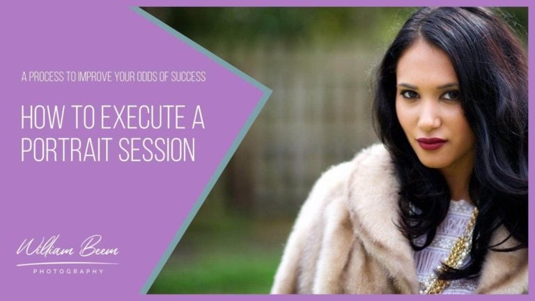
How to Make Your Photos Pop
What does it mean to make a photo pop?
A photo pops when it is interesting and stands out from the rest. It may be colorful or uniquely composed. Photos that “pop” are interesting and eye-catching. They stand out from the rest of the images in a gallery or on a webpage. This makes them more likely to be noticed and remembered.
Here are 5 steps to make your photos pop and get noticed.
1: Start In Camera
You would think this should go without saying, but I’ve been wrong before. If you want to make your photos pop, start with your capture. A few things should go through your mind at the point of capture.
First, do you have a subject? There are countless photos in the world with no discernible subject. People thought they found a pretty scene and took a snapshot. A photo without a subject will never have an element that pops.
Next, is anyone interested in your subject? Find something unique, interesting, beautiful or somehow engaging. It could be a person, a car or anything. It just has to be interesting to your audience. We’re not worried about the size of the audience right now.
If you’re taking photos to compete with your favorite beekeeping magazine, then you know you have an audience of interested people. It could be a small audience, but they still want quality photos. Start by asking yourself who cares about your subject.
Once you have a subject and know someone is interested, work on isolating your subject. How you do that is up to your creativity. You can go with a shallow depth of field or be selective about how you light your subject. Find a way to isolate your subject from the background.
Avoid competing with details. Your photo is about your subject, not all the crap surrounding it. Make sure your subject is appropriate in size to the background or complementary elements. Eliminate anything that you don’t need in the photo. Details outside of your subject are just distractions.
Your mind dislikes clutter. That’s why isolated subjects pop more than those competing with too much detail.
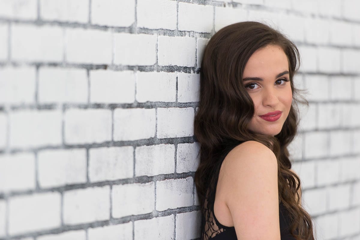
Take a look at the photo below of Elena. Beautiful girl for a portrait. I liked the lines on the wall to lead into her as my subject, but I also realized they could be a distraction. I could have lit her and let the wall fade to darkness, but I opted for a shallow depth of field. We had great ambient light in the studio from some frosted glass windows, so I decided to use that light.
Shooting at 200mm with f/2.8 softened the lines on either side of her, so your eye gets drawn to the sharpest part of the image, where Elena stands.

2: Fix Your Colors
Here’s the nice thing about photography as an art. It doesn’t have to be accurate. However, it does need to be consistent with itself. The human mind can accept things it knows is unreal as long as it has some logic. Otherwise, we could never accept a black-and-white photo.
There are several ways to fix your colors to make your photos pop. One of the easiest things to do is to correct your White Balance. There are numerous White Balance targets that you can use when you’re shooting. Hold it up in the same light you’re going to use to photograph your subject When you get back to your post-processing environment, such as Lightroom, use the White Balance eyedropper to select the target and set your White Balance for the photos.

Is your camera giving you weird, inaccurate colors in your photos? Avoid that issue entirely by using the Lastolite 12-Inch Ezybalance Card.
This helpful tool lets you set your camera's white balance perfectly, so you'll never have to worry about poor coloration again. Not only that, but the Ezybalance Card is also great for exposure control and creating accurate color rendition. It's collapsible and durable, so you can take it wherever you go, and it's easily cleanable too. Plus, it's double-sided with grey and white tones to suit your needs.
If you want to have greater color accuracy, use something like the Calibrite ColorChecker Passport Photo 2.

The Calibrite ColorChecker Passport Photo 2 is the perfect tool for avoiding frustration with poor colors in your photos.
The Portable Protective Case accommodates multiple positions for easy use with four specialized targets. You can create custom camera profiles based on your individual camera/lens/lighting combinations for DNG and ICC workflows. You can also create a custom in-camera white balance for a consistent white point across a set of images without needing to correct each image later.
The enhancement patches allow you to check and evaluate shadow details and highlight clipping, and the lanyard ensures that your Passport is always where you need it.
In a pinch, click something that looks like it ought to be color neutral. It may not be accurate, but it will get you in the neighborhood. I clicked one of the white bricks behind Elena for the image below.
3: Boost Your Contrast and Color
Let’s face it, this image looks pretty flat so far. Other than the shallow depth of field to isolate Elena, there isn’t much that makes her pop yet. Now it’s time to change all that with a little excessive editing.
I’m using Lightroom for the following edits. The truth is that I didn’t even have to select some of the most important values. Holding down the Shift Key and double-clicking the labels, Lightroom set the White and Black points for me.
It’s a place to start. You can still move them if you like, but I find they work well most of the time. You can do the same technique with Highlights and Shadows. For this image, those values didn’t change.
I moved the Contrast to +25 and also moved Vibrancy to +25. However, I didn’t bother with Clarity. For most of this image, I want a soft appearance. Clarity makes things gritty.
Sometimes, gritty is good. If you’re working with a subject that could use enhanced texture, crank up the Clarity a bit. Nothing exceeds like excess!
With these adjustments, we’re increasing the amount of information your mind has to separate elements of your photo. Rather than having one flat, homogenous mess, you’re starting to get definable elements.
Do you remember a face, or do you remember someone’s eyes or their smile? In this step, you’re enhancing the overall image. It’s like adding spice to a meal. You’re creating interest with useful information.

4: Crop Your Way to Success
Some people don’t believe in cropping their photos in post-processing. I’m not one of them. That’s not a knock on those who don’t choose to crop later. I don’t know their motivations. Perhaps that drives them harder to get things right in camera, and I don’t find any fault with that idea.
My experience teaches me that having extra room n your compositions is good. Several post-processing choices can mess with your perfect, in-camera composition. Not the least of them is Lens Correction. It’s a wonderful tool, but it eats up the edges.
There may be times when you want to tilt the composition later. You can’t always go back and re-shoot to get it right. Try as we do to consider everything at the moment of capture. Sometimes, we screw up. I know I do. Sometimes I need to fix a horizon line, or I decide later that another angle works better.
I can make the change if I have some extra space to crop. If not, I may end up with a throw-away photo that was close but not quite there.
Also, who says that you can only show your photos in the aspect ratio that your camera captures? I tend to prefer 16:9 aspect ratio for many of my photos, but I can’t do that at the moment of capture. I have to crop to get what I want. Who’s going to stop me?
Notice how Elena is larger in the image now that I’ve cropped the frame. Yes, you could shoot her closer in camera; in some cases, you should. If you didn’t, then crop away, so you bring her closer. She’s the subject, and that’s what the mind wants. Fill the frame with your subject.

5: Enhance The Details To Make Your Photos Pop
This is the part that can separate your photos from the masses. Pay attention to the details. Does your subject have a feature that should stand out a bit? Bright the eyes. Shine up some chrome on a car. Add some texture to a building.
It’s amazing how subtle details can affect your perception of a photo. Have you ever seen a bad composite where someone looks plastered on a background yet doesn’t belong? You know it’s a fake right away. It would take a very subtle shadow to make it believable, but someone skipped that step.
The brain rejects inconsistency. We know when something doesn’t look right, even if we don’t know what’s missing. If you want to make your photos pop, take some time enhancing the details of your subject. I increased the highlights in Elena’s hair below, brightened her eyes, and made her skin a tad warmer.
The warmth of her skin and the cool background tone is another form of contrast. It’s a detail that makes her stand out from the wall. Your selective edits to details add contrast and tension that the brain finds interesting. So tweak those details and make your photos pop into the mind of your viewer.