Affiliate Disclosure: We earn a commission if you purchase through one of our links at no additional cost to you.
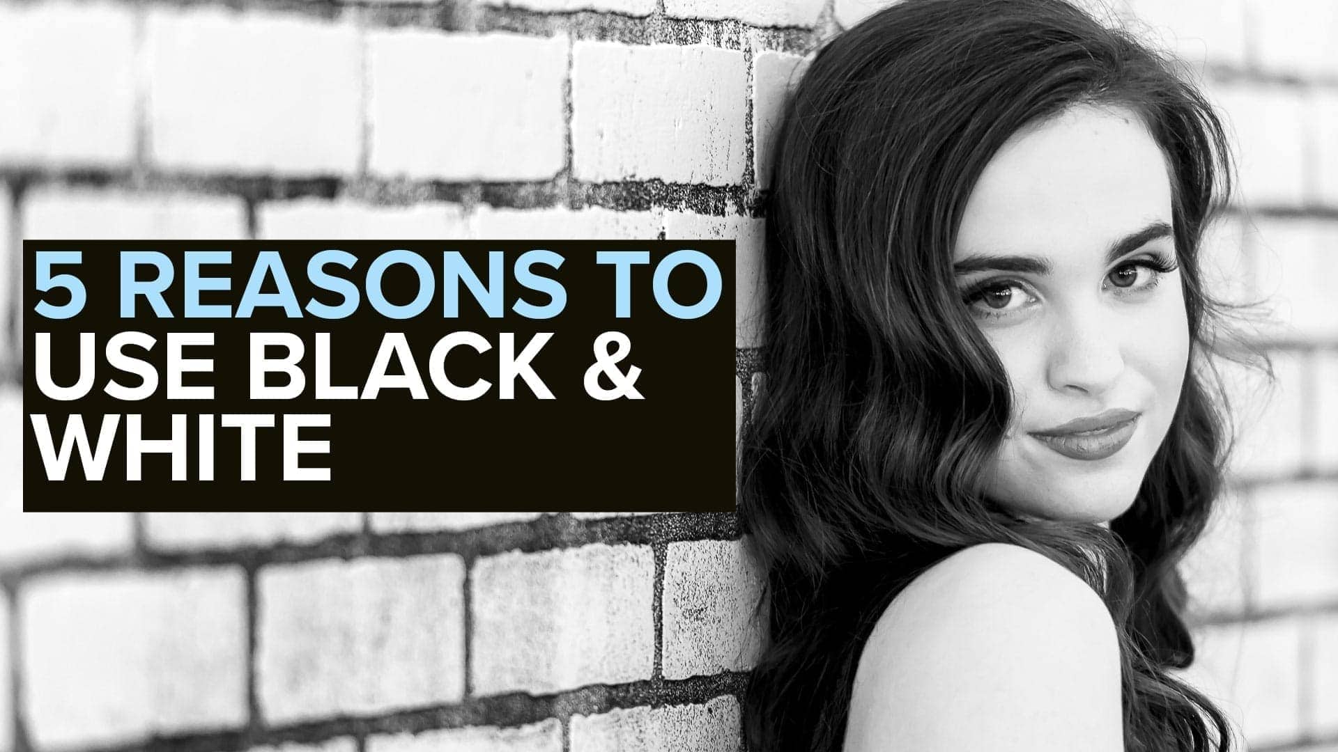
Converting to black and white is always an option, but when are the right times to do it? Check out this video to learn 5 creative reasons to convert to black and white.
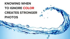
You Should Convert to Black and White When the Time is Right
Not every photo works well if you convert to black and white. The trouble is understanding when and why to use black and white, or any other monochrome, for your photograph.
In this video, I list five opportunities you should consider before you convert to black and white or enhance the color.
Before we get into those, there’s one more thing that I think works well for black and white photos.
Minimalism.
It’s not an absolute requirement, but I think that black and white photo conversion work best when you don’t have a lot of clutter or distracting elements.
Many of the reasons I list in this video are about eliminating distractions and telling a story. Don’t lose sight of those objectives just to convert to black and white.
5 Creative Reasons to Convert to Black and White
1: Change the way you tell your story
Change the dynamic of the photo to reveal the story in a different way than you see it in color. Photography is all about visual storytelling. We perceive photos differently when we eliminate color.
Black and white photography immediately enhances tonal range and contrast. More than that, we associate black and white photography with an older period in time. In effect, you can make your photo appear timeless by using black and white conversion.
2: To Reveal Texture
Black and white truly reveals the highlights, shadows, and tonal nature of texture. Use this with caution, as not all texture is desirable. You need to differentiate between desirable texture and background clutter.
If you’re looking at choppy waves on a lake or the ocean, black and white may accentuate the textures into a noisy cacophony of distraction from your main subject. On the other hand, a close-up on one wave may reveal textural details that most people miss.
Black and white could be the difference between fine art and a fine mess.
3: Accentuate Shape
Color is the enemy of shape, and I think, vice versa. Eliminating the distraction of color accentuates shape.
Why is shape important?
We think of the art elements as tools that are at your disposal. These elements answer the “What” part of your composition. As in, what are you going to put inside your frame? Here are a few examples.
People inherently recognize shapes. By accentuating shape, you’re going to attract more attention due to familiarity.
4: Fix Problems with the Color of Light
Sometimes light has conflicting colors that don’t work together. Unify your image with black and white.
Concert photography is a great example of this problem Stage lights often feature color and they’re moving all over the place. You may capture the lead singer in a great moment or pose, only to find there’s an awful red or green light on their face.
Convert it to black and white. Now people appreciate the moment instead of the color cast by the stage lights.
5: Show Tonal Range and Contrast
Tonal ranges and contrast flourish in black and white. Contrast changes how you perceive your subject.
People love contrast. It defines shapes and edges. Contrast differentiates between dark and light, shadow and highlight. Things are clear and comprehendible when tonal contrast gets amped up.
Black and white isn’t the only way to show contrast and tonal range, but it sure makes the difference in contrast very obvious and clear.
Recommended Software for Black & White Conversion
Silver Efex Pro is part of the Nik Collection. It’s a plugin you can use in Photoshop or Lightroom, and I think it’s the best tool to use for Black and White conversion.
The Nik Collection is a suite of eight plug-ins that will unlock your photographic potential. Use Nik Color Efex to apply stunning and imaginative effects with the world’s most comprehensive filters for editing color, tone, contrast, and more. Master the art of black-and-white photography with Nik Silver Efex, using a comprehensive set of darkroom-inspired controls and a refined interface to let you create stunning monochrome images.
Other tools in the collection correct perspective, apply to sharpen and provide many photographic effects to your images.
It works with Adobe Photoshop, Lightroom Classic, and as standalone software for Mac and PC.
Black and white conversion isn’t just a matter of desaturating a color photograph. In fact, that approach ruins the contrast within the photo. Using a tool like Silver Efex Pro gives you great results with simple adjustments due to the great options to make local adjustments to highlight elements in your photograph.
You also get presets for 20 different film emulsions, helping you recreate looks from your favorite photos.
Transcript
If you're taking photos with modern cameras, DSLR, or mirrorless camera, color is obviously the default and I love color. Most of the photographs I take are in color, but there are times when black and white is really a good choice, if not the best choice for your photograph. And that's what we're going to take a look at today in this video,
five reasons and opportunities to convert to black and white, that really make a difference. Hi, my name is William Beem. I'm a photographer in Central Florida. If this is your first time here, welcome. And if you've seen some of my videos before, welcome back. Thank you very much for coming back. Hope you'll enjoy this hope. You'll share this with a friend.
In fact, if you like it, please go ahead. Click like, subscribe and ring the bell notification icon. So you get more videos. What I want to do today is take you on a little bit of a journey. We're going to show you five reasons to convert the black and white, and some reasons why maybe color is the right thing for you.
But let's take a look and see what we can learn both about color and why black and white is sometimes the best choice. Let me start you off with this thought. Color deceives. And I mean that quite sincerely. There are times when colors, depending upon what other colors are next to will make you think that there's something that they're not. If you put different shades together and then take one of those shapes and put it against maybe a complimentary color,
the way you look at it is going to be different. It might have a darker tone. It might just seem different. And there are other circumstances where color doesn't look like what it really is. So one of the things about black and white is you're dealing with a monochromatic scale. And we say black and white, it's really monochrome and black and white would be from black all the way through the shades of gray to white.
You can do the same thing with other colors. So for example, if you want to create a monochrome with blue or red or anything else, that's quite possible, but for this video, we're going to stick with black and white. Let me give you a little thought about why color deceives. This is the quote from Joseph Albers. Every perception of color is an illusion.
We do not see colors as they really are. In our perception. they alter one another. That's kind of what I was just talking about. You can put colors next to each other and they will alter your perception of what the color really is. And there are other opportunities where color isn't quite what it seems depending upon maybe the ambient light or other circumstances.
So let's go take a look at a few examples. One of the reasons I love this photograph, this was shot just after dawn, you know, morning time at the Lincoln Memorial. I love the blue sky against the warmer, neutral colors of the Memorial. And I thought that this could work as the black and white, but to me, the color is actually what spoke to me. In this case,
color is not at all what it seems in the photograph. I've done some manipulation in Photoshop. First off the Spaceship Earth at Epcot doesn't actually fly like this. And it's not quite that shiny. I cropped this, I cut out some trees there on the side. This was a vertical photo that I flipped around to make it look like it was flying.
And I did a Curves adjustment. And that's what gave us the cool colors on the left, the warm colors on the right. It's also what made the dull and shiny opposite colors on Spaceship Earth itself. If you go to it in person, it's really just kind of a dull grey, but working with Photoshop to kind of change things around a little bit and made something that was based on something in reality,
but turn it into something that you're not going to see if you walk through in person. This was an opportunity where color really mattered to me. I was intrigued by the school girl walking along because her backpack straps and her school uniform mirror the car that was right next to her. I can convert this into black and white, but you lose the impact of the color because those tones just kind of muddy together.
What we see in color sometimes overpowers our sense of shape or tone. And in this case, this is kind of a sunset photo, and you can see the warm light showing up on the top of this gate. And it just really adds to the colors there. And these were times when I think color really mattered, but there are also times when you want to convert black and white.
In this case, I think it was the pink on her shirt that really stood off against both her skin and the neutral background. It was the case where color and her smile, of course, really made the story. Converting this to black and white, the tones of that shirt would kind of fade into what the background was. It just wouldn't work quite the same way.
So, the first item or opportunity you have for using black and white is to tell a story. Let's take a look at an example that I shot. This was what we call Dawn Patrol. When I took a trip to Cuba with several other photographers a few years ago, every morning we would get up before Dawn and we would want to take advantage of the empty streets and the sun coming up at the perfect time.
I kind of held back a little bit. We had just gotten started and left our hotel. And I thought, this is the story. This is a moment not about the architecture and not about the people, but about the journey that we were taking, getting up at this time and going off and to do something. And I thought this worked best in a monochrome or black and white environment.
This is the concert photo I took in downtown Orlando at a club a few years ago. And this guy was really getting into playing his keyboards. But the color photo didn't really work. Behind him, where you see black, there was actually a red drape and the stage lights on him were very yellow. It kind of made him look sickly and the colors just weren't really working for me.
Well, take the color away, concentrate on the tonal differences and you'd have a completely different story about what this guy's offering up to the stage and the audience. I mentioned Cuba. This is one of the gentlemen that was with us. Fun guy, and he really enjoyed his cigars. So we were in a little, basically a little girl's bedroom and a farm,
and he was sitting down and I took this outside of a window looking in, I liked the photo, but we went inside and I took this photo with the window light. And the way the gradation goes back and forth, I think works better in a monochrome or black and white, because then you see the tonal change. You see the ranges and it really adds a different kind of impact to a story.
Something else to keep in mind about black and white. Early photography was monochrome. There wasn't color photography at the beginning. And we kind of subconsciously think about something in the past when we look at black and white photos. So the idea here is this could have been taken at any time. You don't see anything here that really says this was taken in 2012,
2013, or even 1999. A photo like this could have been taken back in the 1920s or thirties and worked out just the same. Another thing that really works well with black and white conversion - texture. And again, it goes back to the tonal changes that you see in black and white. So this is the photograph in color, obviously, that I took of the subway in the Washington DC area.
I think it's called the Metro, but you can tell, I don't go to Washington DC that often. And I liked it pretty much for the converging lines, but mostly the texture of the ceiling above. But as I processed it, I realize there's some color changes that are going on there. And it just really didn't grab what I was looking for or wanted to share from this experience.
So I converted it to black and white, and you can see how the texture really stands out, how it takes you on a journey. And you can also see how it kind of helps the converging lines because in the previous version of the color version, the color was different closer to the lens and got changed as it went further from the lens,
those color changes were honestly, I'd say a bit of a distraction. And so was that sign, you know, what have you seen it with a little lizard or gecko over there? You take all that away. You take the color away, you can concentrate on the shapes. You can concentrate on the textures and you see a very different message. This one is a building in Las Vegas.
I think it's a Frank Gehry design. I think the Lou Ruvo Center for Brain Health. Don't get me. I could be wrong about that, but that's like, it's, it's an interesting architectural design. And it's made out of these little metal slates. Again with the sun, there were some different colors going on and they were distractions with what I really wanted to do was speak about the shape of the building,
the texture of the building. And that's why I think that a black and white conversion really helped this the most. We talked about textures and I mentioned shape a little bit. Shape is the good thing you show in black and white or monochrome. And I'm going to give you one more quote. This is from the same gentleman, Josef Albers. Shape is the enemy of color.
And you can turn that around. Color is the enemy of shape. Each distracts from the other. Well, let's take a look at this. This again is Spaceship Earth at Epcot, and I love the colors here. They project this at night. You see the warm colors and then they softly change the cooler colors. And you concentrate on the colors because that's what just really grabs attention.
Your brain is going to look for light and changes in light. And that's exactly what we're seeing here. But if you eliminate those colors and you look at the tonality, you still see light, but you're not distracted by the colors that are showing up there. And you perceive these shapes, these textures in different ways. Of course, light is important to every photographer.
We can't do anything without it. But light comes with a variety of colors or variety of attributes that sometimes get in the way of what you're really trying to say. Well, let's take a look at this one. This is the concert photograph. And on the stage, there was a red light that was moving around and all the colors on the stage and the lights were moving around.
When you were in the audience, that's great, very dynamic. And of course the stage lights are geared for the audience. When you're a concert photographer, well, you get a still image. And if I captured him like this, then that's the way he looks forever. Unless we go ahead and convert black and white. Now suddenly the story changes.
It's not about a guy with red light on his face. You see details that you probably didn't notice before. If you look at the drum kit and see how it sparkled. You can see his face. You can see the microphones and everything else in the background in a different way. So by eliminating color, we've actually brought out our subject. This is another example,
obviously in Las Vegas. If you've ever been to this spot or seen video of it, you know that there are a lot of colors here. The Eiffel tower is kind of filled with yellow light. The Flamingo logo is hot pink. The balloon for Paris blue, the buildings are yet another color. There's just so much color there that you can't really concentrate on
any one thing. Converting it to black and white creates unity. You're not distracted by colors anymore. The whole image is unified with this monochromatic theme. Lights become light rather than different colored lights. And sometimes that is the best way to take a scene and bring it out so that everything is as important or equal to others. And yeah, maybe you concentrate on the balloon or the Eiffel tower.
The Eiffel tower is actually kind of what I was concentrating on here, but you're not distracted from your main subject based upon the light and change color in other parts of the scene. Converting to the black and white is a wonderful way to accentuate contrast. And if you've got a scene where you want to show the contrast more than anything else, this is a good opportunity to convert to black and white.
But let's take a look at this. I've got a portrait, lovely young woman here, and the lines lead you right into her. The photo is I think, great, just as it is, it shows who she is. It draws you into her, but what happens if you convert this? Suddenly, you've got a very different story. She becomes part of her environment and her face and the skin tones change and the hair is a bit more structured and it's still compelling.
I wouldn't say that one is better than the other. In fact, I'm not trying to tell you that black and white is better than color or vice versa. They're both useful. They're both interesting. And I think you should use both of them, but there are times when maybe when you convert to black and white, you accentuate part of a story that gets distracted by color.
So here's another one. A lovely model. She's got blonde hair, she's got skin tone. And of course the top is kind of like a cream color. But they're not really matching color. Convert to black and white. And suddenly you've eliminated those distractions and you concentrate on her. Concentrate on her face. You concentrate on her flowing hair and the light that's falling on her.
It really changes the story for this photograph. All right. So we've talked about the five reasons why you may want to consider converting to black and white, but I want to give you a little bit of advice about conversion. It's not just a matter of desaturating, your photo and think. Okay. It's black and white. I'm done. Matter of fact,
desaturation is probably the worst thing you can do to convert your photograph to black and white. But let's start off here and show some examples of different conversions of black and white. So this is our color photograph. It'll nice colorful. You can see the emotion on her face, but if you take a closer look on her hand, you can see a bit of a purple state light.
You can see that on her hair. And it adds a little bit of a distraction. We convert this to black and white and suddenly we don't have those distractions anymore, but we've got new issues to deal with. Is that the skin tone that we want to show? Are we highlighting or darkening areas of her clothing or hair? Well, we can change how that looks. A different process.
You notice her hair shines a bit more. Her face is brighter and stands out a bit more. The t-shirt logo stands out a bit more. We go to another one and we really dark in the background. We've darkened her clothes. So it's kind of accentuating her face, but not so much anything else. It really depends. Where do you want to send attention?
And what total contrast range do you want? Here, again, this is yet another conversion and we brightened things up in some places. Her skin tone, I think, looks better. The logo comes down, but she's not overwhelmed by the background. And then we change it again and we get yet another conversion. In this case, her skin tone changes. Honestly,
this is not my favorite one for her skin tone, but it shows that you can't just necessarily do one conversion and then call it a day. The way that you handle this by using different filters. And by that, I mean different colors, for example. You can tweak the yellow saturation or luminance to change her skin tone and other factors, you know,
the shirt has some red in it. You can change the red luminance and saturation to change that. Same thing with the background and it was kind of a purple color. You might want to change the magenta. And that's really all I wanted to share today about how to take a look at color photos and converting them black and white. And when you may want to do that,
Hey, thank you so much for visiting here today. I hope you enjoyed it. If you liked this, please remember go ahead, click like that. Lets YouTube know if I'm doing something right and it'll share this with more people, click subscribe if you want to see more videos like this and hit the bell notification icon. You'll get a notice the next time I come out with another video.
Thank you so much. And let me know if you look at these different color conversions or the different reasons we're converting to black and white. Let me know the reasons that are important to you. Is it going to be color, contrast, tone? Is that going to be some different type of processing that gets you there? So let me know in the comments below what your favorite is and then I'll get any questions about converting to black and white or about the reasons to convert to black and white.
Let me know there. I'll be happy to try and come back and ask you. Thanks so much. I'll see you in the next video.
Related Links