Affiliate Disclosure: We earn a commission if you purchase through one of our links at no additional cost to you.
Looking for new ways to improve your photography and tell better stories without relying on new gear? We’ll share how you can use color to create better photos by understanding a few key principles.
1: Understand how colors make you feel
2: Learn how to find colors that work together
3: Learn how to create visual depth with dominant and receding colors
Learning how to understand how colors make your audience feel gives you an extra power when creating and composing your photographs.
Colors Evoke Feelings and Emotions
Imagine you’re walking in a hallway. The lights are filled with sodium vapor and they emit a sickly green color. Other people pass you in the hallway, but their skin doesn’t look quite normal to you.
How does that make you feel?
Now imagine you’re in a bar filled with people talking, drinking and dancing on the main floor. Red and Yellow lights flash all around you. Again, the skin doesn’t look normal, but it’s different than those you saw in the hallway.
How does that make you feel?
Finally, imagine you’re at a ski resort. It’s cold and snowing outside, and the colors seem to have a light blue tint to them. You’re about to slip into a hot tub, with a deeper shade of blue water.
How does that make you feel?
In each of these little vignettes, color is a subtle part of the story, yet it can have a major impact upon how you perceive the environment. They may make you feel sickly, warm or cold.
Colors tell stories because we associate feelings and emotions with them. Understanding how those colors make people feel, and then using them in your story, gives you enormous power as a photographer.
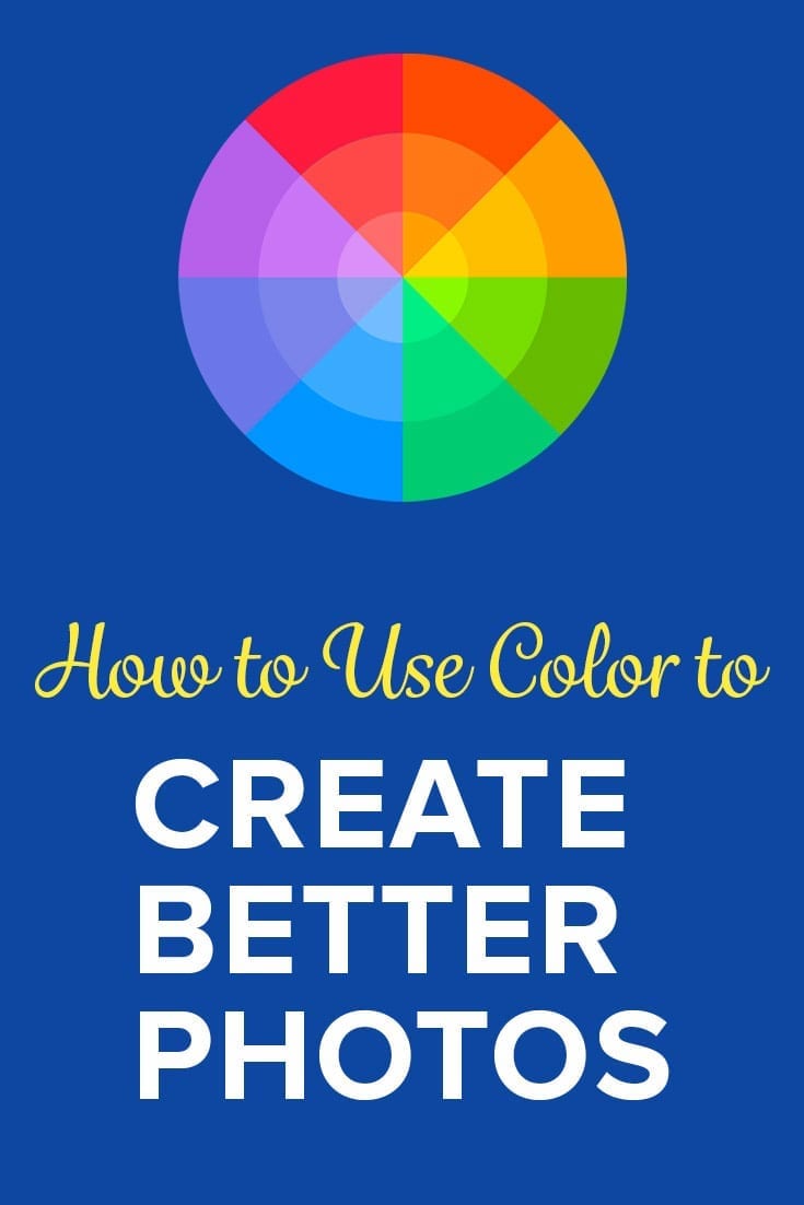
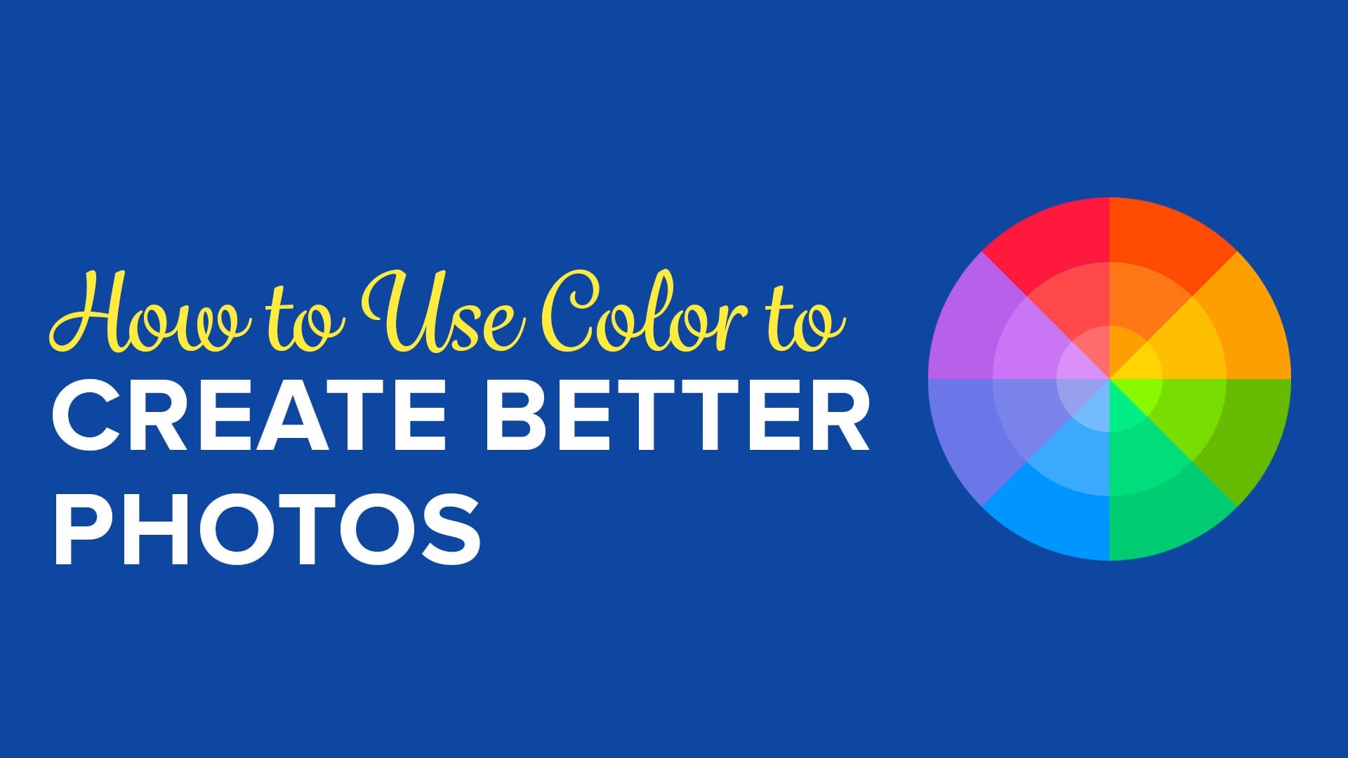
Why Use the Color Wheel?
If you don’t have a color wheel, relax. Adobe has a free color wheel for you to use.
Why do you want to use a color wheel? Because it’s a great way to show the relationships between colors, and it helps keep you from mixing colors that just don’t work with each other.
The most common color relation is a Complementary relationship. Complementary colors are opposite each other on the Color Wheel.
Think of combinations like Red & Green, Purple & Yellow, or Blue & Orange.
Triads are another relationship. Rather than being opposite colors, the colors in a Triad appear in equally distant thirds on the wheel. You could see a combination of Pink, Cyan and Yellow as a Triad of colors that work together.
Red, Green and Blue (RGB) are a Triad that form the Primary Colors of Light.
Analogous colors are those near each other on the color wheel. You can also use Monochromatic or Shades of the same color by adding white (Tint) or Black (Shade) to create related colors.
Understanding how colors relate to each other can help you create contrast or symmetry with color.
You can use these colors either directly with objects in your composition, or also by using Color Grading to subtly influence your viewer’s emotions.
Dominant Colors vs Receding Colors
Warmer colors are Dominant colors. These are the colors that you typically want in your foreground, or as your subject. They tend to stand out, particularly in front of Receding colors.
As you would expect, colors with cooler temperatures are Receding colors. They make excellent backgrounds for Dominant colors. They’re non-threatening and provide good color contrast for Dominant color.
A good example for portraits would be using a Cyan or Teal background for your subject. A person’s normal skin tone will pop out against those receding colors. If you’re lucky enough to have a red-headed subject, they’ll practically jump off the photo with added depth and dimension.
You’re probably already familiar with this combination, as it’s used in almost every Hollywood movie poster – Orange and Teal/Cyan. It’s the “go to” color grading concept for countless movie advertisements and posters.
However, you don’t need to use this only with portraits. Imagine how well a Red Bell Pepper stands out on a background of Greens.
You can also use neutral colors to Recede against Dominant colors. Picture a Red car against either a White or Black wall. It still pops and the background doesn’t compete with your subject.
How Do Colors Pass on Information?
Think about some of the information we get from color.
The right colors can make you think about the seasons of the year. Cool colors happen in Winter. Warm colors come with Autumn leaves. Spring brings out the green and all the flowers of the season. Summer is bright and bold, typically with Blue water and Yellow sunshine.
Yet colors also tell you something about people and how they live. Visit towns like New Orleans, Havana or Portofino to see how they use color around them every day. Santorini features white buildings with Blue roofs.
Yet when you visit a major city like London, New York or Chicago, the colors of the buildings seem a bit drab.
Some cities, like Las Vegas, come alive at night with colors from signs on Las Vegas Boulevard. Yet those same places seem very different during the daylight hours.
You can use color to set a mood, let people know about the time or season, and much more.
Why do you think insurance companies charge higher rates for people who drive Red cars? To be honest, they don’t base the rate on the color. That’s a myth.
However, there is some statistical evidence to suggest that people who drive red cars get more tickets than others, which can increate their rates. Why are they getting more tickets? Either the Red color is inciting them to drive a bit faster or more aggressively, or the police perceive them to do so.
Either way, Red is expensive. Auto makers even charge more for Red cars.
How Do Colors Tell Stories?
So what’s the story? Are Red cars faster or more aggressive? All those tickets can’t be wrong.
You can use color to help tell stories with these ideas:
- Draw the eye to something significant
- Set the tone of your story
- Evoke emotions in people who see your photos
- Inform viewers of character traits in portraits
If you see a guy wearing Red with horns, you think of something evil. Do you feel a sense of sadness when you see a group of people wearing Prison Blues? A Purple cloak gives someone a regal flair, and is also a bit mysterious.
Think about how color affects your life and your understanding of things around you. Then you can use color to tell your story in photography.
Subscribe to The Photo Flunky Show
Thank you for listening to The Photo Flunky Show. Make sure you get every episode by subscribing.
iTunes – https://williambeem.com/itunes