Affiliate Disclosure: We earn a commission if you purchase through one of our links at no additional cost to you.
You can streamline your post processing workflow using color labels to mark your progress. Here’s a quick post to show how it works.
Why Use Color Labels?
I’ve been using this method for a few years now, but I’m surprised that more photographers haven’t stumbled on to the benefits of color coding their post processing workflow. It’s very simple, easy to setup, and it works in either Aperture or Lightroom.
One of the reasons I prefer using colors is because it’s much easier to recognize a color label on a grid of photos compared to using stars or keywords. The human mind can easily identify colors and correlate them to a message. That’s all you have to do with Color Labels to make them a simple tool in your workflow. You’ll be able to identify your images at a glance – this one I haven’t reviewed yet, this one I want to process, this one sucks so bad I can’t get it to the trash can fast enough!
You could use Star ratings for a lifecycle status, but it’s not as visually striking as a color. Can you be sure if you saw two stars or three stars in a quick glance? Now compare that to a quick glance of Red and Green labels. For most of us, the brain will identify different colors faster than a number of the same character.
How to Use Color Labels in Post Processing Workflow
Of course, I’m not talking about using labels or stars as a rating system. Instead, I use them to mark my progress in a defined workflow. Here’s how I have my Color Labels defined in Aperture.
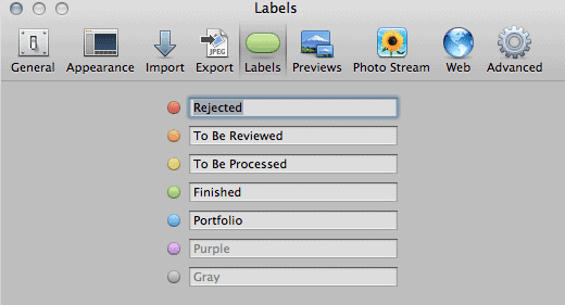
I started by using a simple Red – Yellow – Green workflow. It wasn’t long before I discovered I needed to include Orange and Blue. The idea is to use Color Labels as states in the lifecycle of my post processing workflow. Here’s how it works:
- All photos get imported as Orange – To Be Reviewed. I don’t know if I like them or not until I review them, so this is the first state. It’s like going through the Customs office at the airport. You can be accepted or rejected.
- The next state depends upon your evaluation of an image. Some are easy to reject. Blurry, bad composition – basically anything that makes you go “Ack!” when you see it. Reject it. If you think it’s nice and you want to do more work on it, promote it to Yellow. Later on when you’re in the mood to process a few images, you can do a quick search for the Yellow Color Label and start processing. If you can’t decide, leave it. Of course, that means you’re going to eventually come back to this image to evaluate it again. Don’t be afraid to reject something if it doesn’t jump out as a keeper.
- I tend to do my post processing in one sitting when I want to finish an image, so I don’t have a state between To Be Processed and Finished. If you want, feel free to use another color to represent In Process status.
- I may finish a lot of photos, but they aren’t all going to be Portfolio images. That’s why I added the Blue label – sort of like my Blue Ribbon winners. These change from time to time, just as you would revisit your portfolio on occasion.
My post processing workflow may not be the same as yours, but you can still adopt the idea of using Color Labels to represent a state in the lifecycle of your workflow.
Happy Independence Day
Tomorrow is Independence Day, so I’ll offer my obligatory USA Flag photo today. The nice thing about wandering through the US Capitol is that they have no shortage of flags on display – as it should be.