Affiliate Disclosure: We earn a commission if you purchase through one of our links at no additional cost to you.
It’s easy to produce overwhelming colors in HDR processing. You get some crazy colors out of Photomatix and other tools. Now how to you bring them back down to Earth?
Photomatix has more tools now than when I first started using it, but it’s still not the end of your HDR processing. Those crazy, grungy results it produces were all the rage a few years ago, but now they look about as cool as those neon butt-hugger shorts people wore back in the ’80s. The world doesn’t always look electric and grungy. Maybe your photos shouldn’t be electric and grungy, either.
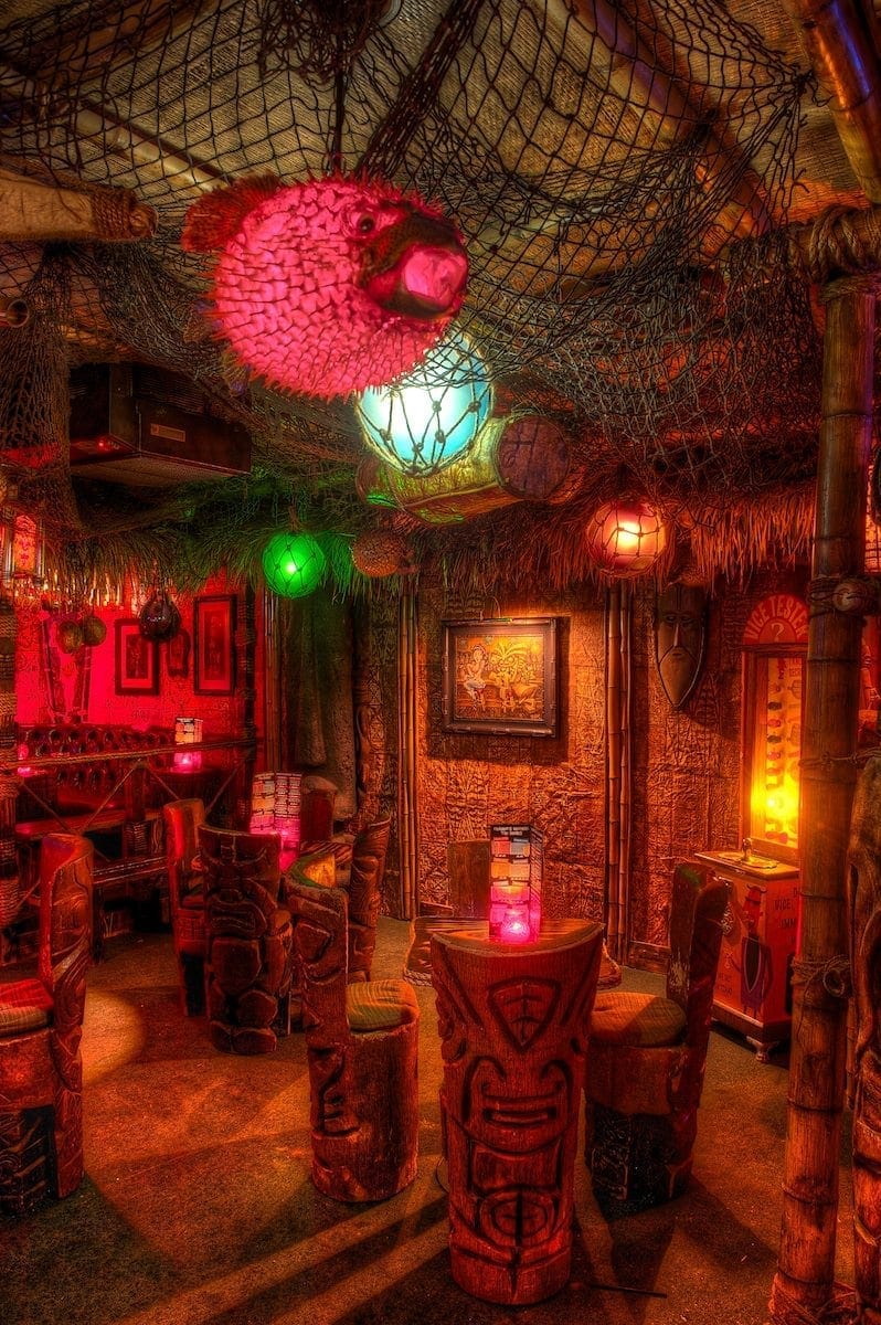
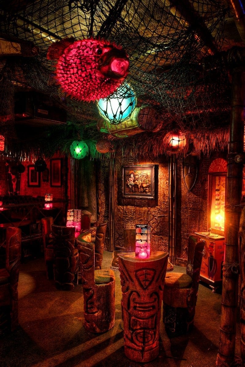
I think everyone goes through this phase. I’ve made every mistake in HDR that others have warned me about. Little by little, you start to recognize those things and make corrections. Then you occasionally get a scene like this one that just throws all the rules out the window. What happens when you’re in a dark room with multi-colored lights?
Photomatix goes crazy, for one thing. Here’s an example of the least objectionable result I pulled out of Photomatix for this shot inside of Frankie’s Tiki Room.
Dealing with Overwhelming Colors in HDR
Despite having a number of differently colored lights in the room, Photomatix decided to give the image a pretty strong red cast to the image. The wood doesn’t look quite right and neither does the floor. It’s not really something you’re going to correct with a White Balance, though. There are a few ways that you can bring the image back in line with reality.
1: Blending Original Exposures with Layer Masks
I know a lot of photographers would love to shoot their HDR skipping every other stop. In other words, they only want three images from a 5-stop range, the -2, 0 & +2 exposures of a bracket. For Photomatix processing, those are likely the only ones they need. The place where I find fault with that wish is when it comes to finishing the image in Photoshop. Sometimes I need to blend part of a photo from one of the originals, and I find that the -1 or +1 are often more useful to me than the -2 and +2 exposures.
When I blend in areas from those exposures, I’m doing two things. The first is selective control of exposure on a given part of the image. Photomatix still works on a global scale, so I get the best average from it that I want. Then I go back and pick the best parts from the original exposures to touch up parts of the shot. Sometimes I may only need to use one exposure, but it’s useful to have every shot in the bracket for some images – like this one.
The second benefit of blending is bringing in the original colors that I captured. Sometimes I’ll process those in Aperture or Adobe Camera RAW, but quite often they’re straight out of the camera. Photomatix can add a color cast when blending a scene with multiple light sources, so the original exposure brings me back from the overwhelming colors in HDR that it produces.
2: Blend a Black & White Layer with Soft Light
I’ve mentioned this before as a trick I learned from the Concert Photography course I took at Photoshop World. Got crappy red light on your subject? Eliminate the color and you can use the photo. Just convert it to Black & White.
I did the same thing here by adding a Black & White layer in Photoshop. I tweaked the various colors to make sure the Red, Green, Blue, and Orange lights each had their own shade. Then I switched the Blend Mode to Soft Light and dragged the opacity down to 40%. That killed the strong red color cast on the rest of the image by adding a neutral element. It’s also good for adding contrast.
Don’t Stop There
Those two steps are there to get control of your image, but it’s still not the end of the road. Now you still have to go back and evaluate the whole image. Add some sharpening, add some glow, use a vignette or whatever you want to direct the viewer’s eye. Everything up until this point is just prep work to tame the overwhelming colors in HDR, but you still have to finish your photo.
Tiki Table for Two
Frankie’s Tiki Room in Las Vegas is one of those off-strip places with a little kitsch and some friendly folks inside. It’s worth a visit because they always offer free rum tomorrow.


Interesting, while you use B&W to tone down the grunge factor, Joel Grimes uses a B&W layer to up the grunge (maybe we should call it hardness) of the image. B&W a multi-tasking tool.
True, you can use B&W to add contrast. The key, at least for my work, is how you define the B&W image before blending it in with your image. You can tweak it to change the color tones, which can bring its effect toward a smoother or grungier result.
William, have you tried generating a 32-bit TIFF image and editing that directly in Adobe Camera RAW? You have access to all the sliders you normally would with a raw image, but you can generally crank some of them (such as Clarity) more than you could with a NEF. Also, you’ll note that some sliders have gained super powers. One example is Exposure, which goes from the five-stop range in either direction to a 10-stop range. You also have the full range of presets available in White Balance, despite it being a TIFF. You can make these files using “Merge to HDR Pro …” in Photoshop, or Photomatix can make them. Photoshop seems to give better results when fed RAW files than TIFFs generated from RAW files, and sometimes I get better results when I give it just the 0, -2 and +2 exposures than if I give it everything from -4 to +4. Quirky. Sometimes I get better results out of Photomatix. I do shudder to think what the size of the Floating Point TIFF would be from files shot with a D800; my D7000 RAW files result in a 32-bit TIFF that averages around 125MB (and that’s using LZW compression). But hey, you have to occupy some hard drive space to make real mayonnaise, I suppose. Anyway, this gives you a new look for HDR. Try it, if you haven’t already — best thing is that you don’t have to alter your shooting routine to accomodate it.
Sure. In fact, here’s a link to my coverage of creating a 32-bit TIFF. https://williambeem.com/how-to-create-a-32-bit-tiff-with-hdr-pro/
Although I like this technique, it’s just one tool and isn’t always appropriate for every scenario. There are plenty of times to choose Photomatix over a 32-bit TIFF, and vice-versa. Each has its own distinct look. Sometimes you want an image to have a look that requires a specific tool.
Okay — I agree completely, by the way. Nice to have another good tool in the toolbox. Sometimes I wind up making an image two or even three different ways and blending the results. I probably read your earlier entry on 32-bit TIFFs and forgot you had covered it — I’ve encountered an interesting mix of those who know the technique and those who don’t. Figures, since it is relatively new.