Affiliate Disclosure: We earn a commission if you purchase through one of our links at no additional cost to you.
How do you know when to choose black and white for photos? There’s a certain amount of personal taste, of course, but some photos lend themselves to monochrome.
I am definitely someone who loves color, often to a fault. Some of my photos virtually smack you over the face with their color. That’s a technique that can draw some criticism, but I don’t care. There’s someone to criticize everything, so you may as well do what makes you happy.
When I pull out my camera, I don’t consciously think “This is going to be a black and white photo.” Some photographers work that way, but not me. Nor am I thinking about which colors I’m going to amp up later in post processing. The truth is that I just don’t know until I’ve loaded the images on my computer.
When to Choose Black and White
There are a few things I’ve learned that can help you if you’d like to work on more black & white photography. Some of them may surprise you.
1: Low Contrast Light
When you have boring, grey skies, start thinking about black & white. Instead of thinking about colors, you start to think about tones. Look for your range of light and dark tones, even if they’re different colors.
2: Bright Colors
This may sound counter-intuitive to some, but exaggerated colors often work well in black and white photos. I’ll go as far as to amp up the Saturation (yes, the hated Saturation slider) to prepare a photo for black and white processing. While the colors may look garish, you end up with more tones to stand out in your black and white photo.
3: Light with Crappy Color
This is a tip I learned from Alan Hess and Scott Diussa in their Real World Concert Photography course at Photoshop World. Sometimes you’re going to take a photo of a performer and there’s an ugly red light splattered on their face. Nobody looks good in red light. So make it a black and white photo. You’re no longer distracted by the color and you can pay attention to the subject. If the only thing that’s bad about your photo is the color, eliminate it.
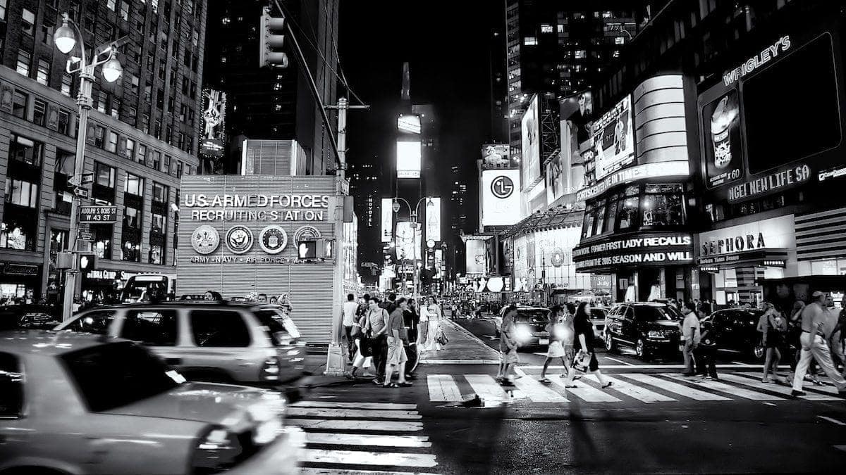
4: When Color is a Distraction
I really love to use color to direct the viewer’s eye, but sometimes there’s just too much of it. When color attacks your sense, converting to black and white can slow things down and let your viewer take time to find little pieces of your image. That’s why I decided to choose black and white for this photo of a New York City street photo. There’s too much going on, lights all over the place and color that demanded attention. That’s great if color is your subject, but sometimes you want to tell a different story.