Affiliate Disclosure: We earn a commission if you purchase through one of our links at no additional cost to you.
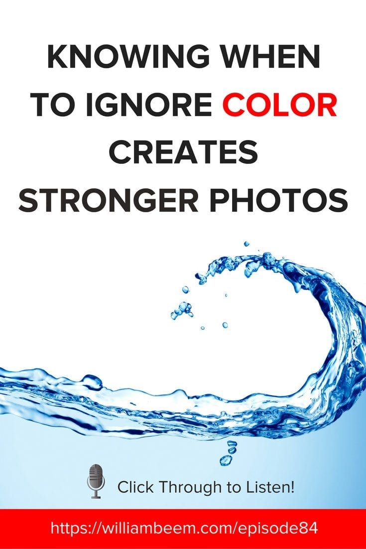
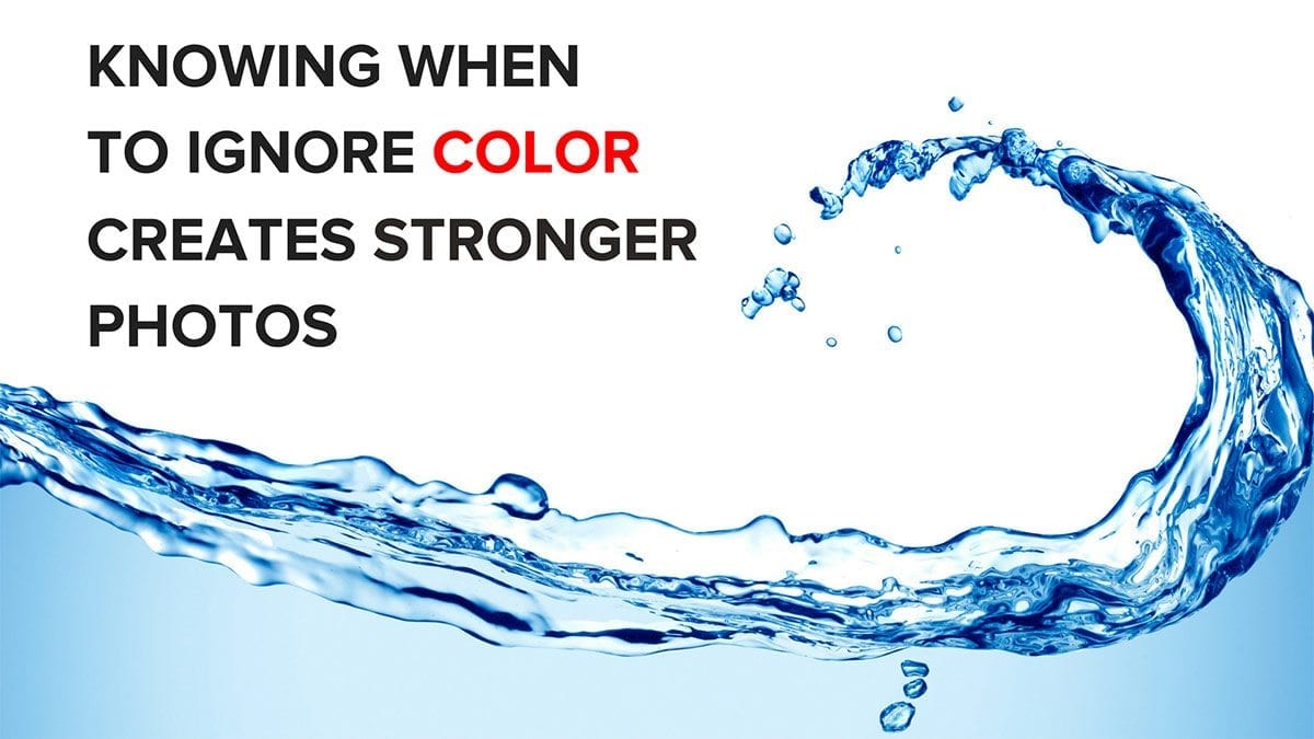
Knowing When to Ignore Color Creates Stronger Photos
Should your photos be in Color or Black & White? Knowing when to ignore color can help you create stronger photos by embracing the mood or emotion needed to tell your story.
Sometimes color is a distraction. Eliminating color can simplify your photos to reveal an entirely different message or feeling.
That doesn’t mean converting your photos to black and white is a fix for a bad photo. I think most photos look much better in color than black and white. What’s important is to know when color is part of your story, or if color is distracting from your story.
Elements of Color
When color works, it’s often because of these three elements:
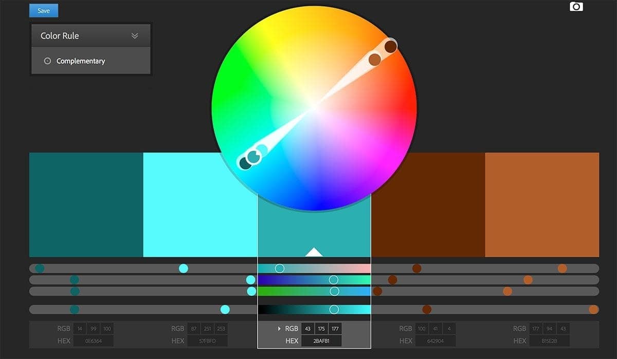
- Color Contrast / Complementary Colors
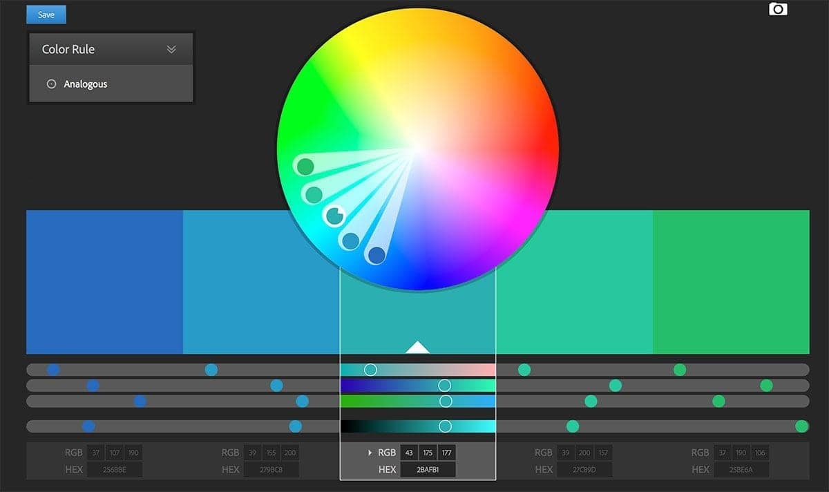
- Analogous Colors
- Bold Color
Color contrast includes colors at different parts of the color wheel. Here’s an example from the Adobe Color Wheel:
Analogous colors are those close to each other on the color wheel:
There are other strong options, like Monochromatic, Triad and Compound color combinations. The trick is to recognize when your photo has color working for it, or when color may work against it. By keeping aware of strong color combinations, you may be able to arrange your composition to use color as a strong enhancement to your photo.
Bold colors tend to stand out from the rest of the background or other components of your photo. If it’s a bold, complementary color – so much the better.
Elements of Shape
I attributed that quote to Joe Maisel on the podcast (and perhaps he’s used it). The point is that people remember shapes before they remember color. Also, that color can distract the eye from shape.
Black and White tends to work best with high contrast and simplicity of form. When I see a bad black and white photography, it’s usually because there are too many things competing for attention in the frame.
When you deal with monochromatic images, similar shades tend to make a mess. Stark contrast tends to make an impression when it doesn’t have to compete with other shapes for attention.
Deciding Upon the Purpose of Your Photo
What kind of impact do you want to make with your photographs? Knowing when to ignore color is really about knowing what story you want to tell. Determine the impact you want to make. Pick a mood to convey.
Sometimes color is the story. If it isn’t, try eliminating it to see if the photo is stronger without color.
Related Posts

https://color.adobe.com/create/color-wheel/
FREE Lightroom Presets by ON1
I mentioned at the start of the show that you can get a bunch of Lightroom presets for FREE from ON1.
Transcript
THE PHOTO FLUNKY SHOW: Episode 84
Links to subscribe to the show:
You can find links to this episode and all of the other ones at photoflunky.com
iTunes: williambeem.com/itunes
Google Play Music: williambeem.com/googleplay
Stitcher Radio: williambeem.com/stitcher
Blubrry: williambeem.com/blubrry
Keep up with us on social media:
Twitter: @photoflunky
Facebook: William Beem Photography
YouTube: William Beem Photography
You can find links to this episode and all of the other ones at photoflunky.com and of course if you’d like to subscribe, we would love that. Go to at williambeem.com/itunes or williambeem.com/googleplay or williambeem.com/stitcher or even williambeem.com/blubrry
William: Hi there. Welcome to the Photo Flunky Show, Episode 84.
The thing we are going to talk about today is knowing when to ignore color. And will it make your photos stronger?
Hi, my name is William Beem.
Lee: Hi! My name is Lee Beem.
William: And before we get to that topic, let me let you know that show notes are going to be available at williambeem.com/episode84 And of course you can find a transcript of the show there for free. Links to subscribe are going to be there and at photoflunky.com There will be a player there that will let you listen to our previous episodes, too.
Also, I want to let you know that On1 has some free Lightroom presets and I’ve got a quick link for you. Just go to willambeem.com/on1lrpresents. I’ll have a link to that on the show notes page, but it is williambeem.com/on1lrpresents. Check them out. There will be links to that on the show notes as well.
So the idea is knowing when to ignore color and how will it make your photos stronger. What we really are talking about is an article that I did a while back and it was called the Dominance of Color.
Lee: I remember that.
William: First off, I love color. I really photograph in color and for color most of the time. That’s kind of really what to me, is making a lot of my artistic statement. How I used color in my photographs. And by using color I’m looking for specific elements. I’m looking for color contrast. I’m looking for complementary colors; I’m looking for something bold or a statement.
But there are photographs where that just really doesn’t work.
Lee, when you are shooting, I know we talked previously about a lot of your product photography. I know you love your details, but is color important to you when you are shooting it, or are you shooting for the subject?
Lee: I am shooting for the subject and because I am shooting for the subject, color is important to me. So yes. Color is important. In fact, color is one of the key factors in me putting a photo together.
Where I use black and white is not so much to take a black and white photo, but it’s more about having a neutral, non conflicting or non competitive background. So I will have black or white or some shade in between in my background if I’m trying to isolate my subject. But as far as subjects go, I never ever shoot product photography in black and white. Ever. Color is something …. I gravitate towards color. To me it’s expressive; it’s vibrant; it’s eye catching and draws you in; it creates a mood. It really tells a story and I’ve evolved because there was a time when I was really into black and white photos, not to take it myself, but I thought black and white is all the rage. And looking back I realize that was my only draw to it: that it was all the rage. I didn’t know anything about photography and it was portrayed to be this kind of classy almost upper level “Oh, this is a beautiful black and white.” When I look at it now I think well, I never really liked any of the stuff. I just thought it was a trendy thing to do. So to keep up with everybody you had to like some black and white.
Truthfully, occasionally something works in black and white and there is a time to use it and that will stand out to me – I’d say that is less than one percent of the time. On the whole, if I had to make a statement over it I’d say it’s not my preference. I don’t really care for it.
William: I think that’s going to be the case for most people and your right. People do use black and white as a trend in cases sometimes where I think they shouldn’t. One of the things I hate seeing is a very busy photo converted to black and white.
Lee: Landscapes. They don’t belong in black and white.
William: No. Mean if the land isn’t beautiful, why are you photographing it in the first place? Converting it to black and white isn’t going to help it. We’ll get to kind of what we’re thinking about for black and white and what I’m looking at is for the elements of color.
When I talk about color contrast obviously we are talking about colors on opposite ends of the color wheel. You see this in movies all the time where they use that kind of teal and orange. The orange tone kind of mimics skin tone and the teal background highlights it. It really works very well. But if you look at almost any movie poster, you are going to see this kind of color combination in use.
But it’s not the only color contrast that you can use.
Lee: It’s not. There are various ways to work the color wheel.
William: And one of the other ones is for symmetry and complimentary colors. They are kind of in the same family; the same ballpark.
Lee: And they work together.
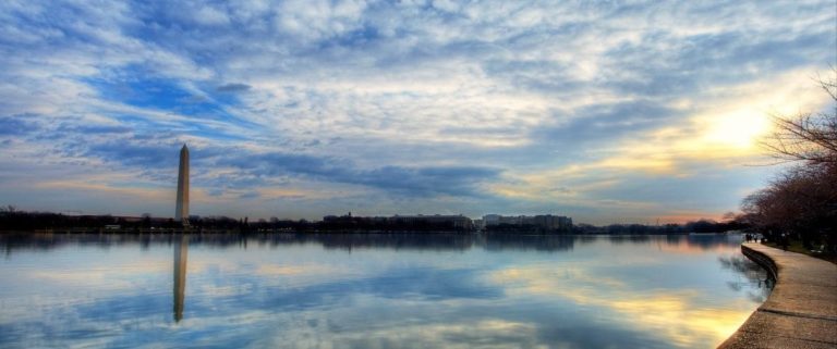
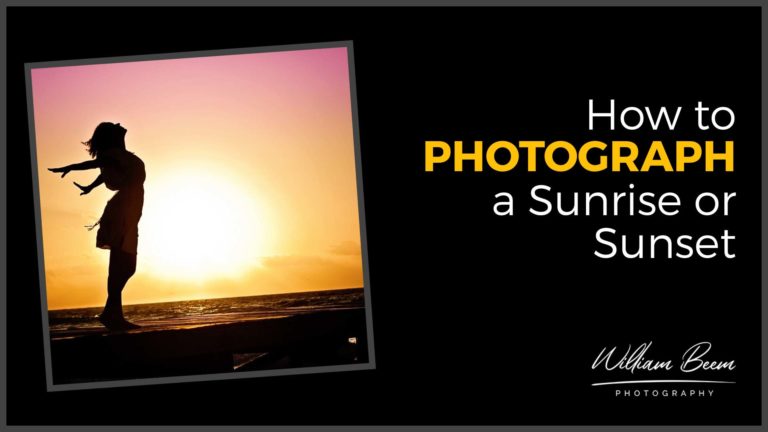
William: Those are things that I am looking for when I am shooting. In other words, is there some way that the colors are working together and that’s why if I were doing a landscape, depending upon the subject I’m shooting, the time of day matters. Do I want this under a bold blue sky or do I want this under a nice orange or creamy color or sunset?
Lee: It’s a mood thing. It’s your story.
William: It really is. And then sometimes you need bold color that just reaches out and smacks you in the face and that can work with color contrast very well. So for example, I’ve got a photograph of a musician on stage. He is wearing a bright red shirt and the stage lighting behind him is blue. So he really pops out of that. If I convert that to black and white it just all muddles together.
Lee: I was just looking at that a little while ago and I thought, no. The black and white just doesn’t work for me. There is no mood, there is no atmosphere; there is no story in there.
William: It’s not to say that concert photography can’t work in black and white and when I went to training for concert photography one of the things that they told you is: what do you do when the stage lights on someone’s face just look really awful? Oh. Convert to black and white. Then you still have the light. You have the shadows and tone, but you don’t have the awful color that’s ruining someone’s skin tone.
Lee: Black and white will work if your color is the distraction in there, to eliminate distraction. But if you’ve got a busy photo with too many colors or too much stuff, black and white is not a quick fix. You still have a busy photo with too much stuff.
William: Yeah, sometimes a bad photo is just a bad photo. And no amount of post processing changes or is going to fix that. It also depends if your subject is a shape and this is a saying that I heard attributed to Jay Maisel and I’m probably going to get it wrong.
Lee: You’re not allowed to get it wrong! Photo Flunky!
William: It’s not my quote so I don’t have to get it right.
Lee: OK. Fair enough.
William: Color is the enemy of shape. Or is shape the enemy of color? One of those … they are both enemies so I guess it doesn’t matter which way you put it. But the idea is if you really want to show a shape or a form, then the way to amplify that is to take out the color. Sometimes the color is so overpowering and that’s kind of why I wrote that post: The Dominance of Color. You see the color instead of the shape that you want and it takes away from it.
Lee: That’s where contrast comes into play because if you don’t have your contrast accentuated taking away the color alone is not good enough. You either want clean lines or stark contrasts of light and dark to draw you into that shape.
William: Yes, I would say that you want high contrast so that you can have the shape and by high contrast it doesn’t mean your subject has to be black and your background has to be white. I’ve got a portrait that I really love. As a matter of fact it’s on my desktop right now. It’s of a young model with her hair blowing in the wind on a black background and it works better in my mind, as a black and white than it does in color. There is nothing wrong with it in color, but it’s much more striking in black and white, particularly when you see the way the shadow drops off on her face and just the way she pops out of the black background. I think in black and white it does a better job than it does in color.
Lee: I think so too, with that one.
William: So it’s not every photo, it’s not every time that you have somebody in the front of a black background or a white background, for that matter. I’ve done it the opposite way too where I did a silhouette on white backgrounds. Sometimes when you really want to amplify the shape black and white and simple contrast work best.
And that way I’m just looking for simplicity of form, I’m looking for light and shadows and I’m looking for contrast. To me those are the photos I think that work best in black and white.
I’ve done the same thing with our dog, Milo.
Lee: Yes. He’s a white dog.
William: Milo is a Labrador Retriever. He is very light yellow, which means he is bred to be a white dog. And you look at him and you see a white dog, but if you look at him in the photo you can see little bits of the yellow coming back in. You convert him to black and white and suddenly he is exactly what he looks like. I shot him on a black background. It just works that much better. It is a very simple thing. You know your subject is the only thing there on the black background. Black and white works extremely well for that.
But if I did that with my Golden Retriever it doesn’t really work quite as well. The color is an important part of a different subject.
Lee: She’s a Golden Retriever, not a black and white retriever.
William: Exactly. You rob some subjects of who and what they are if you take color away from them. I guess the decision of whether you are going to go from color to black and white really depends upon the purpose of your photo. What is the impact that you are trying to make? In some cases, like I said, the musician with the red shirt and blue background. He has his little dramatic rock n roll pose going on, but it just loses all appeal when I take the color away from that. The story there is action and brash and bold. Color really hits that mood.
Lee: As soon as it’s black and white it sucks the life out of the photo.
William: That’s because some of these colors that you see that complement each other really well, when you desaturate them of all that color there’s not that much of the contrast between the red and the blue when you desaturate it. So you have got to have that contrast. If you don’t have the contrast you don’t have a good black and white photo, in my opinion. Same thing with simplicity and form. I have seen photos that were very busy environments converted to black and white and I thought everything is just muddled together here.
Lee: There’s no subject. It gets lost in it.
William: To me black and white is contrast, simplicity of form and then light and shadows. That’s really it. If you’ve got those things going together then you have the potential for a good black and white photo. If you are just converting it to black and white to see how it looks, it probably looks like crap.
Lee: Most likely.
William: It’s not artistic just because you have desaturated it.
Lee: I agree. I think that is the downfall that so many people have to wade their way through.
William: So let me ask you this. Do you change the meaning of a photo if you remove the color?
Lee: Yes, I think you do. You can take away the elements that you are trying to communicate by removing the color. Unless you physically see in black and white, naturally we are inclined to pick out things that stand out to us and color plays an enormous role that we are not always even aware of how powerful it is, in how we absorb stories and information and pick up on moods that are going on around us.
William: I think that is also the time when you want to take away color. When color becomes the distraction. If you take a look at the same photo and desaturate the color and it has a different meaning to you – suddenly the mood changes. Then you’ve got a powerful reason for going with black and white. It could be that the mood is one thing with color and one thing with black and white. I particularly find that with portraits, but it’s just a matter of what is the message that you are trying to send and which way are you doing the best job of promoting the message?
Lee: There’s a fine line, I think. With the mood with a black and white photo if you have specifically taken that shot and set it up to get it to work with black and white it can be seen as an objective thing, I suppose because it lacks a certain amount of emotion. You don’t get swayed by color; and we do get swayed by color even though we are not aware of it. That is why these movie posters and films use this contrasting color. They lean more heavily one way or another depending on what they want you to feel. So yes, black and white I would see as a bit more objective. I know that we have discussed it being used in a documentary style. That doesn’t necessarily mean it always works best for a documentary style however and I do want to point that out. But that is an area where it certainly can work.
William: You’re absolutely right about color being used to sway your emotion. If you look at movies, I haven’t seen it yet, but I’ve seen enough clips so far of the Wonder Woman movie and people are even posting videos on YouTube about the use of color in that movie. You can see it in the action scenes and some of the other scenes where they’ve got bright sunshine, other places where it’s cold and blue color cast on things. They are affecting your mood by using the different color tones and color schemes within the movie and it’s a very powerful tool. You can do the same thing in your photography. We have talked about that before and I’ve got some of my videos that are showing how you can use color lookup tables in Photoshop to either bind things together or sway your opinion of what the photo should be. You take all of that away with stark black and white.
That’s kind of what we are talking about. It’s knowing when to go with black and white, because color is a beautiful thing. Most of my photos I’m taking with a mind that they are going to be in color, but every once in a while you find something that is high contrast, simple in form and has a good use of light and shadows and I think those are the ones that are a good idea to break away from color.
Lee: I can quite confidently say that having learned what I’ve learned going through photography, I am not going to be swayed into falling into a trend and liking something because it feels appropriate to like it. I like it or I don’t and if I’m the only person who doesn’t like something, I’m OK with that because I am who I am.
William: I agree with you. It’s why we wanted to do this show. Doing black and white for the sake of black and white misleads both the photographer and the audience. There are times when you can do a really good black and white and it has an impact and a presence. Those times are going to be very diminished I believe, compared to a good color photograph.
William: Thank you very much listening to the Photo Flunky Show. Show notes are going to be available at williambeem.com/episode84 And of course you can find a transcript of the show there for free.
We would love it if you subscribe to us on iTunes, Google Play Music and Blubrry and others. We’ll have links to subscribe on the show notes page. Thank you so much. If you’ve got a thought on this, leave a note in the comments and we’ll get back to you. See you again next week.