Affiliate Disclosure: We earn a commission if you purchase through one of our links at no additional cost to you.
Photo composition has a lot of rules if you listen to most photography advice. We like to think that creativity has no rules. While creativity is boundless, we also admit that some creative endeavors absolutely fail.
That’s why we think of photo composition rules as guidelines. It’s a good place to start, but don’t limit your creativity because of someone else’s rules.
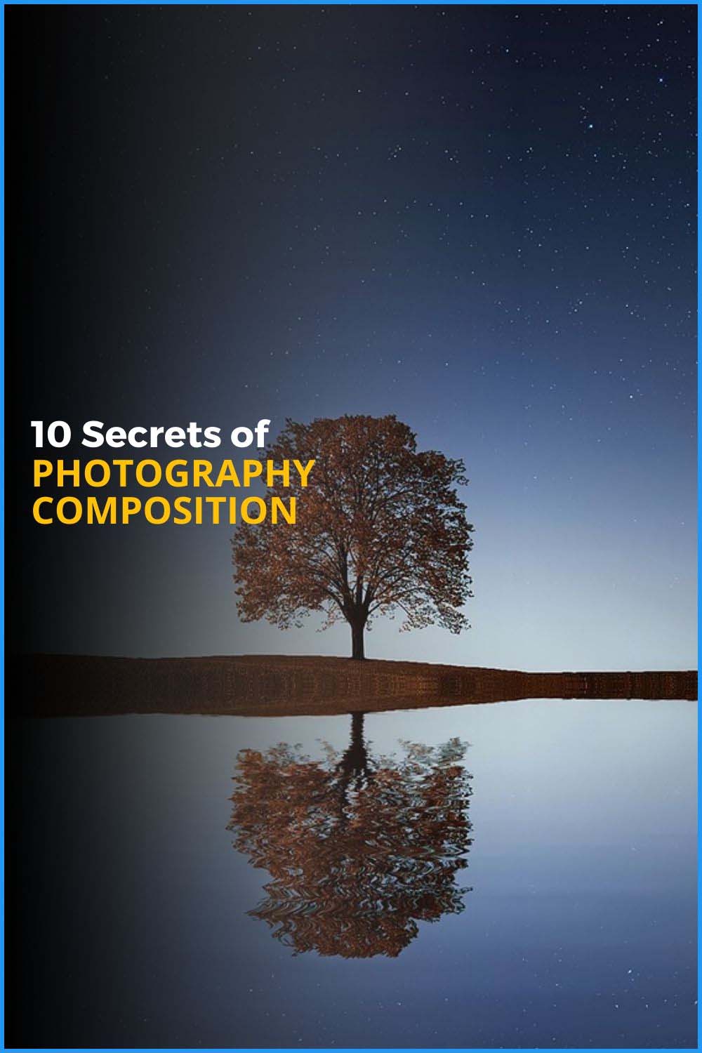
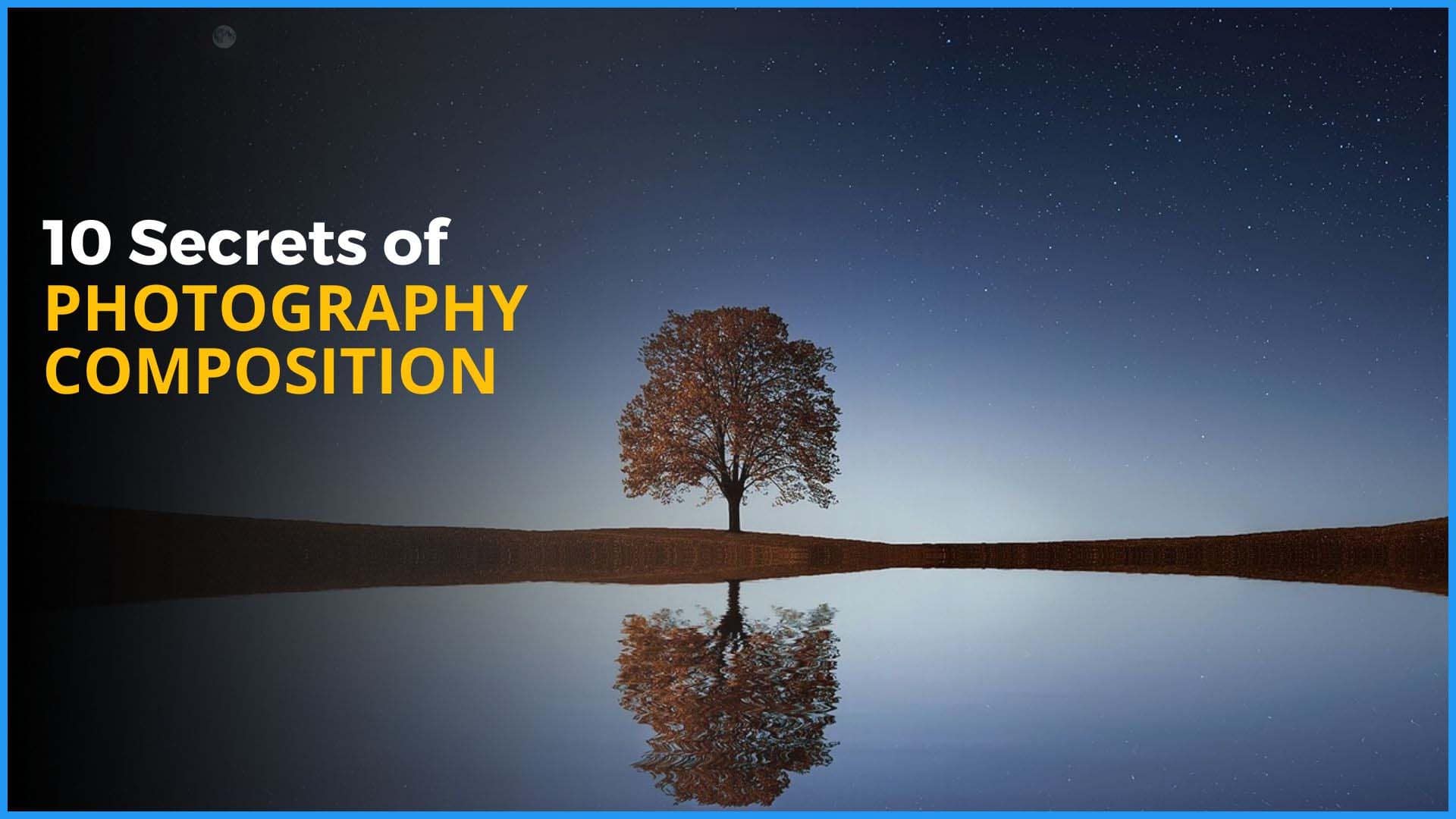
10 Photo Composition Ideas for Better Results
This article and podcast episode came out of our previous article on Photography Secrets: 101 Tips for New Photographers.
Here’s what we’d like you to take away from our photo composition ideas.
Composition rules are mostly guidelines. Don’t think that these are hard rules that you absolutely MUST obey. Photo composition is a creative act and has no boundaries. So give yourself the freedom to break the rules.
It’s cool to break the rules, except when the rules are better. Let’s face it. Sometimes breaking the rules for the sake of breaking the rules leads to disastrous results. Bouncing off the rails can be fun, but going off a cliff doesn’t help anyone.
Simplify your compositions. Eliminate as much of the stuff in your photos as you can. Distill your final composition to the point where you cannot remove anything else or it will destroy your result. Cut out the crap.
1: You Can Do Better Than The Rule Of Thirds
The Rule of Thirds is not absolute, but it is a good place to start considering your photo composition. As I’ve said, it’s a guideline. It’s there to get you started and you can have favorable results using nothing but the Rule of Thirds.
Is that the limit of your imagination or creativity, though?
When you want to move beyond the level of “good enough”, don’t be afraid to leave the rule of thirds behind. It’s a suggestion, not the law.
2: Who Says You Can’t Center Your Subject?
One reason the Rule of Thirds exists is to keep you from putting your subject dead center of the frame. In many cases, dead center is dull and boring. It’s pedestrian and what many people do when taking snapshots.
On the other hand, centering your subject can also give it a sense of power. Your subject commands the space and imposes itself upon everything else.
You see this sort of thing in propaganda posters, often for the reason of imposing power or strength. Think about the story you want to tell. Sometimes putting your subject in the center is the right thing to do. It’s a decision, so don’t let some arbitrary rule rob your photo of potential impact.
3: Balance And Symmetry Are Your Friends
When someone looks at a photo, they tend to want to see one of two things. Either you’re simply documenting a subject and they want to make an identification or they want a sense of storytelling.
Balance and symmetry are pleasing to the human eye. They’re storytelling elements.
Balance is a matter of having equal visual weight. When everything in the photo is crammed into one side and it’s empty on the other, you’re out of balance.
Is that a bad thing?
It depends upon your story, but I’ll tell you that it makes people feel like something is missing. Comfort and discomfort are emotional tools that you can use to tell your story.
Symmetry happens when you have equal parts facing each other. We think of beauty as symmetrical, like when the two sides of a person’s face are mirror images of another.
You can use reflections to achieve symmetry of your subject.
4: A Pattern Interrupted Catches The Eye
Patterns are useful, but repetition becomes boring. That’s why I hate Ravel’s Bolero. Some people think that song was a product of dementia, but I digress.
Most music doesn’t repeat the same notes. You have a structure that changes, like a verse & chorus a few times, a bridge, and then another verse & chorus.
That bridge in the music is the pattern interrupted. It’s something different that shakes up the nervous system and forces it to pay attention.
You can use the same technique in visual storytelling. Interrupt a pattern in your photo composition and the view immediately gets attracted to the thing that’s different.
5: Give Your Subjects Breathing Room
When a photo gets too crowded, the viewer doesn’t know where to look. If a person can’t understand what they’re looking at in a photo, they’ll stop looking.
That’s why your photo composition needs to do something to direct the eye to your subject. You can use some negative space, and that space doesn’t have to be to the left or right.
Don’t forget to add some depth and dimension to your photos in order to give your subject some breathing room and space so they can stand out as the star of your image.
6: Too Much Negative Space Takes Away From Your Subject
There’s a concept of having too much of a good thing. You can ruin a brisket with too much barbecue sauce. Similarly, you can ruin your subject’s appeal by having too much negative space.
If your subject is too small to be noticed, there’s too much negative space. In fact, your viewers may think that something else in your photo is the subject.
Don’t make your viewers hunt for the subject or guess what the photo is about. Too much negative space around your subject weakens your photo composition.
7: Leave Room To Crop If Your Final Output Is A Different Shape Than Your Camera’s Image
Your camera takes photos in one aspect ratio, but you may need to share them in a different aspect ratio.
A video thumbnail is usually 16:9. Pinterest images are 3:2. Instagram is typically a square 1:1 ratio. Don’t get me started on a panorama aspect ratio.
When you compose your photo, think ahead as to how you will use it. If you have multiple uses, then take multiple compositions.
When it’s time to crop your photo to fit its final destination, it may not work if you just have one frame.
Even if you don’t change the aspect ratio, something as simple as putting a photo in a frame can eat up space around the edges. I know, because there’s a group photo from our wedding that we framed and one poor guy on the end of the line only shows half of his body because the photographer didn’t leave room to have the photo framed.
8: Eliminate Distractions
The best photo composition is often the simplest one. Eliminate anything in your photo that isn’t truly necessary to tell the story that you want to share.
Sometimes that means moving the camera. Other times it means you move the subject. Maybe you have to wait for something to clear the background or you have to go pick up an item to get it out of your photo.
Take a moment to think about what does and what does not add to the story in your photo. Then cut out the crap.
9: Don’t settle for one composition
I love the idea of walking up to a subject, sizing up the perfect composition, taking one masterful photo, and then tossing my camera over my shoulder as I walk away.
It doesn’t work like that, though.
The truth is that you don’t know which shot is best when you’re taking photos. More than once I thought I absolutely knew which photo was the best during the shoot.
Then I reviewed my photos later and it wasn’t as fabulous as I felt it was at the moment of capture. That’s why you take as many photos as you can while you’re there.
Later on, during the review, the photos look different. That’s because you see them as the static, frozen images that they are. What you see live in the viewfinder can have a very different impact than a stationary image.
10. Sometimes The Right Angle Is A Diagonal
Another reason that I don’t always like the rule of thirds is that it doesn’t give you any options outside of vertical or horizontal lines.
Diagonal lines add interest that most people ignore.
These lines indicate travel. Also, it allows for a different division of elements using shapes like triangles, which can be visually powerful in a photo.
Look for opportunities to shake things up using diagonal lines to attract the eye and draw them from one spot to another in your photo compositions.
Time Stamps
Transcript
In today's episode, we're going to talk about 10 secrets about composition. I'm William Beem. Welcome to I Like Your Picture. The show that helps you improve your photography with visual storytelling. What is visual storytelling? It's a method of approaching your photography with a knowledge of who you're trying to serve with your photos and what emotion you want to make them feel. We encourage you to concentrate on your subject,
light and background to create a photo your audience loves. I'm glad you found us. Hi, I'm William Beem. Lee is not really a big fan of these composition topics, but it was part of the article that I'm basing this on, which was about 101 simple topics and ideas for beginning photographers. And I want to let you know, there's three things we want to talk about overall here,
or at least I hope that you'll take away from this. Number one, composition rules are mostly guidelines. In other words, don't think of them as rules. Don't think of them as you have to do this every time. Their guidelines are there to kind of point you in the right path, not tell you exactly what to do. Number two, it's cool to break the rules,
except when the rules were better. And by that, I mean, sometimes people intentionally break the rules to do something different that they think is creative and it just sucks. Yeah. And number three, simplify your compositions. The more simple your compositions are, often the better they'll look. Yes. In a lot of cases, I have seen people who are taking these rules either too much verbatim or trying to completely disregard them.
And I think the truth is somewhere in the middle and it's really something where you just kind of feel your way through it. And I bring that up specifically because that's what Lee does. She doesn't worry about all these rules. She kind of feels her way through her compositions. I don't expect somebody who made some arbitrary rule and everyone else wants to call it gospel to know what I need and what I want from my photo,
least of all, what my audience wants, because they don't know who these people are. So I kind of, it's not so much that I go out and break the rules. I just disregard them from the beginning. I'd look at them. And if I think some aspect of a rule makes sense in a certain situation, well then I choose to use it.
But it's not really going out to try and break the rules. I just look at them. I go there they're most, for the most part they're stupid. I mean, somebody somewhere had to break something down, probably wrote a book or had a lecture that ended up being preached broadly that you have to use, like, for example, the rule of thirds and you cannot open a photography forum or a book or an article or anything without seeing something about the rule of thirds.
And I thought that's just because one person tried it out, their photo worked, they thought it was a good idea and not everybody wants to come and they just parroting the stuff off, but nobody really understands it. I mean, they understand how the rule of thirds works, but why is the better you ask somebody? Why is it better to use that rule of thirds and then see how they.. It's
because they don't have a reason. A lot of the time, I think most of the time there isn't one. So that's just my view of it. And that's why we're starting with number one. You can do better than the rule of thirds. So when I say better, here's what I mean. If you're using the rule of thirds and it,
honestly, it is a place where I start my compositions, almost all of them. I start with rule of thirds. I don't want, in most cases, I don't want my subject to be dead center. That's not the most interesting look unless I'm looking for a statement of power and authority, then dead center really works very well. And that goes against the rule of thirds.
The idea of the rule of thirds, let's say, if I'm taking a portrait and I'm going to take one of these little intersections between a border, a vertical line and a horizontal line, and I placed that right on the subject's eye. That's supposed to be where it draws your interest and attention. And it kind of works. There are a lot of photos that you'll see like that,
where the person is a little off-center and you just want to be drawn into their eyes. That's when I think of the rule of thirds, but there's another rule. And this goes with the golden ratio and a concept known as Phi. And it's not really on that line where the intersection is of the rule of thirds. It's a little bit more towards the center.
And if you follow that, the idea is that you get a more natural and pleasing look than the rule of thirds gets you. So what I'm saying is you can do better than the rule of thirds is it might be a place to start, but it doesn't mean you should just do that and stop without looking at other compositions and saying, do I like this better?
Yeah. And I think it's probably fair to say that most people are applying the rule of thirds when they frame their photos these days, or their art, or whatever they're doing. I mean, they teach this stuff in art classes as well. And I've, my teacher had a hell of a time with me, but you know what? The examiners bought my art.
So I never got it back at the end of the final exam. So whatever I was doing that broke the rules kind of works. But I think we've been trained that that's how it should look. And I think that means everything looks kind of similar in terms of using the rule of thirds. So if you want people to notice your stuff, then don't use it.
Know what you're doing. Don't just kind of randomly go and do something. I think that's what William was talking about in the beginning. When he said you break the rule just to try and be different for the sake of breaking it, but play around and find out different ways that different subjects work in every, every picture is going to be different. And what you put in that little intersection in the rule of thirds may vary.
I gave an example of, you know, a portrait subject's eye, but what if you're not taking a portrait? Well, then what do you put in that intersection? What's the place where you want to draw the eye and is that intersection in the rule of thirds, the best place? Sometimes it may be. Sometimes it's not all I'm saying is to me,
the rule of thirds is a place to start, but it's not just like a robotic, I'm going to do the rule of thirds - click. I'm done. You have to look. You have to feel what it is. Because remember everything we're doing is to try and tell a story and to evoke an emotion in the viewer. So the idea is you wanna make people feel something,
not be a robot. All right. Number two, who says you can't center your subject? There's one thing that's, that's more wrong than center. I'm assuming that you think center is wrong. Cause I, I do some center things. I think they sometimes work, but if you want to really mess it up, be almost center, but not quite.
I think that's true. The reason I bring this up is kind of as contradictory to the rule of thirds. Everybody says, don't put your subject dead center. Don't put your subject dead center. If you ever go look at like some of the old propaganda posters, their subject is dead center. And they do that because that is the center of power in that image.
Yeah. That's what you get in the center. I mean, you're commanding that space. When you put your subject in the center, it dominates everything else around it. It's not appropriate for every photo, but it depends upon what you want to do. Try putting your subject in the center. It may work. It may not. The thing about composition is you'd kind of need to work the scene.
You don't just do one thing and call it a day. So it's no different than the rule of thirds. Like, yeah, you can start there, then you can center it and then you can try and do a few other things. These rules that tell you that you can do this, or you have to do this, or you should not do that.
As I said, they're guidelines. They're not laws. I think centering your subject actually works really well when you've got a very, very simple setup. You know, you've got a picture of a bowl of berries on a black background or whatever, like a very, fairly plain, maybe textured background. You don't have a whole lot of stuff going on. You have clean lines,
no patterns around the rim. You want to shoot a top-down. I think that is a situation where dead center can be very, very powerful. It just gets right in there. Number three, balance and symmetry are your friends. So Lee, when I talk about balance and cemetery, what comes to mind for you? Well, it's, to me,
it's the whole weight and feel of the picture. I mean, you know, when something feels lopsided, there's too much going on in one portion and nothing in the opposite to end or the corresponding end. And that's really what, it's what it comes down to. Yeah. We're talking about visual weight with balance and you can have your subject consuming. Let's say we do the rule of thirds.
It's consuming, maybe the left side of the frame. Well, that's adding weight to the left side of the frame. And then what do you have on the right side of the frame? Are you going to put text there or is it going to be open space? Is it supposed to be distracting and interrupt you and center? It can be balanced,
but we're not necessarily talking about centering things to achieve balance. We're talking about the visual weight of your scene and with symmetry, we're talking about, is it even on both sides? So we talk about someone, maybe they have a symmetrical face. So in other words, their left side and the right side are mirror images of each other. And it doesn't have to be a person to have symmetry.
You can have symmetry with, you know, a flight of stairs. Yeah. But when we talk about balance and Lee, when I'm talking about visual weight, I'm probably not describing it well. How would you describe visual weight? To me, visual waiters is what is going on there. It could be lines. It could be color. It could be texture.
It could be where all the subject matter is. And the other sides may be more bland. It could be all light or dark, but really it's where your eye is drawn is usually where it's well, it's always going to be where the most activity is. And there are so many elements of an image that will contribute to this weight or whatever. You know,
you put something in front of you, your eye goes straight to a point. And then beyond that point, it stays in an area. That is the area that's carrying the weight. And it's where there's either movement or activity or interest, contrast, lights. It could be any of those things, but if you don't have it going on anywhere else or something that kind of softly interrupts somewhere else to kind of balance the photo,
that's where you get it feeling a little bit off-kilter. And speaking of interruptions, number four, a pattern interrupted, catches the eye. So let me describe what I'm talking about. A pattern. Let's say we're looking at a flight of stairs. Each step is the same as the other, except for one. Maybe it's painted a different color. Maybe there's something on the stairs. on that step.
Something that interrupts the repetitive pattern is going to catch your eye and the idea is that's how you draw the attention of your viewer to something that is just a little bit different. It's out of the ordinary. And that's the whole idea of a pattern interrupted. Now you can do this in a number of ways. I mentioned stairs, maybe somebody sitting on it.
You can find a row of chairs. Maybe they're all white. And then one of them is red or maybe one of them is pulled aside or at a different angle. Something like that is a very simple thing to do, but it's a very eye-catching thing to do. And it just kind of shakes up your brain a little bit, Works on the same principles.
When you look at something, you go off. That thing just bothers me. I didn't check it or straighten it up before I took that photo and didn't notice it. It's the same thing. It's just when you do it intentionally to draw attention there. Alright. And I've just got this image of a portrait and let's pick on Russell Brand. I like him cause he's kind of a little quirky.
He's a quirky guy. So imagine you've got five chairs in the two on the left and the two on the right are people who are very prim and proper. And in the middle is him leaning against the chair with his leg up on the arm of the chair. And it just, that is a pattern interrupted. That is, you know, an image. Clearly, it's going to be about him and it doesn't have to be the center chair.
You know, it could be any of the other chairs, but the idea is everything looks like it belongs. And then you put something in there that doesn't belong. When you take somebody, you know, who's all glamorously dressed up and they put them at this old rusted abandoned building. You put them in a situation where they just look, you can see that they don't belong.
And that's also kind of pattern interrupted. The fish out of water, kind of concept for your view of the photo. Number five, give your subjects some breathing room. I see a lot of photos that are too cluttered. There's too much going on. They're too busy. And you don't really know what the subject is. Well, if you don't let the subject breathe it suffocates.
In other words, you just don't know that it's exactly which one. And there's different ways to give your subjects. Some breathing room. One is they could be a little off to the side or they could be in a space of their own. You can use your depth of field to kind of blur out the background. So it's not so busy. And then your subject stands out.
You can use a vignette to kind of highlight your subject and give them some breathing room, but basically don't smother your subject so that they blend in with everything else, because then people just don't know what they're looking at or why. Number six, too much negative space can take away from your subject. Well, yeah. And you see this often when people just doing zoom in enough,
they don't get close enough, whatever it is, you know, there's just like, well. You're going to crop that? Yeah. You're looking at a big empty space and then there's your subject is just there. One of the things that comes in mind is a photo of that a friend of mine took, and I won't mention his name cause I don't want to insult them in public.
It was a photo of a woman in a red dress. She was on the bow of a yacht and she was so tiny on the yacht. It looked like it was a photo of a yacht and someone posted a mannequin up there. You couldn't tell that if this was supposed to be a portrait and there was a lot of negative space. So it was looked more like they were trying to sell the yacht than actually take a portrait.
Sometimes you got to get in on your subject and eliminate that negative space. So this is different than giving your subjects breathing room. This woman had so much room to breathe. You know, she could have had an oxygen tank around, but you need to show your subject and people want to get close to see their subjects. So if you have so much negative space around your subjects,
they get lost as well as if they were in a busy room. And you got a problem when your subject becomes the background. And I know that those two are conflicting with each other, say, all right, don't give them breathing room, but don't give them too much negative space. It is a balancing act. And you've got to decide what is it that you really want to tell in your story?
Are you telling a story about a yacht or are you telling a story about a woman in a red dress on the bow of the yacht? And if it's the latter, then get closer to the woman. The yacht can be in back in the background, it can be blurry. It could be a vignette on the woman and not the yacht, but pick your subject and make them the center of attention.
I just think of about the breathing room thing, kind of in context of what do in life. It all has to fall into the context about overall how much space is there in the frame and how much is in the frame. I mean, if you walk into a room, that's got a hundred seats and there's three people in there and you go and sit right next to one of those three people.
You know that that is just, you don't do that. Somebody said, if it's me, I'm going to get up and move. It's like this whole room empty, even though you know that later on, this place is going to fill up. You walk into that same room and there's maybe three empty, empty seats. And 97 chairs are taken.
You grab whichever empty seat and you are going to be next to somebody, but it's the same with your photos. You got to look at it in context of how much is going on in that frame. And then figure out how you make the subject stand out and separate the background a little bit from the subject. Number seven, leave room to crop. If your final output is a different shape than your camera's image.
This advice flies in the face of things that we were told for years. I think the difference is because we're now shooting primarily with digital rather than film. So with film, they always told you to get in close and that's because he didn't really crop your film photos, except for like, if you're going to the magazine, that cut things up. But for the most part,
if you were shooting film, the way you framed your shot is the way that you presented your shot. Later on. Now with digital, it's easy to crop in Lightroom or any other tool and you can make whatever image you want. But the other part is we post photos in different aspect ratios and different uses. So for example, if you're putting something on Pinterest,
then you're going to have a two by three vertical kind of aspect ratio. If you're going to put it up someplace else, it might be a 16 by nine or a four by three aspect ratio. When you take your photo, you're getting the aspect ratio of your camera. The reason I'm saying leave room to crop is because you may want to put it in multiple places.
If you're taking photographs for someone else, they may have different needs. So for example, I always go back to the wedding example. What does the florist need? What does the couple obviously need? What does the caterer need? And they may want something for their social media. They may want something to frame and hang on the wall. They've got different needs and you need to be able to provide photos with those aspect ratios.
And if you don't choose the aspect ratio and crop it accordingly, you just give them some photos, that's going to represent your work if they did the cropping. It might not look the best as if you did it. And also remember when you change your crop, you've effectively got a different shape that is going to affect the composition. That was so perfect for that 16 by nine,
you had in mind when you first composed it. Now you're going to do a nine by 16. You are going to have to most likely reposition yourself and or reposition your subjects or do something. If you can actually move the like moving fixed objects. Obviously, you have to move yourself. But I mean, if you've got a lot of control over your set,
I do this all the time with food photos. I know that I might want to use it in a different format. And I actually have to set up the whole thing again. Sometimes certain little details and things that I've put in there to enhance the original photo actually come out or stuff gets added in because it affects the way that your, your weight and balance is in the picture.
When you change the shape and dimensions of it, We're saying leave room to crop. And it doesn't mean you just take one photo and crop it all the different ways. Lee is talking about you may have to reposition things and take different shots of the same subject, but maybe organized differently so that you get the best result for the crop that you have in mind.
I mean, some of them like you're doing an Instagram, you might have a square crop. I mentioned Pinterest, you're going to have that vertical crop. Facebook is going to be something different. What you put on your wall could be different. Think about where your photo is going to end up, take as many photos as you need, and then crop those photos for the different needs that you have.
Yeah. Number eight, this one ought to be obvious, but eliminate distractions. Yes. Like using window lights. And then you've got the shadows from the louver blinds coming in and you want to watch it. I've learned that I have, it's something I have to watch out for. I wasn't so smart when I started using that little position. Open
the blinds. Close the blinds, do something with it. But these, these things actually form distractions. Definitely keep an eye on your background for distractions. Right now, I've got like a social media profile photo of Lee and I together, that's the photo I want. We're at independence day celebration last year. And we just took a little snapshot of ourselves.
And I really like it. I like the way she looks. I like the way I look. Now, if I look in the background, it's horrible. We're at a marina. So there's like all these little Lily pads around and then there's a tree behind us. Then there's some green building, whatever. For social media. I don't care. If I were taking this photo for someone else,
like a professional image, I would never have released that photo. It just wouldn't happen. But that's what I'm talking about. Eliminate distractions. Sometimes you can move the things that are distracting you. Sometimes you have to move so they are not in your background. Don't just plant your feet someplace and say, all right, I'm going to take all my photos from here.
And I know that's a pain sometimes if you're in a crowded situation, but don't be afraid to move around or to pick something up and move it away. And there are places where if you pick something up and move it away, maybe you need to put it back when you're done. But For example, Lee is good at this. If there's something that's in the way of her photo,
when she can't walk around or something like that, she'll just temporarily put it aside, take her photo and then put it back. No harm's really done. People will give these little looks at her expressions of like they're gasping. And I thought, well that's because there wasn't a sign on telling you that you couldn't move it. So then it was an assumed rule.
Yeah. If there's a sign that I wouldn't move it, I don't recommend moving. Unless you're really bold, then call me because I want to learn from you. All right. Number nine. And we kind of alluded to this before. Don't settle for one composition. You ruined it earlier, but go ahead and talk about this because you do multiple compositions of the same thing with food photography.
Well, I do. You know, I like to keep my own photos for myself on my phone. I have family members far away who are interested in seeing the photos I take. They just like looking at them. I know how they view them and my composition is going to be different for those I'm going with something pretty standard. I usually use a lot of square crop.
I just like the square crop, I guess, because I've gotten used to doing it. But I think it was New Year's Eve. I'd set up, it was a dessert board, a dessert board and some port, some old things. And it was simple, but it looked pretty w we were happy and I wanted a picture of it. So I set it up and I took the photo. I had to rearrange.
I took the original photos for us, which were the photos for us. And then I thought I'll have a couple of square crops. I actually had to move things. I took things out of the photo. I had to rearrange the lighting. I had to reposition the subject, but that was really because otherwise the weight of the photo was going to be a bit lopsided.
Everything would have been either cut off or I would have had to pull back and I'd have too much negative space at the top and bottom. So that's really what I had to do. But this happens a lot. If you recompose, you have to rearrange the balance. And this is kind of what I call working the scene. If you don't just walk up to something,
get your composition, take it snap and say, I've got it. It's perfect. I'm done. You never know. Sometimes another position, another composition, another angle may be what you want to do. Maybe you need to change your subject a little bit. Even if your camera's in the same position, your composition is different because the subject changed. I had a model one time,
and I wanted photos of her lips because she had beautiful lips. She had a beautiful jawline. And the thing is, you can take a photo of lips, but what shape or position is the best for her lips? And I didn't know at the time. So I had her doing all sorts of things. Sometimes she was smiling. Sometimes her lips were together.
Sometimes I'd say part your lips. And then sometimes I'd say, look like you're getting ready to kiss somebody. And we tried all those things. And here's the reason why. When you look at the photographs afterward, you get a different feeling than you do when you're in front of somebody who's doing all the stuff. I mean, for us, it was kind of funny.
She's going through all these little gyrations with her lips. I mean, it was, it was kind of silly and stupid, but at the end, if you want that perfect photo of, you know, perfect lips, you don't really know which one is going to be, unless you have some to choose from. And then you see them in relationship to each other.
You don't see that when a person is standing there and they move their lips around, you just see what, what they look like at that moment, you know? And there's going to be a little playfulness. Some of them look like smirks and other things, which could be useful as well too, but take multiple pictures, try different compositions, or try your subject in different arrangements.
And then look at your photos after. Something's going to stand out. And you're going to think this is the better one. All right. Our last one, number 10, sometimes the right angle is diagonal. Oh, I like diagonals. I know. Go ahead and tell us all about diagonals. Well, diagonals. for me. is just, I didn't arrange things in a diagonal.
And I'm saying I do arrange because I don't take typically that. Well, I try and not take pictures of people. I'm not a portrait personal, unless it's like our own family memories and snapshots. But I, you know, I do a lot of stuff. You have food photography and things where I can actually control everything on the scene. It's smaller so I can physically move it.
And sometimes it's not really about moving the subject matter as much, just moving myself and shooting from a different angle. So that's everything is diagonal. I just find it interesting. That's the whole point of using a diagonal. It adds interest. Now, there are different ways you can do diagonals. You can tilt your camera and maybe you give the photo a little bit more energy because it's not just straight on.
You can imagine the shape of triangles, which is rather powerful in photography. If you use like different triangles and you don't necessarily see a triangle there, you just see lines that this could be a triangle. And that could be as simple as someone, you know, bending their elbow and creating a triangle in a certain zone of the photograph. But look for ways that you can either move your camera or move your subject so that there is a diagonal line,
even if it's just a perceived diagonal line. And that adds some interest that you wouldn't get otherwise. Think about again, I talked about a group of photos, like the one where I gave all the chairs while they were all kind of on a flat line. What happens if, you know, from one head to the next, they kind of had a diagonal difference?
Somebody is taller than the other. Somebody sitting in a chair, it just moves in a flow instead of left to right. It kind of moves from top of one side down towards the lower end of another side. Those are just some ideas. Play with them, have some fun with them. The best thing about photography is to go experiment and put these things kind of in your little tool bag.
So that way, when you're out doing something that's really important to you, you've got a bunch of different ideas. If something's not working, then you can say, okay, let's try this. I remember that photography, art, all these things do have some rules they've got, which, you know, for the most part, I suggest take them as recommended guidelines,
play around and see what does and doesn't work. But creativity has no rules. The idea that we're giving you these rules, well, they're not really rules. They're just secrets about composition. Thank you so much for joining us on I Like Your Picture. This was episode 277. Show notes are going to be available at WilliamBeem.com/episode277.
And come back in a couple of weeks, we're going to be doing an episode about post-processing and that is going to be the last episode of I Like Your Picture. So we hope to see you there.