Affiliate Disclosure: We earn a commission if you purchase through one of our links at no additional cost to you.
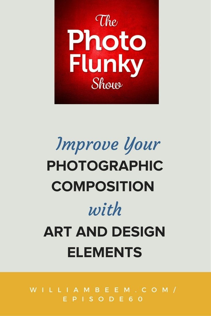
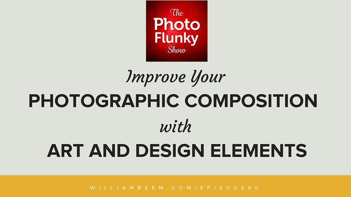
Improve Your Photographic Composition Using Fundamental Elements
Thank you for listening to The Photo Flunky Show. In episode 60, we discuss how you use composition to tell a story by arranging art and design elements.
Instead of discussing things like “Rule of Thirds” and “Leading Lines“, we have a different approach. We use simple questions like Why, What and How.
The answer to “Why” you need a composition is pretty simple. You’re trying to communicate, to tell a story, that fits in a given format. Part of your answer to “Why” includes the format you need your photo to fill when you’re done. That could be specific dimensions for artwork on your wall, social media, print publication, or another use.
We think of the art elements as tools that are at your disposal. These elements answer the “What” part of your composition. As in, what are you going to put inside your frame? Here are a few examples.
We consider the design elements as styles or techniques you can use. The design elements describe “How” you will arrange those art elements in your frame. Here are a few examples.
These are just a few examples you can use in Art and Design. Some of them may be different than you’ve heard before. For example, we didn’t list light as one of the elements, but we mentioned how you can use it to provide contrast.
Be sure to listen to the full episode to find out how to improve your photographic composition.
Transcript
William: Hey there! Welcome to the Photo Flunky Show, Episode sixty.
Do you like that? I don’t get to say “Hey there!” very often.
Lee: No you don’t.
William: I really don’t. Today we’re going to be talking about composition and probably not exactly in the way that you’ve heard about it in the past, but we are new at this so give us a try. We’ll see if we can’t give you something new to think about.
Hi, my name is William Beem.
Lee: My name is Lee Beem.
William: And before we get started talking about composition, I’ve got a little preamble for you.
First off, welcome to the Photo Flunky Show! You are going to find show notes available at williambeem.com/episode60 and of course there is a transcript of the show there for free. So if you want to read this later, be my guest.
Lee: Love from Lee!
William: Exactly. Lee creates our transcripts for us so all love to Lee for creating the transcript.
Lee: Thank you!
William: And of course there are links to subscribe to the Photo Flunky Show. We would absolutely adore you if you would subscribe on iTunes or Google Play or whatever service floats your boat.
Lee: We adore you anyway, actually. But we’ll adore you more. And forever!
William: Yeah, see like you get bonus points for subscribing to the show.
Lee: Yes.
William: One other thing I want to bring up is I have a free ebook available. You can get your copy at williambeem.com/freebook So that’s only two e’s. I didn’t do like free ebook. It’s just freebook. And this book is about photography; about creative portraiture in particular. It is kind of not necessarily going through the technical details, the lighting and all that other stuff. It is going about the emotion and the creative aspects of portrait photography. I would really love it if you would take a look at it.
Please give me your feedback and of course, since it’s a free book, you’re free to share this with anyone you want to.
Lee: It’s a really nice book. I am not just saying this. I really did enjoy looking through it.
William: OK, why don’t we go ahead and jump right into what we are talking about today and it is about composition and really kind of, what is composition? And what are the things that go into your composition?
You’ve probably heard many people tell you about rule of thirds, leading lines and so forth. We are not really going to talk about that stuff today.
Lee: No.
William: No, no. What we are really talking about with composition is why you are doing it in the first place. It is to tell a story. Every photograph you’re taking, you have got some kind of message that’s kind of coming out with it and anything from a snapshot to say “Hi, I’m here at Walt Disney World!” to your most elaborate portraits that you can come up with, you’ve got something that you want to say; something that you want to show.
But there are certain elements and principles that you use to make that message.
Lee: Yes.
William: And that’s what we want to talk about today. Really, when you get down to composition it is a combination of elements of art and principles of design.
Lee: Yes.
William: And that sounds complicated, but hopefully we’ll make it sound simple for you.
Lee: Yeah, don’t think too much. Once you get this you get to feel it instead of think about it.
William: And we are going to break it down. The art elements are really going to be what? These are the things that you can use as tools in your composition.
The design principles are how you are going to use them. If that makes any sense?
Lee: It ... well it will probably make sense as we discuss them.
William: Well, let’s start off with art elements. So first thing: color. And that can go for a black and white. An absence of color is a statement in itself. But color and how you use it; are you looking for a splash of color? Are you looking for something minimalistic? A single color throughout?
I know if we think of like high key images usually it’s going to be a very white, very bright color with maybe elements of your subject just kind of popping out a little bit.
Lee: Yes.
William: But your use of color is going to have an impact and it’s something that you can choose as a tool.
Are you shooting for color or are you trying to use color to drive home a message?
Lee: I mean it can highlight and accentuate things. It can lead you in. It also ... color is a very powerful element in that it transmits some kind of mood as well. You know, colors have a lot of symbolism and the symbolism isn’t something that people made up. It’s because certain colors are known to evoke a certain mood or feeling from people.
William: And there are times when the color contrast can really just kind of combine together. When you have different colors and something just kind of pops out at you, it really accentuates what your subject is or in some cases, what your subject isn’t; but color is a powerful tool that you’ve got at your disposal. It’s one of the art elements.
Another one is going to be shape and you may not be thinking about this, but people inherently recognize shapes. You know, something like a triangle is a very powerful shape.
Lee: Yes. Actually if you think of the leading lines and things, you find your little triangles and things like that. I know we don’t want to discuss that side of it, but it’s just an example of how these things are present without you consciously thinking about them.
William: I think lines are inherent as well. People have always talked about leading lines and they’ve also talked about place of ... composition with the rule of thirds. You know, are you on this line or are you on that line?
But I’m thinking elements in your image that are going to have an impact upon your viewer and how they see it and how they perceive it.
Shapes are going to be one of those things. Concentric shapes. You know if you’re going to have concentric circles going through your image, are you squaring everything up? And shapes don’t necessarily have to be perfect.
Lee: No.
William: One of the elements that I’ve seen of this is there is a photograph of .... Well you’ve probably seen this in a number of places, but a photograph of an old stone bridge going over the water. You catch it with the calm water and the bridge arches up and the reflection is underneath and it looks like a perfect circle.
That is a wonderful use or element of shape.
Lee: That’s also to do with the angle. You’ve got to position yourself for composition.
William: Are you looking at shapes in your compositions? How are you actually sizing things up?
Lee: I never, ever think about shapes, rule of thirds leading lines ... I don’t know. I think sometimes I just get a feel. I like to feel my photos more than I like to think about them and you get people who do things where they’ve got a very good technical mind and I think those people are going to actually see the shapes and lines. I think I tend to feel the shapes and lines without consciously thinking about them. And sometimes I’m trying to compose a picture and I’m not really thinking about why this doesn’t work, but I know when it doesn’t and I’ll just decide not to hit the shutter button. And that’s usually what it is. It’s just that I’m not consciously thinking about it. I get the feeling and I feel when it’s right.
William: I think that’s important. When I’m talking about shape I’m not necessarily saying that you see a shape in the photo. It’s like I gave an example of one where you do, but that kind of hits you over the head. Oh, wow! There’s a circle underneath that bridge!
Lee: But some people do. Some people’s minds are just very sharp that way and they are very in tune with recognizing these things very consciously.
William: Well, one of the things I look for, for shape, is if I have different elements in a photo and I look at them and say the space between this object, this object and this object kind of creates a shape, I’ll see the empty space as a shape. And space in itself is one of the art elements you want to use.
Lee: Oh absolutely! Yes.
William: And that’s where I come back and you may not be thinking that there’s a triangle in there, but I am looking for shapes, whether squares, circles, triangles or something else. I am looking for something that kind of like ... OK if you connect the dots there’s a shape in there! And I found that actually kind of enhances how people react to a photograph.
Lee: Well it draws the eye.
William: Well people aren’t ... I don’t think they are consciously thinking oh, there’s a star or a triangle or a box. Inherently you notice that shapes are there and there is some kind of reference between different items inside the photo.
Lee: It gives you a sense of balance. It kind of grounds you or draws you in or puts you in a certain position when you are viewing the photo.
William: If you look at art elements, let’s take photography out of it and you’re going back and you’ve got someone who is doing drawing. That’s the first thing they’ll start off with. They’ll draw a circle, they’ll draw a line and they’ll use these shapes as a foundation for whatever they are going to create. And there is no reason that photographers can’t do the same thing.
Lee: Well, photography is a form of art.
William: Oh, absolutely.
Lee: I know this is a widely debated subject and I’m not going to get into it, but anything creative has elements of art.
William: Well that’s why I kind of want to bring this up. Maybe we don’t talk about this enough, but since photography is an art, you need to bring in the same kind of concepts and maybe study different types of art to understand what’s behind them and then use those elements in your photography. And it kind of changes the way you see things.
For example, we mentioned space, but also texture and I love texture. People, I think especially if you get like side lighting on texture and you see these little things crawling out of an old decrepit wall or ....
Lee: It gives you a 3-D feel. You almost can reach .... feel like you can touch it.
William: And that’s one of the things of dimension inside of a photograph. You have a foreground, a middle and a background. We’ve heard that advice a number of times.
Lee: Yes.
William: But space isn’t just empty area in your photograph. Space goes in all directions. If you can combine a sense of space in your photograph from foreground to background or from side to side or high and low. Whatever dimension you want to go into, it’s a flat 2-D image. We get that. But you can represent space through perspective.
Lee: Yes.
William: Alright, we want to get to the other half of composition with design principles and one of the keys there is balance.
Lee Yes.
William: Tell me what you think when you see a photo that’s really out of balance. Is it lop sided or what does it make you feel.
Lee: It’s almost an unsettling feel. It gives you a sense of being uneasy. I translate this into everyday life. I like to feel like my feet are solid when I’m on the ground. I’m the kind of person who doesn’t care for the thought of going and walking out on ice. I’m actually afraid of falling and I want to feel like I am secure. And I think that extends itself into viewing pictures or looking at any kind of scene. You sort of get that feeling when you see something that is not balanced; whether it’s a person who has maybe got their center of gravity a little bit forward and they are leaning over into a big body of water that looks dangerous. It doesn’t matter what it is. That feeling of balance, if you’ve nailed it, you give a sense of almost calm or excitement. The person feels safe viewing it.
William: But that’s the nice thing about a photograph. You may not always want your viewer to feel safe.
Lee: Oh you can use this the other way around as well for effect!
William: Exactly. So you can kind of manipulate the emotions of your viewer.
Lee: That goes back to your story.
William: Yeah, it really goes back to your story. It’s like what do you want your viewer to feel? If you are not evoking a feeling then you’ve got a nice document. But if you really want to turn your compositions into art, you want to make someone feel something. Do they feel insecure because there’s a lack of balance? And also there is a graphic design matter of balance as well, too.
Lee: Yes.
William: Are you heavy on one side and then there is nothing of interest on the other?
Lee: And sometimes you do that on purpose. For example if you’re doing something where you want to put some text or put something else in there or a composite. So there are times that this is not a “don’t do it” or it’s wrong if you do it; just be aware.
William: Well, one of the things for photography is there is going to be a use for it. It might be something that you hang on your wall as art or maybe you’re just shooting it for something where you are going to put text. There’s a number of people who put things out on social media where they need room to write something for a message.
Lee: Yeah and I’ve learned the hard way because I tend not to do that and I’m learning that there are times when I need to do that.
William: Well you’ve really been diving into that for your site that you’re bringing up. And you’re putting out a lot of social media with messages on it.
Lee: I am.
William: And what have you learned since then, of trying to design your photograph so that you still have room for your type?
Lee: I have learned to ... I like a tight crop. I have always been one for details. Those of you who have been listening to us for a while will know this. I like to zoom in and get really tight. I have had to let that go because when you are shooting something for a purpose, you can still have your personality in there, but your style might have to give a little bit so that you can serve the purpose for which it’s designed.
And that has meant that I do my little crop photo which I think the tightest crop is probably Instagram because it’s going to square up, but I’ve learned to start zooming out and zooming out more and more because things like Twitter for example where you’ve got the wide one, I want to maybe have something to side – the subject to the side – very slightly so that I can put the text on the side. Because these platforms dictate that you have to use them so differently to make them work.
So yeah, I’ve learned that one photo is not ... there’s no one correct way to shoot. It depends on your purpose.
William: We’re kind of breaking away from design, but it’s also going back to your purpose of what the photo is and we found out that the optimum format for Instagram, Twitter and Facebook are different shapes. And Pinterest as well. Pinterest has that long vertical one.
You can’t necessarily shoot one shot and hope that it works great for everything because you’ll be doing a lot of cropping.
Lee: That’s true. Now I’d say that Instagram or any kind of square crop that you might want to use is the most difficult one if you don’t care to have your subject dead center. A square crop really? The middle is the middle. You know what I mean?
William: You’re pretty much going bull’s eye with that. But it’s like Pinterest. You might have this wonderful panorama. How do you turn that into a vertical?
Lee: I know, it’s just so hard.
William: It can be and there are just different creative ways that you have to think about how am I going to use this photo? And that’s going to affect really the story that you’re telling and where you’re displaying it and what are the constraints of how you’re going to do it?
But then you have to combine your art and your design principles to make it fit the format.
Lee: Yes.
William: OK, speaking of design principles, let’s get back.
Another one is contrast and that’s more than just a slider in Lightroom!
Lee: Yes!
William: I mean you’re looking for natural contrast and I find it’s much easier if you have a very simple photo where there’s not too much detail or background in there, but you know, contrast could be something as simple as color contrast, or it could be as stark as black and white contrast.
Lee: It could be. It could be light, it could be textures. Textures – you know, something very smooth and very heavily textured also forms a very stark contrast.
William: It could be something bold or something narrow. In portrait photography, your shadows on your subject’s face are contrasts. You’ve got the area that’s lit and you’ve got the area where it’s falling into shadow and that makes it interesting to me because you’re kind of ... you don’t see everything. It’s boring if you see everything lit completely the same.
Lee: Yes.
William: One of my favorites is movement. Photographs are obviously a fraction of a second in time; usually. Some of them are long exposures, maybe a bit more. But I kind of like the idea of showing a little bit of movement inside of my photos.
Lee: Yes.
William: And it could be a freeze frame where you just see that I’m coming to like a horse race. You know, you see motion or a runner. You see that they’re moving. But I also like it if you can show some blur in there and you get part of them sharp and part of them blurry. You know there’s movement going on by the time you capture it.
Lee: But also getting back to the composition with movement, even if it’s a freeze frame, whether it’s blurry or not, you can also use your space in your composition to accentuate it by putting ... is the subject entering the frame or are they leaving the frame? Where is ... if it’s panoramic style you can have the empty space where the part is they’ve already covered; where they’re leaving behind them or you can have them facing in and almost diving into the empty space ahead of them. So this all comes into your composition of movement.
William: Yeah and it really is: what is the story you want to tell and where do you want to direct the eye?
Sometimes like if you’re shooting a race, you want to give them - whatever the nose of whatever is running or moving – you want to give them some space to decide so they have room to move into it.
Lee: Yes.
William: Usually if they are just about to exit the frame it’s kind of not as good visually, but unless you’re combining that with something else and saying, hey I’m getting the hell out of here!
Lee: It goes back to your story, right?
William: It really does go back to your story. Another element that we like is pattern. And we are just simply ... we naturally pick up on patterns.
Lee: Yes, we do.
William: You see a row of chairs and you know that your eye kind of follows it. You can use a pattern interrupted. So you see a row of chairs and one of them is a different color than all the rest, or maybe it’s turned in the opposite direction of all the rest; it catches your eye. This is an element of design that you can put in to kind of say, something is different about this. You should be paying attention to it.
And finally, emphasis. Where do you want the emphasis in your photo? And usually that’s going to be your subject, but what do you want really to stand out more than anything?
I do this sometimes if I’m doing like a cityscape. I’m going to put emphasis on the streets with all the lights running down through there because I want to show a little bit of movement, but it also brings up some contrast. But emphasizing a part of your photograph just kind of enhances it.
We talked about this actually a few weeks ago on the show about fireworks.
Lee: Yes.
William: I will do emphasis on the fireworks themselves, because that’s really what it’s all about. And it might be over a castle, it might be over a city or something like that, but I’m going to amp up the colors on the fireworks, I’m going to brighten them more than anything else, because that’s kind of what the photograph is about.
Lee: So you can use color, you can use sharpness, you can use blur ...
William: You can use any tool at your disposal. But you can go ahead and provide some emphasis in there as a design principle. But all of this really is how to tell a story. So what we kind of wanted to bring to you is just something different besides rules or guidelines to follow, but rather things to think about. The art elements are your tools: color, shape, line, texture, space. And then your design principles are kind of how you’re going to arrange those art elements to build your composition.
We hope this helped you. Thanks so much. Happy photography!
Have you noticed I’m starting to sound like an NPR ... I did that. Happy photography!
Thank you so much for listening to the Photo Flunky Show. This was episode sixty and of course you can find show notes available at williambeem.com/episode60
There is a transcript of the show there for free and don’t forget, get your free copy of my Creative Portraiture book. It is williambeem.com/freebook and you’ll be able to find it. Also we’ve got little notes on the side bar so you can find it very easily.
And last but not least, please subscribe to us on iTunes, Google Play Music, Blubrry and others. There are links to subscribe at photoflunky.com
Thank you so much! We’ll see you next week.