Affiliate Disclosure: We earn a commission if you purchase through one of our links at no additional cost to you.
How to Recognize Photography Fads
Photography fads plague many photographers, and I’m hoping that we can recognize and overcome bad photography techniques before they become photography fads.
Every period in time seems to have its fads. What is a fad, anyway?
I have to hang my head in shame because I’ve participated in some of the fads mentioned in this episode. OK, I participated in most of them.
Don’t judge.
If you’re a new photographer, fads are appealing. That’s because new photographers are still trying to find their feet and also want to get some views of their work.
Participating in a fad is just a matter of riding a trend where most people are paying attention. It seems nice at the time, but like most fads, that attention fades.
Here are a few things to consider about a new photography style that just may be a fad.
Those are your clues. When everyone gets excited about something, but it just doesn’t look good enough for commercial appeal, it’s a photography fad.
I think that photographs need to look natural. That’s different than looking realistic, since photographs are not reality.
However, a natural look means that all of the elements in the photograph seem to belong together. It can be an alternate universe, but everything needs to fit together. When some of the pieces of your photograph seem a step out of pace with the rest, it’s a fad.
6 Photography Fads (and why I dislike them)
Shame.
That’s the biggest reason I dislike these old fads. As I said, I participated with many of them. When I look back on some of my photos, I wonder just what the hell I was thinking.
HDR
The idea behind HDR is fine, and it’s possible to do a great job creating HDR photos. The problem is that most people screw it up and create something awful.
HDR exists to compensate for the camera’s limited dynamic range. In other words, a camera doesn’t see light the same way a human eye does. We can see a broader range of light than a camera sensor.
In order to compensate, HDR takes different exposures of the same scene and blends them together to create a higher range of light, from dark shadows to brilliant highlights, within the same photo.
It’s great for real estate, where you show the beautiful scene outside a window without losing the interior into darkness.
Unfortunately, early HDR just became an excuse for over-processed, grungy photos.
Like this one. Have you ever seen anything so dreadful? Sadly, I have because I created this monstrosity a decade ago.
I apologize.
Glamour Shots
When we recorded this episode, I would’ve bet cash money that Glamour Shots was out of business. Yet I was wrong.
Glamour Shots evolved into a business providing women with a photography experience. The whole idea was to pamper them and make them feel good about themselves, and record that experience with photos.
I remember this business from the 1980’s, and that ought to be enough to scare anyone away. That’s because I remember how horrible the 1980’s style was for women.
As my wife, Lee, likes to state: the 1980’s were the worst years of women’s fashion ever. Glamour Shots documented it all, too.
It wasn’t just the fashion, though. They shoved women into poses that didn’t fit their body type of personality. My personal favorite tragedy were the photos they created with heavy white vignettes.
Lee gets a bit ill just thinking about it.
In my view, it was rife with gimmicks and other photography fads. Even now, they’re showing Selective Color on their web page.
Oh, just don’t do it!
Selective Color
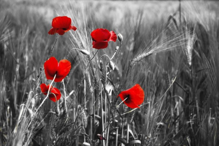
Selective color is a pretty simple concept. You convert a photo to Black & White, and then selectively reveal color in a specific place to draw attention to it.
The first time I saw this technique, I thought it was pretty cool. By the thousandth time I saw it, it was really getting poorly executed.
Like HDR, there is a right way and a wrong way to execute the notion of selective color.
One of the worst ways to do it is to reveal Red, and that seems to be the most popular way to do it. Perhaps it’s because Red can be so bright and electrifying, which really makes it stand out from the Black & White photo.
It’s more like it stands on your eyeballs, because of the pain you feel upon witnessing those photos.
Orange & Teal
You see Orange and Teal predominantly used in color grading. It’s particularly used in cinematic color grading and movie posters.
Someone decided that photographs can also use this color grading style to make their photos more “cinematic.” Therefore, you find tutorials on YouTube and plenty of LUTS or Lightroom presets to help you get that “orange and teal” look for your photos.
That’s right, just slap it on and you too can have the cinematic look. Just like millions of other photos using the exact same color grading scheme.
If you’re noticing a trend, that’s good.
The problem with many fads are that they are simple recipes or presets. That’s because a lot of photographers go for a technical process rather than creatively feeling their way to their own look.
Bokeh Because You Can

There are people who love their bokeh. They think it’s a subject all to itself, so why put anything clear and recognizable in the photo?
As a background, I love bokeh. As the entire photo, I scratch my head.
Using bokeh to isolate your subject from the background is a good thing. It draws attention where it belongs, which is on your subject.
Snapping blurry photos because you have fast glass is just one of the saddest photography fads, though.
Grungy Post Processing
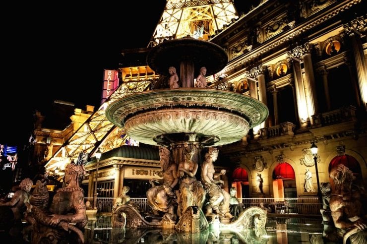
Grungy post processing happens when you use too much sharpening, clarity and other detail oriented tools to bring out the ugly side of texture.
If you look at this photo of the fountain in front of Paris Las Vegas, you can see that I definitely overemphasized the texture. As a result, I really screwed up the tonal balance of the photo in the process.
It’s an unnatural look. Worse than that, it’s an unnecessary look. Why would anyone want to emphasize the worst parts of any subject’s appearance?
There are portraits of freckled children that make them look like monsters because of grungy post processing.
Like most photography fads, it’s a process that’s just taken too far for effect, and not for the enjoyment of the viewer.
Let’s hope this never happens again.
Transcript
Every once in a while, there's some new style, new technique. In my opinion, a new fad that comes along in photography. You don't always recognize it at the time that it comes along, but we're going to take a look at the past and see if we can help you understand when something really is a photography fad. I'm William Beem. Welcome to I Like Your Picture.
The show that helps you improve your photography with visual storytelling. What is visual storytelling? It's a method of approaching your photography with a knowledge of who you're trying to serve with your photos and what emotion you want to make them feel. We encourage you to concentrate on your subject, light and background to create a photo Yyour audience loves. I'm glad you found us.
Hi, my name is William Beem. My name is Lee Beem. And this episode, we're going to talk about photography fads. We want to teach you how to recognize a fad. I want to let you know, they're usually awful. And sometimes we don't recognize how awful they are until the fad passes. I'm going to just jump right into the various fads.
And the first one is near and dear to my heart because I was really into this fad. And it's not always terrible, but in a lot of cases it was and that's HDR. HDR. Why did you love HDR? I was quite new to photography. As in, I had kind of figured out exactly how to use my camera. I understood how to use it in manual mode.
So it felt like I had a good grasp of the basics. HDR was the first thing I wanted to master a skill. I felt like that would help me understand things. And honestly, I loved it. The only thing that made me stop using it was an update to Photomatix where they kind of went in on this interior design kind of, I dunno like this,
what do you call it? Where they're taking photos inside buildings and stuff. And something just changed with that update. And it didn't, the software just didn't behave the way I wanted it to. And I didn't like it. It just, there was something dull about the finishes. The idea of HDR makes a lot of sense. For example, you were talking about interiors. Real estate photographers,
I think could really benefit from HDR because when you go inside of a building, the camera doesn't see the same range of light that the human eye does. So the idea is you're taking overexposures under exposures in a common exposure and then merging them together so that you can get a photograph that looks like what the human eye would experience. As far as the range of light.
The problem is Photomatix, and some other plugins really turned things into grungy, awful messes. And that became an art style of itself. Know there were some of the grungy stuff that I kinda liked, and I think I would have continued to like it in its place if it was a rare exception as a statement piece, but what happens? And I think this is where the fad thing comes in.
Somebody sees something, everybody starts doing it and not just everyone starts doing this when everyone starts doing it to every photo. And it's you see, and you look at it and let's face it. People have varying levels of skill in turning out their finished piece and also understanding what's going to work and what's not. And I think that's where it turns people off.
I think that grungy style probably wouldn't have bugged people if it was just like a rare thing, you know, like the rusty old truck that's been found in some abandoned ruins. I saw some really nice ones where the grunge it fits. I think there was a difference between enhancing the rusty old truck and turning into super grunge. And that was where things went
overboard. HDR, I think caught the blame for that because a lot of people were doing it as HDR photos, and they were probably using other tools as well to get that look. The same thing with urban exploration, you know, urbex. I never understood the appeal of going into some filthy old building that was falling apart and littered, and then trying to get a photo with so much detail that the
eye can't comprehend everything. You don't know where to look. Like I said, HDR has a good purpose. I've got a lot of brackets, you know, things that I've taken. Some, I'm not really proud of today. Some of my go back. And I think I could probably make that look like a much better photo using those brackets. But overall I think HDR just really isn't going anywhere.
And one of the reasons I say that as you look at one of the premier tools right now is from Skylum is Aurora HDR. That hasn't been updated since 2018. There's no demand asking for more. Yeah, that's I think also because there are other things, you know, tools have advanced within various types of software that allow you to do things that you could only do through bracketing.
And also the sensors in modern cameras have more range than what they did in the past. So I think the need for it is not quite as great. People are learning more about lighting. And they're also learning more about how to blend their exposures perhaps in a tool like Photoshop rather than going through a full on HDR product. So I think, although HDR
isn't completely dead. I think it's heyday is kind of past. Yeah. The next one is I'm going to call this glamour shots and that's named after a business from the eighties where, you know, it was kind of like an experience for women that would go in, they'd get hair and makeup and so forth. And then they'd take the photographs with kind of the soft look like in a little Vaseline on the lens or a nylon or something like that.
And they'd give them a white vignette and really some tacky poses, too. Oh, well, didn't they do that with baby photos? They did. And it's like, it was just a really over the top kind of glamour experience and all these people come out and then they show their photos and we look like, Oh, you poor thing. Did you pay for that?
Do you know what the funny thing is? I didn't really know about this. I know what you're talking about, but I guess I wasn't into photos. So I didn't know, you know, at the time into photography, I didn't know about that. It was the thing. But the funny thing is when I think glamour, I think like crystal clear,
sharp. So what you're describing is more kind of that like that ultra soft look where your edges are soft that. Yeah. I would never associate soft edges and kind of, you know, blended things with glamour. Well, there's glamour photography, which is a completely different type of style. And that's usually about the model, usually female, showing a lot of skin and showing basically,
you know, kind of a glamorous look. I don't think that's a problem. When I say glamour shots. I'm thinking about that old business and its name was glamour shots. Never heard of it. That's okay. You didn't grow up here. It was just a really, it was designed to be an experience for women and it was very popular in its day,
but the photographs that came out of a Results, you know, like I said, particularly those white vignettes and the over the top poses and the makeup and the hair, it was just like, Oh, please don't do that. It was, think about it. It was over-processed. When you think about eighties fashion and eighties style. Oh, the worst decade in women's fashion,
The big teased hair, it was just please. No don't ever do that again. So did they have like shoulder pads in their bathing suits? No. It depends on what they wanted to wear. So, but usually it was kind of a headshot. And I just remember the hair was teased to death. The pose was like, kind of throwing your head back and looking a little bit over your shoulder with just some of the worst expressions,
because let's face it. People who go into a mall to get a photograph aren't trained models. They don't really understand expression on camera. They tend to exaggerate. Well, they're being coached by whoever was back there. It's like, I want you to look sexy. Then do this and do this. And of course they have example photos in that place in the mall and women are trying to copy what they've seen on some of these other shots.
And you know what? Sometimes an expression or a pose will work for the young fit model that was on their demo shot. And then you get a woman in her mid forties, who's a little bit plump and goes and tries to do the same thing. And it's not a flattering look for her. You have to tailor your pose to your subject and you can come up with a really nice shot for anybody.
I'm not trying to pick on people who have reached a certain age or a certain weight or anything like that. You can get great shots of anybody, but you can't fit everybody into the same mold. No, that's a reality. When you've heard me, don't have me looking sideways over my shoulder because I'm older. I'm not overweight, but the skin in my neck causes all these little creases and it only does it when I twist my head.
And you're not overweight. You turn sideways and I can't see you. The idea with glamour shots was it was this pre-packaged thing. Everybody fit into the same mold. They sold a lot of stuff. And then after a while, when everybody complained about the photographs, they kind of went out of business and slid away. Right? The next one on my list is selective color.
And this was quite a fad for a while. People were doing black and white and then they take one little piece and bring out the color. Yeah, I didn't hate it when I first saw it, but I really quickly got sick of it when everybody was doing it. When you first saw it, it was new and unusual. And as one-off,
I think it was a very spectacular technique. But as you said, everybody started doing it. I did it too. And that's, I remember this one time I went to, I guess it was Downtown Disney, then. It's Disney Springs now. And I wanted to, I wanted to practice some HDR and I was taking photographs of the House of Blues.
And that's when I got hassled by Disney security. Yeah. I came back and I was just really in a foul mood. And sometimes your mood affects the way you do your post-processing. So I did it as a black and white photo, except for the House of Blues sign on the top, which is blue neon. And I brought that out and I remember one guy made a comment,
says like your mistake, or your crime was selective color. And he was right. Yeah. I didn't, I never really fell for it. In fact, I've never tried selective color. I've never done it, but I think that's because by the time it got to a stage where I would have been able to grasp how to do it, I already was sick of seeing it all over.
It was really big in wedding photography. So for example, a bride holding her flowers would, everything would be black and white. And then they'd brush the color back into the flowers. Or maybe if somebody had red shoes, you know, it was all black and white. Then suddenly you see the red shoes. I had a red dress. And do you remember the one request I made of the photographer?
Cause I knew that I was high risk for bride and a red dress. Somebody is going to try selective color. I said, we do not want selective color. Yeah. And fortunately they did not give us any selective color. So that was, that was good. All right. The next one is one of Lee's favorites and that is processing everything with orange
and teal. This is, this one actually makes me feel physically nauseous. And it did from the start, even when it was a trend and I said I hate this. It just turns my stomach. This would have been number one on mine. I hate it more than selective color. Now, if you're not familiar with orange and teal, take a look at movie posters,
you will see this used quite often in movie posters. There's a lot of teal or blues. And then there's a lot of orange, like, so maybe there's a blue sky and an explosion and fire that's, that's kind of orange and teal. But typically it's done with skin tones and it's a way for skin tones to have a lot of color contrast off the background,
it's warm and cool contrast. It's become such a fad that photographers are doing this all over the place because they think, Oh, people really like this. The combination on the color wheel is called vomit orange and death. And as you can tell, I asked Lee to hold her feelings back on this one. So it wouldn't have made a difference, But tell me why does this one really bug you so much?
I! Do you know what? I think it's one of those things where like with HDR, it's too much in your face. It's almost like, okay, we assume that you are unable to distinguish between warm and cold. So instead of taking like, like a blue and yellow, we're going to take this orange and teal, which is kind of,
and we're going to crank up the vibrance and the saturation and really going to put it in your face because you stupid, you don't really couldn't tell which is hot and which is cold. It is so over-exaggerate, it's like somebody just hits sliders all the way to 100. And the, I think they do almost. And the other part is other colors fade out of the photograph.
It's like, you're gonna look at orange. You're gonna look at teal and maybe some, you know, shades intents of those colors, but any other color is kind of destroys what they're looking for with that balance. So it all falls to the background. And it's just like you said, it's like hitting you upside the head with a big salami. Yeah.
It's not a pleasant experience. So it's, it's been overused. And we think that, look, you're going to see presets being sold for Lightroom and maybe Photoshop, whatever, say orange and teal. Look at that orange until look. Please don't, we've had that look enough. And it's not something that is unique or it's gone. It's not going to express you with your own look.
You're just taking somebody else's look and slapping on your photo if you do this and we're over it. Yeah. And Lee is going to scroll past those pictures with some descriptive comments in doing so The next one on our list is bokeh, because you can, in other words, you've got a F 1.4 or faster lens, or maybe even F 2.8.
And just because you can blur the background out, you do that because you think the blur is prettier than a subject. Yeah. Look, this one, I know that this really bothers a lot of photographers. It's some playing that just doesn't notice it, but it doesn't bug me. It's like, Oh, well I'll just ignore that. There's nothing great about it.
I know that there are people who would see a photo with a lot of bokeh, just because, and then have a lot to say about us. I guess they, this was their orange and teal version. Here's how I look at it. People are taking photographs where everything is blurred out. Like maybe there's some light, you know, bloom in the background.
And they find that exciting as if that were the subject. I thought, no, that's not the point of having that separation between your subject and the background. I am all for separation between your subject in the background and using, you know, lens blur to get it. But when you have bokeh, you have that blurry look just because you can,
it's not an artistic creation anymore. It's just like, Oh, I paid a lot for a lens. So let me show you how blurry I can get it. It used to be that we look at blurry photos and say, Oh, I'm sorry, this one's blurry. And now we've got photographers that are saying, Oh, look at my blurry photo.
Isn't this just the greatest blur that you've ever seen? And there are different kinds of bokeh because there are different kinds of lenses, if you spend more for a lens, you get more aperture blades, you get rounded blades and you get wider apertures and you can have some really beautiful background blur. And I think that's useful for separation of your subject from the background.
Sometimes you look and say, Oh, that background is ugly. And the guy says, don't worry. I got a 200 millimeter F 2 lens. I can blur that crap out. Okay. But if you say, get that model out of my way, because I'm going to blow out those lights in the background. And that's my photo. That's just horrible.
I didn't understand that. You're going to have a subject. You gotta have a subject. If you don't have a subject, you, I don't, I don't know why you're even taking the picture. The last one on our list, grungy post-processing and this kind of goes back to something I was talking about with HDR. And it doesn't have to be HDR with is when you amp up the details,
amp up the, everything that brings out detail in every little subject to an extreme amount. And I said, urban, urban exploration was a way of doing this. And it's just, I don't know what you're supposed to look at. I like having details enhanced in localized areas on a photograph. But if you just turn the slider up all the way on everything in the photo,
you take away the person's ability to determine what is sharp. And that tells them where they're supposed to look. If there's too much stuff and Oh, I'm supposed to have to let my eye wander around here. Well, my eyes going to wander right away. Yep. I agree. It's well, there's, there's nowhere to draw your eye. If there's more than one place,
you don't have a place to go. Yeah. So I, I know there was a fad with all this grungy post-processing and some people still do it. I don't get it. That happened, I think, when Lightroom got its clarity slide, everybody got Lightroom. Yeah. Clarity is really, it's a useful tool, but it can be overused. And there are filters and plugins that you can buy that will give you this look.
And again, I think that they can be very overused, but let me come back to one of the main points we want to talk about is how to recognize a fad. And I'm going to look at it this way. Fads are fads when the results of your photo don't look natural. Yeah. There's that. But also to me, fads are fads.
When all of a sudden everybody is doing the same thing. And to me in photography, very specifically photography is a creative thing to do. So when you're dealing with creativity, you will never find everybody going for something or seemingly everybody. The whole thing about if you speak to creative people or artsy people. They disagree on so many things because it's very individual how they decide to present and interpret things.
So to me, when you're looking at photos and suddenly everybody is doing something, it means there's nothing original coming up. People are following a fad. One of the things that I like to say is that the purpose of taking a photograph isn't to be realistic. It, photos are not real. It's a two dimensional little plane. You want to kind of create what I call an acceptable illusion.
And that doesn't mean that it has to look like just the same thing you saw. If you were standing there, I just saw a photograph that was a five minute long exposure on the beach with a lifeguard stand. It was beautiful and colorful. There was nothing about the clouds in the sky that looked realistic, but they did look like they naturally belonged there.
Yeah. I mean, they were still pink, you know, because the morning sunrise in South Florida, you get that kind of pink glow on the clouds. And as they moved across a long exposure, the clouds were not well-defined. They were just a big blur. So was the water. So was the sand, the only thing that was really still was the lifeguard shack,
which isn't moving anywhere. I really love this photograph. I love the use of color. I love the use of time and motion in it. So it was not realistic, but it is natural. And that's kind of what I mean. Let me give you another example. Our daughter loves to paint and she worked on this project where she was painting an elephant.
Do you remember how to describe that? You look at it and you say, okay, I know that's an elephant, but it's not the way an elephant looks if you were standing in nature. Yeah, She, she done it though. That was the one she did across three panels Across three panels. Look, the shape of the elephant's head was very rounded on top.
So it wasn't quite the same, you know, bumps and grooves that you would have on the ears they call her was what was it? Purple. Yeah. She had purples and kind of like soft greens and whites, But everything worked together. It wasn't not a realistic elephant, but it was natural for the environment of the painting that she was making.
I love colors. And I'm not saying that you should not do things to enhance your photograph or make art out of them, but everything in the photo has to work together so that you naturally believe that what you see belongs there. Yeah. Also the other thing, I think fads are fun. It's a fun way to play. You possibly learn things,
even if it's learning what you do. And don't like, so fads are not a problem until you using whatever that technique or approach is on every single photo. And the other problem is as kind of like with fashion, when something trends for awhile and it goes out of fashion, if you don't notice you carry on doing it, I don't think it makes you look good. Well,
you know what fads aren't always about photography techniques or post-processing techniques. One fad that came up was from Instagram, with this couple of was going around the world and the girlfriend would hold the boyfriend's hand, he'd be behind her and he'd take a picture. And she was always leading him off someplace in all these different locations, the post-processing was beautiful. It was natural.
And a lot of people started copying that kind of style. Yeah. They were trendsetters. I think there's a difference between being a trendsetter and being a fad. Well, that's probably exactly what happened with like the people with selective color and you know, the grungy post-processing cause grungy post-processing like I say, I didn't hate it, but there is such a thing as too much.
I mean, if you're hitting up the extreme ends of sliders or you're kind of adding more and more filters and things in there to redo and exaggerate things, it gets so point where you go, OK. You've killed it. And with that, we're going to call it a day. So if you have some ideas of things that are fads from the past that we don't want to repeat,
please leave us a note in the show notes and we will see you again with the next episode. Speaking of those show notes, this is episode 262. So you can find the show notes to leave your comments at William Beem dot com slash episode two six two. Thank you so much. We're really glad you're here. Hey, if you have not subscribed yet,
please go to William Beem dot com slash iTunes or go to the show notes page. There's a couple of other places there that we'll have links for you to subscribe. And that way you'll get the show delivered to you for free every time it comes out. Thanks so much. We'll see you in the next episode.