Affiliate Disclosure: We earn a commission if you purchase through one of our links at no additional cost to you.
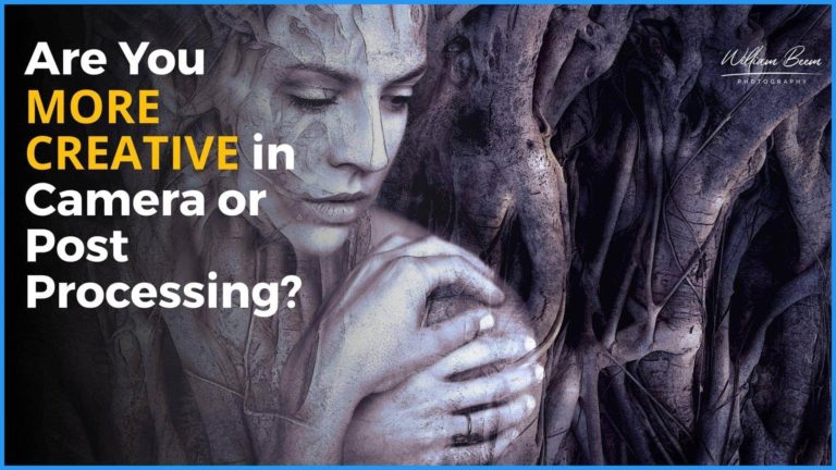
Luminar 4 Creative tools allow you to add some compositing and style to your photos. In this video, I’ll show you all of the tools and provide you with an overview of their capabilities and how to use them.
Using the Luminar 4 Creative Tools
The Creative tab in Luminar 4 has a collection of tools that mostly help you add some style to your photos. There are also a few that I’d place under the label of compositing tools.
You can find these tools on the Right side of the program under an icon that looks like an artist’s palette. That’s no coincidence. Photography is one of the arts. Too many photographers think they need to create realistic photos, but that’s simply not true.
Photography is not reality. Instead, photography is a representation of something. It’s OK to put your own artistic spin on your photos. In fact, it’s encouraged.
I hope you enjoy this overview. Please let me know in the comments which of the Creative tools is your favorite.
Hi. Today, we're going to take a look at the Luminar 4 Creative tools. These are the things that you're going to use to enhance your photos. They are a bit more of a stylistic approach. It's also something where you can do some basic compositing. So why don't we go ahead and get started? Hi, my name is William Beem. If you haven't been here before I am a portrait photographer in central Florida,
I'm also the cohost of the photography podcast called, I Like Your Picture. I've been working on a series of the various tools inside of Luminar 4. I'll add that in the card above. So if you'd go ahead and check that out. If you want to see some of the other videos that were created on this tool. All right, let's go ahead and get started here.
So I've got a photo selected and let's go ahead and hit the edit tab. And this one that looks kinda like a little artist palette, and you can see where it says creative. Those are the tools they're going to talk about today, and we'll start off with the AI Sky Replacement. So you can see the sky behind the women. It's blank.
It's bald of any clouds. It's just not interesting at all. It is very easy to go ahead and change that we can go over here to the sky replacement and choose the sky selection. I'm just gonna pick the first one here, Blue Sky 1. And with just a click, you can see that suddenly everything is different. We've got some clouds behind them and it looks like a much more interesting photo just for having done that part.
You can take a look at the horizon position and we can go ahead and kind of change how the horizon looks, moving it up and down. And I would say, be careful when you're doing this, because for example, we changed the horizon position way over here to the right side, about 62. Notice how these clouds, they got fuller, but they also got down towards the horizon line itself.
Typically you don't see clouds right on the horizon line. So when you're doing this, think about it. If the clouds are touching the horizon, maybe if you've got something where it looks like they're further back it's okay. But if they're just right on the horizon line, it doesn't look believable. So you can adjust that to whatever photograph that you have.
That makes sense for them. It also, you've got an option here to relight the scene. So many, move that over to the side and take a look down here, kind of in the foreground. And you can see how the lighting is changing a little bit on the ocean waves. You're getting a bit more specularity when you turn this up and that could be interesting,
but also what's really happening is if you look closely right here, you're going to see there's a cloud in the reflection of the water. So be careful about relighting the scene. If you have still water, it makes sense for the reflection to be there. In this case where I've got water with waves in it, you wouldn't naturally expect to see clouds when you relight the scene.
So I'm going to pull this one down and just kind of avoid having those clouds, being a big distraction in the water. One of the other ones I wanted to take a look at is first off, you got to check box down here to flip the sky. So if you don't like the way the clouds are, maybe the sun is in one of the skies that you've chosen,
that you need it to be. On the other side, you can go ahead and flip the sky just by checking that and it'll move it around. You can also change or defocus the sky let's make this actually pretty bold. And you can see how blurry that is in the background. That's a little too much for this photograph, but the idea is that it really makes your subject pop kind of like if you were taking the photograph with a shallow depth of field. Atmospheric haze,
again, if that makes sense for you, if you can go ahead and click this and try and bring some up. I don't necessarily need any haze in the photo like this. It's supposed to be a bright, clear sunny day. And you can also change the temperature. So if we drag this to the right is going to get warmer, and if you've got a scene that should be cool.
You can go ahead and drag it over the left and you really cool things down. Sometimes that might be good for color contrast. Sometimes it might work for the atmosphere or the season that you're working with. And of course you can change the exposure. You can make this much brighter, or you can drag to the left and make the sky much darker.
Okay, the next thing we want to take a look at is the AI Augmented Sky. Essentially, this is the compositing tool to place objects in the sky. So we go over here and select the list. Now notice down in the bottom, you can have a custom image that you wanna place there, but let's go ahead and take a look at some of the things that you can put in.
I'm going to go ahead and choose this balloon. Now you can see how it's kind of shown behind is only going to be in the sky area. A couple of things you wanted to be able to do is going to place the objects. You can click this button and you'll find a bounding box. Grab that once it's in place and decide where you want it to be.
And also this allows you to select the size of the object that's going to be in your image. We'll put this here. Not too big. You'll notice that there an amount slider over here. 100 is going to be full opacity. Zero is not visible at all. So if you come up and you start off that maybe your, it looks like it's faded or almost see-through check the amount.
If you want to make sure it's all the way through. Go ahead and pull that to 100. You can do a couple of things with this. You can warm up the object, you know, as if the sun is on it. You can cool it down. Same as you did with the sky. You can relight it. In other words,
you can kind of change the direction of the lighting on the object, which makes sense, because you never know which direction the lighting is coming from on your photograph. Go into the advanced settings, you can go ahead and check this box to flip it and much like the sky itself. You can go ahead and defocus the object that's in the sky. So if in other words,
if you had the clouds defocused in the sky, it doesn't make sense. If you had a very sharp image of the balloon or whatever object you put up there. You want to kind of match that with the focus. Next tool we're going to look at are going to look at our sun rays. This is kind of handy. You can see as there's an option to place the sun center.
This little white.is going to represent where the sun should be in your photograph. It helps if the sun or the light coming from the sun is at an angle that you can kind of see where this is coming from. Right now, you don't see anything really happening. That's because the amount slider is at zero. As we take the amount slider and bring it up,
you can see that there are different rays showing up and going over the subject. You don't have to have just this one kind of look, there is an option over here for overall look, and you can kind of change how that goes. You can also change the strength of the sunrays. The problem is you need to keep in mind any shadows that are in your photograph need to make sense.
So for example, if the sun were actually way back up here in the corner like this, but the shadows are going in this direction, the sun would actually be out of frame for a photograph like this. It doesn't make any sense at all. So one of the things that you really need to do is determine is the sun supposed to be visible,
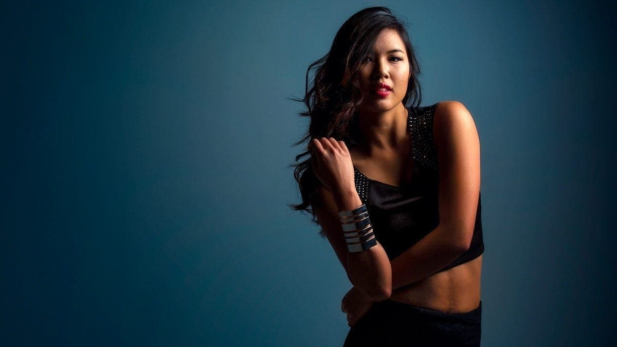
or the rays from the sun? Are they supposed to be visible within your frame? If they're not and if they go against the shadows, it will not make any sense at all to your viewer. So that's just a little word of caution for working with sunrays. Okay. The next one is actually one of my favorite ones for working with portraits and that's called Dramatic.
And what this does is really very simple. You bring this amount slider up and you can see that it's doing a couple of things. It's desaturating the photo a bit. And it's adding a lot of contrast to it. In other words, things got kind of crunchy down here. You can see the skin tone and the swimsuits changed as the more I bring this up and I bring this all the way over.
It's almost like a cross process look, but it's, I think used within a certain amount of taste. I like it for portraits. It's not in my mind. I don't think it's really meant for portraits, but it's something I like, because I do like that desaturated look and you don't have to work with it just globally. Keep in mind a lot of these tools.
You haven't a mask over here. So we may want to go ahead and use a luminosity mask and kind of selectively apply where we're going to have that effect going. So we've got a mask applied over here, and if we go ahead and select a brush, for example, you can go over here and click this eyeball and that'll show you how your masks applied.
You can also invert this mask if you want to. We've kind of inverted the mask so that it's darker on them. We're not seeing the effect on them as much. There's still some, but not quite as much. So as we bring the amount look over, it's actually affecting the background more than it is our subjects. So to me, that's kind of a way to make the subject stand out. And we can change the local contrast settings just to see how much of that grit that you want to add in there,
or take away. Okay, let's go ahead and take a look at the advanced settings. You can change your saturation. So if you don't like that, look where it's, desaturating things, I actually kind of do. You can go ahead and bring that back, and then you can also change the brightness or darkness that's brought in by this filter. But I kind of liked the fact that by default,
it goes ahead and desaturates things and just kind of brings up some contrast. Okay. So for this one, I'm just going to do a little bit of touch up. I'm going to go over to Light and I'm going to warm this up just a bit and maybe bring the exposure up just a bit. And now let's go back to the Creative tab and let's try and replacing the sky behind. Let's go back and try a blue sky.
Let's say five, just to see what happens. Alright, so we've got a very different look for those things, but what I really want to do over here is come and take a look at the Matte Look tools. And again, this one is pretty easy to use. You can, let's go ahead and bring this amount up to roughly about 50 or so.
And you can see how it changes the, let me do it a little before and after. So that's where we started off. And then this is where we are now. And we can kind of turn the matte, look on and off. So it's a subtle effect there, but we can then start to fade this out. And this is a popular look for a lot of people.
It's kind of like almost an Instagram filter, in my mind. It's not a tool that I particularly care to use. I like my color and my contrast, but it's something that if this is the look that you're going for kind of like a stylization that you might see in some advertisement, and you can add or subtract your contrast to this one. And I think used in,
in kinda like small doses, I actually kinda liked the look of it. But if you slide these things all the way over and really fade them out. It's personal preference. It's not a look that I go for, but I think there's a lot that you can do with it. Mystical kind of gives you a little bit of a glow that goes with your photographs.
So let's go ahead and just bring this all the way up. Well, not all the way up, but we'll go ahead and bring about halfway and you can see how it's softening things up and softens the sky, me turn this effect off. And you can see like, especially right here on her face as I turn it on and off. You can see how it's just really affecting the skies and switching things up.
And it kind of gives you that, that mystical feeling. And it's an effect that I used to use quite a lot in Photoshop. And it was, it took me a lot more, much more effort in order to put that in place. And now all you have to do is just kind of bring up a slider. One of the things you want to do or possibly want to do is maybe go ahead and edit this out and I might get a brush.
I like the background mystical, but I don't necessarily want the face of my subject to be mystical. So I want some things to be sharp. And I'm going to take that off of the subject, kind of on the body. And I want basically the eye to be drawn to things that are sharper. So what you can do with a mystical is you can bring that softness up in the background,
but your eyes going to be drawn to first the thing that's brightest and second to the thing that sharpest. So if you keep some sharpness on your subject and you soften the background, it really kind of draws your eye right into the person or subject that you have for your photograph. Alright, so color styles are basically look up tables. You can use these in a number of different software processing tools.
I'm glad to see that they're here in Luminar 4. You can go over here and choose a LUT. There are several that are included, and of course you can load up your own custom LUT files. There are a number of vendors that will provide LUT files, and it's just gives you a different color toning or color mapping for the colors inside of your photographs.
So you can see that they're broken into sections. There's cinematic of LUTs. There are creative LUTs. There are portrait toning, LUTs, and cross processing LUTs. I wouldn't use the cross processing on a portrait, but we can take a look at some of the, uh, portrait toning LUTs like Athena, Gloria, Maria, Rosa, Sina, and Venus.
Actually, I'm kind of liking, uh, both Sina and Venus. Let's go ahead with Venus on this one. And then you can kind of change the amount over here by moving the slider up. You can get very harsh with these LUTs. I don't particularly like it all the way up, because look at what happened to the pillows in the background.
You can see that this kind of gotten like a comical. I prefer them maybe 25 to 35. And then of course, you'd go ahead and change the saturation. If it's oversaturated, you can pull that down, pump it up. This case, I think I'm gonna pull it down. And same thing with the contrast. If you'd like more contrast, you can pump it up,
If you like less contrast, you can pull it down. I kind of like it right here. Looks like we're about 25 or 26. And like the other tools, you have a mask here, so you can choose where that LUT or the color look and color style is gonna apply on your photograph. Alright, Texture Overlay gives you an option to add a texture to your photograph.
Sometimes you can use this for toning. You can use it for color changes. For portraits, particularly on a gray background, such as this one. I kind of like using it for replacing my background. So let's go ahead and give you an example of what I'm talking about. Click on load textures. Now you don't get any textures that are included with Luminar 4, at least not that I'm seeing. It's expecting that you will have textures of your own.
So I'm going to choose this one. That's kind of like a fiery orange and red and open up. And here's what you'll see. It'll just put it right on top of your subject at 50%. So if you drag this all the way over to 100, you've got a nice texture. You don't see your subject at all. So let's go ahead and hit that 50.
Here's the thing I like about using these for backgrounds. You have to be careful with which photograph you use and how well they can blend in with what you have. Like I said, if you have a gray background, it's very easy to do. The thing about using that as a background, the easy part is masking out everything in the middle. The hard part are the edges and the fine hair that you find it here. So that's why you want to look at something that is maybe on a gray background. I've let me get started. And we'll talk about this. Notice that we can change the blend mode. You can come down here and do this like a screen or overlay. And I'm going to go ahead and leave this at normal for right now.
And I'll show you when we change the blend mode, I'm gonna leave the opacity here. And the first thing that I'm going to do is I'm going to start with a mask. I'm going to choose a brush and up here, I'm going to change it to erase. And you can also do this with your keyboard shortcut. You notice like there's a little minus sign in the middle.
If I hit my option key on Mac or alt key on Windows, it changes that to the opposite. So in this case would change the plus. What I'd like to do is start off with erase and just select the, a major site parts that I'm going to paint out. And I'm just changing the, uh, the bracket keys to make my brush larger.
And now look, what I'm doing here is like, when I'm painting, you know, you see the mask overlay and it almost looks like I'm trying to put the, uh, mask in, but what I'm doing here with the negative or the minus in there is just getting the large portions of her kind of masked out. And I'll change, hit the bracket keys again,
to kind of change the size of my brush. And I'm looking at places where she still needs to have a little bit more brought in brought out. And notice I'm staying away from the edges as much as possible. Right. So that's kind of a rough look. Now I noticed I didn't paint here on her hair and probably could, uh, do a little bit more over here,
but we're not going to go for a perfectly fine way, but look at the edges. You don't see it much of a problem. So what we're gonna do now is we're going to change the opacity all the way up. I'm gonna turn the blend mode down to soft light or overlay. And I replaced the background without having to do much work or much fine detail masking.
I might want to do some in here. So for example, where her hair is over, um, for clothing, this part right in here, I think what I'll do is I'll change the opacity down to 25% and just give that a quick brush and I should have done that with this and just change that. So you can kind of build up as you go.
That's the nice thing about lowering the opacity. You don't necessarily make a stroke and have it all at once. So you can just kind of build up as we go. And if there's any spots that I've missed, you can kind of look at it with a mass. So go ahead over here to the eyeball and you can see where the mask is,
and you can see that maybe on her shoulder, um, on her, um, her right and our left. You can see that maybe on her shoulder was a little bit ago, but if you look at it without this mask on, you don't notice it quite so much. I think you probably want to get in there and do some detail work and you can change the hardness of your brush.
So for example, I've got a very soft brush. If I need to get into it, I can make that a very hard brush and I can just hit this plus icon kinda zoom in I'm holding on a space bar to get the hand key so I can move over here to her shoulder. And then I can just kind of work on the detail here to brush that away.
And we'll do the same thing over here on this side. And that's just kind of a quick and dirty composite using the texture overlay. So let's go ahead and move on to the Glow tool. All right, we're looking at the same portrait here. The glow tool in my mind is a little bit similar to the mystical tool. Sometimes I may use them together and you just simply drag the
amount up. I typically like to start halfway and see what the effect is going to look like. And then I'll dial it in where I want it to be. So you've got a couple of choices here, soft, focus bright, there are soft focus and soft glow. Let's say we look at the soft focus and overall, I kind of liked that,
but what I'm going to do still is go down to edit mask. Let me get my brush and I'm gonna make sure this is set to erase. And then things that should be in focus. Matter of fact, I've still got the capacity on 20% of it. Go ahead and raise that up. Things like her eyes, her lips, I'm going to go ahead and remove the glow from that.
And I'm going to change the softness of my brush and move that up. And I may do the same thing with her hair, cause I expect to see some texture in her hair. Right. So now we've got a very different look. There are things, maybe jewelry. I would also bring out. And if you had something like this on clothing where there's some texture in there,
I might want to go ahead and bring that out too. So I'll just do those kind of selectively. Okay. So let's take a quick look at a before and after with a glow. So that's where we started off before we turn on the glow and we'll turn that back on and you can see how the effect is kind of softens everything up. It's softening the skin a bit,
but by brushing out things that should have texture and detail, you can see her eyes are still sharp and clear. Her lips are still sharp and clear, same thing with her hair. So I really liked the glow effect. I may not go quite that high, but it gives you just another way of softening things and then leaving sharpness where you want the eye to be drawn.
Okay. On this portrait, I've gone ahead. I've done a black and white conversion and a little bit of a AI Skin Enhancer on her. Let's go ahead and take a look at film grain. This is another one. Just bring up the slider to add more grain. So I'm going to bring this up to about 74 75, and we can click on advanced settings.
And it'll give you a little bit of option about the size of roughness. Typically, when I'm looking at grain, I'm looking at black and white photo or maybe something of sepia, and you can see with this amount of 74, it's just really destroying her as a portrait. So that's why I wouldn't recommend it here, but I wanted to bring it up that much so we can see what is the result of changing the size.
So right now we're down at 20 that's the default. We bring this size up. You can go ahead and see how it's making the grain much larger on her face. And same thing with roughness. If you bring that up, you're going to have a much rougher of look to the grain. If you're trying to recreate an old vintage photograph, this is a tool that you can use.
If you're looking for something that is going to enhance or glamorize your subject, then I would go ahead and skip film grain. It's there for a purpose. It's useful. In some cases. It's not a portrait harassment tool that I would typically use. All right. The last of the Luminar 4 creative tools that we're going to look at is this one for fog.
You can see that we have a choice, light fog or dark fog, and we have an amount slider. So let's start off with light fog. And we're going to go ahead and just bring that up about halfway. Basically, it just kind of puts a haze over everything. That may not be what you want to do. So sometimes you may want to mask your fog.
I'm going to go ahead and get a gradient mask and we're going to put it. So we're going to put it there and it's going to kind of make it look like the fog is a bit more off shore. And then you're just kind of great gradually going into it. We might want to move this over here with the shoreline. And that way you can see that it's... turn the eyeball on,
you can see that you're kind of looking off the side and the, uh, the fog is coming in. Let's try with dark fog. I'm curious how that works out. Same thing, only a little bit darker. It's not something I typically use for portraits. I'll be honest with you, but the idea that you can add a little bit of atmospheric haze is in a couple of places within the creative set is actually nice.
Think that fog is something that I'm probably gonna use if I have an environmental photo and maybe probably at a lower setting, just to change the nature of the light, that's happening in a certain area. You notice I've got a lot more clarity over here and it's a bit hazier and lighter over there. I think that's one of those things that you can do to try and draw the eye to a certain area.
Okay? So that's a look at the Luminar 4 Creative tools. I think there's a lot of options and possibilities here to really stylize and tone your photographs. There's definitely something that would use all the time, whether I'm doing portraits, or if I'm doing something more of a landscape type of photograph. You might want to be able to use these in the city scapes.
You can use the same thing with a number of your creative aspects. And one of the things I like about the creative tools is that it kind of recognizes that photography is not realism. Photography is art. What you're looking at with a photograph is you're looking at a representation of something. So don't be afraid to go ahead and do some creative things to change the representation,
to make it appear as you want to appear. So thank you so much. I hope you found value with this. If you did, I would love it. If you would like, subscribe and ring the little bell notification. I'm working on this series, as I said of linked in the card above that'll show you the playlist for the series. There'll be more to come and please leave me a comment below. Which of these tools is your favorite?
Which one do you think are you most likely going to use? Or if you have any questions about how to use them. So for example, we talked about the sun rays and the direction of a light. Let me know if you're running into any problems with these. I'll see if I can help you out. Thanks so much. We'll see you again,
next time.
Related Links
Some of the links below are affiliate links. These are items that I use and recommend. There’s no extra cost to you, but I may receive a small commission if you buy something based upon my recommendation.
If you enjoy the free training, buy me a burger! : https://www.paypal.me/williambeem
Here are some of the gear and resources I use for my photography and tutorial videos.
Luminar Neo is an AI-powered photo editor that turns any portrait into a stunning masterpiece. With FaceAI and SkinAI, you can easily retouch portraits, removing blemishes and highlighting facial features. And with the Portrait BokehAI tool, you can create a beautiful bokeh effect in any light. Plus, the Background Removal tool makes it easy to remove backgrounds without spending hours masking.
Skylum now offers Luminar Neo as either a stand-alone tool or part of a membership with extensions to offer more valuable tools like:
- HDR Merge
- Noiseless AI
- Upscale AI
- AI Background Removal
- GenErase
- GenExpand
- GenRemove
Additional extensions are coming.
Luminar Neo's exposure correction and color vibrancy features for all your travel memories will keep your photos looking natural and beautiful.
Finally, Luminar Neo's SkinAI and FaceAI provide the perfect finishing touches for your portraits, ensuring stunning results every time.
You can get everything with different pricing plans. Monthly, Annual or even Lifetime plans are available.
SAVE: You can save $10 using my coupon code - Beem10off
- Promo Code: Beem10off
- Easy to use
- Get great results fast
- Plenty of post-processing features
- Professional extensions are available
- May be slow on older computers
- File management is rudimentary
Software:
Skylum Luminar (Coupon Code BEEM to save $10) – https://williambeem.com/luminar
Skylum Aurora HDR (Coupon Code BEEM to save $10) – https://williambeem.com/aurorahdr
Topaz Studio (Coupon Code WBEEMPHOTO to save 15%) – https://williambeem.com/TopazStudio
Topaz Mask AI (Coupon Code WBEEMPHOTO to save 15%) – https://williambeem.com/TopazMaskAI
Topaz Adust AI (Coupon Code WBEEMPHOTO to save 15%) – https://williambeem.com/TopazAdjustAI
Topaz Sharpen AI (Coupon Code WBEEMPHOTO to save 15%) – https://williambeem.com/TopazSharpenAI
Topaz DeNoise AI 2 (Coupon Code WBEEMPHOTO to save 15%) – https://williambeem.com/TopazNoizeAI2
Imagenomic Portraiture – https://williambeem.com/portraiture-ps
Adobe Create Cloud – https://williambeem.com/cc
The following links are Amazon affiliate links
Hardware:
Nikon Z50 DX-format Mirrorless Camera Body w/ NIKKOR Z DX 16-50mm f/3.5-6.3 VR (video tutorials) – https://amzn.to/30Txt5W
Shure SM58 Microphone – https://amzn.to/3fVO5hM
Yamaha MG12XU Mixer – https://amzn.to/33Vrpf1
dbx 286s Mic Preamp/Processor – https://amzn.to/31RGVpx
Zoom H4n Handy Recorder – https://amzn.to/2E3XxCA
Neewer 2 Packs Professional Metal Bi-Color Dimmable 660 LED Video Light – https://amzn.to/2XY1Cze
Neewer Collapsible Softbox Diffuser – https://amzn.to/2PTIGNm
GVM RGB LED Video Light – https://amzn.to/3iyWZTS
Want to learn more about Photography software? Click below to check out articles about Adobe, ON1, Skylum, and more.
Photography Software Articles