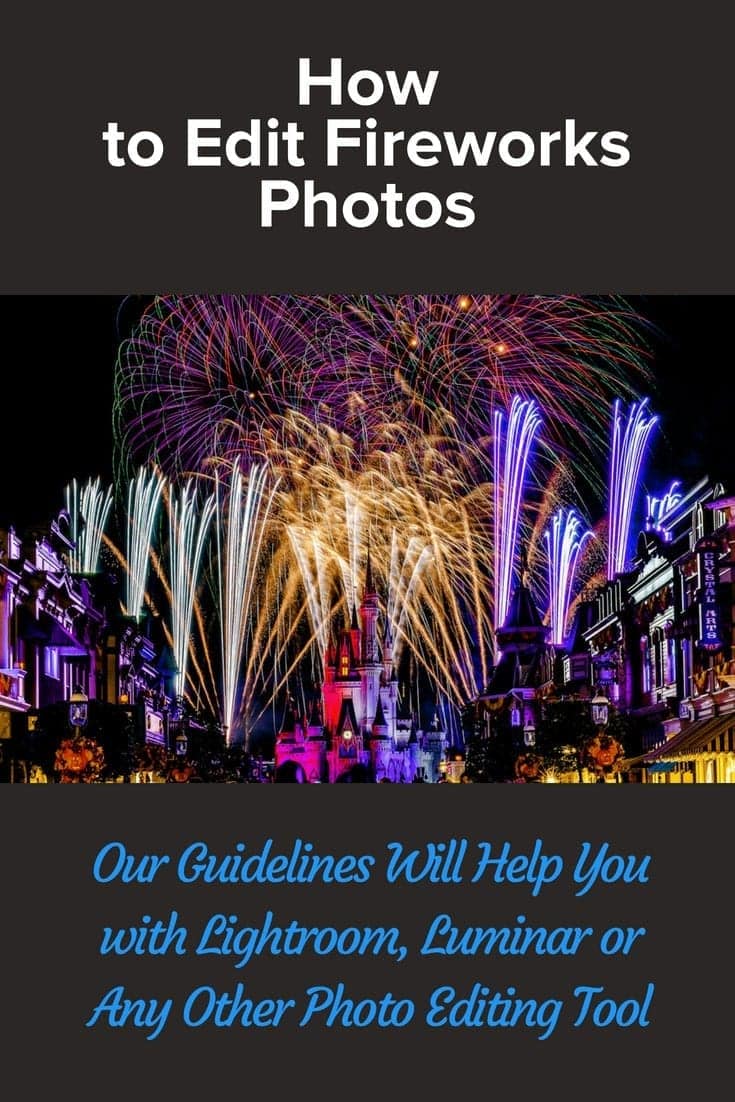
Affiliate Disclosure: We earn a commission if you purchase through one of our links at no additional cost to you.
Why do you want to get started with Luminar 4.3? Luminar 4.3 is a great tool for photographers from Skylum. It has all the tools most photographers need without bloating the software with things you’ll never use.
Luminar 4 has AI enhanced tools that are easy to understand and use. You’ll get great results and save time doing it.
In this video, I provide an overview of the major features and benefits of using Luminar 4.3.
- Organize your photos simply and effectively with the Luminar Library.
- Change the way you process your photos using the AI tools that create wonderful results and save you time.
- Easily export your photos to sites like SmugMug or 500px, or use one of the many options to share in email, messages or save your photo in several different file formats.
Get Started with Luminar
Luminar 4.3 is just what most photographers need, without burdening you with tools that you may never use. Interesting portait features of Luminar 4.3 include like AI Skin Enhancing and AI Portrait Enhancer.
You’ll find quick and easy tools that allow you to enhance and refine portraits in ways that used to take a lot of time and skill in Photoshop. Luminar automatically recognizes faces and uses the power of its artificial intelligence to create the right look for each portrait.
Of course, it’s not a tool just for portraits. You’ll find tools for travel, landscape and quick compositing tools to replace a sky or add something to it.
Related Links
Please know that some of the links below are affiliate links. These are items that I use and recommend. There’s no extra cost to you, but I may receive a small commission if you buy something based upon my recommendation. Those commissions help us keep the blog running so we can keep sharing more info.
Get Luminar 4 here: https://williambeem.com/skylum Use coupon code BEEM to save $10!
If you enjoy the free training, buy me a burger! : https://www.paypal.me/williambeem
Check out my YouTube Channel here: https://williambeem.com/youtube
Hey, if you've been looking at Luminar and wondering if it's right for you, you're in the right place. Today, we're going to take a look at Luminar 4 and some of the features that has that could benefit your photography. We'll take a look at the library, how you can organize your photos. We'll look at some of the artificial intelligence, the AI tools that they have,
that really changed the way you do your processing. We'll take a look at some of the key tools that help you with corrections, some with portraits. And we'll also look at how you can export your photos and share them with other people. And if you stay to the end, I've got a little bit of a bonus for you. Hi, I'm William,
Beem. I'm a portrait photographer in central Florida. I'm also the cohost of the, I Like Your Picture podcast. If you want to check that out, I'll leave a link to that in the description below. So let's go ahead. Let's get started taking a look at Luminar. Okay. The first thing I want to do is take a look at the user interface and just kind of give you an idea of how things work.
As you can see here, I've in a folder called dental. Actually it's an album. The difference between folders and albums are pretty simple. If you have a Mac or a windows machine, you use folders. Those are folders that are on your hard drive and your operating system. And Luminar can see those. Albums, however, are like virtual folders. They exist only in Luminar and they allow you to add collections of photos that you want that go in that folder.
So in this case, I've got one called demo with just a few pictures in here, some of them with a few different problems. And I just kind of want to go over those within this demo. And you can add albums for whatever you want. They could be portraits, they could be family events, travel, whatever the case is. It's just a very simple and easy way to organize the photos that you want to see rather than looking at every photo that you took.
So you also notice that we have some shortcuts up here. So some say all photos, on this day, recently edited and so forth. Those are default with Luminar, but you can also right -click on an album for example, and say, add to shortcuts. You can right-click on a folder and do the same thing, add to shortcuts. So that way,
if you have a long list of folder. So for example, when I open mine up, this is the pictures folder on my Mac, but underneath that, I have tons of folders and then even folders have sub folders and they just kind of go on and on and on. It gets a bit difficult to manage. So if you want to just select something,
that's what you want to be able to get to right away each time, just go ahead and right-click and add it to your shortcuts. Now, if you notice on the top of our menu bar, you can see we've got some options as to what size you may want to see the photos inside of your grid. You can choose the grid over here with this little,
a set of boxes, or you can zero in on a single image and click that button. And you'll see that you'll get a little sidebar over here with the different photos. So you can kind of go back and forth between them and choose what works best for you. Besides using the sizes that are preset over here, you can also click these plus and minuses to kind of change the size of the photos that are within your grid.
So just a couple of ways to get to the same thing really. Now over here in the center search, if you know something by name or extension or a folder, somethings you can type in here, let's say would just simply look for Portraits. And as I started typing, you could see that it brings up various things that might fit the search that I'm going with it.
So you don't even have to type out the entire word. You can just go ahead and start typing and it'll give you some results right there. This button is to export or share your images. We're gonna be coming up on that a little bit later on in the video. So we'll skip right ahead. These three tabs over here are the ones you're probably going to be using the most.
The one for library, we're looking at over here. When you select a photo that you want to work on, you can see the orange frame around it. It shows which photo you've seen. You can click on edit or info. You click on info. It'll give you a little bit of detail. This is a raw file from a Nikon, a shot years ago with a Nikon D700.
And it'll tell you the specs about the photograph. But most of the magic is going to happen side of the edit, and we're going to go over a few of those tools. I just wanted to bring over a couple other things about the user interface before we move on and that's down here. So you'll see these three dots and that will give you a chance if you've ever done some changes and you decide,
you know what? I just don't like anything I did. And I'm going to back off. There's a thing here to revert to image. Also, you can copy whatever adjustments you've made on one image and sync them with this to another one, or just paste them to something. So you've got a couple of options there. Finally, for organizing the photos in your library,
you've got a few options down here. You can give it a little heart in order to just say, this is one that I really love, and that's kind of the same thing as a flag or a pick in other applications. You notice that you also have color labels. They're set to none by default. A lot of people get confused by how to use Color labels.
I'll tell you what my strategy is. It's kind of like using a traffic light. When I import, the ones that I've just imported, I want to set to yellow. Anything I don't like gets turned to red. Anything I do like I go ahead and I sit that little heart. In other words, I flag it. The idea is yellow means it's imported
and I haven't done anything with it yet. If I go ahead and put the heart on it, that means I like it. And I may want to go ahead and do some post-processing on it. Once I'm done with that, it moves ahead to green. If I really like it, I'll put it in blue as maybe this is a, a portfolio quality photograph.
Honestly, I don't know, have a reason for purple. So if you come up with one, leave me a note in the comments. You could do the same thing with stars. A lot of people will get confused as like, well, what's a one star, what's a two star. You could use those in lifecycle, or you could relate them to some form of your workflow.
So in other words, I've reviewed this, but I haven't edited. I've done some cleanup work and you could move that in stages, along with your stars. If you don't want to use it as a value of judgment, I kind of tend to use the colors and the heart for my workflow and also value of what something is. So if I know I see something that's green,
it's done. If it's blue, I really like it. I want to put it in my portfolio. Alright. And of course, if you really hate something over here and this little lower spot, you can see a trash can just click that, get rid of it. All right. Let's move on to the next module. Okay. In this section,
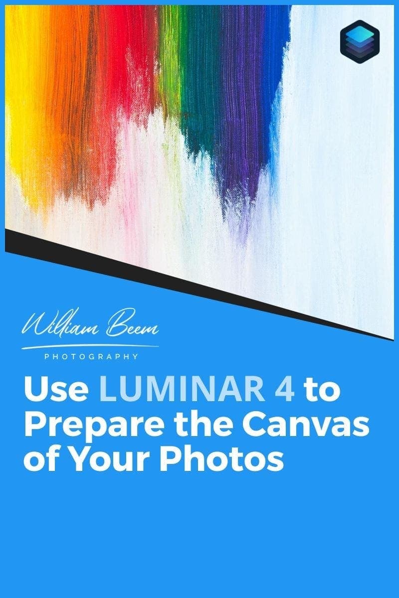
we're going to be talking about the canvas, and if that doesn't make any sense to you, don't worry. It'll make sense. In a moment. You come over here and look in the upper corner, you'll see this thing looks like a pencil and a ruler, and it pops up and says the word canvas. We'll go ahead and click on that while we're under the edit tab.
And you'll see that it gives you a couple of tools. There's an erase tool. There's a clone stamp tool. There's lens geometry, and crop and rotate. So crop and rotate makes sense to a lot of people. You understand cropping something in and you understand rotating photos. Lens geometry is kind of dealing with imperfections that happen due to the lens and focal length that you're taking your photo with.
Overall, the canvas is about the size and shape of the background of your photograph. In other words, is it going to be something like a square crop? Is it gonna be a normal, you know, four by six, eight by 10. Is it going to be a 16 by nine? But also there are other factors. If you look at lens geometry,
let's go ahead and pull this one open. And if you have a raw file, this doesn't really show up for, um, for JPEGs. But I have a raw file. There's a button here for auto distortion and corrections - click that. And you can see that it just kind of popped the image just a little bit. It's correcting for the distortion within the lens that I use for this particular photograph.
You can also remove chromatic aberrations. You can defringe it, but you can also do a little bit of manual work over here. You see there's sliders over here for lens distortion. As I move this to the negative, it kind of bows out. If I move it back a little bit, it kind of bows in. You notice that there's another section over here for devignette.
So you can bring this up a little bit. Some lenses, and maybe if you've got a lens hood on you, you might have a little bit of darkening in the corners, or just kind of a vignette that naturally occurs with your lens. You can remove that because you don't always want that happening. So you can kind of correct that over here with the devignette.
And this devignette midpoint allows you to change. Where is the center of the vignetting problem that you have? It's something you have to do to taste so you can kind of look at your photograph and see how that works. There's more options down here for vertical and horizontal. I won't go into those too much, cause we'll do that in another video.
This is kind of an overview, but you can see that it kind of moves things backward, moves things forward, and you can kind of change the plane of your photograph. So we'll double click the title vertical, and that'll just reset everything back to normal. The idea for the lens geometry is to fix the canvas that you're working on. So if you have any of these little errors where it's
just kind of out of alignment with what your vision is. And sometimes maybe you took the photograph that was out of alignment and you need to align it to put on something else. So you've got options to work with out here. It's actually a pretty cool little tool. Now, click that. Crop and rotate is exactly what you would expect. There's you see the crop lines over here and you can click this and just kind of change the orientation of your crop bar.
So if you want to make a portrait of your landscape shot, just click this little button over here and it'll change the orientation of your crop. And of course you can change the aspect ratio here. You can do it Freehanded or there's a number of things that you can do right here with common types of crops. I kind of like this one,
like if you want to do a Facebook cover photo, it just has a crop and therefore you automatically, and you can just set that up as to how you want it to be. So that's the, to me, that's, that's a nice little, if you know, custom dimensions, you can go ahead and put that in and it'll put the aspect ratio that you want.
And then you can resize the crop. Clone stamp tool is pretty simple to use. You can see in the middle here, it says select the source. So for example, uh, like every person she's got just a couple of little bumps on her head, little imperfections. If I click right here next to it. You can see the size of the brush,
that, that little plus sign that's right in the middle. That's the source where we're going to be cloning from. I'm going to use my bracket keys to reduce the size of my brush. And I'm just going to go ahead and click on that little imperfection and you can see two things. One, you can see the imperfections and all over there, but now if I want to work the same way with other imperfections,
like this one, you can see that there's kind of a little bit of a linking between the source and the brush. So I don't have to keep selecting a source every time that I go ahead and click that brush. So I can go ahead and click that and that's gone and you can very quickly kind of move around and get some of those small little imperfections and clone them out of the way.
Then when you're done up here on the upper right corner, just click done. Alright. And that's a quick look at the canvas area. Okay. This is the section that most people are interested in with Luminar and that's taking a look at some of the AI tools. So there's a few different places that we're going to look at. We're going to start here with some of the ones to try and just make everything better kind of tools.
So we're under the edit tab over here and we're on the essentials tool. So you can see what the little light source over here. And there's two of them here. One's called AI Enhanced. The other one's called AI Structure. Let's start off with AI enhance. You can see that there is an AI Accent and there's an AI Sky Enhancer. Let's start off with AI Accent.
Really, all you do is you drag this slider over and you can see how it changes the photograph. It's just, it's just kind of makes everything look better., It's adding, you know, contrast it's brightening and warming, and it's doing a number of things and it's doing it differently for each photograph. That's part of the AI. It's got this database of knowledge that is from different photographs have been processed.
At least that's the way I understand it. Then it uses that knowledge to try and enhance the photograph you've got. So let's take a look up here with this is the before and the after. So you can see it just kind of really just sets the contrast in the warmth. Let's go ahead and take a look at the compare slider and you can also see a before and after.
So that's our before that's our after. And you can take a look just at the sky on each side to see that it is making some changes. Take a look at the lighting inside of the Capitol building and how it's kind of coming off with a nice little glow. It really just does a nice job just by moving that slider. Now on this photograph,
the AI Sky Enhancement, probably isn't going to do too much. You can see that it's darkening the sky. And that's typically what it seemed to do is bringing out the blue, but that's not really what I want for this photo. To me, a sky without clouds is just not what I want. So we're going to skip past the AI Structure.
And we're going to jump ahead to the creative tab, because this is one of the hallmark features of Luminar is the sky replacement. And you can choose the sky. There are a number of skies that are part of Luminar. So if you're not certain that you've got a sky replacement that you want to use, you can get started over here. So we're going to choose a dramatic sunset one and see how that looks.
And this is one of the things where you kind of need to experiment a little bit. You want to make sure that the lighting that's within the sky matches the lighting that's within your subject. If the two don't match together, people are gonna look at it no matter how well it's masked in here. And you can see over here with these little trees are the masking is outstanding.
Even over here on top of the Capitol with these little railings, it masks perfectly. This is the quickest replacement for a sky I've ever seen. But no matter how good the masking is, if the lighting of the sky does not match, then you've got a bad photo. Let's go ahead and take a look at a few other skies. I mean,
we can try a blue sky. I don't think that's really going to be able to fit for this, but it just shows you that there is possibilities. And like I said, if the sky doesn't match the scene, it just comes across the wrong way. Now, if you don't find what you want out of all of these, you can also come down here to load a custom sky.
And I've got a collection of skies that may or may not work. Let's try something really strange. Let's try this one and we'll just check that out. Actually, it kind of works in a way with the color of the tone of the upper dome, but the idea is there's some scarves out there for you to try out. You can go find and take pictures of your own skies if you like,
or find collections of others. So long as we're looking at sky replacements, I'm going to go ahead and click here on the advanced settings. And now you've got a few other options down here. So close gaps in case you've got some places where it's just not really showing up quite the way you want to. I don't think this image is going to be a good option for it,
but if you're, if you're finding a gap, you can kind of stretch the sky or bring it closer or further away. The resolution of the sky is I think that we're seeing in these packages, packages are just much larger than what our original image is going to look like. You can also flip the sky. So we can go ahead and change the defocus.
The defocus has kind of given you a little bit of out-of-focus look for your sky. And typically, that's not something I want, but I do like the option that is there. Because as I said, maybe you've got a sky that you liked. The sun is on the right, but in your photo, you need it on the left. It's good to be able to just flip that back and forth.
There's an option to add some atmospheric haze, basically make it look foggy or hazy, and you can kind of bring that in on your sky as well, too. It's something that you're going to do to taste. Same thing with the temperature. If you pull it down, I believe it makes it cooler. And if you go ahead and bring this up,
it's going to make it much warmer. So you'll have to choose that. And you can also, this is a handy one, reduce the exposure of a sky or brighten it up depending upon your need. So there's plenty of options there for if you're going to replace the sky, you can also just kind of change how the sky looks overall with just a little selective processing.
Now, another item that we have here is this AI Augmented Sky. This is the type of compositing within the area that's the sky. So you can't necessarily put something down here and have it appear, but you can put something in the sky. So let's go ahead and take a look again. You can download new objects, you can choose some of the options they have here.
So for example, we have a balloon at the bottom. You see there's a place to load a custom image. So let's go ahead and put in a balloon. Now, if for some reason your object isn't where you want it, or you don't see it, click this button says place object, and you'll see little framework that comes out. So you can go ahead and move that up where you want.
And if it's too large, grab one of these handles and make it a bit more of an appropriate size for your image. And you just go ahead and hit place object, again. This amount slider is kind of like an opacity slider. So if it's a little too much, I don't know why you'd want to see through a balloon, but if you ever do,
there's a way to do it. You also have a warm slider or so you can kind of bring that down to cool it down, or bring it all the way up and add a lot of warmth to your object that you bring in there. And again, there's another relight, a slider for you. In the advanced settings, you can refine the mask,
you can defocus the outer. So for example, it's supposed to be in the background and it shouldn't be quite as clear. You can go ahead and give that a little bit of lens blur. That's what the defocus is doing for you. But let's go ahead and do that. And again, there's an option here to flip the object. So for some reason you want this blue on the other side,
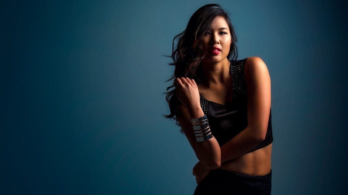
you can flip it around. The reason they put these tools in here is because they don't know which way you're going to need them in your composition. So sometimes just flipping the tool around is the best way to handle that. Okay. So I promised we we'd come back and take a look at the AI Structure. We've got a different photo here. You can tell us kind of grungy looking in the background and we've got a person with skin tone upfront.
So you're set at zero in the center. Let's go ahead and bring this up quite a bit - 74, and you can see it affected everything. It affected the skin tone effect his hair. Also a lot of stuff in the background. If we come on the other end, look how soft it is. It's almost like having a lens blur kind of effect almost on him.
So it's probably not exactly what we're looking for. We can take a look at doing some selective adjustments. So for example, let's say that we want this look, but we don't want it to affect his skin. Well, we can do an edit mask and then let's do a luminosity mask. And what we're going to find is that it's creating the luminosity mask. It's going to create a little map of things that are darker or lighter.
And then it's going to apply selectively the, of the effect of AI Structure based upon that mask. And you can go ahead and flip this around. So for example, if you want to invert that filter, we can do that. And you see it now as giving much more for the background, whether it is to his skin tone. So you can kind of soften,
or let's say that now that we're applying it to the background, we want that to not compete with him. We could change this over here. And maybe it's a little too much, but you see that he really stands out quite a bit compared to the background. Where before it was kind of competing with him. So if I turn this off,
you can see that background. It's just a bit too busy, a bit too much information there. You kind of want to mute that. So sometimes you may want to take your structure down, apply it with a mask that, uh, selectively decides where you're getting everything. The last of the AI effects that we want to look at are the tools are under the portrait.
You can see there's an AI Skin Enhancer, an AI Portrait Enhancer. Skin Enhancer is really very simple. Uh, you've got an outsider, you kick it up and you can see what the changes are. Let me go ahead and zoom in a little bit here. So as you take a look, you can see like there's just little micro blemishes,
imperfections, in her skin. And as we smooth it out, you can see that it goes away. Not everything, though. You can see, like, there's a little blemish here and a little blemish here. You could go and get the clone tool that we looked at earlier and take that out. But there's an option here. If you check this box, AI Skin Defects removal.
And as you click that, and then you go ahead and bring this amount slider up, you'll find that it kind of gets rid of those little micro blemishes. And if you need to go back and use the clone tool for something that's maybe a little bit more than a blemish, you can, but let's take a quick look here so you can see that's before,
and then that's after. And you take a look right around in here. You can see just a little tiny imperfection. No one would ever know or notice. And there's a couple of right in here and right in here. And as we bring this over and see the after is kind of taking care of those things for you. So that's a very handy tool.
Also notice that we still have pores. We still have some structure inside of her skin. And we didn't lose that. Even though we just kind of reduced it a little bit. I took this off and I probably wouldn't, uh, process her skin quite that for a young woman like this, but that's a nice feature. Another one is this shine removal.
So take a look right here on the edge of her nose was a bit of shine from the flash that was used maybe a little over a here on her cheeks. So as I bring this up, you can see that that kind of gets processed and taken away. Let me do the before and after, it's a very subtle look. So, you can see how the shine is on her nose.
And then as I come over here, you see those, it wasn't removed entirely. It was reduced. And I think that's good. You still want to have a little bit of highlight, but there's a little bit too much of a specular highlight there. So it's really taking the specularity out of it. So that is the skin enhancer. And of course,
there's a mask where you can go ahead and just selectively apply this where you want to. The portrait enhancer is really an interesting thing. So the first item on here is face light. One of the reasons why you have that is because sometimes you want to brighten the face because the human eye is drawn towards the thing, that's the brightest. So I'm going to take this all the way up to like 49, 50,
and you can see a really brighten her face. You don't want to take it all the way to a hundred, because then she ends up looking like a flashlight. And that's not quite the look that we're going for. I typically do this very slowly, kind of in stages, to see where I want to. And then I'll give it a quick, you know,
before and after look. So we can toggle this over here and see how the lighting changes on her face. And then when we're ready, we'll just go ahead and turn it back on. She doesn't have any red eyes, so I can't really demonstrate that, but take a look at the whites of her eyes. This little eye whitening tool is,
is really rather handy. The next item down is the eye enhancer. This is going to concentrate on the Iris right in here. So I will bring that up about halfway. And the reason I'm bringing these things up to halfway isn't necessarily because that's, the choice that would make. It's I want to be able to demonstrate what the difference is. So again, we'll get our a compare tool.
So that's before that's after, and you can see like, even with, you know, dark Brown eyes as she has here, there's a lot more life to it than there was before. So this is where I have dark circles. That's kind of, if you've got some shadows with dark circles underneath here, we'll give it a quick try,
but I'm not expecting much from that on, on her face. Now the one thing that I wouldn't think that you would need to do on this face, but I've learned over the years is this is something that you kind of want to do on every face is to slim it down just a little bit, not much. And we're talking about maybe 5%,
this tool makes it very easy. I'm going to, I'm going to do more than 5%. I'm gonna bring it up halfway again, and we'll see the changes in her face up here. And it's just one of those things that you almost don't notice that you may have seen it pop up, let me turn this on and off. So this is before,
and this is after. It's a very subtle thing and I wouldn't go to 50 with her, but I would probably bring it back down around 20 or so. And then just, it's a very subtle kind of look, but it makes a difference in how you perceive someone. It's the same thing. When you want to enlarge the eyes. This is an old magazine trick.
It really just helps people connect with the person a little bit better. And it also may depend upon which lens you use when you're taking the photograph. So let's show you what I mean. Again, I'm gonna bring this up about 50 and you can see it just popped her eyes out. And when you first see it happening, I don't know if I want to do that,
but give it a little before and after look, there's our before... there's after it kind of opens up her eyes, you can see it's changing her eyebrows and her forehead just a little bit too. It's kind of like the way we relate to newborns. You know, they've got big eyes for their head and it just makes them a bit more endearing. So this is more than I would go again.
So we'll go ahead and move that. The next item down is about improving the eyebrows. So it's a little sparse in here. We want to fill those in. So I'm going to bring this slider up again about 50. And what you'll see is there's a change where it's a little bit thicker and it's a little bit darker than it was before, and you can move it all the way over to a hundred and it really going to pop those eyebrows in there.
And that's too much. It's like it, it demands your attention and that's not what we're looking for with eyebrows. Now I will say this much. It works great on brunettes. When you do it on blondes, it works on them too, but it makes their eyebrows darker. And that's not necessarily how blondes appear. Same thing with the redheads. So the coloring seems to be just making things fuller and darker.
So this is a tool that I like for brunettes. I don't necessarily use this very much, or at least not in very large degrees with a blonde or a redhead. Finally, the next section we're getting down to are lips and teeth. I feel like going to go with the teeth whitening first. So you can see she's got nice healthy teeth.
We bring this up to about 52 and suddenly... there you go. Those teeth whitening should not be white. There should always be a little bit of yellow in there. So if I bring this all the way up to 100, you're going to see her teeth just look unnatural. So the idea is to enhance what's there, not replace it with a flashlight. I want to turn that back down a little bit and then we'll just take a look at the lips. So we can boost the saturation.
We can change the redness. In other words, she's got nice lipstick on here, but we can also boost that up and just add a little bit more red to it. We can also darken the redness of her lips, and that just kind of gives you some options. You can work with a lot of combinations with saturation, redness, and darkening,
to get the look that you want. Alright, so those are the AI tools. I hope you found them interesting and useful. There's a lot of power in them and they will save you a lot of time. Honestly, it really changes the way that I process my photos these days. I'll see in the next module where we're talking about exporting, alright,
in this last section, I wanted to talk to you about some of the ways that you get your photos out of Luminar and that's important. Let's face it. What's the point of processing all these things. If you can't get them out of Luminar, print them, share them and show your work to other people. So there's really only a few simple things that you need to be aware of.
If we look at this little icon up here, I mentioned this earlier, this is the export icon. So you can export your image. There's also a section to send in mail, in messages to SmugMug or 500PX. And I'm on a Mac. So obviously that's why mail and messages are here. If you're on a Windows machine, you may have different options.
Also, you can open them in other tools. So for example, I've got Photoshop. Elements is greyed out because that's a tool I don't have on this computer. I also have Lightroom and Apple's photos. So again, if you're on a Windows machine, some of your options may be different because you're probably not going to see the window. Excuse me, Apple photos.
You can also click on one of the images and right click on it. And you'll see that there are options here to export, to share the same programs and open it in the same program. So, whether you want to right click on the photo, or just select it over here and click the share button, your options really are the same. So if we click export image,
you've got a few things. You can change the name, you can change the location. So I've got this one going to my desktop. Sharpening! I typically, if I'm going to just do a JPEG off to my desktop, I'm going to set it high. Sizing, I typically like to do long edge. And in my case, I kind of go for HD dimension.
So I'm going to say 1920. And that way it automatically does the calculation. You don't have to know exactly the dimension. It should be 1080, if you're going for that 16 by 9 look. But if you haven't cropped your photograph and it's not in that 16 by 9 dimension, you don't necessarily know what the other size is. So that's why I just go with a long edge.
On 1920. Color space is very important. If you're going for the web SRGB, but you also have options for Adobe RGB and ProPhoto RGB, depending on where you're going to be sending this file. And of course you can choose from a few different types of file formats, JPEG, PNGs, Photoshops, PDFs, whatever you need. Quality. It really depends again,
where are you going to send it? If I'm going to put this on a website, I know that I can reduce the quality and still, It looks good. So basically I might bring that quality down to 65 and that'll give me a smaller file size. So my webpage loads faster, I don't necessarily get a worse appearance to my web visitors. If I'm going to print,
I want to raise that thing all the way up to a hundred. So you can just select your options, hit, save, and it'll do the export. And that's really it for getting your photos out of Luminar. Right, thank you so much for watching my little overview of Luminar. I hope this has been helpful to you. I mentioned there'd be a bonus at the end.
If you take a look in the description, you'll see that I've got a coupon code for you. It's the same thing as my last name. And that'll save you $10. If you're buying Luminar. Sometimes Luminar is on sale from Skylum and they will have additional bonus on there. And occasionally they've also allowed us to stack our coupon codes on top of that. Last thing
before we go, let me know in the comments. What was your favorite part of Luminar? Is it the fact that this is a very straightforward and easy to use program? It doesn't have anything more than you need. It does the job and it does it very well. Do you like the AI tools for the augmented sky or enhancing the sky or the fact that you can just drag a slider for the AI Accent and make everything look better?
Your post-processing has never been faster. Do you like the portrait tools? I mean, you can really go in there and take care of some portraits, reshaping the face, enhancing the eyes, eyebrows, brightening, the teeth. These are things that used to take a long time in Photoshop. And now if you can just move a slider and make them happen.
Do you like the fact that it is a way to organize your photos? Very simple, very easy, and you can get your photos in and out without any problem. Let me know in the comments below, and I'll see you in the next video.
Want to learn more about Photography software? Click below to check out articles about Adobe, ON1, Skylum, and more.
Photography Software Articles