Affiliate Disclosure: We earn a commission if you purchase through one of our links at no additional cost to you.
You want to create unity in your photography so all of the elements look like they belong together.
Have you ever looked at a photo and something just didn’t seem right? Sure, it used the obligatory compositional elements like Rule of Thirds or Leading Lines. There’s nothing obviously wrong when you see it.
It just doesn’t look right.
Chances are that the elements in the photograph lack unity.
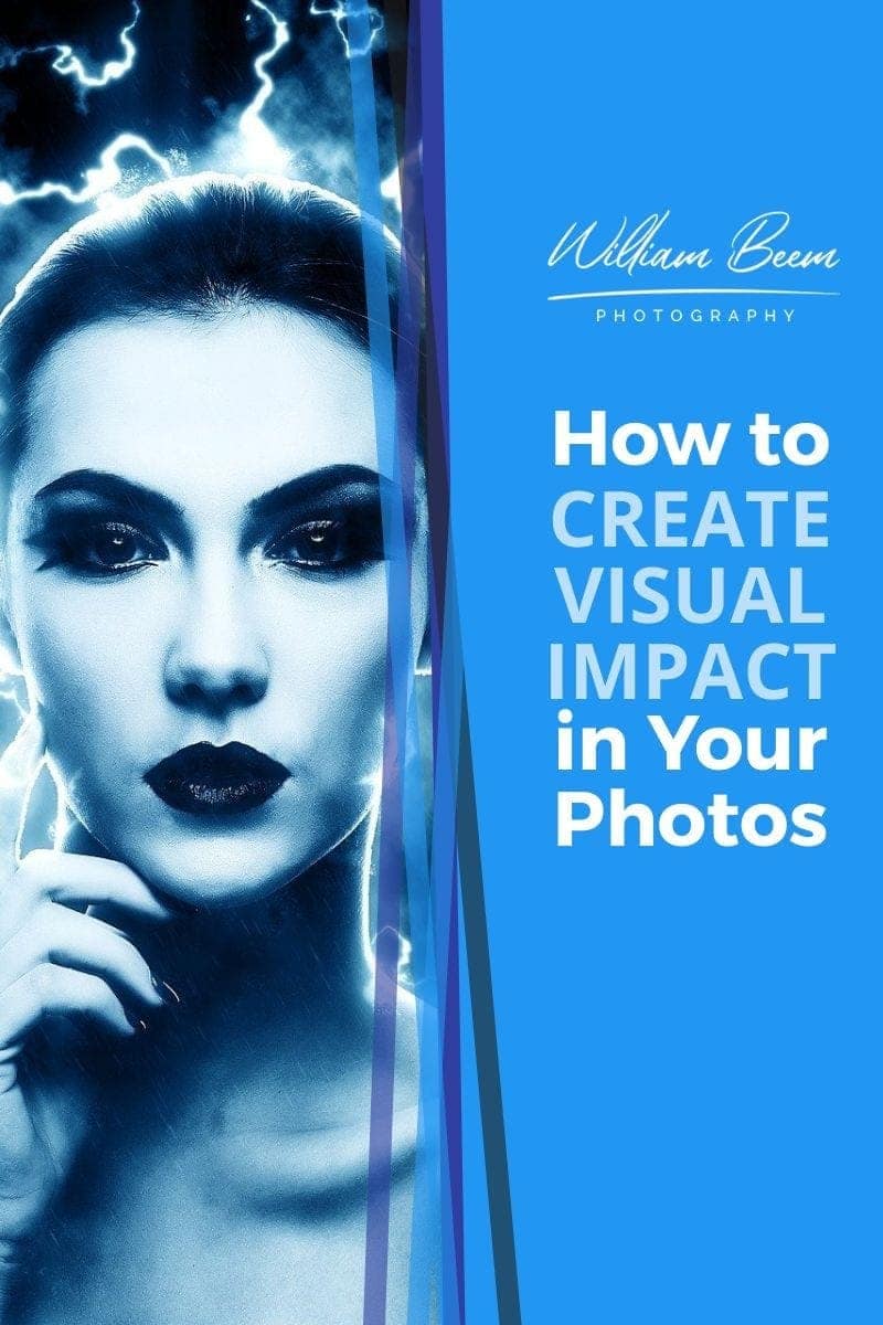
Why It’s Important to Create Unity in Photos
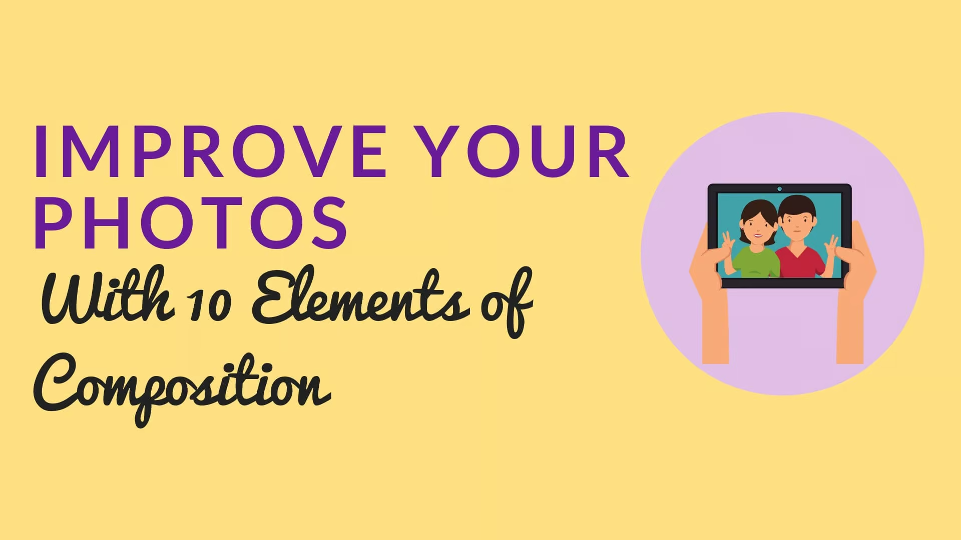
Unity is one of the 10 Elements of Composition, based on a post I created a while ago.
Unity gives the viewer a sense of content. The elements look like they belong together.
If you’ve ever seen a photo of Santorini, Greece, all of the buildings look very unified. White buildings capped with blue domes along a cliff next to the sea. Everything fit. Everything belongs together. It’s peaceful and serene.

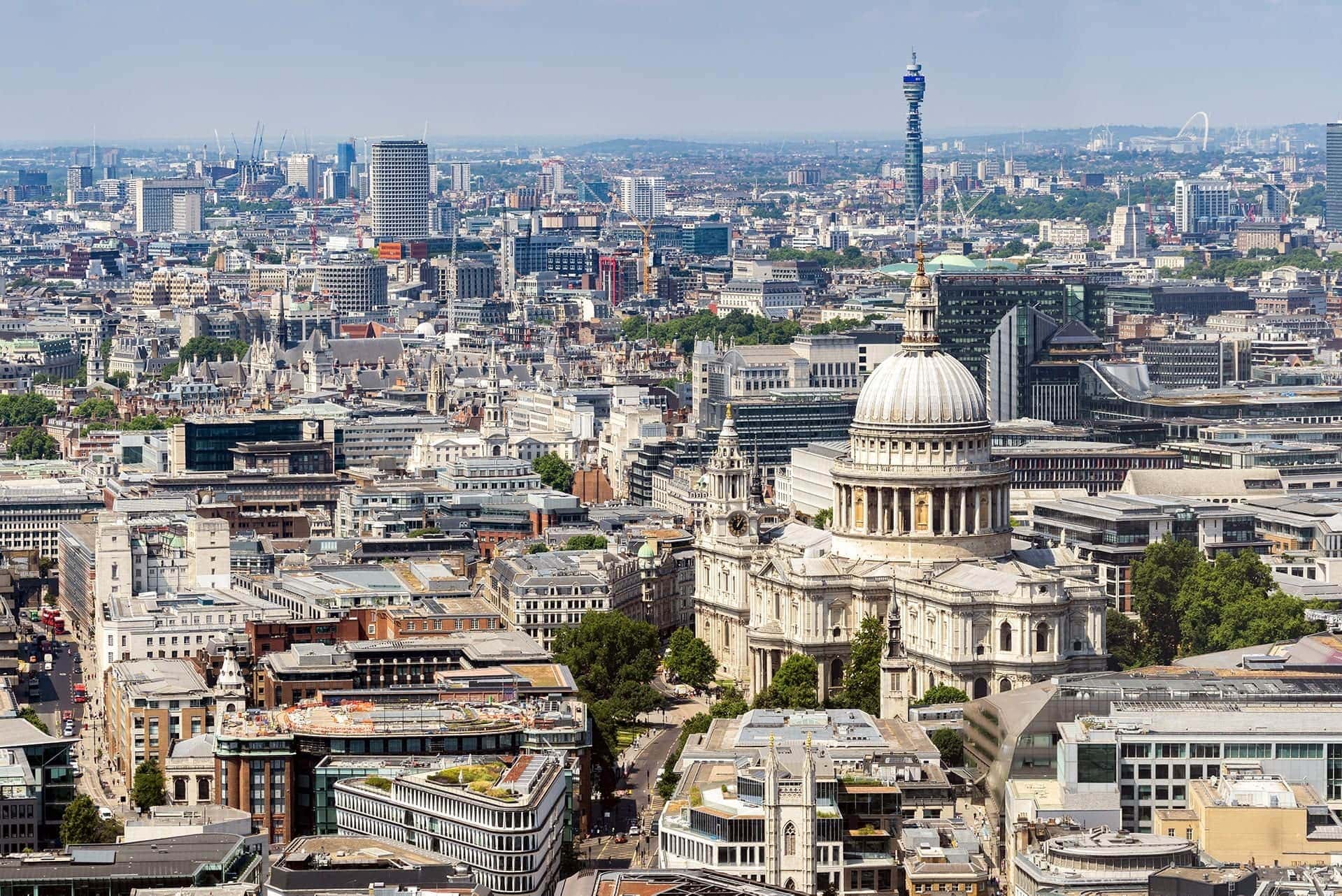
Now take a look at the skyline of London. It’s a hot mess of buildings disunited through time. A few modern skyscrapers, some old brick buildings, and everything in between. Nothing looks like it relates to the building next to it.
You could say the same thing about my hometown of Orlando. Old brick buildings, some ugly things created in the ’70s, and a few modern skyscrapers. Each has its own design, none of which belongs to the neighbor next to it.
Whether it’s London or Orlando, there’s no unity in the design of these towns. Places like Santorini or some Caribbean towns with colorful beach houses have unity. They share the same design and color palette for everything in the scene.
Whatever photography you enjoy, it’s important to create unity in your scene so it makes sense to the viewer.
How to Make Sure Elements in Your Photo Work Together
It’s one thing to understand that you need to create unity in your photos, but it’s something else to know how to do it.
Try to keep in mind that unity is sometimes a subtextual thing. It isn’t always obvious why something isn’t working. There should be a theme to your photograph and all of the elements in it need to support that theme.
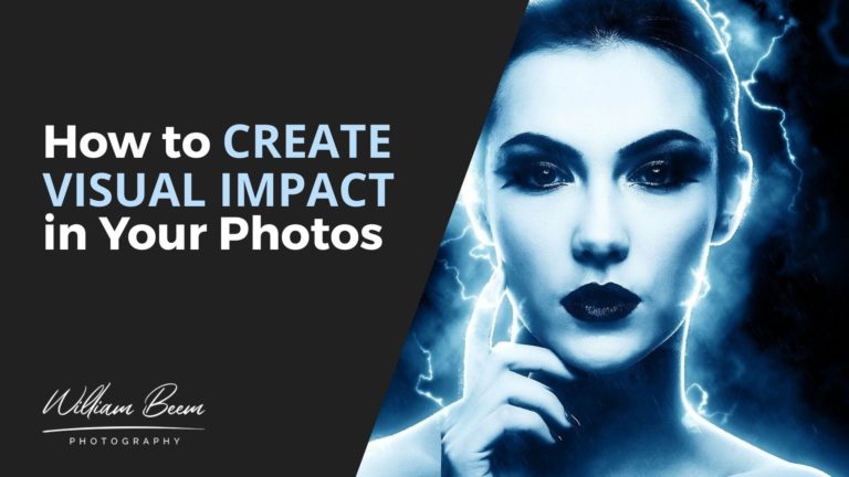
That includes your post-processing. One of the reasons why people like to use color grading on photos is that it provides a unified color palette for everything in the photograph. This is something particularly important with composite photos, where each element may have its own color cast.
Something has to tie the elements together thematically, both with the context of the elements in a photo belonging together and visually so the colors and lighting work harmoniously.
One of the examples we provided in the podcast was about Lee’s top-down coffee photos. If she builds a set using rustic-looking backgrounds and elements, it would be out of character to have a plastic sugar bowl in the photo.
Unity brings harmony.
Elements That Create Unity
We discussed some things that help create unity, like color harmony. There are a few ways to achieve color harmony, but that’s not the only way to create unity in your photos. Here are a few elements to consider when you create your photos.
1: Color Harmony
Color harmony is one of the most visual aspects of your photograph. That doesn’t mean you have to create everything with the same color (though you could). Nor does it mean that you just say “To hell with it” and convert everything into Black and White (though you could).
I love color. It has a place in our hearts and tells a big part of the story in our photographs.
2: White Balance
Your white balance doesn’t have to be critically correct for art, but it does for commercial work. If you get a job working for a client with specific brand colors, you need to ensure that you represent them correctly.
That means using tools like the Calibrite ColorChecker Passport Photo 2 and the Calibrite ColorChecker Display Plus to ensure accuracy from capture to print.
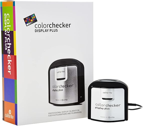
Having an accurate display is critical. The Calibrite ColorChecker Display Plus is a direct replacement for the X-Rite i1Display Pro Plus, and offers technology for better blacks on OLED displays or any display that can achieve close to zero black point.
HDR-supported displays are also no problem, as this unit is designed to minimize clipping in dark areas while allowing you to achieve excellent blacks. It's USB-C compatible with the included USB-C to USB-A adapter, so you'll be able to use it with the latest computers and devices.

The Calibrite ColorChecker Passport Photo 2 is the perfect tool for avoiding frustration with poor colors in your photos.
The Portable Protective Case accommodates multiple positions for easy use with four specialized targets. You can create custom camera profiles based on your individual camera/lens/lighting combinations for DNG and ICC workflows. You can also create a custom in-camera white balance for a consistent white point across a set of images without needing to correct each image later.
The enhancement patches allow you to check and evaluate shadow details and highlight clipping, and the lanyard ensures that your Passport is always where you need it.
Artistically, you can use white balance to unify the scene with color temperature. It’s really up to you to decide what works best. If you’re into flash photography, using color gels and a creative white balance can help you create some striking and colorful photographs.
If you like composite photography, keep an eye out for elements with different white balance. You’ll have to unify them in Photoshop or some other post-processing tool.
3: Color Palette
If you’re like me, you don’t know how to create a color palette. That’s OK. There are a few different ways to get control of your color palette.
There are design sites and Instagram accounts that concentrate on color palettes. Check out the Hook Agency for some example palettes. At the bottom of their page are more sites to check out to see color palettes or generate your own.
Adobe Color is one of my favorite sites to use to generate a color palette. You can upload a photo and it will extract color palettes from the image.
4: Color Grading
Color grading is a process that changes the visual tone in your photos. Since it’s used frequently in motion pictures, people think that color grading their photos provides a cinematic effect.
There are a number of ways to implement color grading in Lightroom or Photoshop. It’s frequently used to change colors in the highlights and shadows
You can do a lot of things to change the colors in your photographs, both selectively and globally. Selective adjustments may allow you to change different elements to use colors from a palette you selected using one of the resources above.
Global color changes, or color grading, add unity to the entire image and create a visual color harmony with every element.
5: Mood
You can create unity with the mood of your photos. How do you want your audience to feel when they see your photo?
Every photo should evoke an emotion. Does your photo have a unified emotional feel to it, or are some pieces not telling the same story?
That doesn’t mean you can’t have an element out of place to create emotional contrast, but it has to make sense to the viewer. If you have a photo of a beach volleyball game with many young, fit players, it will look strange if there’s a killer clown on one of the teams.
Make sure your whole photo has the same mood.
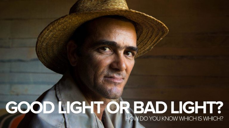
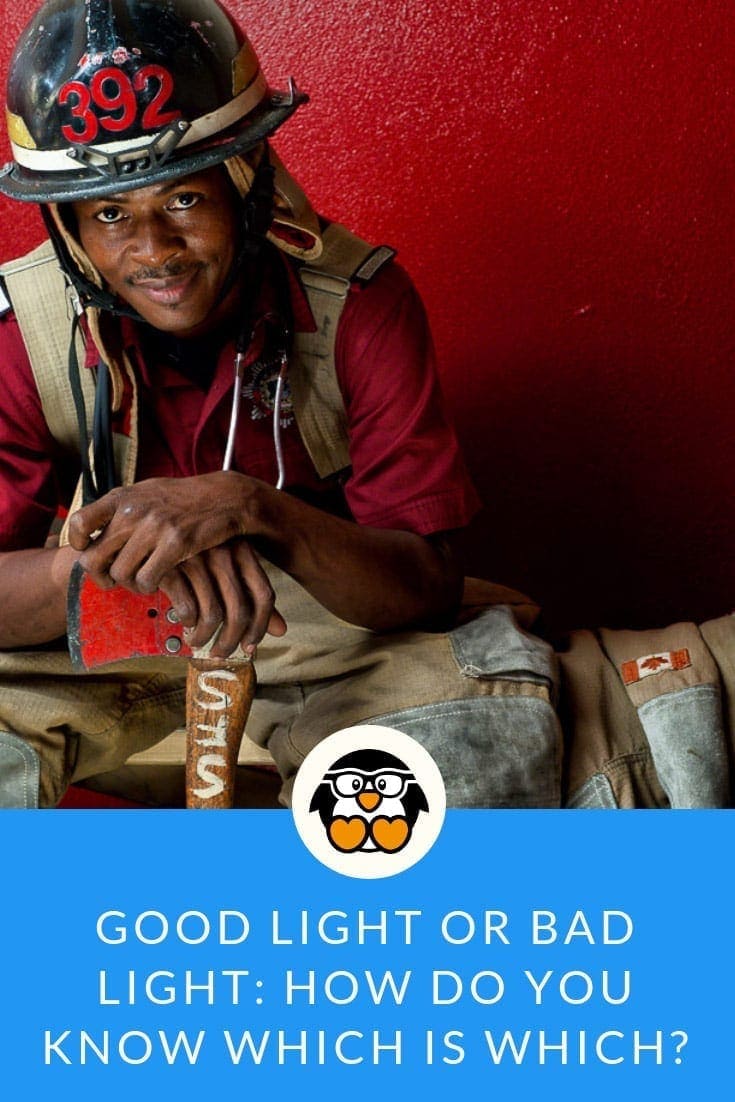
6: Lighting
Lighting is a great way to either create unity or kill it.
Are your shadows all going in the right direction? Nothing looks quite out of place like having light come from a source that doesn’t make sense to the viewer. Remember the elements of light to help create unity and provide logic to the photo.
Light is your primary tool for photography. Remember, you don’t have to light everything. The absence of light creates shadows that define your subjects and give them dimension. Light also helps you set the mood for your photos, so choose the light that tells your story and unifies your photo.
7: Supporting Subjects
Part of your job to create unity in your photos is to provide a sense of logic. Things need to make sense at a glance.
You can do that by carefully including only the supporting elements that tell your subject’s story and excluding anything you don’t need. That probably makes a lot of sense when you’re building a set or a scene. Not quite as much when you’re capturing a place or event.
That’s when you have to rely upon your sense of composition. Choose the right lens to include what you need and exclude what you don’t want to have in the photo. More than once I’ve had to work a scene to get my subject composed without some distracting element just out of frame.
If you have the time to take composing your scene, use it. Take photos from different angles and see what works best. Sometimes the best composition is only a couple of feet away.
Include the items that make sense and eliminate everything else from your composition.
Bonus: Learn How to Use Space and Balance in Your Photography
We didn’t discuss it much in this episode, but check out this article about How to Use Space and Balance in Your Photography.
When You Create Unity, You Create Logic
We started this article by discussing how a photo just doesn’t look right to a viewer. Essentially, that’s because there was something illogical about the image. If it “just doesn’t look right”, then the viewer’s brain knows there’s something illogical about the photo and refuses to accept it.
Unity also helps when you create your photography website.
That decision happens in a split second. Taking a bit of time to create unity, from capture to post-processing and print, is extremely important to your final result.