Affiliate Disclosure: We earn a commission if you purchase through one of our links at no additional cost to you.
I finished watching episode #109 of The Grid on Kelby TV, featuring an online portfolio critique. The horror. I learned that plenty of photographers don’t know how to create a photography website. Let’s discuss how to create a photography web site.
How Do You Know What You Want?
There were several different site designs during the critique and one thing became very clear to me. Most people never actually thought about what they want to accomplish by posting photos online.
Trying to create a photography website is like any other development project. I’m going to use a word that nobody likes to discuss, but it’s critical – requirements. Software developers need requirements to design and develop a system.
Building your photography website is a software development project. If you don’t define what you want – your requirements – then you will fail.
So, what are some common requirements that visitors want to see in a photography website?
How to Create a Photography Web Site
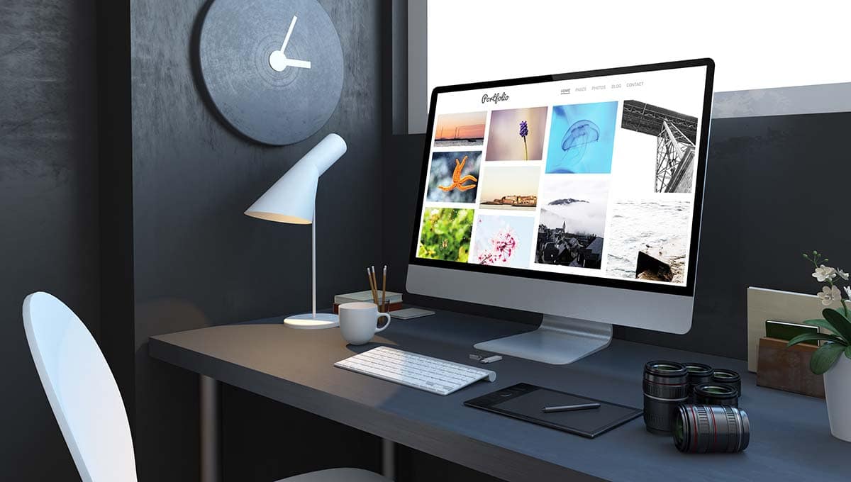
I’m willing to bet that most of you are thinking about the wrong things as criteria for your website. You may be thinking of specific details, but you need to look at a higher level. Instead of making tactical decisions, start with your objective.
For example, I want to attract other photographers who are interested in learning from me, or I want to attract potential wedding contracts in the Central Florida area. Be specific. Give your site a mission statement. Refine your objectives so you can say what you do and who your site’s audience is.
Eliminate extraneous content. Define a niche and work it.
Since I don’t know your niche, I’m going to give you some very generic and essential strategies for your photography web site.
5: Visually Interesting
How long do you stay on an ugly website? Most people leave rather early if the site looks unprofessional, cluttered, or poorly designed. Photography is a work of the visual arts. Your photography website needs to complement your work, not detract from it.
My advice is to go for a minimalist approach. Don’t add anything that doesn’t serve a purpose. Eliminate distractions from your purpose. It’s easy to start adding all sorts of banner ads, plugins, and other things that seem to do something cool or clever. In the end, those things are distractions. Yes, I make some money from the ads on this site, but they’re getting the ax fairly soon.
Why? Because ads don’t deliver that much money, and they can interfere with your potential to earn even more money. If your objective doesn’t include earning money, then you don’t need ads anyway. If you earn money from clients, you don’t want ads distracting attention from your message. Eliminate distractions from your site’s purpose.
Use simple colors and not many of them. Black text on a white background is the easiest to read, so that’s what you should use. You only need two fonts – one for headlines and one for your body text. Anything else is confusing. Speaking of text, make it large and easy to read. I use a 16-pixel font size for my body text. Don’t go smaller than 14 px.
Use color consistently. Don’t use the same color for hyperlinks in one place and then use it for emphasis in another. Assign a task to your colors, just as you do with your fonts. While you’re at it, don’t use a color that a four-year-old can’t pronounce. There is no chartreuse in a good web site.
4: Easy to Navigate
Do you feel frustrated when you surf into a web page and don’t see a way to navigate? Most people do, which is about the time when they leave your website. Make sure that every page has a menu so they can get to your Home, About, Blog, Portfolio, and Contact page. If you don’t give your readers an escape route, they’ll create their own.
Use hyperlinks in your text to keep people on your site. If I link to an article on my site, the visitor sees more of my website. If I link to some external page, it opens in a new window. They can see what I reference, but my site is still there, ready for them to resume exploring my content.
Resist the urge to be clever or different when naming your menu items. Use words that are common so everyone will understand their purpose. People like consistency. That’s why McDonald’s is a success. Not because it has the best burgers, but because people get a consistent product from one McDonald’s to the next. Be creative with your art. Be consistent with your navigation.
3: Fast Performance
People will quickly get bored and leave if your site doesn’t load in a reasonable amount of time. Fast performance is a challenge for photography sites. You want people to see large images, but that creates longer download times. Your load times will suffer if you have several large images on the same page.
Other factors can degrade your site’s performance. The type of web host you choose may significantly impact your site performance. Many people get an inexpensive shared hosting plan for about $10. It’s cheap but the digital equivalent of living in a tenement building. If your neighbor uses a lot of resources or attracts a lot of traffic, then your portion of the shared resources declines.
Likewise, malware that gets hacked into one website on a shared host can cause problems for all of the other sites on that server. It’s the equivalent of a fire in the building. You can do everything right and still suffer because of your neighbor.
For a little more money, you can get a Virtual Private Server. It’s all yours. You can load up multiple sites if you like, and change the configuration to suit your needs. You can get a managed WordPress hosting site for a bit more money (a lot more money).
Some people swear by these due to their performance and the fact that the hosting company keeps everything up to date. Expect to pay $100 or more monthly for this kind of service. You’ll also have to deal with some limitations from some of these providers.
You can also go with a service like SmugMug or 500px. You couldn’t get me to use them if they paid me for using their service. Yes, they are fast and have some beautiful layouts. They are also the living embodiment of digital sharecropping. You’re building your future, tilling someone else’s soil.
When you don’t have control of the site hosting your images, you lose the ability to market your images in ways possible on your site. You’ll have little or no access to visitor analytics, it’s difficult to build an e-mail list for direct marketing, etc.
Sometimes, these sites make it easier for someone to leave your page and visit another photographer hosted on their service. For these hosts, that’s great. The visitor is still on their page. For you, it’s not so great. You just got punked by your host and paid them to do it.
2: Mobile Device Accessible
You want a site with a responsive design. That means your website can reconfigure itself to accommodate different browser dimensions so your site works on phones, tablets, and computers with different resolutions.
Go ahead and resize your browser for this page to see what I mean. The sidebar will collapse. The menu adjusts. The site still works automatically at some different resolutions.
Avoid sending your mobile visitors to another site that’s geared for mobile. They won’t have the same experience and won’t be on your site. Likewise, you want to avoid using a plugin for WordPress like WPTOUCH to make your site work for mobile users. It doesn’t always work as you may expect and it’s a resource hog that can impact your performance. Look for a theme specifically created for responsive design.
1: Useful Content
Why do you go to a website? What drives you there? Curiosity? Boredom? Perhaps, but neither of those last for very long. Most people discover sites through a search engine and use a search engine to solve a problem.
They want to learn something. They want to see something. They want to hire someone. Search engine users are first-time visitors who need answers to their problems. If they encounter the slightest problem with your site, they will immediately leave and go look at the next entry on the search engine results page.
Everything we discussed so far is about eliminating problems that will make those first-time visitors decide to leave. They want to see an attractive site. They want to understand how to navigate through the site intuitively. It has to load quickly. About half of them may use their phone or tablet for the search, so it needs to work on any platform.
If you covered those bases, you’re in the running to win their hearts and minds. Now it’s all up to you and your content.
Don’t worry about Search Engine Optimization to rank high on Google. That does nothing if they arrive and find nothing of value. Concentrate on providing value to your visitors. Be useful. This is why you need a niche. You can’t be all things to everyone, but you can do a great job for a specific group.
Here’s the golden target you want to reach. There are things you know. There are things other people want to know. The gold is within the intersection of your knowledge and their desire.
How do you discover what people want to know? This is where analytics help. If you have your site, you can see what search queries lead people to visit your site. That information is gold. If you have a site with another service, you’re missing out on valuable information about what your visitors want from you.
Bonus Points
If you build it, he will come.
The voice who made that statement talked about a baseball field, not a website. There are millions and millions of websites on the Internet. People will not suddenly appear at your digital door because you put out the welcome mat. You have to promote your site. You must make your content specific enough to rise to the top of a search engine results page and yet generic enough to attract a significant audience.
If that sounds hard, it is! Building a website is a weekend project. Building your reputation may take years. Plan on doing it one step at a time.

