Affiliate Disclosure: We earn a commission if you purchase through one of our links at no additional cost to you.
Color is an inherent part of our world. Knowing how to use color in your photography should seem natural, but it isn’t. I made some garish color mistakes more times than I care to admit. Fortunately, learning how to find harmony with color isn’t that hard if you understand some basic concepts.
Color Demands Attention (at the cost of your subject)
Knowing how and when to use color depends upon the story you want to tell. After all, photographers are visual storytellers. Our strongest photos have some kind of message.
Sometimes color conveys the message. Other times color gets in the way of the message.
On the podcast, I referenced a post called The Dominance of Color when discussing whether I should use a color or black & white result for my photo. There are a few examples on that post, but one, in particular, was a photo of my Labrador Retriever, Milo.
He’s an odd creature, billed as a White Labrador. There’s really no such thing, he’s just a very pale yellow lab. However, when you see Milo, you think you’re looking at a white lab.
That is until you take a photo and freeze him in a moment.
Then you see shades of yellow creeping in here or there. I also noticed a small red botch above one of his eyes in the portrait. These aren’t things you notice around Milo, but they’re hard to ignore in this photo.
My solution was to convert the photo to a black & white image. That’s when I saw the dog that I know, without this extraneous color information to change my view of Milo.
Color Sets the Mood of Your Photo
We associate colors with moods. Mad people see red. Sad people have the blues.
These phrases didn’t come out of thin air. You can excite emotions with your use of color. We have active and passive colors at our disposal.
Active Colors
Active colors are warm colors, like yellow, orange, and red. They don’t just mean anger. Red may also indicate energy and excitement. Red is passionate.
Using active colors in your photos can trigger emotions and help tell your story. Warm colors associate with life. That’s why many sports teams wear Red to put the team in a winning mood.
Passive Colors
Passive colors are cool colors, like blue, violet, purple. They define reason, professionalism and tranquility. Sometimes that tranquility descends into sadness.
When you think or reason and professionalism, it’s no wonder that the most popular colors for ties are blue. Red isn’t even in the top 10 list. Men who wear these ties want to convey confidence in their action. Red may be a power color, but it also signifies a potential for conflict or recklessness.
Working With the Color Wheel
Understanding which colors work together is pretty simple, particularly when you use a color wheel. The Adobe Color Wheel is a free resource, but it offers some advantages for Creative Cloud members.
One of the reasons I like using this tool is that you can upload a photo to analyze the colors.
Let’s upload a colorful image and see what kind of color palette we get in response.
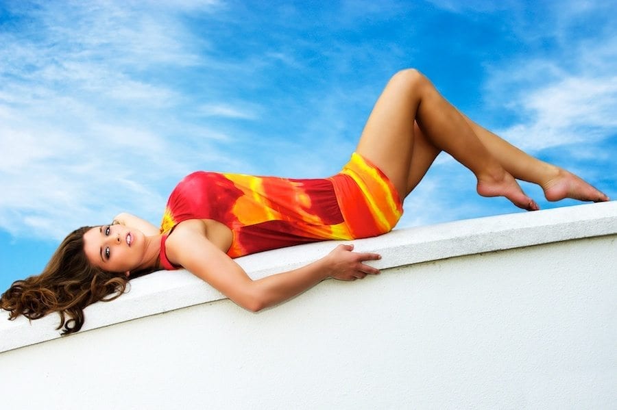
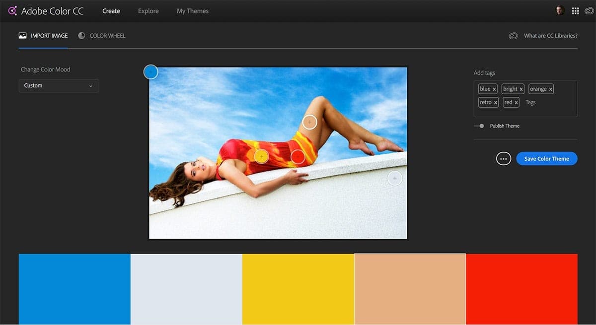
After uploading this photo, here are the colors that the Adobe Color Wheel assembled into a palette for us.
I bet the color palette results aren’t quite what you expected. Yet each result comes from placing a circle over part of the image.
The sky, her dress, skin tones and the wall are all in there.
We can move those circles around and pull out different colors. Imagine if I chose her hair instead of the sky, or used the skin tone from her face instead of her thigh.
If you want a closer look at those colors, I published the color palette for you to review. There are plenty of other published color palettes on Adobe Color. If you have Creative Cloud, you can save these palettes and import them into Photoshop or other CC tools for color grading or design.
An important part of this technique is identifying colors that don’t stand out to the human eye. That’s because the presence of surrounding colors makes us think the color is one thing when it’s really something else. The second color from the left is a good example. The wall doesn’t appear to be that color, but it is.
Using Color Harmonies in Photography
Use color harmonies to create unity in your photos. Let’s define some of our terms to help you understand what colors work together.
1: Complementary Colors
Your complementary colors are opposites on the color wheel. One example you probably already know – because it’s used repeatedly in movies and posters – is the teal and orange combination.
We often use this in photography for portraits to varying degrees. That’s because skin tones are primarily in the range of orange. Even brown skin tones are essentially a darker shade of orange.
We have a nice color contrast with teal colors.
If you look around, you’ll find other popular combinations, like purple and green or blue and yellow.
2: Analogous Colors
As in this example, analogous colors are near each other on the color wheel.
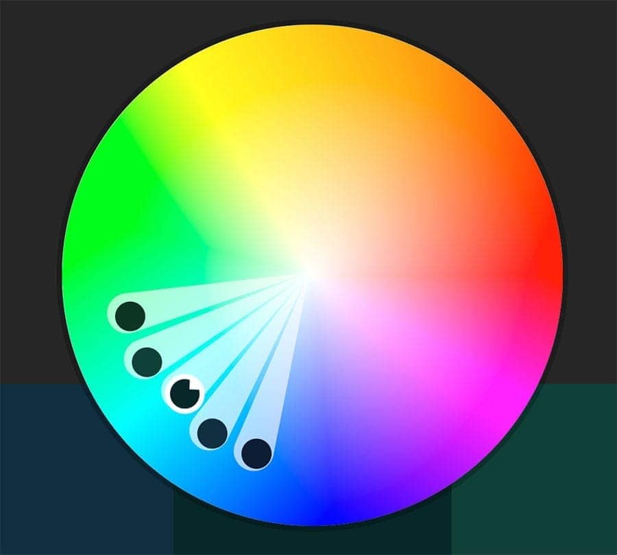
When using analogous colors, try to keep this technique in mind.
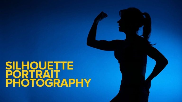
3: Monochromatic Colors
We think of black and white photos when discussing monochromatic photos, and that’s true. You’re simply using various shades and tints of the same color to create your image.
However, you aren’t limited to just black (no color) and white (all colors) in the spectrum. This method is often used in graphic design and advertisements, but it’s just as valid for your photos.
4: Neutral Colors
Your neutral colors are often earth tones. They provide a calm background based on colors found in nature. You often see neutral colors used in architectural exteriors and interiors.
Interior designers think of neutral colors as tones without color. That isn’t really true, but neutral colors serve a purpose – to let the bolder colors stand out.
How to Use Color in Your Photography
There are various ways to use color in your photography, but you must consider them in advance. It’s nice if you can walk around and find perfect color harmonies. It’s possible.
Unfortunately, many places in the world are just full of chaotic color choices. I learned that in my school lunchrooms.
1: Bring Your Own Colors
The simplest concept is just to bring what you need to design your scene. That could be with wardrobe or set pieces with the colors you want. Lee does this with backgrounds for her food photography and choices of the food and containers or set pieces she chooses.
You can get the seamless paper in various colors for portraits and choose a wardrobe to work with.
2: Find Some Cool Colors
Sometimes you can find a location that has just the perfect color. I saw a great blue wall in Havana and just waited for the right person. An older woman in a bright yellow dress came by and it was the perfect color combination.
She wanted a peso, but that’s another story.
3: Use Flash and Gels
Using color gels with portraits is a very popular technique these days. Wedding photographers use color gels on backgrounds all the time, and you can turn a plain wall into any color you want.
I’m a fan of the MagMod System and bought the MagMod Artistic and MagMod Creative gel packs. These things aren’t cheap but are durable and easy to use.

The MagMod Starter Flash Kit 2 is a great way to get started and save money. The kit includes the MagGrip 2, MagSphere 2 diffuser, and MagGrid 2, which are essential for on- or off-camera lighting.
With the simple-to-use MagGrip 2 and precision MagGrid 2, you can create perfect light control. The MagSphere 2 diffuser gives you omnidirectional light for a softer look.

Make your images pop with MagMod's Pro Creative Gels. These gels are durable polycarbonate and feature permanent, embedded names for quick and easy identification. The embedded magnets make it easy to attach and remove the gels to change your look in a flash! With various colors to choose from, you can easily add drama and interest to your photos.
Includes 1 of each: Red, Orange, Yellow, Blue, Green, and Purple.
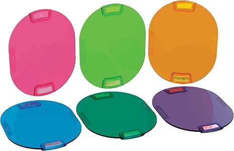
MagMod Pro Artistic Gels are the perfect way to add color to your shots. Mix and match multiple colors to create your unique looks, or use them to add a dramatic effect to your photographs. With permanently embedded names and magnets, these gels are quick and easy to use and will last for years.
Includes 1 of each: Cyan, Amber, Aqua, Pink, Lavender, and Lime.
The system works with magnets, so it’s very easy to add gels or other modifiers, even when you stack them together. The gels aren’t those flimsy sheets or small things that require rubber bands or velcro to mount. They are a firm polycarbonate material, each labeled with their color.
It’s a great system designed to last.
4: Use Creative White Balance
This technique often works with flash & gels, but you can use it without them. Change the color temperature to suit your color needs, warming up the scene or cooling it down. You can use a corrective flash gel, like a Color Temperature Orange (CTO) or Color Temperature Blue (CTB) to offset the white balance color and make your subject appear normal.

If you're looking for a quick and easy way to get professionally calibrated color correction, MagMod Pro Correction Gels are the way to go. These gels come in various colors and are designed to deliver accurate results. Made of durable polycarbonate construction, they also feature permanently embedded names for easy identification. The built-in magnets make it easy to attach and remove them without fiddling with a separate gel holder system.
Includes 1 of each: ¼ CTO, ½ CTO, Full CTO, ½ Plusgreen, ½ CTB, 8x ND (3 stops).
5: Use Color Grading in Post Processing
Another popular trend is to change the color after the shot. You can do this in Lightroom or Photoshop with the Hue/Saturation/Luminance sliders or other tools.
If you're a photographer, there's no doubt that you've heard of Adobe Creative Cloud. And if you haven't, well, let us introduce you! Adobe Creative Cloud is a subscription service that gives you access to two industry-leading products for photographers: Photoshop and Lightroom Classic. With Creative Cloud, you can edit and organize your photos and bring your creative vision to life.
Lookup Tables, or LUTs, are gaining popularity as a way to color grade your photos. I use LUTs from Lutify.me, which work with Lightroom as Profiles
If you're a photographer or filmmaker, you know how important it is to get the perfect color grade for your work. And that's where Lutify.me comes in. They offer commercial grade 3D LUTs color grading packages. With a revolutionary LUTs Previewer, you'll be able to see how your colors will look before you even start grading, which means you can get the perfect look for your film or photos every time. These LUTs easily ntegrate with your post-processing tools.
You can find LUTs in Photoshop and many other apps, like ON1 Photo RAW and Skylum Luminar AI.

There's no denying that ON1 Photo RAW is an excellent raw processor, packed with everything photographers need in a single application. With Version 2022.5, you get all of the incredible features you loved in previous versions of Photo RAW, like Browse, Effects, Portrait, HDR, and Resize. Plus, you get an all-new set of technologies and features, like Sky Swap AI, NoNoise AI, Time-Lapse, and so much more!
SAVE: Apply my coupon code to save 20% at checkout - WBEEM20
Luminar AI is the photo editor that relies on AI to give your photos more than 20 unique effects and editing features. With Luminar AI, you can enhance landscapes, retouch portraits, remove unwanted details in a click, and even change skies with complete scene relighting. Create a single style for your photos and apply it to the whole series for a consistent look.
And for all your travel memories, Luminar AI's exposure correction and color vibrancy features will keep your photos looking natural and beautiful. Finally, Luminar AI's SkinAI and FaceAI provide the perfect finishing touches for your portraits, ensuring stunning results every time.
SAVE: You can save $10 using my coupon code - BEEM
Luminar Neo is an AI-powered photo editor that turns any portrait into a stunning masterpiece. With FaceAI and SkinAI, you can easily retouch portraits, removing blemishes and highlighting facial features. And with the Portrait BokehAI tool, you can create a beautiful bokeh effect in any light. Plus, the Background Removal tool makes it easy to remove backgrounds without spending hours masking.
Skylum now offers Luminar Neo as either a stand-alone tool or part of a membership with extensions to offer more valuable tools like:
- HDR Merge
- Noiseless AI
- Upscale AI
- AI Background Removal
- GenErase
- GenExpand
- GenRemove
Additional extensions are coming.
Luminar Neo's exposure correction and color vibrancy features for all your travel memories will keep your photos looking natural and beautiful.
Finally, Luminar Neo's SkinAI and FaceAI provide the perfect finishing touches for your portraits, ensuring stunning results every time.
You can get everything with different pricing plans. Monthly, Annual or even Lifetime plans are available.
SAVE: You can save $10 using my coupon code - Beem10off
- Promo Code: Beem10off
- Easy to use
- Get great results fast
- Plenty of post-processing features
- Professional extensions are available
- May be slow on older computers
- File management is rudimentary
6: Color Accuracy Tools
We discussed several cases for artistic color use, but sometimes you need to ensure you’re capturing and delivering accurate color results. If you’re shooting photos for a brand, then you must get the colors right in your photos and prints.
You can do this at the point of capture and in your post-processing.
I use the X-Calibrite ColorChecker Passport Photo 2 during my photo sessions to get the right color profile on the spot.

The Calibrite ColorChecker Passport Photo 2 is the perfect tool for avoiding frustration with poor colors in your photos.
The Portable Protective Case accommodates multiple positions for easy use with four specialized targets. You can create custom camera profiles based on your individual camera/lens/lighting combinations for DNG and ICC workflows. You can also create a custom in-camera white balance for a consistent white point across a set of images without needing to correct each image later.
The enhancement patches allow you to check and evaluate shadow details and highlight clipping, and the lanyard ensures that your Passport is always where you need it.
It works with Lightroom to create a DNG camera calibration based on the lens and lighting for your photos. You must remember to take a clear photo of it in the same conditions as your subject.
The next tool is the Calibrite ColorChecker Display Plus to ensure that your monitor shows the correct colors.
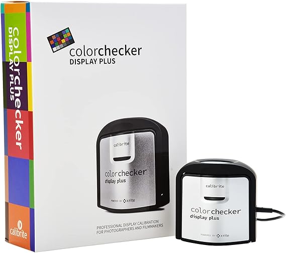
Having an accurate display is critical. The Calibrite ColorChecker Display Plus is a direct replacement for the X-Rite i1Display Pro Plus, and offers technology for better blacks on OLED displays or any display that can achieve close to zero black point.
HDR-supported displays are also no problem, as this unit is designed to minimize clipping in dark areas while allowing you to achieve excellent blacks. It's USB-C compatible with the included USB-C to USB-A adapter, so you'll be able to use it with the latest computers and devices.
This is a big deal not only for accurate colors for brands but also to ensure that what you see on your screen is what you get when you print.
Is Color Your Friend or Enemy?
I love color. It’s full of information and great to help tell your story, except when it gets in the way. It’s your call to decide whether to use color, how to arrange it, or when to leave it out of your photos.
It all comes down to the story you need to tell. Color is just a tool, but a very powerful one.


Everybody want’s make to their photo color full.So i think it’s very useful and helpful for this people they are want’s color.